7 Quantifying Uncertainty
So far we have developed ways to show how to use data to decide between competing questions about the world. For instance, does Harvard enroll proportionately less Asian Americans than other private universities in the United States; are the exam grades in one lab section of a course too low when compared to other lab sections; can an experimental drug bring an improvement to patients recovering from brain trauma? We evaluated questions like these by means of a hypothesis test where we put forward two hypotheses: a null hypothesis and an alternative hypothesis.
Often we are just interested in what a value looks like. For instance, airlines might be interested in the median flight delay of their flights to preserve customer satisfaction; political candidates may look to the percentage of voters favoring them to gauge how aggressive their campaigning should be.
Put in the language of statistics, we are interested in estimating some unknown parameter about a population. If all the data have been made available to us, we could compute the parameter directly with ease. However, we often do not have access to the full population (as is the case with polling voters) or there may be too much data to work with that it becomes computationally prohibitive (as is the case with flights).
We have seen before that sampling distributions can provide reliable approximations to the true (and usually unknown) distribution and that, likewise, a statistic computed from it can provide a reliable estimate of the parameter in question. However, the value of a statistic can turn out differently depending on the random samples that are drawn to compose a sampling distribution. How much can the value of a statistic vary? Could we quantify this uncertainty?
This chapter develops a way to answer this question using an important technique in data science called resampling. We begin by introducing order statistics and percentiles. This will provide us the tools needed to develop the resampling method to produce distributions from a sample, in which we apply order statistics to the generated distributions to obtain something called the confidence interval.
7.1 Order Statistics
The minimum, maximum, and the median are part of what we call order statistics. Order statistics are values at certain positions in numerical data after reordering the data in ascending order.
7.1.1 Prerequisites
This section will make use of data for all flights that departed New York City in 2013. The dataset is made available by the Bureau of Transportation Statistics in the United States. Let’s also load in the tidyverse as usual.
7.1.2 The flights data frame
In our prior exploration of this data frame, we generated empirical distributions of departure delays. Let’s revisit this study and visualize the departure delays again.
ggplot(flights) +
  geom_histogram(aes(x = dep_delay, y = after_stat(density)),
                 color="grey", bins = 30)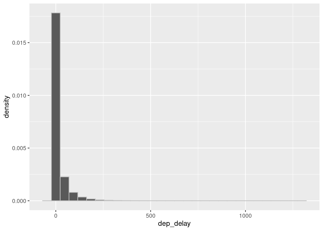
As before, we are interested in the bulk of the data here, so we can ignore the 1.83% of flights with delays of more than 150 minutes.
flights150 <- flights |>
  filter(dep_delay <= 150)
ggplot(flights150) +
  geom_histogram(aes(x = dep_delay, y = after_stat(density)),
                 color="grey", bins = 30)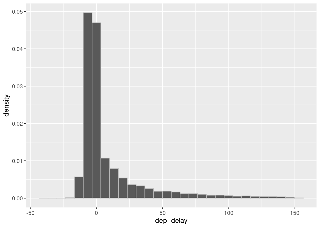
Let’s extract the departure delay column as a vector.
dep_delays <- flights150 |> pull(dep_delay)
7.1.3 median
The median is a popular order statistic that gives us a sense of the central tendency of the data. It is the value at the middle position in the data after reordering of the values.
median(dep_delays)## [1] -2This tells us that half of the flights had early departures – not bad! Recall that we also used the mean to understand the central tendency. Note that the mean (or average) is a statistic, but it is not an order statistic. Let’s compare with the mean of departure delays.
mean(dep_delays)## [1] 8.716037There is quite a bit of discrepancy between the two. Observe that the histogram above has a very long right tail; the mean is pulled upward by flights with long departure delays. In general:
If a distribution has a long tail, the mean will be pulled away from the median in the direction of the tail. Otherwise, if the distribution is symmetrical, the mean and the median will equal.
When the distribution is “skewed” like the one here, the median can be a stronger indicator of central tendency.
There are cases, by the way, where two medians exist. Such an event occurs exactly when the number of values is an even number. If there are 10 values, the 5th and the 6th values in the ascending order are the two medians. The one at the lower position in the order is the odd median and the other one, i.e., the one at the higher position in the order, is the even median. To compute the median in this case, we usually take the average of the odd and even median.
7.1.4 min and max
What is the earliest flight that left? We can find out by looking for the minimum departed flight delay.
min(dep_delays)## [1] -43The authors admit that this flight might have left a little too early for their liking. What about the latest flight?
max(dep_delays)## [1] 150Recall that this maximum is actually artificial because we filtered all rows whose departure delay was more than 150. To recover the true maximum, we need to refer to the original flights data.
## [1] 1301That is almost a 22 hour delay – better get a sleeping bag!
7.2 Percentiles
Now that we have an understanding of order statistics, we can use it to develop the notion of a percentile. We will also explore a closely related concept called the quartile.
You are probably already familiar with the concept of percentiles from sports or standardized testing like the SAT. Organizations like the College Board talk so much about percentiles – to the extent of writing full guides on how to interpret them – because they are indicators of how students perform relative to other exam-takers. Indeed, the percentile is another order statistic that tells us something about the rank of a data point after reordering the elements in a dataset. Now that we have an understanding of order statistics, we can use it to develop the notion of a percentile. We will also explore a closely related concept called the quartile.
7.2.2 The finals tibble
In the spirit of the College Board, we will examine exam scores to develop an understanding of percentiles. Recall that the finals data frame contains hypothetical final exam scores from two offerings of an undergraduate computer science course. Let’s load it in.
finals## # A tibble: 102 × 2
## grade class
## <dbl> <chr>
## 1 89 A
## 2 17 A
## 3 94 A
## 4 51 A
## 5 49 A
## 6 93 A
## 7 52 A
## 8 54 A
## 9 57 A
## 10 65 A
## # ℹ 92 more rowsThe dataset contains final scores from a total of 105 students.
nrow(finals)## [1] 102We will not concern ourselves with the individual offerings of the course this time. Since the scores are of interest for this study, let us extract a vector of scores from the tibble.
scores <- finals |>
  pull(grade)
To orient ourselves to the data, we can look at the maximum and minimum scores.
max(scores)## [1] 98
min(scores)## [1] 0We may be alarmed to see that the minimum score of 0. Some insight into the course would reveal that there were a few students who did not appear for the final exam (don’t be one of them!).
Finally, let us visualize the distribution of scores.
ggplot(finals) +
  geom_histogram(aes(x = grade, y = after_stat(density)),
                 col="grey", fill = "darkcyan", bins = 10)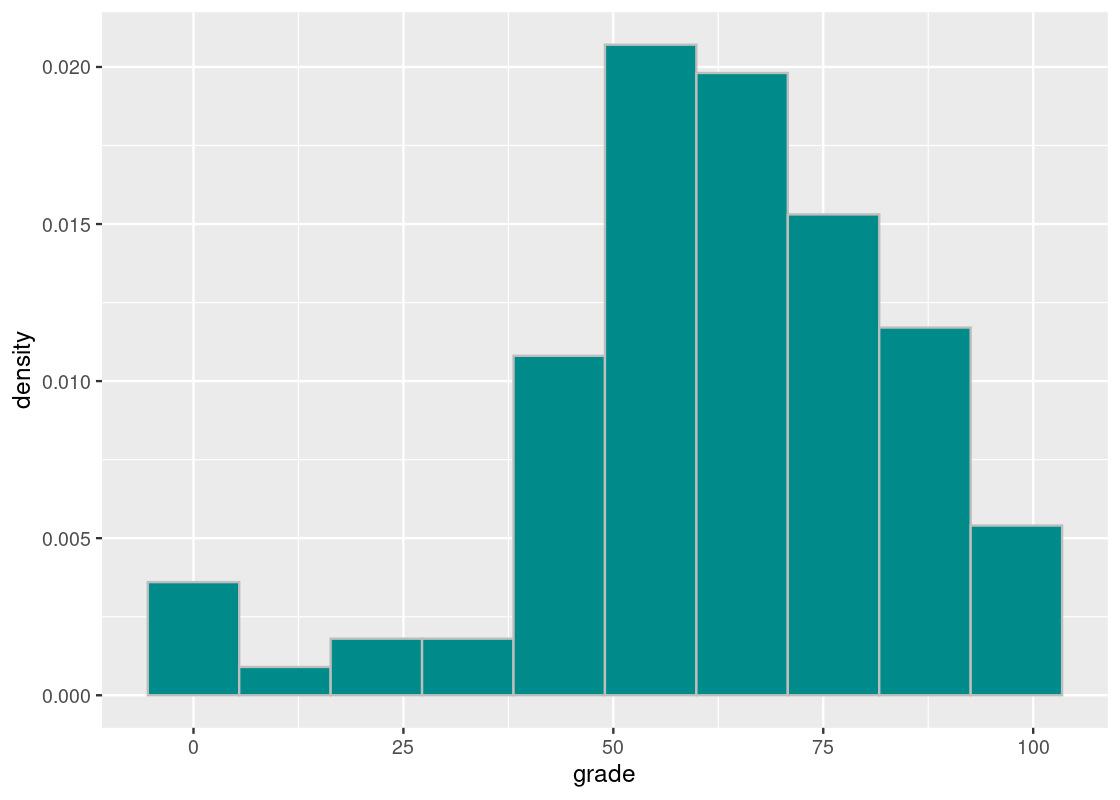
7.2.3 The quantile function
The percentile is an order statistic where the position of the data is not the rank but a percentage that specifies relative position in the data. For instance, the 50th percentile is the smallest value that is at least as large as 50% of the elements in scores; it must be a value on the list of scores. We can compute this simply with the quantile function in R.
## 50%
##  65
The value at the 50th percentile is something we already know: the median score!
median(scores)## [1] 65The quantile function gives the value that cuts off the first n percent of the data values when it is sorted in ascending order. There are many ways to compute percentiles (see the help page for a sneak peek, with ?quantile). The one that matches the definition used here corresponds to type = 1.
The additional argument passed in is a vector of desired percentages. These must be between 0 and 1. This is how quantile gets its name: quantiles are percentiles scaled to have a value between 0 and 1, e.g. 0.5 rather than 50.
Let us look at some more percentile values in the vector of scores.
##   5%  20%  90%  95%  99% 100%
##   17   49   89   93   97   98
Let’s pick apart some of these values. We see that the value at the 5th percentile is the lowest exam score that is at least as large as 5% of the scores. We can confirm this easily by summing the number of scores less than 17 and dividing by the total number of scores.
## [1] 0.04901961Moving on up, we see that the 95th and 99th percentiles are quite close together. We also observe that the 100th percentile is 98, which corresponds to the maximum score obtained on the final. That is, a 98 is at least as large as 100% of the scores, which is the entire class.
The 0th percentile is simply the smallest value in the dataset, as 0% of the data is at least as large as it. In other words, there is no exam score in the class lower than a 0.
## 0%
##  0
If the College Board says a student is in the “top 10 percentile”, this would be a misnomer. What they really mean to say is that the student is in the \(1 - \text{top X percentile}\), or 90th percentile.
7.2.4 Quartiles
In addition to the medians, common percentiles are the \(1/4\)th and \(3/4\)th, which we often call the bottom quarter and the top quarter. Basically, we chop the data in quarters and use the boundaries between the neighboring quarters. Since these percentiles partition the data into quarters, these are given a special name: quartiles.
##   0%  25%  50%  75% 100%
##    0   52   65   77   98
Observe what happens when we omit the vector of percentages.
quantile(scores, type = 1)## 0% 25% 50% 75% 100%
## 0 52 65 77 98The corresponding 0th, 25th, 50th, 75th, and 100th percentiles of the vector are returned.
7.2.5 Combining two percentiles
By combining two percentiles, we can get a rough sense of the distribution. For example, the combination of 25th and 75th percentiles represents the “middle” 50%. Similarly, the 2.5th and 97.5th percentiles represent the middle 95% of the data. That is,
##  2.5% 97.5%
##     0    95
95% of the scores is between 0 and 95. We could find this more directly by realizing that the middle 95% corresponds to going up and down from the 50th percentile by half of that amount, which is 47.5%.
##  2.5% 97.5%
##     0    95
As one more example, here is the middle 90% of scores.
##  5% 95%
##  17  93
7.2.6 Advantages of percentiles
Percentile is a useful concept because it eliminates the use of population size in specifying the position; that is, the position specification does not directly take into account the size of the data. What do we mean by that?
Let’s return to the example of final exam scores. Suppose that one offering of the class contained 50 students while another had 200 students. Consider the “top 10 students” in each class.
Since top 10 is 20% of 50 students, there is a 20% chance for a student to be among the top 10, while the chances decrease to 5% for the class of 200. That is, if we specify a top group with its size, the significance being in the top group varies depending on the size of the population and so we must to specify the size of the underlying group, e.g., “top 10 in a group of 4000 students”. Percentiles are nice in that they are not sensitive to these changes.
7.3 Resampling
It is usually the case that a data scientist will receive a sample from an underlying population to which she has no access. If she had access to the underlying population, she could calculate the parameter value directly. Since that is impossible, is there a way for her to use the sample at hand to generate a range of values for the statistic?
Yes! This is a technique we call resampling, which is also known as the bootstrap. In bootstrapping, we treat the dataset at hand as the “population” and generate “new” samples from it. But there is a catch. Each sample data set that we generate should be equal in size to the original. This necessarily means that our sampling plan be done with replacement.
Since the samples have the same size as the original with the use of replacement, duplicates and omissions can arise. That is, there are items that will appear multiple times as well as items that are missing. Because randomness is involved, the discrepancy varies.
7.3.1 Prerequisites
This section will defer again to the New York City flights in 2013 from the Bureau of Transportation Statistics. Let’s also load in the tidyverse as usual.
7.3.2 Population parameter: the median time spent in the air
When studying this dataset, we have spent a lot of time examining flight departure delays. This time we will turn our attention to another variable in the tibble which tracks the amount of time a flight spent in air, in minutes. The variable is called air_time.
Let’s visualize the distribution of air time in flights.
Recall the distribution of departure delays in flights150.
ggplot(flights) +
  geom_histogram(aes(x = air_time, y = after_stat(density)),
                 col="grey", fill = "darkcyan", bins = 20)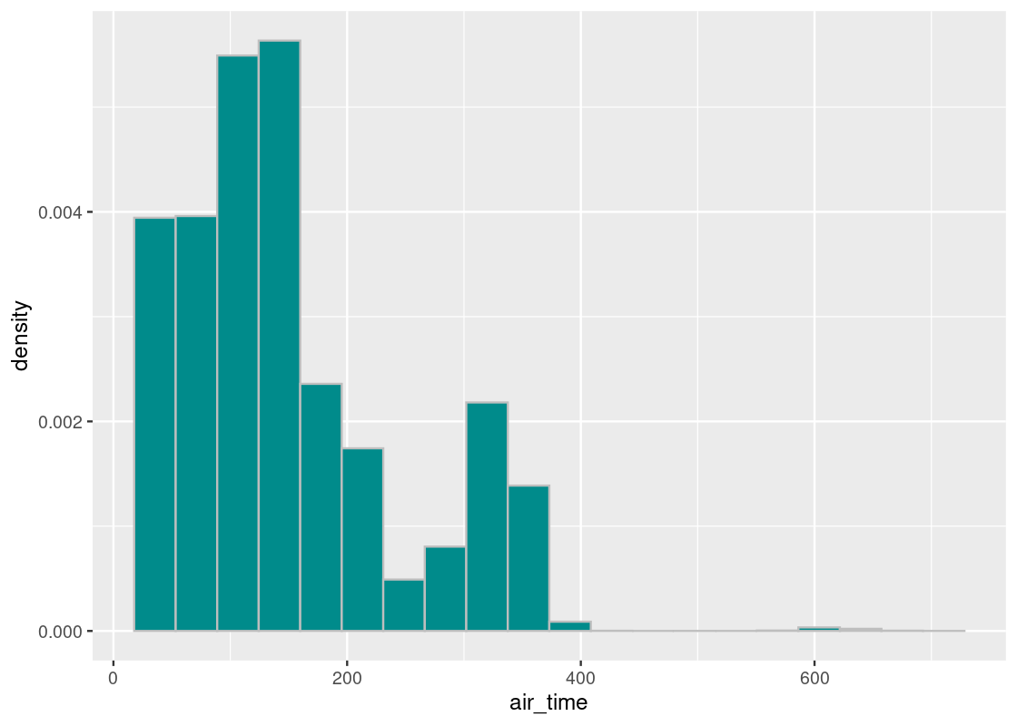
As before, let’s concentrate on the bulk of the data and filter out any flights that flew for more than 400 minutes.
We plot this distribution one more time.
ggplot(flights400) +
  geom_histogram(aes(x = air_time, y = after_stat(density)),
                 col="grey", fill = "darkcyan", bins = 20)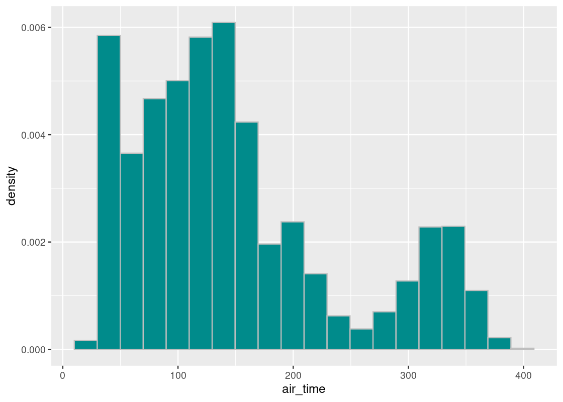
The parameter we will select for this study is the mean air time.
## [1] 149.6463Let us see how well we can estimate this value based on a sample of the flights. We will study two such samples: an artificial sample and a random sample.
7.3.3 First try: A mechanical sample
For our mechanical sample, we will assume that we have been given only a cross-section of the flights data and try to estimate the population median based on this sample. Let us suppose we have been given the flight data for only the months of September and October.
flights_sample <- flights400 |>
  filter(month == 9 | month == 10)
There are 55,522 flights appearing in the subset. Let’s visualize the distribution of air time from our sample.
ggplot(flights_sample) +
  geom_histogram(aes(x = air_time, y = after_stat(density)),
                 col="grey", fill = "darkcyan", bins = 20)
It appears close to the population of flights, though there are notable differences: flights that have longer air times (between 300 and 400 minutes) appear exaggerated in this dataset. Let’s compute the mean from this sample.
## [1] 145.378It is quite different from the population median. Nevertheless, this subset of flights will serve as the dataset from which we will bootstrap our samples. Put another way, we will treat this sample as if it were the population.
7.3.4 Resampling the sample mean
To perform a bootstrap, we will draw from the sample, at random with replacement, the same number of times as the size of the sample dataset.
To simplify the work, let us extract the column of air times as a vector.
air_times <- flights_sample |>
  pull(air_time)
We know already how to sample at random with replacement from a vector using sample. Computing the sample mean is also straightforward: just pipe the returned vector into mean.
## [1] 145.3686Let us move this work into a function we can call.
one_sample_mean <- function() {
  sample_mean <- flights_sample |>
    pull(air_time) |>
    sample(replace = TRUE) |>
    mean()
  return(sample_mean)
}
Give it a run!
one_sample_mean()## [1] 144.6964This function is actually quite useful. Let’s generalize the function so that we may call it with other datasets we will work with. The modified function will receive three parameters: (1) a tibble to sample from, (2) the column to work on, and (3) the statistic to compute.
one_sample_value <- function(df, label, statistic) {
  sample_value <- df |>
    pull({{ label }}) |>
    sample(replace = TRUE) |>
    statistic()
  return(sample_value)
}
We can now call it as follows.
one_sample_value(flights_sample, air_time, mean)## [1] 145.398Q: What’s the deal with those (ugly) double curly braces (
{{) ? To make R programming more enjoyable, the tidyverse allows us to write out column names, e.g.air_time, just like we would variable names. The catch is that when we try to use such syntax sugar from inside a function, R has no idea what we mean. In other words, when we saypull(label)R thinks that we want to extract a vector from a column calledlabel, despite the fact we passed inair_timeas an argument. To lead R in the right direction, we surroundlabelwith{{so that R knows to interpretlabelas, indeed,air_time.
7.3.5 Distribution of the sample mean
We now have all the pieces in place to perform the bootstrap. We will replicate this process many times so that we can compose an empirical distribution of all the bootstrapped sample means. Let’s repeat the process 10,000 times.
bstrap_means <- replicate(n = 10000,
                    one_sample_value(flights_sample, air_time, mean))
Let us visualize the bootstrapped sample means using a histogram.
df <- tibble(bstrap_means)
ggplot(df, aes(x = bstrap_means, y = after_stat(density))) +
  geom_histogram(col="grey", fill = "darkcyan", bins = 8)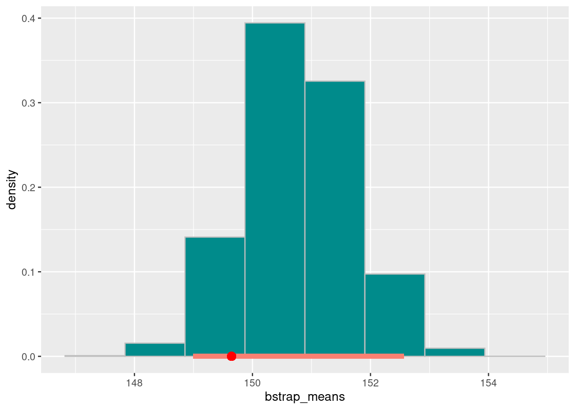
7.3.6 Did it capture the parameter?
How often does the population mean fall somewhere in the empirical histogram? Does it reside
“somewhere at the center” or at the fringes where the tails are? Let us be more specific by what we mean when we say “somewhere at the center”: the middle 95% of bootstrapped means containing the population mean.
We can identify the “middle 95%” using the percentiles we learned from the last section. Here they are:
desired_area <- 0.95
middle95 <- quantile(bstrap_means,
                     0.5 + (desired_area / 2) * c(-1, 1), type = 1)
middle95
## 2.5% 97.5%
## 144.6075 146.1229Let us annotate this interval on the histogram.
df <- tibble(bstrap_means)

ggplot(df, aes(x = bstrap_means, y = after_stat(density))) +
  geom_histogram(col="grey", fill = "darkcyan", bins = 8) +
  annotate("segment", x = middle95[1], y = 0,
                   xend = middle95[2], yend = 0,
size = 2, color = "salmon") 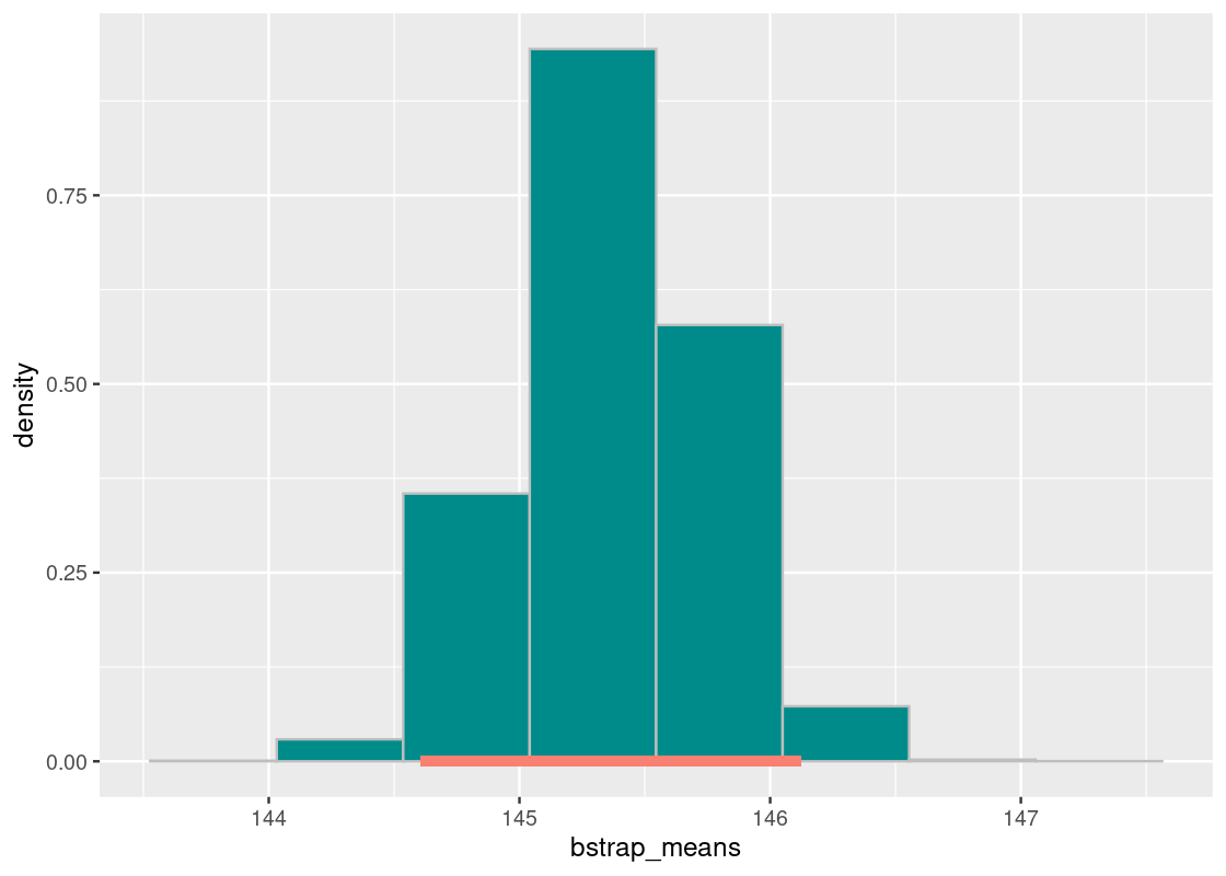
pop_mean## [1] 149.6463Our population mean is 149.6 minutes – that is nowhere to be seen in this interval or even in the histogram! It would seem then that in all of the 10,000 replications of the bootstrap, not even one was able to capture the population mean. What happened?
Recall the subset selection we used: all flights in September or October. This was a very artificial selection that is prone to bias. We learned before when we discussed sampling plans that bias in the sample can mislead the statistic computed from it, especially when using a convenience sample such as the one here.
7.3.7 Second try: A random sample
We will now try to estimate the population mean using a random sample of flights. Let us select at random without replacement 10,000 flights from the data.
flights_sample <- flights400 |>
  slice_sample(n = 10000, replace = FALSE)
We will visualize what our random sample looks like.
ggplot(flights_sample) +
  geom_histogram(aes(x = air_time, y = after_stat(density)),
                 col="grey", fill = "darkcyan", bins = 20)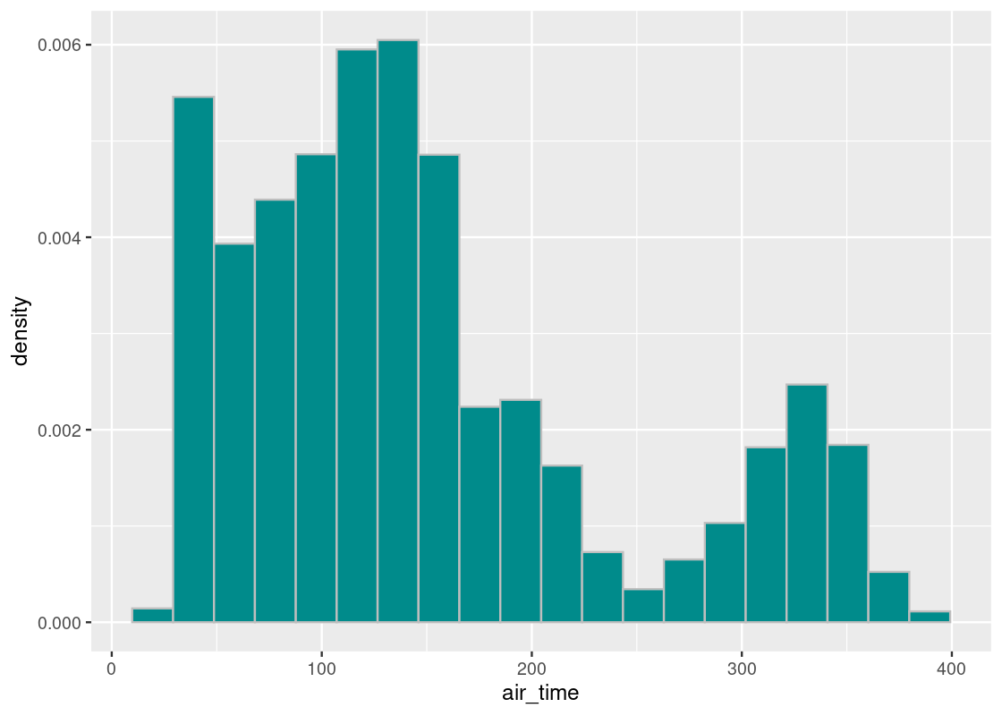
Let us also compute the sample mean again.
## [1] 150.7474We observe that the sample mean is also much closer to the population mean, unlike our mechanical selection attempt. This is confirmation of the Law of Averages (finally) at work: when we sample at random and the sample size is large, the distribution of the sample closely follows that of the flight population.
Let us now repeat the bootstrap. Recall that we will treat this sample as if it were the population.
7.3.8 Distribution of the sample mean (revisited)
We have done all the hard work already in setting up the bootstrap. To redo the process, we need only to pass in the random sample contained in flights_sample. As before, let us repeat the process 10,000 times.
bstrap_means <- replicate(n = 10000,
                  one_sample_value(flights_sample, air_time, mean))
We will identify the “middle 95%”. Here is the interval:
desired_area <- 0.95
middle95 <- quantile(bstrap_means,
                     0.5 + (desired_area / 2) * c(-1, 1), type = 1)
middle95
## 2.5% 97.5%
## 148.9982 152.5637Let us annotate this interval on the histogram. We will also plot the population mean as a red dot.
df <- tibble(bstrap_means)

ggplot(df, aes(x = bstrap_means, y = after_stat(density))) +
  geom_histogram(col="grey", fill = "darkcyan", bins = 8) +
  annotate("segment", x = middle95[1], y = 0,
                   xend = middle95[2], yend = 0,
                   size = 2, color = "salmon") +
  annotate("point", x = pop_mean, y = 0, color = "red", size = 3)
The population mean of 149.6 minutes falls in this interval. We conclude that the “middle 95%” interval of bootstrapped means successfully captured the parameter.
7.3.9 Lucky try?
Our interval of bootstrapped means captured the parameter in the air time data. But were we just lucky? We can test it out.
We would like to see how often the “middle 95%” interval captures the parameter. We will need to redo the entire process many times to find an answer. More specifically, we will follow the recipe:
- Collect a fresh sample of size 10,000 from the population. For the sampling plan, sample at random without replacement.
- Do 10,000 replications of the bootstrap process and find the “middle 95%” interval of bootstrapped means. We will repeat this process 100 times so that we end up with 100 intervals; we will count how many of them contain the population mean.
all_the_bootstraps <- function() {
  desired_area <- 0.95

  flights_sample <- flights400 |>
    slice_sample(n = 10000, replace = FALSE)

  bstrap_means <- replicate(n = 10000,
                    one_sample_value(flights_sample, air_time, mean))
  middle95 <- quantile(bstrap_means,
                       0.5 + (desired_area / 2) * c(-1, 1), type = 1)
  return(middle95)
}
intervals <- replicate(n = 100, all_the_bootstraps())Note that this simulation will take awhile (> 20 minutes). Grab a coffee!
Let’s examine some of the intervals of bootstrapped means.
intervals[,1]## 2.5% 97.5%
## 147.4277 151.0550
intervals[,2]## 2.5% 97.5%
## 148.7328 152.4258Let’s transform intervals into a tibble which will make it easier to understand and visualize the results.
left_column <- intervals[1,]
right_column <- intervals[2,]
interval_df <- tibble(
  replication = 1:100,
  left = left_column,
  right = right_column
)
interval_df
## # A tibble: 100 × 3
## replication left right
## <int> <dbl> <dbl>
## 1 1 147. 151.
## 2 2 149. 152.
## 3 3 148. 152.
## 4 4 149. 152.
## 5 5 149. 153.
## 6 6 147. 150.
## 7 7 148. 151.
## 8 8 148. 151.
## 9 9 148. 152.
## 10 10 149. 152.
## # ℹ 90 more rowsHow many of these contain the population mean? We can count the number of intervals where the population mean is between the left and right endpoints.
## [1] 94We can visualize these intervals by stacking them on top of each other vertically. The vertical red line shows where the population mean lies. Under real-life circumstances, we do not know where it is.
ggplot(interval_df) +
  geom_segment(aes(x = left, y = replication,
                   xend = right, yend = replication),
               color = "salmon") +
  geom_vline(xintercept = pop_mean, color = "red") +
  labs(x = "Air time (minutes)")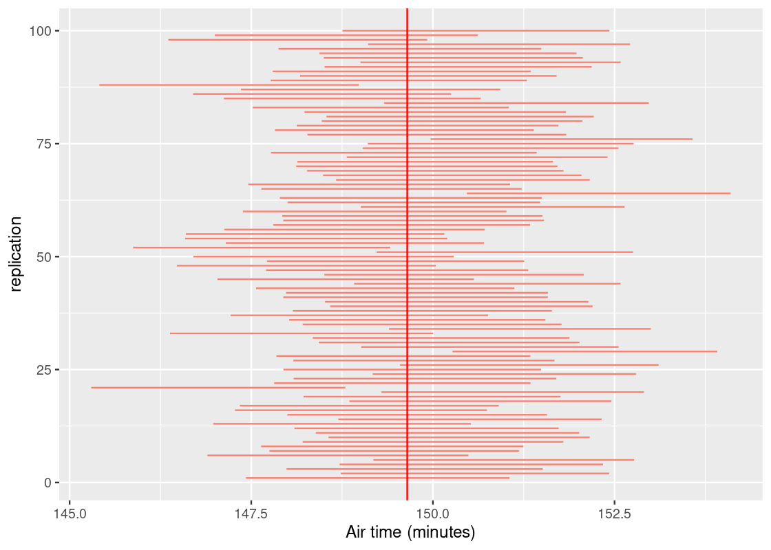
We expect about 95 of the 100 intervals to cross the vertical line; meaning, it contains the parameter. We would label such intervals as “good”. If an interval does not, oh well – that’s the nature of chance. Fortunately, these do not occur often. In fact, they should occur about 5 times among 100 trials, or 95%. The strength of statistics is not clairvoyance, but the ability to quantify uncertainty.
7.3.10 Resampling round-up
Before we close this section, we end with a quick summary on how to perform a bootstrap.
Goal: To estimate some population parameter we do not know about, e.g., the mean air time of New York City flights.
- Select a sampling plan. A safe bet is to sample at random without replacement from the population. Be sure the sample drawn is large in size and remember that in reality sampling is an expensive process. It is likely you will get only one chance to draw a sample from the population.
- Bootstrap the random sample (this time, with replacement) and compute the desired statistic from it.
- Replicate this process a great number of times to obtain many bootstrapped samples.
- Find the “middle 95%” interval of the bootstrapped samples.
7.4 Confidence Intervals
The previous section developed a way to estimate the value of a parameter we do not know. Because chance is an inevitable part of drawing a random sample, we cannot be precise and offer a single value for this estimate, e.g., we can determine that the mean height of all individuals in the United States is exactly 5.3 feet. Instead, we provide an interval of estimates by looking at a bulk of values that are “somewhere in the center”. Typically this entails looking at the “middle 95%” interval, but we may prefer other intervals such as the “middle 90%” or even the “middle 99%”.
Recall that knowing the value of the parameter beforehand is a rare luxury out of reach; if we could obtain it somehow, there would be no need for statistical methods like the bootstrap. Instead, data scientists place their confidence on intervals of estimates where the process that generates said interval is successful in capturing the parameter some percentage of the time.
These “intervals of estimates” are so important to statistics and data science that they are given a special name: the confidence interval. This section will explore confidence intervals, and their use, in greater depth.
7.4.1 Prerequisites
We will make use of the tidyverse in this chapter, so let’s load it in as usual.
We will also bring forward the one_sample_value function we wrote in the previous section.
one_sample_value <- function(df, label, statistic) {
  sample_value <- df |>
    pull({{ label }}) |>
    sample(replace = TRUE) |>
    statistic()
  return(sample_value)
}
For the running example in this section, we turn to survey data collected by the US National Center for Health Statistics (NCHS) on nutrition and health information. This data is available in the tibble NHANES from the NHANES package. In accordance to the documentation (see ?NHANES), the dataset can be treated as if it were a simple random sample from the American population. We use this dataset as an example where we do not know the population parameter.
library(NHANES)
NHANES
## # A tibble: 10,000 × 76
## ID SurveyYr Gender Age AgeDecade AgeMonths Race1 Race3 Education
## <int> <fct> <fct> <int> <fct> <int> <fct> <fct> <fct>
## 1 51624 2009_10 male 34 " 30-39" 409 White <NA> High School
## 2 51624 2009_10 male 34 " 30-39" 409 White <NA> High School
## 3 51624 2009_10 male 34 " 30-39" 409 White <NA> High School
## 4 51625 2009_10 male 4 " 0-9" 49 Other <NA> <NA>
## 5 51630 2009_10 female 49 " 40-49" 596 White <NA> Some College
## 6 51638 2009_10 male 9 " 0-9" 115 White <NA> <NA>
## 7 51646 2009_10 male 8 " 0-9" 101 White <NA> <NA>
## 8 51647 2009_10 female 45 " 40-49" 541 White <NA> College Grad
## 9 51647 2009_10 female 45 " 40-49" 541 White <NA> College Grad
## 10 51647 2009_10 female 45 " 40-49" 541 White <NA> College Grad
## # ℹ 9,990 more rows
## # ℹ 67 more variables: MaritalStatus <fct>, HHIncome <fct>, HHIncomeMid <int>,
## # Poverty <dbl>, HomeRooms <int>, HomeOwn <fct>, Work <fct>, Weight <dbl>,
## # Length <dbl>, HeadCirc <dbl>, Height <dbl>, BMI <dbl>,
## # BMICatUnder20yrs <fct>, BMI_WHO <fct>, Pulse <int>, BPSysAve <int>,
## # BPDiaAve <int>, BPSys1 <int>, BPDia1 <int>, BPSys2 <int>, BPDia2 <int>,
## # BPSys3 <int>, BPDia3 <int>, Testosterone <dbl>, DirectChol <dbl>, …7.4.2 Estimating a population proportion
Let us use this dataset to estimate the proportion of healthy sleepers in the American population. A “healthy amount of sleep” is defined by the American Academy of Sleep Medicine as 7 to 9 hours per night for adults between the ages of 18 and 60.
With this information, we perform some basic preprocessing of the data:
- Drop any observations that contain a missing value in the column
SleepHrsNight. - Filter the data to contain observations for adults between the ages of 18 and 60.
- Create a new Boolean variable
healthy_sleepthat indicates whether a participant gets a healthy amount of sleep.
NHANES_relevant <- NHANES |>
  drop_na(c(SleepHrsNight)) |>
  filter(between(Age, 18, 60)) |>
  mutate(healthy_sleep = between(SleepHrsNight, 7, 9)) |>
  relocate(healthy_sleep, .before = SurveyYr)
NHANES_relevant
## # A tibble: 5,748 × 77
## ID healthy_sleep SurveyYr Gender Age AgeDecade AgeMonths Race1 Race3
## <int> <lgl> <fct> <fct> <int> <fct> <int> <fct> <fct>
## 1 51624 FALSE 2009_10 male 34 " 30-39" 409 White <NA>
## 2 51624 FALSE 2009_10 male 34 " 30-39" 409 White <NA>
## 3 51624 FALSE 2009_10 male 34 " 30-39" 409 White <NA>
## 4 51630 TRUE 2009_10 female 49 " 40-49" 596 White <NA>
## 5 51647 TRUE 2009_10 female 45 " 40-49" 541 White <NA>
## 6 51647 TRUE 2009_10 female 45 " 40-49" 541 White <NA>
## 7 51647 TRUE 2009_10 female 45 " 40-49" 541 White <NA>
## 8 51656 FALSE 2009_10 male 58 " 50-59" 707 White <NA>
## 9 51657 FALSE 2009_10 male 54 " 50-59" 654 White <NA>
## 10 51666 FALSE 2009_10 female 58 " 50-59" 700 Mexican <NA>
## # ℹ 5,738 more rows
## # ℹ 68 more variables: Education <fct>, MaritalStatus <fct>, HHIncome <fct>,
## # HHIncomeMid <int>, Poverty <dbl>, HomeRooms <int>, HomeOwn <fct>,
## # Work <fct>, Weight <dbl>, Length <dbl>, HeadCirc <dbl>, Height <dbl>,
## # BMI <dbl>, BMICatUnder20yrs <fct>, BMI_WHO <fct>, Pulse <int>,
## # BPSysAve <int>, BPDiaAve <int>, BPSys1 <int>, BPDia1 <int>, BPSys2 <int>,
## # BPDia2 <int>, BPSys3 <int>, BPDia3 <int>, Testosterone <dbl>, …We can inspect the resulting table. Note that there are 5,748 observations in the tibble.
NHANES_relevant## # A tibble: 5,748 × 77
## ID healthy_sleep SurveyYr Gender Age AgeDecade AgeMonths Race1 Race3
## <int> <lgl> <fct> <fct> <int> <fct> <int> <fct> <fct>
## 1 51624 FALSE 2009_10 male 34 " 30-39" 409 White <NA>
## 2 51624 FALSE 2009_10 male 34 " 30-39" 409 White <NA>
## 3 51624 FALSE 2009_10 male 34 " 30-39" 409 White <NA>
## 4 51630 TRUE 2009_10 female 49 " 40-49" 596 White <NA>
## 5 51647 TRUE 2009_10 female 45 " 40-49" 541 White <NA>
## 6 51647 TRUE 2009_10 female 45 " 40-49" 541 White <NA>
## 7 51647 TRUE 2009_10 female 45 " 40-49" 541 White <NA>
## 8 51656 FALSE 2009_10 male 58 " 50-59" 707 White <NA>
## 9 51657 FALSE 2009_10 male 54 " 50-59" 654 White <NA>
## 10 51666 FALSE 2009_10 female 58 " 50-59" 700 Mexican <NA>
## # ℹ 5,738 more rows
## # ℹ 68 more variables: Education <fct>, MaritalStatus <fct>, HHIncome <fct>,
## # HHIncomeMid <int>, Poverty <dbl>, HomeRooms <int>, HomeOwn <fct>,
## # Work <fct>, Weight <dbl>, Length <dbl>, HeadCirc <dbl>, Height <dbl>,
## # BMI <dbl>, BMICatUnder20yrs <fct>, BMI_WHO <fct>, Pulse <int>,
## # BPSysAve <int>, BPDiaAve <int>, BPSys1 <int>, BPDia1 <int>, BPSys2 <int>,
## # BPDia2 <int>, BPSys3 <int>, BPDia3 <int>, Testosterone <dbl>, …We will apply bootstrapping to the NHANES_relevant tibble to estimate an unknown parameter: the proportion of healthy sleepers in the American population.
Let us visualize the distribution of healthy sleepers using a bar chart.
ggplot(NHANES_relevant) +
  geom_bar(aes(x = healthy_sleep),
                 col="grey", fill = "darkcyan", bins = 20)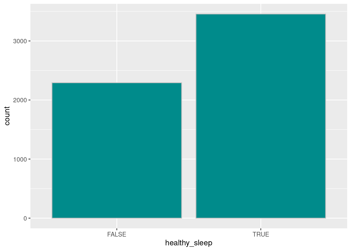
The proportion of healthy sleepers is the fraction of TRUE’s in the healthy_sleep column. Recall that Boolean variables are just 1’s and 0’s. Thus, we can sum the number of TRUE’s and divide by the total number of subjects. This is equivalent to computing the mean for the healthy_sleep column.
## # A tibble: 1 × 1
##    prop
##   <dbl>
## 1 0.601
We are now ready to bootstrap from this random sample. Recall that one_sample_value will perform the bootstrap for us. We will replicate the bootstrap process a large number of times, say 10,000, so that we can plot a sampling histogram of the bootstrapped medians.
# Do the bootstrap!
bstrap_means <- replicate(n = 10000,
                one_sample_value(NHANES_relevant, healthy_sleep, mean))
As before, we will identify the 95% confidence interval. Here is the interval:
desired_area <- 0.95
middle <- quantile(bstrap_means,
                   0.5 + (desired_area / 2) * c(-1, 1), type = 1)
middle
## 2.5% 97.5%
## 0.5887265 0.6139527Let us plot the sampling histogram and annotate the interval on this histogram.
df <- tibble(bstrap_means)
ggplot(df, aes(x = bstrap_means, y = after_stat(density))) +
  geom_histogram(col="grey", fill = "darkcyan", bins = 13) +
  annotate("segment", x = middle[1], y = 0, xend = middle[2],
           yend = 0, size = 2, color = "salmon") +
  labs(x = "Proportion of healthy sleepers")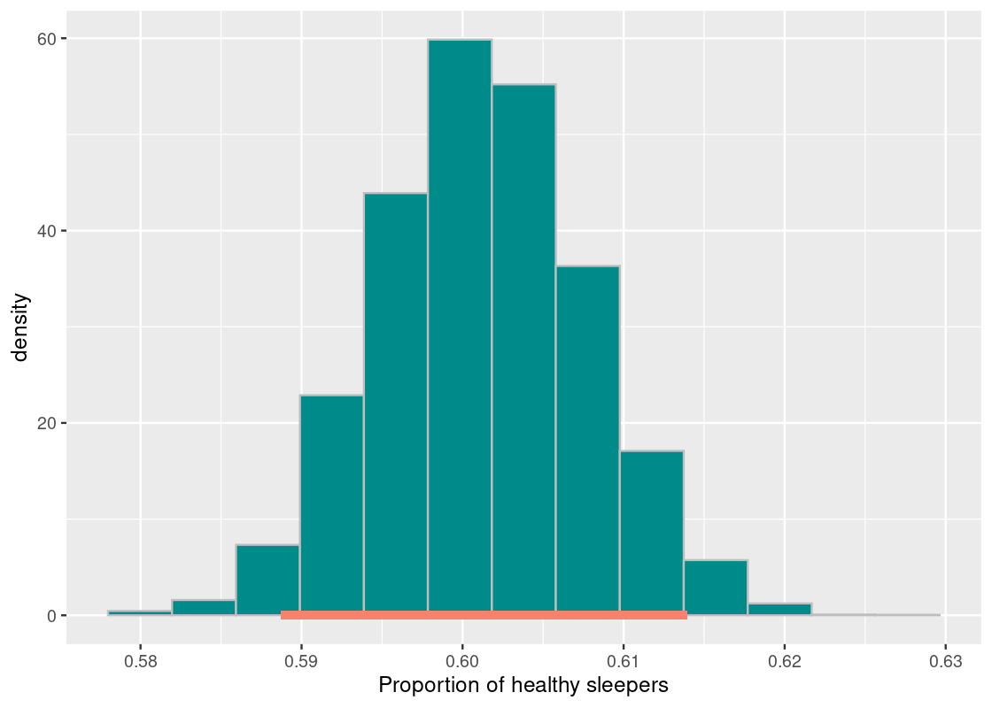
This looks a lot like what we saw in the previous section, with one key difference: there is no dot indicating where the parameter is! We do not know where the dot will fall or if it is even on this interval.
Statistics does not promise clairvoyance. It is a tool for quantifying uncertainty. What we have obtained is a 95% confidence interval of estimates. Meaning, this bootstrap process will be successful in capturing the parameter about 95% of the time. But that also leaves a 5% chance where we are totally off. Can we control the level of uncertainty?
7.4.3 Levels of uncertainty: 80% and 99% confidence intervals
So far we have examined the 95% confidence interval. Let us see what happens to the interval of estimates when we increase our level of confidence. We will examine a 99% confidence interval.
desired_area <- 0.99
middle <- quantile(bstrap_means,
                   0.5 + (desired_area / 2) * c(-1, 1), type = 1)
middle
## 0.5% 99.5%
## 0.5847251 0.6179541
df <- tibble(bstrap_means)
ggplot(df, aes(x = bstrap_means, y = after_stat(density))) +
  geom_histogram(col="grey", fill = "darkcyan", bins = 13) +
  annotate("segment", x = middle[1], y = 0, xend = middle[2], yend = 0,
                   size = 2, color = "salmon") +
  labs(x = "Proportion of healthy sleepers")
The interval is much wider! The proportion of healthy sleepers in the population goes from about 58.4% to 61.7%. This points to a trade-off: as we increase our confidence in the interval of estimates, this is compensated by making the interval wider. That is, a confidence interval generated by this resampling process has a chance of missing the parameter only 1% of the time. That probability does not correspond to the specific interval we found, but to the process that generated said interval. For the \([0.584, 0.617]\) interval we found, the parameter either sits on the interval or not.
Let us move in the other direction and try a 80% confidence interval.
desired_area <- 0.80
middle <- quantile(bstrap_means,
                   0.5 + (desired_area / 2) * c(-1, 1), type = 1)
middle
## 10% 90%
## 0.5929019 0.6096033
df <- tibble(bstrap_means)
ggplot(df, aes(x = bstrap_means, y = after_stat(density))) +
  geom_histogram(col="grey", fill = "darkcyan", bins = 13) +
  annotate("segment", x = middle[1], y = 0, xend = middle[2], yend = 0,
                   size = 2, color = "salmon") +
  labs(x = "Proportion of healthy sleepers")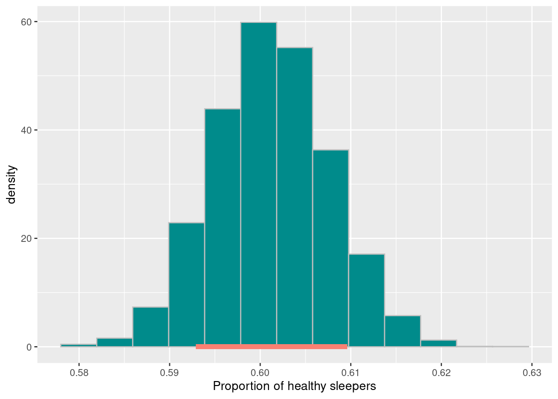
This interval is much narrower than the 99% interval and estimates 59.3% to 60.9% healthy sleepers in the population. This is a much tighter set of estimates, but we traded a narrower interval for lower confidence. This interval has a chance of missing the parameter 20% of the time.
7.4.4 Confidence intervals as a hypothesis test
Confidence intervals can be used for more than trying to estimate a population parameter. One popular use case for the confidence interval is something we saw in the previous chapter: the hypothesis test.
Let us reconsider the 95% confidence interval we obtained. The proportion of healthy sleepers in the population goes from 58.8% to 61.4%. Suppose that a researcher is interested in testing the following hypothesis:
Null hypothesis. The proportion of healthy sleepers in the population is 61%.
Alternative hypothesis. The proportion of healthy sleepers in the population is not 61%.
If we were testing this hypothesis at the 95% significance level, we would fail to reject the null hypothesis. Why?
The value supplied by the null (61%) sits on our 95% confidence interval for the population proportion. Therefore, at this level of significance, this value is plausible.
If we were to lower our confidence (to say 90% or 80%), the conclusion could have been different. This raises an important point about cut-offs: some fields demand a high level of significance for a result to be accepted by its scientific community; other fields may require much less convincing. For instance, experimental studies in Physics demand significance levels at 99.9% or even 99.99% for a result to be even considered publishable. It is not hard to imagine why: findings in Physics are usually axiomatic and rejecting a null hypothesis implies the discovery of phenomena in nature. A 99.99% confidence interval would guarantee that such a discovery is a fluke only 0.01% of the time.
The basis for using confidence intervals as a hypothesis test is rooted in statistical theory. In practice, we simply check whether the value supplied by the null hypothesis sits on the confidence interval or not.
7.4.5 Final remarks: resampling with care
We end this section with some points to keep in mind when applying resampling.
- Avoid introducing bias into the sample that is used as input for resampling. The sampling plan of simple random sampling will usually work best. And, even with simple random samples, it is possible to draw a “weird” original sample such that the confidence interval generated using it fails to capture the parameter.
- When the size of a random sample is moderately sized enough, the chance of the bootstrapped sample being identical to it is extremely rare. Therefore, you should aim to work with large random samples.
- Resampling does not work well when estimating extreme values, for instance, estimating the minimum or maximum value of a population.
- The distribution of the statistic should look roughly “bell” shaped. The histogram of the resampled statistics will be a hint.
7.5 Exercises
Be sure to install and load the following packages into your R environment before beginning this exercise set.
Question 1. The following vector lucky_numbers contains several numbers:
lucky_numbers <- c(5, 10, 17, 25, 31, 36, 43)
lucky_numbers
## [1] 5 10 17 25 31 36 43Using the function quantile as shown in the textbook, determine the lucky number that results from the order statistics: (1) min, (2) max, and (3) median.
Question 2 The University of Lost World has conducted a staff and faculty survey regarding their most favorite rock bands. The university received 200 votes, which are summarized as follows:
- Pink Floyd (35%)
- Led Zeppelin (22%)
- Allman Brothers Band (20%)
- Yes (12%)
- Uncertain (11%)
In the following, we will use "P", "L", "A", "Y", and "U" to refer to the artists. The following tibble rock_bands summarizes the information:
rock_bands <- tibble(
  band_initial = c("P", "L", "A", "Y", "U"),
  proportion = c(0.35, 0.22, 0.20, 0.12, 0.11),
  votes = proportion * 200
)
rock_bands
## # A tibble: 5 × 3
## band_initial proportion votes
## <chr> <dbl> <dbl>
## 1 P 0.35 70
## 2 L 0.22 44
## 3 A 0.2 40
## 4 Y 0.12 24
## 5 U 0.11 22These proportions represent just a sample of the population of University of Lost World. We will attempt to estimate the corresponding population parameters - the proportion of listening preference for each rock band in the population of University of Lost World staff and faculty. We will use confidence intervals to compute a range of values that reflects the uncertainty of our estimate.
-
Question 2.1 Using
rock_bands, generate a tibblevotescontaining 200 rows corresponding to the votes. You can group byband_initialand repeat each band’s rowvotesnumber of times by usingrep(1, each = votes)within aslice()call (remember computing within groups?). Then form a tibble with a single column namedvote.Here is what the first few rows of this tibble should look like:
vote A A A A A … We will conduct bootstrapping using the tibble
votes. -
Question 2.2 Write a function
one_resampled_statistic(num_resamples)that receives the number of samples to sample with replacement (why not without?) fromvotes. The function resamples from the tibblevotesnum_resamplesnumber of times and then computes the proportion of votes for each of the 5 rock bands. It returns the result as a tibble in the same form asrock_bands, but containing the resampled votes and proportions from the bootstrap.Here is one possible tibble after running
one_resampled_statistic(100). The answer will be different each time you run this!vote votes proportion A 23 0.23 L 19 0.19 P 40 0.40 U 7 0.07 Y 11 0.11 one_resampled_statistic <- function(num_resamples) { } one_resampled_statistic(100) # a sample call -
Question 2.3 Let us set two names,
num_resamplesandtrials, to use when conducting the bootstrapping.trialsis the desired number of resampled proportions to simulate for each of the bands. This can be set to some large value; let us say 1,000 for this experiment. But what value shouldnum_resamplesbe set to, which will be the argument passed toone_resampled_statistic(num_resamples)in the next step?The following code chunk conducts the bootstrapping using your
one_resampled_statistic()function and the namestrialsandnum_resamplesyou created above. It stores the results in a vectorbstrap_props_tibble. -
Question 2.4 Generate an overlaid histogram using
bstrap_props_tibble, showing the five distributions for each band. Be sure to use a positional adjustment to avoid stacking in the bars. You may also wish to set an alpha to see each distribution better. Use 20 for the number of bins.We can see significant difference in the popularity between some bands. For instance, we see that the bootstrapped proportions for \(P\) is significantly higher than \(Y\)’s by virtue of no overlap between their two distributions; conversely, \(U\) and \(Y\) overlap each other completely showing no significant preference for \(U\) over \(Y\) and vice versa. Let us formalize this intuition for these three bands using an approximate 95% confidence interval.
-
Question 2.5 Define a function
cf95that receives a vectorvecand returns the approximate “middle 95%” usingquantile.Let us examine the 95% confidence intervals of the bands \(P\), \(Y\), and \(U\), respectively.
Question 2.6 By looking at the upper and lower endpoints of each interval, and the overlap between intervals (if any), can you say whether \(P\) is more popular than \(Y\) or \(U\)? How about for \(Y\), is \(Y\) more popular than \(U\)?
-
Question 2.7 Suppose you computed the following approximate 95% confidence interval for the proportion of band \(P\) votes.
\[ [.285, .42] \]
Is it true that 95% of the population of faculty lies in the range \([.285, .42]\)? Explain your answer.
Question 2.8 Can we say that there is a 95% probability that the interval \([.285, .42]\) contains the true proportion of the population who listens to band \(P\)? Explain your answer.
-
Question 2.9 Suppose that you created 80%, 90%, and 99% confidence intervals from one sample for the popularity of band \(P\), but forgot to label which confidence interval represented which percentages. Match the following intervals to the percent of confidence the interval represents.
- \([0.265, 0.440]\)
- \([0.305, 0.395]\)
- \([0.285, 0.420]\)
Question 3. Recall the tibble penguins from the package palmerpenguins includes measurements for 344 penguins in the Palmer Archipelago. Let us try using the method of resampling to estimate using confidence intervals some useful parameters of the population.
library(palmerpenguins)
penguins
## # A tibble: 344 × 8
## species island bill_length_mm bill_depth_mm flipper_length_mm body_mass_g
## <fct> <fct> <dbl> <dbl> <int> <int>
## 1 Adelie Torgersen 39.1 18.7 181 3750
## 2 Adelie Torgersen 39.5 17.4 186 3800
## 3 Adelie Torgersen 40.3 18 195 3250
## 4 Adelie Torgersen NA NA NA NA
## 5 Adelie Torgersen 36.7 19.3 193 3450
## 6 Adelie Torgersen 39.3 20.6 190 3650
## 7 Adelie Torgersen 38.9 17.8 181 3625
## 8 Adelie Torgersen 39.2 19.6 195 4675
## 9 Adelie Torgersen 34.1 18.1 193 3475
## 10 Adelie Torgersen 42 20.2 190 4250
## # ℹ 334 more rows
## # ℹ 2 more variables: sex <fct>, year <int>-
Question 3.1 First, let us focus on estimating the mean body mass of the penguins, available in the variable
body_mass_g. Form a tibble namedpenguins_pop_dfthat is identical topenguinsbut does not contain any missing values in the variablebody_mass_g.We will imagine the 342 penguins in
penguins_pop_dfto be the population of penguins of interest. Of course, direct access to the population is almost never possible in a real-world setting. However, for the purposes of this question, we will claim clairvoyance and see how close the method of resampling approximates some population parameter, i.e., the mean body mass of penguins in the Palmer Archipelago. Question 3.2 What is the mean body mass of penguins in
penguins_pop_df? Store it inpop_mean.-
Question 3.3 Draw a sample without replacement from the population in
penguins_pop_df. Because samples can be expensive to collect in real settings, set the sample size to 50.The sample in
one_sampleis what we will use to resample from a large number of times. We saw in the textbook a function that resamples from a tibble, computes a statistic from it, and returns it. Following is the function: Question 3.4 What is the size of the resampled tibble when
one_sampleis passed as an argument? Assign your answer to the nameresampled_size_answer.
2. 684
3. 50
4. 100
5. 1
Question 3.5 Using
replicate, create 1,000 resampled mean statistics fromone_sampleusing the variablebody_mass_g. Assign your answer to the nameresampled_means.Question 3.6 Let us combine the steps Question 3.4 and Question 3.5 into a function. Write a function
resample_mean_procedurethat takes no arguments. The function draws a sample of size 50 from the population (Question 3.4), and then generates 1,000 resampled means from it (Question 3.5) which are then returned.-
Question 3.7 Write a function
get_mean_quantilethat takes a single argumentdesired_area. The function performs the resampling procedure usingresample_mean_procedureand returns the middledesired_areainterval (e.g., 90% or 95%) as a vector.Here is an example call that obtains an approximate 90% confidence interval. Also shown is the population mean. Does your computed interval capture the parameter? Try running the cell a few times. The interval printed should be different each time you run the code chunk.
-
Question 3.8 Repeat the
get_mean_quantileprocedure to obtain 100 different approximate 90% confidence intervals. Assign the intervals to the namemean_intervals.The following code chunk organizes your results into a tibble named
interval_df.interval_df <- tibble( replication = 1:100, left = mean_intervals[1,], right = mean_intervals[2,] ) interval_df -
Question 3.9 Under an approximate 90% confidence interval, how many of the above 100 intervals do you expect captures the population mean? Use what you know about confidence intervals to answer this; do not write any code to determine the answer.
The following code chunk visualizes your intervals with a vertical line showing the parameter:
ggplot(interval_df) +
  geom_segment(aes(x = left, y = replication,
                   xend = right, yend = replication),
               color = "magenta") +
  geom_vline(xintercept = pop_mean, color = "red")
Question 3.10 Now feed the tibble
interval_dfto a filter that keeps only those rows whose approximate 90% confidence interval includespop_mean. How many of those intervals actually captured the parameter? Store the number innumber_captured.
Question 4. This problem is a continuation of Question 3. We will now streamline the previous analysis by generalizing the functions we wrote. This way we can try estimating different parameters and compare the results.
-
Question 4.1 Let us first generalize the
resample_mean_procedurefrom Question 3.6. Call the new functionresample_procedure. The function should receive the following arguments:-
pop_df, a tibble -
label, the variable under examination. Recall the use of{{to refer to it properly. -
initial_sample_size, the sample size to use for the initial draw from the population -
n_resamples, the number of resampled statistics to generate -
stat, the statistic function
The function returns a vector containing the resampled statistics.
resample_procedure <- function(pop_df, label, initial_sample_size, n_resamples, stat) { } -
-
Question 4.2 Generalize the function
get_mean_quantilefrom Question 3.7. Call the new functionget_quantile. This function receives the same arguments asresample_mean_procedurewith the addition of one more argument,desired_area, the interval width. The function then callsresample_procedureto obtain the resampled statistics. The function returns the middle quantile range of these statistics according todesired_area, e.g., the “middle 90%” ifdesired_areais 0.9.get_quantile <- function(pop_df, label, initial_sample_size, n_resamples, stat, desired_area) { } -
Question 4.3 We can now package all the actions into one function. Call the function
conf_interval_test. The function receives the same arguments asget_quantilewith one new argument,num_intervals, the number of confidence intervals to generate. The function performs the following actions (in order):- Compute the population parameter from
pop_df(assuming access to the population is possible inpop_df) by running the functionstat_funcon the variablelabel. Recall the use of{{to refer tolabelproperly. Assign this number to the namepop_stat. - Obtain
num_intervalsmany confidence intervals by repeated calls to the functionget_quantile. Assign the resulting intervals to the nameintervals. - Arrange the results in
intervalsinto a tibble namedinterval_dfwith three variables:replication,left, andright. - Print the number of confidence intervals that capture the parameter
pop_stat. - Visualize the intervals with a vertical red line showing where the parameter is.
NOTE: If writing this function seems daunting, don’t worry! All of the code you need is already written. You should be able to simply copy your work from this question and from the steps in Question 3.
conf_interval_test <- function(pop_df,
                               label,
                               init_samp_size,
                               n_resamples, stat_func,
                               desired_area, num_intervals) {

}
Let us now try some experiments.
- Compute the population parameter from
Question 4.4 Run
conf_interval_testonpenguins_pop_dfto estimate the mean body mass in the population using the variablebody_mass_g. Set the initial draw size to 50 and number of resampled statistics to 1000. Generate 100 different approximate 90% confidence intervals.Question 4.5 Repeat Question 4.4, this time estimating the max body mass in the population instead of the mean.
Question 4.6 Repeat Question 4.4, this time increasing the initial draw size. First try 100, then 200, and 300.
Question 4.7 For the max-based estimates, why is it that so many of the 90% confidence intervals are unsuccessful in capturing the parameter?
Question 4.8 For the mean-based estimates, at some point when increasing the initial draw size from 50 to 300, all of the 100 differently generated confidence intervals capture the parameter. Given what we know about 90% confidence intervals, how can this be possible?
Question 5 Let’s return to the College of Groundhog CSC1234 simulation from Question 6 in Chapter 8. We evaluated the claim that the final scores of students from Section B were significantly lower than those from Sections A and C by means of a permutation test. Permutation analysis seeks to quantify what the null distribution looks like. For this reason, it tries to break whatever structure may be present in the dataset and quantify the patterns we would expect to see under a chance model.
Recall the tibble csc1234 from the edsdata package:
## # A tibble: 388 × 2
##    Section Score
##    <chr>   <dbl>
##  1 A         100
##  2 A         100
##  3 A         100
##  4 A         100
##  5 A         100
##  6 A         100
##  7 A         100
##  8 A         100
##  9 A         100
## 10 A         100
## # ℹ 378 more rows-
Question 5.1 How many students are in each section? Form a tibble that gives an answer and assign the resulting tibble to the name
section_counts.There is another way we can approach the analysis. We can quantify the uncertainty in the mean score difference between two sections by estimating a confidence interval with the resampling technique. Under this scheme, we assume that each section performs identically and that the student scores available in each section (116 from
A, 128 fromB, and 144 fromC) is a sample from some larger population of student scores for the CSC1234 course, which we do not have access to.Thus, we will sample with replacement from each section. Then, as with the permutation exercise, we can compute the mean difference in scores for each pair of sections (“A-B”, “C-B”, “C-A”) using the bootstrapped sample. The interval we obtain from this process can be used to test the hypothesis that the average score difference is different from chance.
Question 5.2 Recall the work from Question 6 in Chapter 8. Copy over your work for creating the function
mean_differencesand the observed group mean differences inobserved_differences.-
Question 5.3 Generate an overlaid histogram for
Scorefromcsc1234showing three distributions in the same plot, the scores for Section A, for Section B, and for Section C. Use 10 bins and adodgepositional adjustment this time to compare the distributions.Resampling calls for sampling with replacement. Suppose that we are to resample scores with replacement from the “Section A” group, then likewise for the “Section B” group, and finally, the “Section C” group. Then we compute the difference in means between the groups (
A-B,C-B,C-A). Would the bulk of this distribution be centered around 0? Let’s find out! -
Question 5.4 State a null and alternative hypothesis for this problem.
Let us use resampling to build a confidence interval and address the hypothesis.
-
Question 5.5 Write a function
resample_tibblethat takes a tibble as its single argument, e.g.,csc1234. The function samplesScorewith replacement WITHIN each group inSection. It overwrites the variableScorewith the result of the sampling. The resampled tibble is returned.resample_tibble(csc1234) # an example call -
Question 5.6 Write a function
csc1234_one_resamplethat takes no arguments. The function resamples fromcsc1234using the functionresample_tibble. It then computes the mean difference in scores using themean_differencesfunction you wrote from the permutation test. The function returns a one-element list containing a vector with the computed differences.csc1234_one_resample() # an example call -
Question 5.7 Using
replicate, generate 10,000 resampled mean differences. Store the resulting vector in the nameresampled_differences.The following code chunk organizes your results into a tibble
differences_tibble:differences_tibble <- tibble( `A-B` = map_dbl(resampled_differences, function(x) x[1]), `C-B` = map_dbl(resampled_differences, function(x) x[2]), `C-A` = map_dbl(resampled_differences, function(x) x[3])) |> pivot_longer(`A-B`:`C-A`, names_to = "Section Pair", values_to = "Statistic") |> mutate(`Section Pair` = factor(`Section Pair`, levels=c("A-B", "C-B", "C-A"))) differences_tibble -
Question 5.8 Form a tibble named
section_intervalsthat gives an approximate 95% confidence interval for each pair of course sections inresampled_differences. The resulting tibble should look like:Section Pair left right A-B … … C-A … … C-B … … To accomplish this, use
quantileto summarize a grouped tibble and then a pivot function. Don’t forget toungroup!The following plots a histogram of your results for each course section pair. It then annotates each histogram with the approximate 95% confidence interval you found.
print(observed_differences)
differences_tibble |>
  ggplot() +
  geom_histogram(aes(x = Statistic, y = after_stat(density)),
                     color = "gray", fill = "darkcyan", bins = 20) +
  geom_segment(data = section_intervals,
               aes(x = left, y = 0, xend = right, yend = 0),
                   size = 2, color = "salmon") +
  facet_wrap(~`Section Pair`)
Note how the observed mean score differences in
observed_differencesfall squarely in its respective interval (if you like, plot the points on your visualization!). Question 5.9 Draw the conclusion of the hypothesis test for each of the three confidence intervals. Do we reject the null hypothesis? If not, what conclusion can we make?
Question 5.10 Suppose that the 95% confidence interval you found for “A-B” is \([-9.35, -1.95]\). Does this mean that 95% of the student scores were between \([-9.35, -1.95]\)? Why or why not?