6 Hypothesis Testing
In the previous chapters, we learned about randomness and sampling. Quite often, a data scientist receives some data and must make some assertion about it. There are typically two kinds of situations:
- She has one dataset and a model that the data should have followed. She needs to decide if it is likely that the dataset indeed follows the model?
- She has two datasets. She needs to decide if it is possible to explain the two datasets using a single model.
Here are examples of the two situations.
- A company making coins is testing the fairness of a coin. Using some machine, the company tosses the coin 10,000 times. They record the face that turns up. By examining the record of the 10,000 tosses, can you tell how likely it is that the coin is fair?
- Is the proportion of enrolled Asian American students at Harvard University disproportionately less than the pool of Harvard-admissible applicants? (SFFA v. Harvard)
For both situations, an important consideration to make is in terms of how to compare the differences and figuring out how a sample at hand was generated.
6.1 Testing a Model
Suppose 10,000 tosses of a coin generate the following counts for “Heads” and “Tails”:
## # A tibble: 2 × 2
##   face  face_counts
##   <chr>       <dbl>
## 1 Heads        4953
## 2 Tails        5047
By dividing each number by 10,000, we get the proportion of the occurrence of each face.
mystery_coin <- mystery_coin |>
  mutate(face_prop = face_counts / 10000)
mystery_coin
## # A tibble: 2 × 3
## face face_counts face_prop
## <chr> <dbl> <dbl>
## 1 Heads 4953 0.495
## 2 Tails 5047 0.505We notice that the values are not exactly 0.5 (= \(1/2\)). How far away is that from what we know about the distribution of a fair coin?
We know that the probability of each face in a fair coin is \(1/2\). By subtracting \(1/2\) from each and obtaining the absolute difference values from them by removing any negative sign we have:
mystery_coin <- mystery_coin |>
  mutate(fair_prop = 1/2,
         abs_diff = abs(face_prop - fair_prop))
mystery_coin
## # A tibble: 2 × 5
## face face_counts face_prop fair_prop abs_diff
## <chr> <dbl> <dbl> <dbl> <dbl>
## 1 Heads 4953 0.495 0.5 0.00470
## 2 Tails 5047 0.505 0.5 0.00470We then compute the sum and take one half of this value.
## # A tibble: 1 × 1
##   tvd_value
##       <dbl>
## 1   0.00470
The number found by following the above steps is called the test statistic. The test statistic is a statistic used to evaluate a hypothesis, i.e., whether a coin at hand is fair or not. When we compute the test statistic from the data given to us, we call this the observed value of the test statistic.
There are many possible test statistics we could have tried for this problem. This one goes by a special name: the total variation distance (or, for short, TVD). The total variation distance serves as the measure for the difference between two distributions, namely, the difference between some given distribution (e.g., following the coin handed to us) and a sampling distribution (e.g., following a fair coin).
Another possible, and perhaps straightforward, test statistic is to simply count the number of heads that appear in the sample.
## [1] 4953Is 4953 heads too small to be due to chance? It is hard to tell without knowing the number of heads we get by chance.
We can conduct some simulation to obtain a sampling distribution of the number of heads produced by a fair coin. As mentioned earlier, the proportion that each face turns up is not constant, even for a fair coin. So, by simulating tosses of a fair coin, we must expect to see a range of the number of heads seen.
6.1.2 The rmultinom function
We saw before that we can generate a sampling distribution by putting in place some sampling strategy. Perhaps the most straightforward is simple random sampling with replacement. This will be the approach we continue to make use of here, as well as throughout the rest of the text.
We also learned about two different ways to sample with replacement. sample samples items from a vector, which we used when simulating the expected amount of grains a minister receives after some number of days. slice_sample functions identically, but instead samples from rows of a data frame or tibble. To generate a sampling distribution for this experiment, we could just use sample again. But there is a quicker way, using a function called rmultinom, which is tailored for sampling at random from categorical distributions. We introduce it here and will use it several times this chapter.
Here is how we can use it to generate a sampling distribution of 100 tosses of a fair coin.
fair_coin <- c(1/2, 1/2)
sample_vector <- rmultinom(n = 1, size = 100, prob = fair_coin)
sample_vector
## [,1]
## [1,] 55
## [2,] 45For generating a sampling distribution, we are more interested in the proportion of resulting heads and tails. Thus, we should divide by the number of tosses. Note how the probability of heads and tails is about equal.
sample_vector / 100## [,1]
## [1,] 0.55
## [2,] 0.45So we can just as easily simulate proportions instead of counts.
The classic interpretation of rmultinom is that you have some marbles to put into boxes of size size, each with some probability prob; the length of prob determines the number of boxes. The result shows the number of marbles that end up in each box. Thus, the function takes the following arguments:
-
size, the total number of marbles that are put into the boxes. -
prob, the distribution of the categories in the population, as a vector of proportions that add up to 1. -
n, the number of samples to draw from this distribution. We will typically leave this at 1 to make things easier to work with later on.
It returns a vector containing the number of marbles in each category in a random sample of the given size taken from the population. Because this distribution is so special, statisticians have given it a name: the multinomial distribution.
Let us see how we can use it to assess the model for 10,000 tosses of a coin.
6.1.3 A model for 10,000 coin tosses
We can extend our coin toss example code to incorporate the rmultinom function:
sample_tibble <- tibble(
  face = c("Heads", "Tails"),
  fair_probs = 1/2,
  sample_counts = rmultinom(n = 1,
                          size = 10000,
                          prob = fair_probs))
sample_tibble
## # A tibble: 2 × 3
## face fair_probs sample_counts[,1]
## <chr> <dbl> <int>
## 1 Heads 0.5 5023
## 2 Tails 0.5 4977How many heads are in this sample?
##      [,1]
## [1,] 5023
We can use this to generate a sampling distribution for the number of heads produced by a fair coin. Let’s wrap this up into a function we can call. This will produce one simulated test statistic under the assumption of a fair coin.
one_simulated_statistic <- function() {
  sample_tibble <- tibble(
    face = c("Heads", "Tails"),
    fair_probs = 1/2,
    sample_counts = rmultinom(n = 1,
                            size = 10000,
                            prob = fair_probs))

  sample_heads <- sample_tibble |>
    filter(face == "Heads") |>
    pull(sample_counts)

  return(sample_heads)
}
Next, we create a vector sample_stats containing 1,000 simulated test statistics. As before, we will use replicate to do the work.
num_repetitions <- 1000
sample_stats  <- replicate(n = num_repetitions,
                           one_simulated_statistic())
6.1.4 Chance of the observed value of the test statistic occurring
To interpret the results of our simulation, we start by visualizing the results using a histogram of the samples.
ggplot(tibble(sample_stats)) +
  geom_histogram(aes(x = sample_stats, y = after_stat(density)),
                 fill = "darkcyan", color = 'gray', bins=14) +
  labs(x = "Number of heads")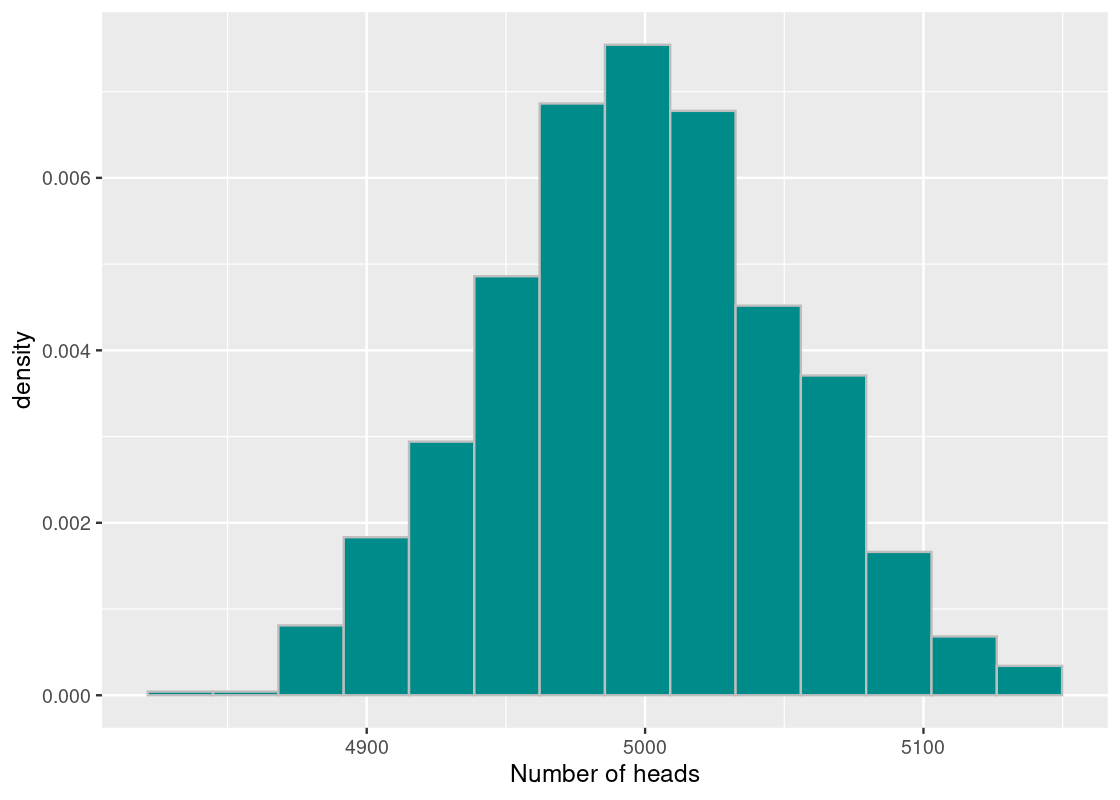
Where does the observed value fall in this histogram? We can plot it easily.
ggplot(tibble(sample_stats)) +
  geom_histogram(aes(x = sample_stats, y = after_stat(density)),
                 fill = "darkcyan", color = 'gray', bins = 12) +
  geom_point(aes(x = observed_heads, y = 0), size = 3,
             color = "salmon") +
  labs(x = "Number of heads")
## Warning in geom_point(aes(x = observed_heads, y = 0), size = 3, color = "salmon"): All aesthetics have length 1, but the data has 1000 rows.
## ℹ Please consider using `annotate()` or provide this layer with data containing
## a single row.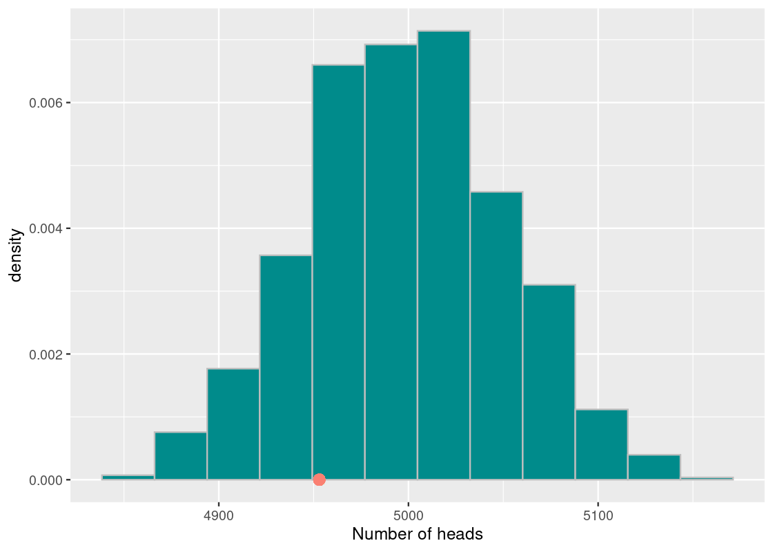
Let us look at the proportion of the elements in the vector sample_stats that are at least as small as the observed number of heads or more extreme, whose value we have stored in observed_heads. We simply count the elements matching the requirement and then divide the count by the length of the vector.
## [1] 0.19The value we get is 0.19, or about 19%. We interpret this value as stating the chance the test statistic achieves a value, under the assumption of the model, at least as extreme as 4953 heads or less. We conclude that a fair coin would yield the observed test statistic value we found (or less) 19% of the time. This value, computed through simulation, is what we call a p-value.
To compute a p-value, we take the following steps:
quantifiable phenomenon.
2. Run a simulation to obtain a histogram of the quantifiable
phenomenon under the model.
3. Compare the observation and examine where in the histogram
the observation stands.
More specifically, we estimate how far the observation is from the central portion of the histogram by splitting the histogram at the point of observation. As shown in the following figure, the portion less than or equal to the observation (in dark cyan) and the portion greater than or equal to the observation (in orange). Note that we can include the equality, when the sampled value equals the observed value, on either side.
## Warning in geom_point(aes(x = observed_heads, y = 0), size = 3, color = "red"): All aesthetics have length 1, but the data has 1000 rows.
## ℹ Please consider using `annotate()` or provide this layer with data containing
##   a single row.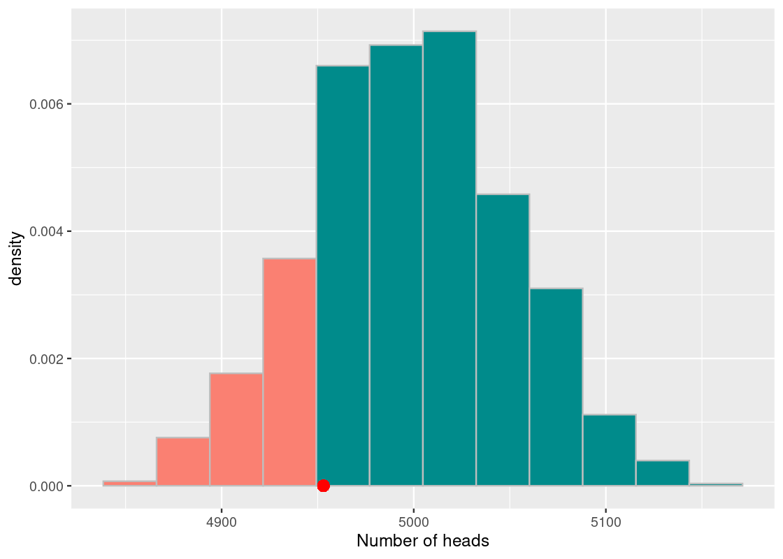
The more orange bars that are visible in the histogram, the higher the likelihood of the observation. Conversely, the less orange bars there are, the lower the likelihood of seeing such an observation. The area covered by the orange bars is formally called the “area in the tail.” The area in the tail is designated a special name: the p-value.
When we compute a p-value, we have in mind two possible interpretations. We call them the Null Hypothesis and the Alternative Hypothesis.
- Null Hypothesis (NH): The hypothesis we use to create the model for simulation. For example, we assume that the coin we have is a fair coin, about 50% equal chance to see either face. Any variation from what we expect is because of chance variation.
- Alternative Hypothesis (AH): The opposite, or counterpart, of the Null Hypothesis. For example, the AH states that the coin is biased towards tails. The difference we observed is caused by something other than randomness.
It is important that your null hypothesis acknowledges differences in the data. For example, if the null hypothesis states that a die is fair, why did you not get any 3’s when rolling the die 6 times?
We can provide one more definition of the p-value in the language of these hypotheses:
The chance, under the null hypothesis, of getting a test statistic equal to the observed test statistic or more extreme in the direction of the alternative hypothesis.
6.2 Case Study: Entering Harvard
Harvard University is one of the most prestigious universities in the United States. A recent lawsuit by Students for Fair Admissions (SFFA) led by Edward Blum against Harvard University alleges that Harvard has used soft racial quotas to keep the numbers of Asian-Americans low.
Put differently, the allegation claims that, from the pool of Harvard-admissible American applicants, Harvard uses a racial discriminatory score that allows the college to choose disproportionately less Asian-Americans. As of this writing, the lawsuit has been appealed and is to appear before the Supreme Court.
This section examines the “Harvard model” to assess, at a basic level, the claim put forward by the lawsuit.
6.2.2 Students for Fair Admissions
Harvard University publishes some statistics on the class of 2024. According to the data, the proportions of the class for Whites, Blacks, Hispanics, Asians, and Others (International and Native Americans) are respectively 46.1%, 14.7%, 12.7%, 24.4%, and 2.1%.
We do not have the data of the students admissible to enter Harvard so, in lieu of this, we refer to student demographics enrolled in a four-year college. According to Chronicle of Higher Education 2020-2021 Almanac, the racial demographics of full-time students in 4-year private non-profit institutions – Harvard is one of them – in Fall 2018 are: 63.6% White, 11.5% Black, 12.3% Hispanic, 8.1% Asian, and 4.5% Other.
Let’s compile this information into a tibble.
class_props <- tribble(~Race, ~Harvard, ~Almanac,
                             "White", 46.1, 63.6,
                             "Black", 14.7, 11.5,
                             "Hispanic", 12.7, 12.3,
                             "Asian", 24.4, 8.1,
                             "Other", 2.1, 4.5)
class_props
## # A tibble: 5 × 3
## Race Harvard Almanac
## <chr> <dbl> <dbl>
## 1 White 46.1 63.6
## 2 Black 14.7 11.5
## 3 Hispanic 12.7 12.3
## 4 Asian 24.4 8.1
## 5 Other 2.1 4.5The distributions may look quite different from each other. Of course, the demographics from the Almanac includes students who did not apply to Harvard, those who might not have got into Harvard, those applied and did not get in, and international students. Moreover, the Almanac data covers all full-time students in 2018 but not students who entered college in 2020.
Notwithstanding these differences, let us conduct an experiment to see how the demographics from Harvard look different from those given by the Almanac in terms of a sampling distribution.
As we will be handling proportions, let us scale the numbers down (by dividing each element by 100) so that they are expressed as percentages.
class_props <- class_props |>
  mutate(Harvard = Harvard / 100,
         Almanac = Almanac / 100)
class_props
## # A tibble: 5 × 3
## Race Harvard Almanac
## <chr> <dbl> <dbl>
## 1 White 0.461 0.636
## 2 Black 0.147 0.115
## 3 Hispanic 0.127 0.123
## 4 Asian 0.244 0.081
## 5 Other 0.021 0.045We will also write a function that computes the total variation distance (TVD) between two vectors.
In this study, our observed value is the TVD between the distribution of students in the Harvard class and the Almanac.
## [1] 0.199The Harvard class of 2024 has 2015 students. We can think of the process of sampling 2015 people to fill the “Harvard class” from those who “were attending” a four-year non-profit college in Fall 2018 and then examining their racial distribution. Of course, we cannot reach out to those individuals specifically, but we know the distribution of the entire population from which we want to sample. Therefore, we can simulate a large number of times what this “Harvard class” looks like and compare it with what we know about the actual Harvard class distribution, available in harvard_diff.
Our sampling plan can be framed as a “boxes and marbles” problem, as we saw in the previous section. There are five “boxes” to choose from, where each corresponds to a race: White, Black, Hispanic, Asian, and Other. The goal is to place marbles (which correspond to students) in each of the boxes, where the probability of ending up in any of the boxes is given by the Almanac.
This is an excellent fit for the rmultinom function. For example, here is one simulation of the proportion of races found in a “Harvard class.”
##            [,1]
## [1,] 0.63374690
## [2,] 0.11761787
## [3,] 0.12406948
## [4,] 0.08784119
## [5,] 0.03672457
How far is our simulated class from the Almanac? We compute the TVD to find out.
## [1] 0.01052854We wrap our work into a function.
one_simulated_class <- function(props) {
  props |>
    mutate(sample = rmultinom(n=1, size=2015, prob = Almanac) / 2015) |>
    summarize(compute_tvd(sample, Almanac)) |>
    pull()
}
Let us simulate what 10,000 classes could look like. This will be contained in a vector called sample_class_tvds. Also, as before, we will use replicate to do the work.
num_repetitions <- 10000
sample_class_tvds <- replicate(n = num_repetitions,
                               one_simulated_class(class_props))
We can now visualize the result.
ggplot(tibble(sample_class_tvds)) +
  geom_histogram(aes(x = sample_class_tvds, y = after_stat(density)),
                 bins = 30, fill = "darkcyan", color = 'gray')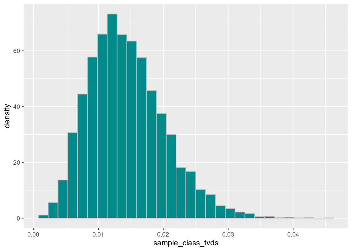
Where does the true Harvard class lie on this histogram? We can plot a point geom to find out.
ggplot(tibble(sample_class_tvds)) +
  geom_histogram(aes(x = sample_class_tvds, y = after_stat(density)),
                 bins = 70, fill = "darkcyan", color = 'gray') +
  geom_point(aes(x = harvard_diff, y = 0), size = 3, color = "salmon")
## Warning in geom_point(aes(x = harvard_diff, y = 0), size = 3, color = "salmon"): All aesthetics have length 1, but the data has 10000 rows.
## ℹ Please consider using `annotate()` or provide this layer with data containing
## a single row.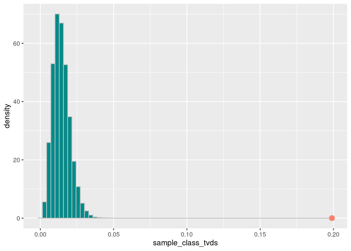
The orange dot shows the distance value of the Harvard value from the Almanac value. What we see is that the proportion of the races at Harvard is nothing like the national proportion.
6.2.3 Proportion of Asian American students
The prior experiment looked at the proportion of all races. However, the claim given by the lawsuit is specifically about Harvard-admissible students who are Asian American. We can now address this by refining our model to include only Asian American students and non-Asian American students.
class_props_asian <- tribble(~Race, ~Harvard, ~Almanac,
                             "Asian", 24.4, 8.1,
                             "Other", 75.6, 91.9)
class_props_asian
## # A tibble: 2 × 3
## Race Harvard Almanac
## <chr> <dbl> <dbl>
## 1 Asian 24.4 8.1
## 2 Other 75.6 91.9As before, we transform the data to be in terms of proportions.
class_props_asian <- class_props_asian |>
  mutate(Harvard = Harvard / 100,
         Almanac = Almanac / 100)
class_props_asian
## # A tibble: 2 × 3
## Race Harvard Almanac
## <chr> <dbl> <dbl>
## 1 Asian 0.244 0.081
## 2 Other 0.756 0.919The proportion of Asian American in private non-profit 4-year colleges is just 8.1% while the race occupies 24.4% of the Harvard freshman class. Let’s recompute our observed TVD value.
harvard_diff <- class_props_asian |>
  filter(Race == "Asian") |>
  summarize(abs(Harvard - Almanac)) |>
  pull()
harvard_diff
## [1] 0.163Note that we took a shortcut for computing the TVD here. When dealing with two categories, the TVD is equal to the distance between the two proportions in one of the categories.
Re-running the simulation is easy. Note that instead of passing class_props as an argument to the function one_simulated_class, we pass the new tibble class_props_asian.
num_repetitions <- 10000
sample_class_tvds <- replicate(n = num_repetitions,
                        one_simulated_class(class_props_asian))
We again visualize the result.
ggplot(tibble(sample_class_tvds)) +
  geom_histogram(aes(x = sample_class_tvds, y = after_stat(density)),
                 binwidth=0.002, fill = "darkcyan", color = 'gray')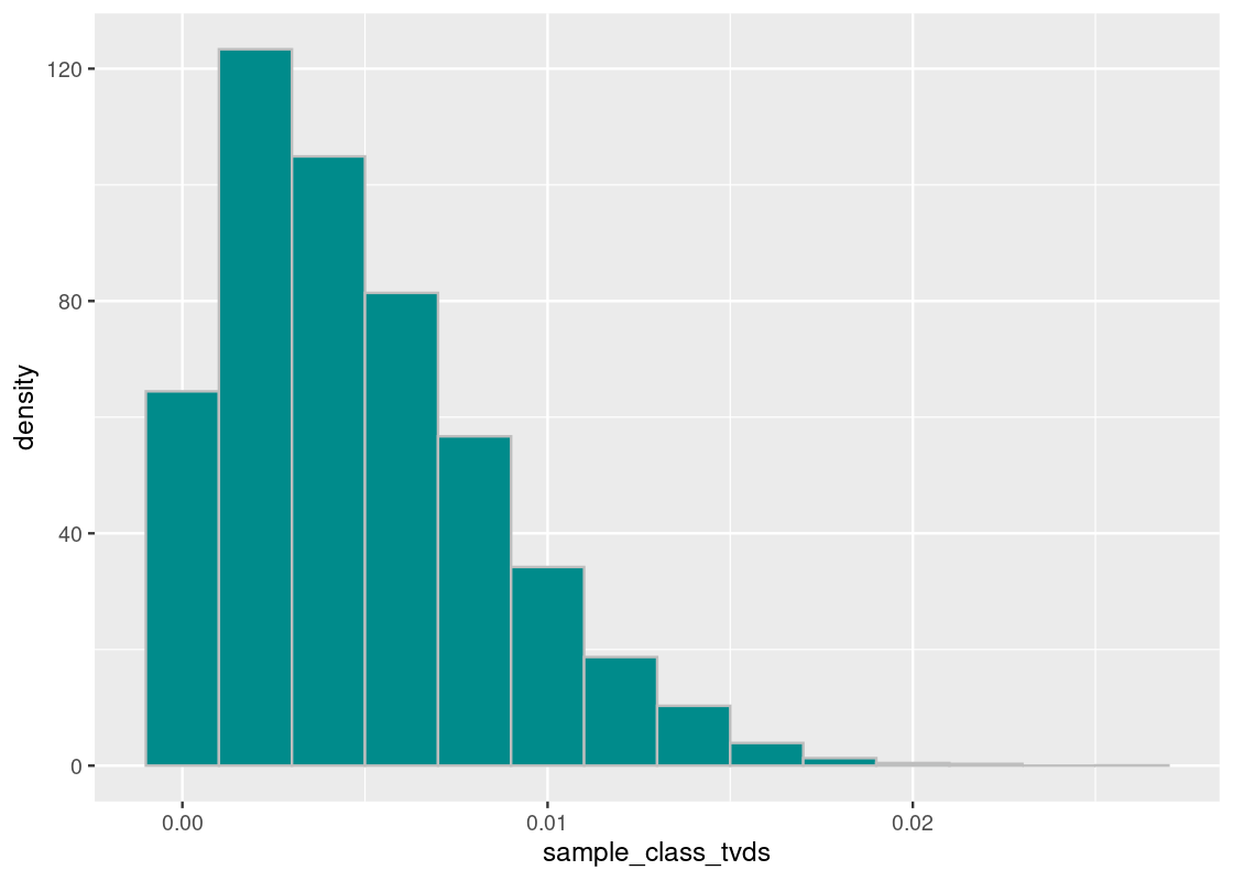
Where does the observed value fall in this histogram?
ggplot(tibble(sample_class_tvds)) +
  geom_histogram(aes(x = sample_class_tvds, y = after_stat(density)),
                 binwidth=0.002, fill = "darkcyan", color = 'gray') +
  geom_point(aes(x = harvard_diff, y = 0), size = 3, color = "salmon")
## Warning in geom_point(aes(x = harvard_diff, y = 0), size = 3, color = "salmon"): All aesthetics have length 1, but the data has 10000 rows.
## ℹ Please consider using `annotate()` or provide this layer with data containing
## a single row.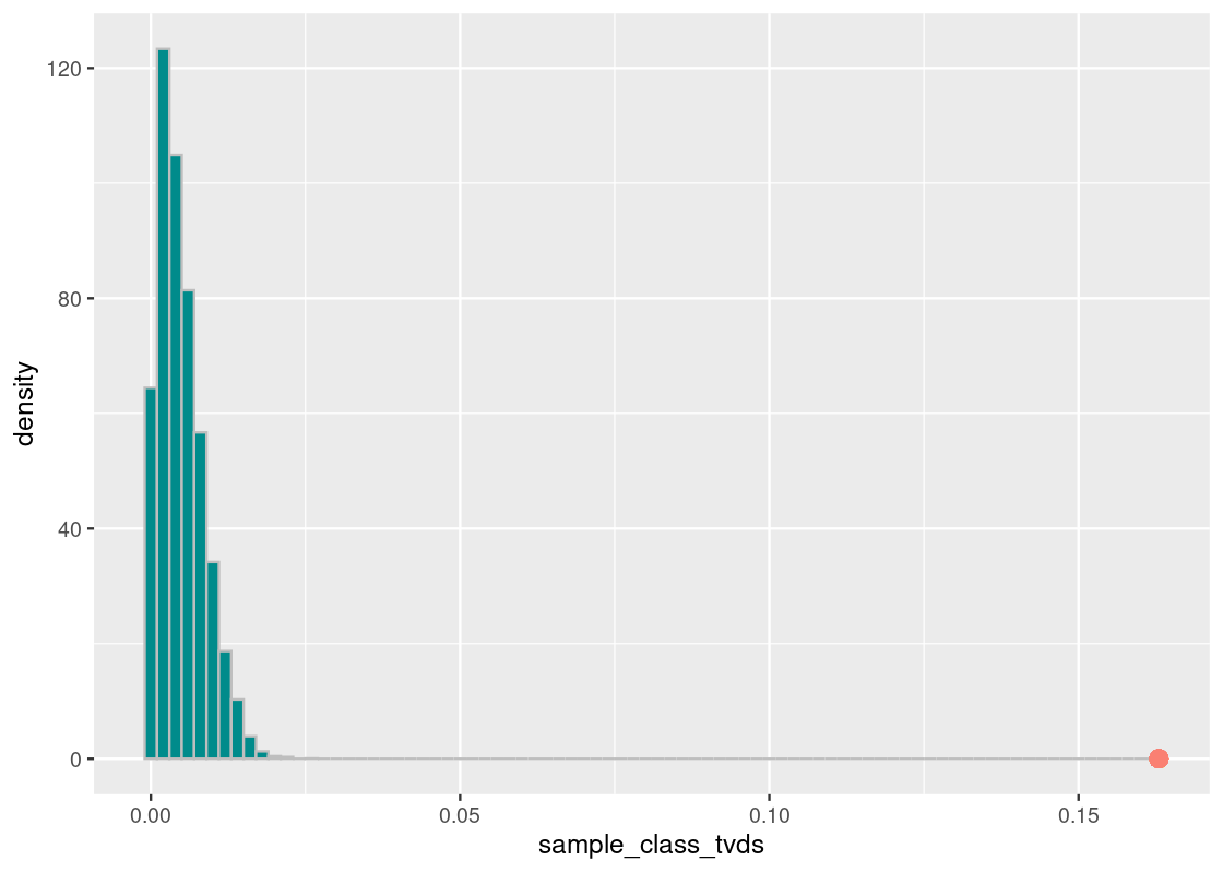
We find that the result is the same; the Harvard proportion of Asian American students is not at all like the national value. We can state, with great confidence, that Harvard enrolls much more Asian students than the national average.
Important note: The reader should be cautioned not to accept these results as direct evidence against the suit’s case. As noted at the outset of this section, we do not know the proportion of Harvard-admissible students and must instead rely on a national Almanac for reference. The base population of students can be very much different which is, in fact, something we anticipated.
6.3 Significance Levels
So far we have evaluated models by comparing some observation to a prediction made by a model. For instance, we compared:
- Racial demographics at Harvard University with the national Almanac at four-year non-profit private colleges.
- 10,000 tosses of an unknown coin at hand with a fair coin.
Sometimes the observed value of the test statistic ends up in the “bulk” of the predictions; sometimes it ends up very far away. But how do we define what “close” or “far” is? And at what point does the observed value transition from being “close” to “far”?
This section examines the significance of an observed value. To set up the discussion, we introduce another example still on the topic of academics: midterm scores in a hypothetical Computer Science course.
6.3.1 Prerequisites
Before starting, let’s load the tidyverse as usual. We will also use a dataset from the edsdata package, so let us load this in as well.
6.3.2 A midterm grumble?
A hypothetical Computer Science course had 40 enrolled students and was divided into 3 lab sections. A Teaching Assistant (TA) leads each section. After a midterm exam was given, the students in one section noticed that their midterm scores were lower compared to students in the other two lab sections. They complained that their performance was due to the TA’s teaching. The professor faced a dilemma: is it the case that the TA is at fault for poor teaching or are the students from that section more vocal about their grumbles following a exam?
If we were to fill that lab section with randomly selected students from the class, it is possible that their average midterm grade will look a lot like the score the grumbling students are unhappy about. It turns out that what we have stated here is a chance model that we can simulate.
Let’s have a look at the data from each student in the course. The following tibble csc_labs contains midterm and final scores, and the lab section the student is enrolled in.
csc_labs## # A tibble: 40 × 3
## midterm final section
## <dbl> <dbl> <chr>
## 1 73 79 F
## 2 30 0 D
## 3 91 77.2 D
## 4 89 76.5 D
## 5 71 76.5 H
## 6 28 0 H
## 7 32 0 F
## 8 54 88 D
## 9 88 76 D
## 10 59 68 F
## # ℹ 30 more rowsWe can use the dplyr verb group_by to examine the mean midterm grade as well as the number of students in each section.
lab_stats <- csc_labs |>
  group_by(section) |>
  summarize(midterm_avg = mean(midterm),
            count = n())
lab_stats
## # A tibble: 3 × 3
## section midterm_avg count
## <chr> <dbl> <int>
## 1 D 70 14
## 2 F 74.3 17
## 3 H 68.6 9Indeed, it seems that the section H students fared the worst, albeit by a small margin, among the three sections. Our statistic then is the mean grade of students in the lab section. Thus, our observed statistic is the mean grade from section H, which is about 68.56.
## [1] 68.55556We formally state our null and alternative hypothesis.
Null Hypothesis: The mean midterm grades of students in lab section H looks like the mean grades of a “section H” that is generated by randomly sampling the same number of students from the class.
Alternative Hypothesis: The section H midterm grades are too low.
To form a random sample, we will need to sample without replacement 9 students from the course to fill up the theoretical “lab section H”.
random_sample <- csc_labs |>
  select(midterm) |>
  slice_sample(n = 9, replace = FALSE)
random_sample
## # A tibble: 9 × 1
## midterm
## <dbl>
## 1 89
## 2 92
## 3 73
## 4 75
## 5 82
## 6 68
## 7 67
## 8 100
## 9 88We can look at the mean midterm score for this randomly sampled section.
## [1] 81.55556Now that we know how to simulate one value, we can wrap this into a function.
one_simulated_mean <- function() {
random_sample <- csc_labs |>
select(midterm) |>
slice_sample(n = 9, replace = FALSE)
random_sample |>
  summarize(mean(midterm)) |>
  pull()
}We will simulate the “section H lab” 10,000 times. Let us run the simulation!
num_repetitions <- 10000
sample_means <- replicate(n = num_repetitions, one_simulated_mean())
As before, we visualize the resulting distribution of grades.
ggplot(tibble(sample_means)) +
  geom_histogram(aes(x = sample_means, y = after_stat(density)),
                 bins = 15, fill = "darkcyan", color = 'gray')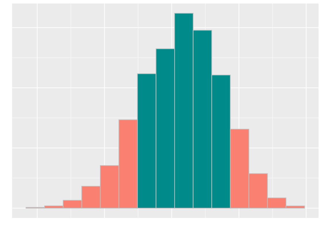
It seems that the grades cluster around 72. Where does the actual section H section lie? Recall that this value is available in the variable observed_statistic. We overlay a point geom to our above plot.
ggplot(tibble(sample_means)) +
  geom_histogram(aes(x = sample_means, y = after_stat(density)),
                 bins = 15, fill = "darkcyan", color = 'gray') +
  geom_point(aes(x = observed_statistic, y = 0),
             size = 3, color = "salmon")
## Warning in geom_point(aes(x = observed_statistic, y = 0), size = 3, color = "salmon"): All aesthetics have length 1, but the data has 10000 rows.
## ℹ Please consider using `annotate()` or provide this layer with data containing
## a single row.
It seems that the observed statistic is “close” to the center of randomly sampled scores.
6.3.3 Cut-off points
Let’s sort the sample means generated. We will examine in particular the value at 10% and 5% from the bottom. We will first turn to the value at 10%.
## [1] 63.33333We plot our sampling histogram and overlay it with a vertical line at this value.
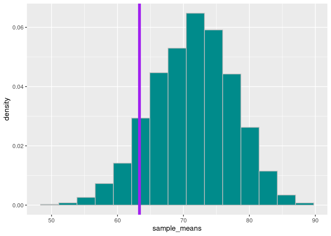
This means that 10% of our simulated mean statistics are equal to or less than 63. Put differently, the chance of a an average midterm score lower than 63 occurring, under the assumption of a TA teaching in good faith, is around 10%.
The situation is not much different if we look at the value 5% from the bottom, which we find to be about 61. We redraw the situation in on our sampling histogram.
sorted_samples[length(sorted_samples)*0.05]## [1] 61.11111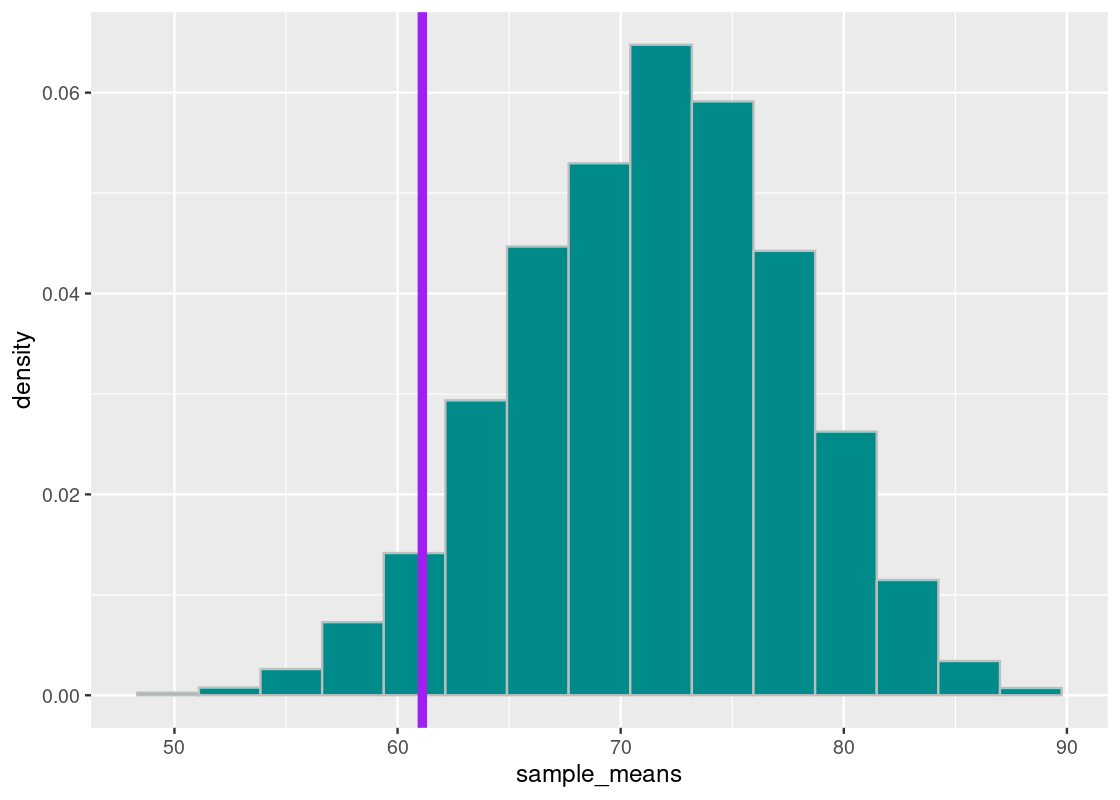
This time, the chance of obtaining a simulated mean midterm score at least as low as 61 is about 5%.
We say that the threshold point 63 is at the 90% significance level and the threshold point 61 is at the 95% significance level.
6.3.4 The significance level is an error probability
The last figure shows that, although rare, a lab section with a “TA teaching in good faith” can still produce mean midterm scores that are at least as low as 61. How often does that occur? The figure gives the answer for that as well: it does so with about 5% chance.
Therefore, if the TA is teaching in good faith and our test uses a 95% significance level to decide whether or not the TA is guilty, then there is about a 5% chance that the test will wrongly conclude that the mean midterm scores are too low and, consequently, the TA is at fault. This example points to a general fact about significance levels:
If you use a \(p\)% significance level for the p-value, and the null hypothesis happens to be true, there is about a \(1-p\)% chance that the test will incorrectly conclude the alternative hypothesis.
Statistical inferences, unlike logical inferences, can be wrong! But the power of statistics is its ability to quantify how often this error will occur. In fact, we can control the chance of wrongly convicting the TA by choosing a higher significance level. We could look at the 99% significance level or even the 99.9% and 99.99% levels; these are commonly referred to in the area of physics which rely on enormous evidence to prove something axiomatic.
Here, too, are trade-offs. By minimizing the error of wrongly convicting a TA teaching in good faith, we increase the chance of another kind of error occurring: our test concluding nothing when in fact there is something unusual about the lab section’s midterm grades.
It is important to note that these cut-off points are convention only and do not have any strong theoretical backing. They were first established by the statistician Ronald Fisher in his seminal work Statistical Methods for Research Workers.
Therefore, declaring an observed statistic as being “too low” or “too high” is a judgment call. In any statistics-based research, you should always provide the observed test statistic and the p-value used in addition to giving your decision; this way your readers can decide for themselves whether or not the results are indeed significant.
6.3.5 The verdict: is the TA guilty?
We can set a modest significance level at 95% for the course case study. Of course, judgment is needed if the decision resulting from this study will cause the TA to be reprimanded – we may tend towards a much more conservative significance level to be fully convinced, even if this means increasing the chance of a “guilty TA” being let free.
We overlay the observed statistic on the sampling histogram. As before, the orange bars show the 95% significance region.
## Warning in geom_point(aes(x = observed_statistic, y = 0), size = 3, color = "red"): All aesthetics have length 1, but the data has 10000 rows.
## ℹ Please consider using `annotate()` or provide this layer with data containing
##   a single row.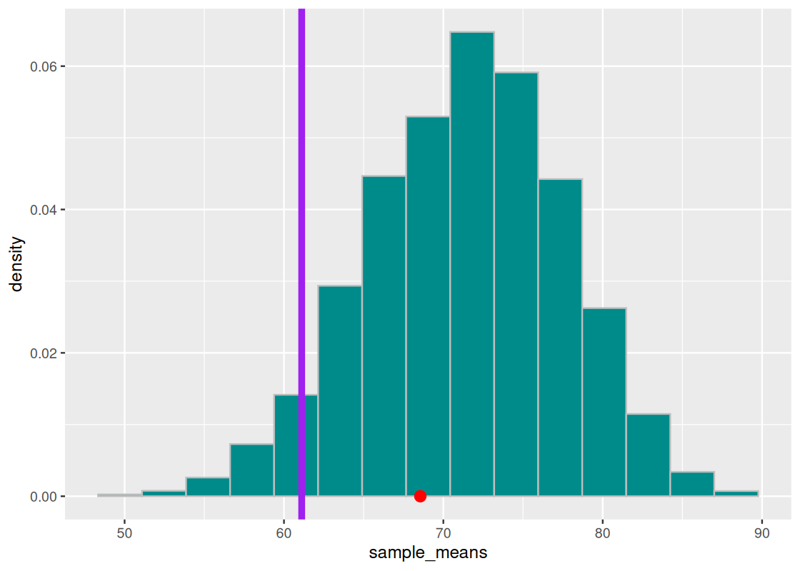
We see that the point does not cross the vertical purple line. We can check numerically how much area “is in the tail”.
## Warning in geom_point(aes(x = observed_statistic, y = 0), size = 3, color = "red"): All aesthetics have length 1, but the data has 10000 rows.
## ℹ Please consider using `annotate()` or provide this layer with data containing
##   a single row.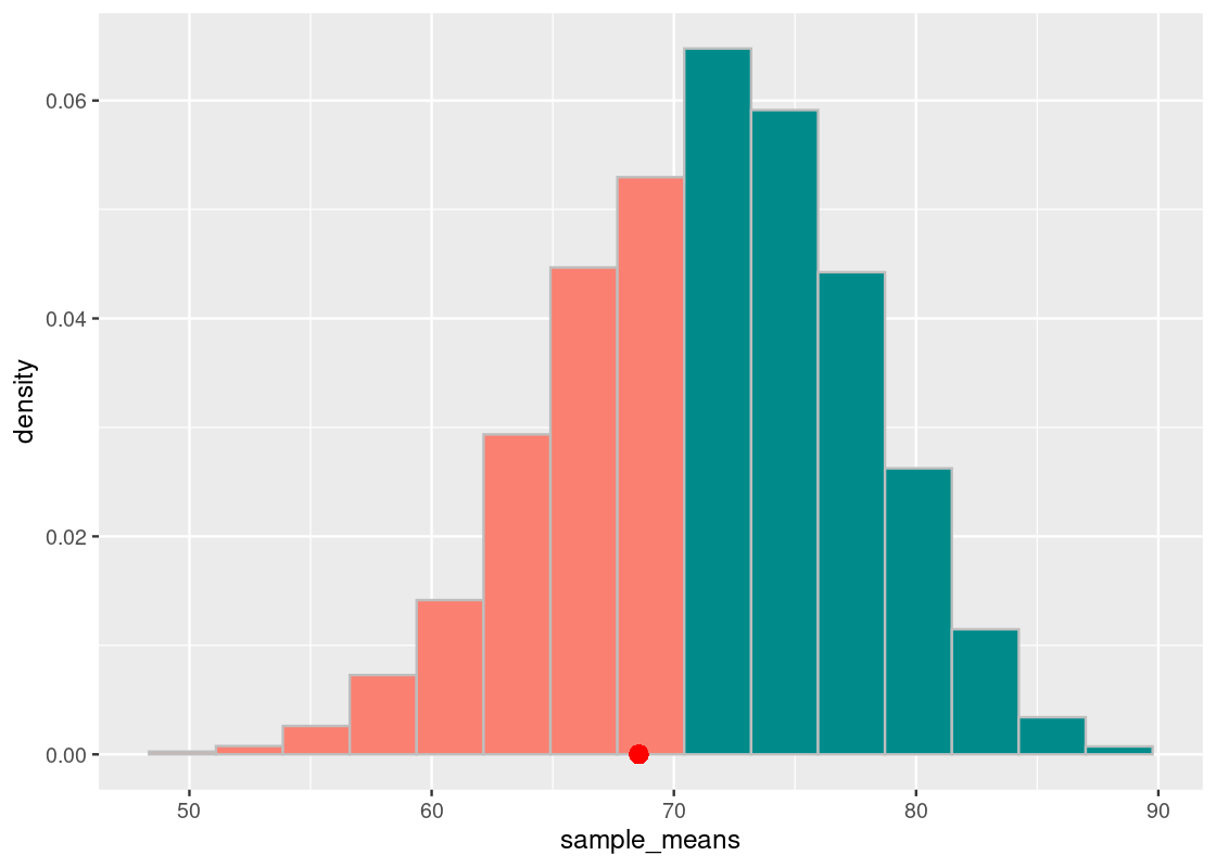
sum(sample_means <= observed_statistic) / num_repetitions## [1] 0.3192We conclude the TA’s defense holds up pretty well: the average lab section H scores are not any different from those generated by chance.
A note, also, on drawing conclusions from a hypothesis test. Even if there was significant evidence to reject the null hypothesis at some conventional cut-off, caution must be exercised in interpreting the poor performance as being directly caused by the TA’s instruction. There could be other variables at play that we did not account for that can affect the significance, e.g., the background of the students enrolled in this particular lab section (did they have less prior programming experience compared to the other sections?). We call these confounding variables, which we will examine in more depth in a later chapter.
In any case, it would be prudent to check in with the TA to get their take on the story.
6.3.6 Choosing a test statistic
By this point, we have been introduced to a few different test statistics. A common challenge when developing a hypothesis test is to first define what a “good” test statistic is for the problem.
Consider your alternative hypothesis and what evidence favors it over the null. If only “large values” or “small values” of the test statistic favor the alternative, then we recommend using the test statistic. For instance, in the midterm example, we considered only “small values” of the sample mean statistic to determine if the lab section H scores are “too low.” In the Harvard admissions example, we considered “large values” of the TVD test statistic to determine if the TVD of the Harvard proportions is “too big” to have been generated by a model under the null hypothesis.
Avoid choosing test statistics where “both big values and small values” favor the alternative. In this case, the area that supports the alternative includes both the left and right “tails”. Consider the following sampling histogram of the test statistic and note the tails as indicated by the orange bars.

We suggest modifying your test statistic so that the evidence favoring the alternative involves only one tail.
Finally, we present a table with some common test statistics and when to use each.
| Test statistic | When to use? |
|---|---|
| Total Variation Distance (TVD) |
Categorical data; compare your sample with the distribution it was drawn from. rmultinom
|
| Number of heads, difference in means | Numerical data; direction matters, e.g., “too few heads” or “too many heads” |
| Absolute difference, mean absolute difference | Numerical data; direction does not matter, only distance, e.g., “number of heads seen is different from a chance flip” |
6.4 Permutation Testing
In the previous section, we study the use of hypothesis testing. In this section we learn a simple method to compare two distributions using a method we call permutation testing. This allows us to decide if the two distributions come from the same underlying distribution.
6.4.1 Prerequisites
Let us begin by loading the tidyverse. We will also use a dataset from the edsdata package.
6.4.2 The effect of a tutoring program
The tibble finals from the edsdata package contains final exam grades in a hypothetical Computer Science course for 105 students. They are divided into two groups, based on two different offerings of the course labeled A and B. The more recent offering B featured a tutoring program for students to receive help on assignments and exams. The course instructor is interested in finding out if the tutoring program boosted overall performance in the class, measured by a final exam. This could help the instructor and department decide if the program should continue or even be expanded. Suppose that the dataset is collected over two semesters from the same Computer Science course.
Let’s first load the dataset.
finals## # A tibble: 102 × 2
## grade class
## <dbl> <chr>
## 1 89 A
## 2 17 A
## 3 94 A
## 4 51 A
## 5 49 A
## 6 93 A
## 7 52 A
## 8 54 A
## 9 57 A
## 10 65 A
## # ℹ 92 more rowsWe can examine the number of enrolled students in each of the two offerings.
## # A tibble: 2 × 2
## # Groups:   class [2]
##   class     n
##   <chr> <int>
## 1 A        49
## 2 B        53
It appears they are about equal. Let’s now turn to a distribution of the students in the offering that featured the tutoring program (class B) compared to those in the offering without the program (class A). To generate an overlaid histogram, we use the positional adjustment argument identity and set an alpha so that the bars are drawn with slight transparency.
ggplot(finals) +
  geom_histogram(aes(x = grade, y = after_stat(density), fill = class),
                 bins = 10, color = "gray",
                 alpha = 0.7, position = "identity")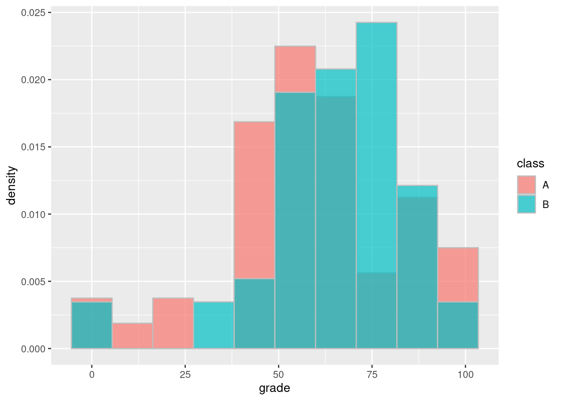
By observation alone, it seems that the final scores of students in the offering where the tutoring program was available (B) is slightly to the right of the distribution corresponding to scores when the program did not exist (A). Could this be chalked up to chance?
As we have done throughout this chapter, we can address this question by means of a hypothesis test. We will state a null and alternative hypothesis that arise from the problem.
Null hypothesis: In the population, the distribution of final exam scores where the tutoring program was available is the same as those when the service did not exist. The difference seen in the sample is because of chance.
Alternative hypothesis: In the population, the distribution of final exam scores when the tutoring program was available are, on average, higher than the scores when the program was not.
According to the alternative hypothesis, the average final score in offering B should be higher than the average final score in offering A. Therefore, a good test statistic we can use is the difference in the mean between the two groups. That is,
\[ \text{test statistic} = \mu_B - \mu_A \]
where \(\mu\) denotes the mean of the group.
First, we form two vectors finalsA and finalsB that contain final scores with respect to the course offering.
finalsA <- finals |>
  filter(class == 'A') |> pull(grade)
finalsB <- finals |>
  filter(class == 'B') |> pull(grade)
The observed value of the statistic can be computed as the following.
## [1] 6.105506We can write a function that computes the statistic for us. We call it mean_diff.
Observe how it returns the same value for the observed statistic.
mean_diff(finalsB, finalsA)## [1] 6.105506To predict the statistic under the null hypothesis, we defer to an idea called the permutation test.
6.4.3 A permutation test
Suppose that we are given the following vector of integers.
1:10## [1] 1 2 3 4 5 6 7 8 9 10We can interpret these numbers as indices that refer to an element inside a vector. We imagine that the first half of indices belong to a group A, and the second half group B.
Under the assumption of the null hypothesis, there should be no difference between the two distributions A and B with respect to the underlying population. For example, whether a final exam score belongs to the course offering A or B should have no effect on the mean final score. If so, there should be no consequences if we place both groups into a pot, shuffle them around, and compute the mean difference from the result. The resulting value we get from this process is one simulated value of the test statistic under the null hypothesis.
The first bit of machinery we need is a function that shuffles a sequence of integers. We actually already know one: sample.
shuffled <- sample(1:10)
shuffled
## [1] 7 10 5 3 4 1 2 6 9 8In this example, sample receives a vector of numbers 1 through 10 and returns the result after shuffling them. We might also call the result a permutation of the original sequence – hence, its namesake.
If we again interpret the resulting vector as indices, we take the first half to be the indices of the shuffled group A and the second half the shuffled group B.
shuffled[1:5] # shuffled group A## [1] 7 10 5 3 4shuffled[6:10] # shuffled group B## [1] 1 2 6 9 8The remaining work then is to compute the difference in means between the shuffled groups.
The function one_mean_difference puts everything together. It receives two vectors, a and b, puts them together in a pot, and deals out two shuffled vectors with the same size as a and b, respectively. The function returns the value of the simulated statistic by calling the functional compute_statistic. For this example, we use mean_diff.
one_difference <- function(a, b, compute_statistic) {
  pot <- c(a, b)
  sample_indices <- sample(1 : length(pot))
  shuffled_a <- pot[sample_indices[1 : length(a)]]
  shuffled_b <- pot[sample_indices[(length(a) + 1) : length(pot)]]
  return(compute_statistic(shuffled_a, shuffled_b))
}
We are now ready to perform a permutation test for the tutoring program example. We would like to simulate the test statistic under the null hypothesis multiple times and collect the values into a vector. As before, we can use replicate. We will simulate 10,000 values.
differences <- replicate(n = 10000,
                         one_difference(finalsA, finalsB, mean_diff))
6.4.4 Conclusion
Let’s visualize the results.
ggplot(tibble(differences)) +
  geom_histogram(aes(x = differences, y = after_stat(density)),
                 col="grey", fill = "darkcyan", bins = 20) +
  geom_point(aes(x = observed_statistic, y = 0),
             color = "salmon", size = 3)
## Warning in geom_point(aes(x = observed_statistic, y = 0), color = "salmon", : All aesthetics have length 1, but the data has 10000 rows.
## ℹ Please consider using `annotate()` or provide this layer with data containing
## a single row.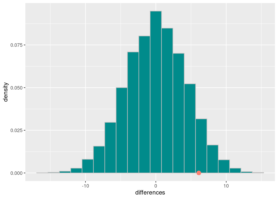
First, observe how the distribution is centered around 0. Under the assumption of the null hypothesis, there is no difference between the final exam averages in the two course offerings and, therefore, the difference clusters around 0.
Also observe that the observed test statistic is quite far from the center. To get a better sense of how far, we compute the p-value.
sum(differences >= observed_statistic) / 10000## [1] 0.0776This means that the chance of obtaining a mean difference at least as large as \(6.10\) is around 8%. By standards of the conventional cut-off points we have discussed, we would have enough evidence to refute the null hypothesis at a 90% significance level. Would this be enough to convince us that the tutoring program is indeed effective? Let us consider for a moment what it would mean if it does not.
If we were to demand a higher significance level, say 95%, our observed statistic is no longer significant. The logical next step would be to conclude that the null hypothesis is true, bearing the implication that the tutoring program is ineffective. This would be a statistical fallacy! Even if our results are not significant at the desired level, we do NOT take the null hypothesis to be true. Put another way, we fail to reject the null hypothesis. That is a mouthful!
The problem here is a lack of evidence. A lack of evidence does not prove that something does not exist, e.g., the tutoring program is not effective; it very well could be, but our study missed it. Indeed, our permutation test only evaluated one criteria – that is, difference in final exam scores – as a measure for improvement. There are other test statistics or criteria we could have considered, like class participation, which may have benefited from the program. It would be up to the judgment of the department on how to use these results in deciding the merit of the tutoring program.
6.4.5 Comparing Summer and Winter Olympic athletes
We end this section with one more example of a permutation test: comparing the weight information of Summer and Winter Olympic athletes. The dataset is available in the name athletes from the edsdata package.
For the sake of this analysis, we focus on Olympic games after the 2000 Summer Olympics.
my_athletes <- athletes |>
  filter(Year > 2000)
We can glance at how much athletes we have in each season.
## # A tibble: 2 × 3
##   Season     n  prop
##   <chr>  <int> <dbl>
## 1 Summer  7964 0.792
## 2 Winter  2088 0.208
We observe that Summer athletes make up the bulk of this dataset. Before proceeding any further, we should visualize the weight information with an overlaid histogram.
my_athletes |>
  ggplot() +
    geom_histogram(aes(x = Weight, y = after_stat(density),
                       fill = Season),
                   bins = 13, color = "gray",
                   alpha = 0.7, position = "identity")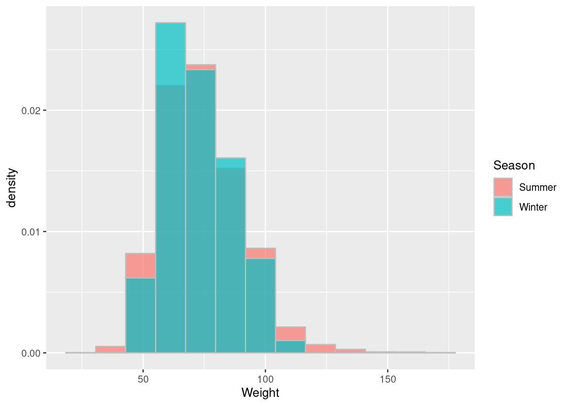
We give our hypothesis statements.
Null hypothesis: In the population, the distribution of weight information in the Summer Olympics is, on average, the same as the Winter Olympics.
Alternative hypothesis: In the population, the distribution of weight information in the Summer Olympics is, on average, different from the Winter Olympics.
Note that the alternative hypothesis, unlike the tutoring program example, does not care whether the weight information for athletes competing in the Winter Olympics is higher or less than that of athletes in the Summer Olympics. It only states that some difference exists. Therefore, the absolute difference in the means would be a good test statistic to use for this problem.
\[ \text{test statistic} = | \mu_B - \mu_A | \]
Note how it does not matter which group ends up as A and likewise for B. Let’s write a function to compute this statistic; it is a slight variation of the mean_diff we saw before.
6.4.6 The test
We form two vectors winter_weights and summer_weights that contain the weight information with respect to the season.
winter_weights <- my_athletes |>
  filter(Season == "Winter") |>
  pull(Weight)
summer_weights <- my_athletes |>
  filter(Season == "Summer") |>
  pull(Weight)
The observed value of the statistic can be computed as the following.
observed_statistic <- mean_abs_diff(winter_weights, summer_weights)
observed_statistic
## [1] 1.298946We are now ready to perform the permutation test. As before, let us simulate the test statistic under the null hypothesis 10,000 times.
differences <- replicate(n = 10000,
        one_difference(winter_weights, summer_weights, mean_abs_diff))
6.4.7 Conclusion
We are ready to visualize the results.
ggplot(tibble(differences)) +
  geom_histogram(aes(x = differences, y = after_stat(density)),
                 col="grey", fill = "darkcyan", bins = 15) +
  geom_point(aes(x = observed_statistic, y = 0),
             color = "salmon", size = 3)
## Warning in geom_point(aes(x = observed_statistic, y = 0), color = "salmon", : All aesthetics have length 1, but the data has 10000 rows.
## ℹ Please consider using `annotate()` or provide this layer with data containing
## a single row.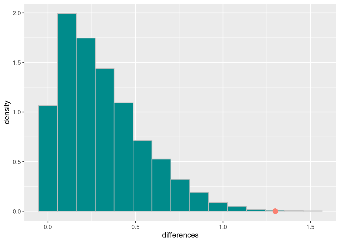
The observed statistic is quite far away from the distribution of simulated test statistics. Let’s do a numerical check.
sum(differences >= observed_statistic) / 10000## [1] 0.001The chance of obtaining a mean absolute difference of \(1.29\) is roughly 0.1%. We can safely reject the null hypothesis at a significance level over 99%. This confirms that, assuming our dataset is representative of the population of Olympic athletes, the weight information between Summer and Winter Olympic players are likely, on average, to be different.
6.5 Exercises
Be sure to install and load the following packages into your R environment before beginning this exercise set.
Question 1 The College of Galaxy makes available applicant acceptance information for different ethnicities: White (“White”), American Indian or Alaska Native (“AI/AN”), Asian (“Asian”), Black (“Black”), Hispanic (“Hispanic”), and Native Hawaiian or Other Pacific Islander (“NH/OPI”). The tibble galaxy_acceptance gives the acceptance result from one year.
galaxy_acceptance <- tribble(
  ~Ethnicity, ~Applied, ~Accepted,
  "White",  925, 811,
  "NH/OPI", 50, 7,
  "Hispanic", 601, 348,
  "Black", 331, 236,
  "Asian", 237, 101,
  "AI/AN", 84, 30)
galaxy_acceptance
## # A tibble: 6 × 3
## Ethnicity Applied Accepted
## <chr> <dbl> <dbl>
## 1 White 925 811
## 2 NH/OPI 50 7
## 3 Hispanic 601 348
## 4 Black 331 236
## 5 Asian 237 101
## 6 AI/AN 84 30-
Question 1.1 What proportion of total accepted applicants are of some ethnicity? Add a new variable named
prop_acceptedthat gives the proportion of each ethnicity with respect to the total number of accepted candidates. Assign the resulting tibble to the namegalaxy_distribution.Based on these observations, you may be convinced that the college is biased in favor of enrolling White applicants. Is it justifiable?
To explore the question, you conduct a hypothesis test by comparing the ethnicity distribution at the college to that of degree-granting institutions in the United States. You decide to test the hypothesis that the ethnicity distribution at the College of Galaxy looks like a random sample from the population of accepted applicants in universities across the United States. Using simulation, this is what the data would look like if the hypothesis were true. If it doesn’t, you reject the hypothesis.
Thus, you offer the null hypothesis:
- Null hypothesis: “The distribution of ethnicities of accepted applicants at the College of Galaxy was a random sample from the population of accepted applicants at degree-granting institutions in the United States.”
-
Question 1.2 With every null hypothesis we write down a corresponding alternative hypothesis. What is the alternative hypothesis in this case?
We have that there are 1533 accepted applicants at the College of Galaxy. Imagine drawing a random sample of 1533 students from among the admitted students at universities across the United States. This is one student admissible pool we could see if the null hypothesis were true.
The Integrated Postsecondary Education Data System (IPEDS) at the National Center for Education Statistics gives data on U.S. colleges, universities, and technical and vocational institutions. As of Fall 2020, they reported the following ethnicity information about admitted applicants at Title IV degree-granting institutions in the U.S:
ipeds2020 <- tribble(~Ethnicity, ~`2020`, "White", 9316458, "NH/OPI", 46144, "Hispanic", 3538778, "Black", 2254757, "Asian", 1285154, "AI/AN", 115951) -
Question 1.3 Repeat Question 1.1 for
ipeds2020. Assign the resulting tibble to the nameipeds2020_dist.Under the null hypothesis, we can simulate one “admissible pool” from the population of students in the U.S as follows:
total_admitted <- galaxy_distribution |> pull(Accepted) |> sum()
prop_accepted <- ipeds2020_dist |> pull(prop_accepted)
rmultinom(n = 1, size = total_admitted, prob = prop_accepted)
The first element in this vector contains the number of White students in this sample pool, the second element the number of Native Hawaiian or Other Pacific Islander students, and so on.
Question 1.4 For the ethnicity distribution in our sample, we are interested in the proportion of ethnicities that appear in the admissible pool. Write a function
prop_from_sample()that takes as an argument some distribution (e.g.,ipeds2020_distribution) and returns a vector containing the proportion of ethnicities that appear in the sample of 1533 people.-
Question 1.5 Call
prop_from_sample()to create one vector calledone_samplethat represents one sample of 1533 people from among the admissible students in the United States.The total variation distance (TVD) is a useful test statistic when comparing two distributions. This distance should be small if the null hypothesis is true because samples will have similar proportions of ethnicities as the population from which the sample is drawn.
-
Question 1.6 Write a function called
compute_tvd(). It takes as an argument a vector of proportions of ethnicities. The first element in the vector is the proportion of White students, the second element the proportion of Native Hawaiian or Other Pacific Islander students, and so on. The function returns the TVD between the given ethnicity distribution and that of the national population.compute_tvd(galaxy_distribution |> pull(prop_accepted)) # example -
Question 1.7 Write a function called
one_simulated_tvd(). This function takes no arguments. It generates a “sample pool” under the null hypothesis, computes the test statistic, and then return it.one_simulated_tvd() # an example call -
Question 1.8 Using
replicate(), run the simulation 10,000 times to produce 10,000 test statistics. Assign the results to a vector calledsample_tvds.The following chunk shows your simulation augmented with an orange dot that shows the TVD between the ethnicity distribution at College of Galaxy and that of the national population.
ggplot(tibble(sample_tvds)) + geom_histogram(aes(x = sample_tvds, y = after_stat(density)), bins = 15, fill = "darkcyan", color = 'gray') + geom_point(aes( x = compute_tvd(galaxy_distribution |> pull(prop_accepted)), y = 0), size = 3, color = "salmon") -
Question 1.9 Determine whether the following conclusions can be drawn from these data. Explain your answer.
- The ethnicity distribution of the admitted applicant pool at the College of Galaxy does not look like that of U.S. universities.
- The ethnicity distribution of the admitted applicant pool at the College of Galaxy is biased toward white applicants.
Question 2: A strange dice. Your friend Jerry invites you to a game of dice. He asks you to roll a dice 10 times and says that he wins $1 each time a 3 turns up and loses $1 on any other face. Jerry’s dice is six-sided, however, the "2" and "4" faces have been replaced with "3"’s. The following code chunk simulates the results after one game:
weird_dice_probs <- c(1/6, 0/6, 3/6, 0/6, 1/6, 1/6)
rmultinom(n = 1, size = 10, prob = weird_dice_probs)
## [,1]
## [1,] 3
## [2,] 0
## [3,] 4
## [4,] 0
## [5,] 1
## [6,] 2While the game seems like an obvious scam, Jerry claims that his dice is no different than a fair dice in the long run. Can you disprove his claim using a hypothesis test?
-
Question 2.1 Write a function
sample_propthat receives two argumentsdistribution(e.g.,weird_dice_probs) andsize(e.g., 10 rolls). The function simulates the game using a dice where the probability of each face is given bydistributionand the dice is rolledsizemany times. The proportion of each face that appeared after the simulation is returned.The following code chunk simulates the result after playing one round of Jerry’s game. You record the sample proportions of the faces that appeared in a tibble named
jerry_die_dist.set.seed(2022) jerry_die_dist <- tibble( face = 1:6, prob = sample_prop(weird_dice_probs, 10) ) jerry_die_distLet us define the distribution for what we know is a fair six-sided die.
Here is what the
jerry_die_distdistribution looks like when visualized: -
Question 2.2 Define a null hypothesis and an alternative hypothesis for this question.
We saw in Section 7.4 that the mean is equivalent to weighing each face by the proportion of times it appears. The mean of
jerry_die_distcan be computed as follows:For reference, here is the mean of a fair six-sided dice. Observe how close this value is to the mean of Jerry’s dice:
The following function
mystery_test_stat1()takes a single tibbledist(e.g.,jerry_die_dist) as its argument and computes a test statistic by comparing it tofair_die_dist. Question 2.3 What test statistic is being used in
mystery_test_stat1?-
Question 2.4 Write a function called
one_simulated_stat. The function receives a single argumentstat_func. The function generates sample proportions after one round of Jerry’s game under the assumption of the null hypothesis, computes the test statistic from this sample using the argumentstat_func, and returns it.one_simulated_stat(mystery_test_stat1) # an example call -
Question 2.5 Complete the following function called
simulate_dice_experiment. The function receives two arguments, anobserved_dist(e.g.,jerry_die_dist) and astat_func. The function computes the observed value of the test statistic usingobserved_dist. It then simulates the game 10,000 times to produce 10,000 different test statistics. The function then prints the p-value and plots a histogram of your simulated test statistics. Also shown is where the observed value falls on this histogram (orange dot) and the cut-off for the 95% significance level.simulate_dice_experiment <- function(observed_dist, stat_func) { p_value_cutoff <- 0.05 print(paste("P-value: ", (sum(test_stats >= observed_stat) / length(test_stats)))) ggplot(tibble(test_stats)) + geom_histogram(aes(x = test_stats, y = after_stat(density)), bins=10, color = "gray", fill='darkcyan') + geom_vline(aes(xintercept=quantile(test_stats, 1-p_value_cutoff)), color='red') + geom_point(aes(x=observed_stat,y=0),size=4,color='orange') } -
Question 2.6 Run the experiment using your function
simulate_dice_experimentusing the observed distribution fromjerry_die_distand the mystery test statistic.The evidence so far has been unsuccessful in refuting Jerry’s claim. Maybe you should stop playing games with Jerry…
As a desperate final attempt before giving up and agreeing to play Jerry’s game, you try using a different test statistic to simulate called
mystery_test_stat2. Question 2.7 Repeat Question 2.6, this time using
mystery_test_stat2instead.Question 2.8 At a significance level of 95%, what do we conclude from the first experiment? How about the second experiment?
Question 2.9 Examine the difference between the test statistics in
mystery_test_stat1andmystery_test_stat2. Why is it that the conclusion of the test is different depending on the test statistic selected?-
Question 2.10 Which of the following statements are FALSE? Indicate them by including its number in the following vector
pvalue_answers.- The p-value printed is the probability that the die is fair.
- The p-value printed is the probability that the die is NOT fair.
- The p-value cutoff (5%) is the probability that the die is NOT fair.
- The p-value cutoff (5%) is the probability of seeing a test statistic as extreme or more extreme than this one if the null hypothesis were true.
Question 2.11 For the statements you selected to be FALSE, explain why they are wrong.
Question 3 This question is a continuation of Question 2. The following incomplete function experiment_rejects_null receives four arguments: a tibble describing the probability distribution of a dice, a function to compute a test statistic, a p-value cutoff, and a number of repetitions to use. The function simulates 10 rolls of the given dice, and tests the null hypothesis about that dice using the test statistic given by stat_func. The function returns a Boolean: TRUE if the experiment rejects the null hypothesis at p_value_cutoff, and FALSE otherwise.
experiment_rejects_null <- function(die_probs,
                      stat_func, p_value_cutoff, num_repetitions) {
  observed_dist <- tibble(
    face = 1:6,
    prob = sample_prop(die_probs, 10)
  )


  p_value <- sum(test_stats >= observed_stat) / num_repetitions
  return(p_value < p_value_cutoff)
}-
Question 3.1 Read and understand the above function. Then complete the missing portion that computes the observed value of the test statistic and simulates
num_repetitionsmany test statistics under the null hypothesis.The following code chunk simulates the result after testing Jerry’s dice with
mystery_test_stat1at the P-value cut-off of 5%. Run it a few times to get a rough sense of the results. -
Question 3.2 Repeat the experiment
experiment_rejects_null(weird_dice_probs, mystery_test_stat1, 0.05, 250)300 times usingreplicate. Assignexperiment_resultsto a vector that stores the result of each experiment.Note: This code chunk will need some time to finish (approximately a few minutes). This will be a little slow. 300 repetitions of the simulation should require a minute or so of computation, and should be enough to get an answer that is roughly correct.
Question 3.3 Compute the proportion of times the function returned
TRUEinexperiment_results. Assign your answer toprop_reject.Question 3.4 Does your answer to Question 3.3 make sense? What value did you expect to get? Put another way, what is the probability that the null hypothesis is rejected when the dice is actually fair?
Question 3.5 What does it mean for the function to return
TRUEwhenweird_dice_probsis passed as an argument? From the perspective of finding the truth about Jerry’s (phony) claim, is the experiment successful? What if the function returnedTRUEwhenfair_die_distis passed as an argument instead?
Question 4. The United States House of Representatives in the 116th Congress (2019-2021) had 435 members. According to the Center for American Women and Politics (CAWP), 101 were women and 334 men. The following tibble house gives the head counts:
house <- tribble(~gender, ~num_members,
                 "Female", 101,
                 "Male",   334)
house
## # A tibble: 2 × 2
## gender num_members
## <chr> <dbl>
## 1 Female 101
## 2 Male 334In this question, we will examine whether women are underrepresented in the chamber.
-
Question 4.1 If men and women are equally represented in the chamber, then the chance of either gender occupying any seat should be like that of a fair coin flip. For instance, if the chamber consisted of just 10 seats, then one “House of Representatives” might look like:
Using this, write a null and alternative hypothesis for this problem.
-
Question 4.2 Using Question 4.1, write a function called
one_sample_housethat simulates one “House” under the null hypothesis. The function receives two arguments,gender_propandhouse_size. The function samples"Female"or"Male"house_sizemany times where the chance of either gender appearing is given bygender_prop. The function then returns a tibble with the gender head counts in the simulated sample. Following is one possible returned tibble:Gender num_members Female 207 Male 228 Question 4.3 A good test statistic for this problem is the difference in the head count of males from the head count of females. Write a function that takes a tibble
head_count_tibas an argument (that has the format as in Question 4.2). The function computes and returns the test statistic from this tibble.Question 4.4 Compute the observed value of the test statistic using your
one_diff_stat(). Assign the resulting value to the nameobserved_value_house.-
Question 4.5 Write a function called
simulate_one_statthat simulates one test statistic. The function receives two arguments, the gender proportionspropand the total seats (total_seats) to fill in the simulated “House”. The function simulates a sample under the null hypothesis, and computes and returns the test statistic from the sample.simulate_one_stat(c(0.5, 0.5), 100) # an example call -
Question 4.6 Simulate 10,000 different test statistics under the null hypothesis. Store the results to a vector named
test_stats.The following
ggplot2code visualizes your results:ggplot(tibble(test_stats)) + geom_histogram(aes(x = test_stats), bins=18, color="gray") + geom_point(aes(x = observed_value_house, y = 0), size=2, color="red") -
Question 4.7 Based on the experiment, what can you say about the representation of women in the House?
Let us now approach the analysis another another way. Instead of assuming equal representation, let us base the comparison by using the representation of women candidates in the preceding 2018 U.S. House Primary elections. The tibble
house_primaryfrom theedsdatapackage compiles primary election results for Democratic and Republican U.S. House candidates running in elections from 2012 to 2018. The data is prepared by the Michael G. Miller Dataverse part of the Harvard Dataverse.## # A tibble: 5,716 × 25 ## raceid year stcd state seat party redist fr law candnumber prez ## <chr> <dbl> <chr> <chr> <dbl> <dbl> <dbl> <dbl> <dbl> <dbl> <dbl> ## 1 201823051 2018 2305 minn… 2 1 0 0 0 6 79.9 ## 2 201810061_p 2018 1006 geor… 0 1 0 2 0 4 49.2 ## 3 201810061_r 2018 1006 geor… 0 1 0 2 0 2 49.2 ## 4 201834010 2018 3401 nort… 3 0 0 0 0 4 69.8 ## 5 201432041 2014 3204 new … 2 1 0 9 1 2 56.8 ## 6 201822101 2018 2210 mich… 0 1 0 1 0 3 33.1 ## 7 201622101 2016 2210 mich… 3 1 0 9 0 1 33.1 ## 8 201832051 2018 3205 new … 1 1 0 0 1 3 87.1 ## 9 201217051 2012 1705 kent… 0 1 1 0 1 2 23.6 ## 10 201809270 2018 0927 flor… 3 0 0 9 1 9 39.9 ## # ℹ 5,706 more rows ## # ℹ 14 more variables: votep <dbl>, type <dbl>, incname <chr>, candidate <chr>, ## # candvotes <dbl>, tvotes <dbl>, candpct <dbl>, winner <dbl>, inc <dbl>, ## # definc <lgl>, gender <dbl>, qual <dbl>, office <dbl>, runoff <dbl> -
Question 4.8 Form a two-element vector named
primary_propthat gives the proportion of female and male candidates, respectively, in the 2018 U.S. House Primary elections. This can be accomplished as follows:- Filter the data to the year
2018. The data should not contain the results for any elections that resulted in a runoff (whererunoff = 1). - Summarize and count each gender that appears in
genderin the resulting tibble. - Add a variable that computes the proportions from these counts.
- Pull the proportions as a vector and assign it to
primary_prop.
- Filter the data to the year
-
Question 4.9 Repeat Question 4.6 this time using the proportions given by
primary_prop.The following code visualizes the revised result:
ggplot(tibble(test_stats)) +
  geom_histogram(aes(x = test_stats), bins=18, color="gray") +
  geom_point(aes(x = observed_value_house, y = 0),
             size=2, color="red")
Question 4.10 Compute the p-value using the
test_statsyou generated by comparing it withobserved_value_house. Assign your answer top_value.Question 4.11 Why is it that in the first histogram the simulated test statistics cluster around 0 and in the second histogram the simulated values cluster around a value much greater? Is the statement of the null hypothesis the same in both cases?
Question 4.12 Now that we have analyzed the data in two ways, are women equally represented in the House? Why or why not?
Question 5. Cathy recently received from a friend a replica dollar coin which appears to be slightly biased towards “Heads”. Cathy tosses the coin 20 times in a row counts how many times “Heads” turns up. She repeats this for 10 trials. Her results are summarized in the following tibble:
cathy_heads_game <- tibble(
  trial = 1:10,
  num_heads = c(12, 13, 13, 11, 17, 10, 10, 14, 9, 15),
  num_tails = 20 - num_heads
)
cathy_heads_game
## # A tibble: 10 × 3
## trial num_heads num_tails
## <int> <dbl> <dbl>
## 1 1 12 8
## 2 2 13 7
## 3 3 13 7
## 4 4 11 9
## 5 5 17 3
## 6 6 10 10
## 7 7 10 10
## 8 8 14 6
## 9 9 9 11
## 10 10 15 5-
Question 5.1 What is the total heads observed? Assign your result to a double named
total_heads_observed.Let us write an experiment and check how plausible it is for this coin to be fair.
-
Question 5.2 Given the outcome of 20 trials, which of the following test statistics would be reasonable for this hypothesis test?
- The total number of heads.
- The total number of heads minus the total number of tails.
- Whether there is at least one head.
- Whether there is at least one tail.
- The total variation distance between the probability distribution of a fair coin and the observed distribution of heads and tails.
- The trial with the minimum number of heads.
Assign the name
good_test_statsto a vector of integers corresponding to these test statistics. -
Question 5.3 Let us write a code that simulates tossing a fair coin. Write a function called
one_test_statthat receives a parameternum_trials. The function simulates a fair coin toss 20 times, records the number of heads, and repeats this procedurenum_trialsmany times. The function returns the total number of heads over the given number of trials.one_test_stat(10) # an example call after cathy's 10 trials Question 5.4 Repeat Cathy’s experiment 10,000 times. Store the results in
total_head_stats.Question 5.5 Compute a p-value using
total_head_stats. Assign the result top_value.Question 5.6 From the experiment how plausible do you say Cathy’s coin is fair?
Question 6. A popular course in the College of Groundhog is an undergraduate programming course CSC1234. In the spring semester of 2022, the course had three sections, A, B, and C. The sections were taught by different instructors. The course had the same textbook, the same assignments, and the same exams. One same formula was applied to determine the final grade. At the end of a semester, some students in Sections A and C came to their instructors and asked if the instructors had been harsher than the instructor for Section B, because several buddies of theirs in Section B did better in the course. Time for a hypothesis test!
The section and score information for the semester is available in the tibble csc1234 from the edsdata package.
## # A tibble: 388 × 2
##    Section Score
##    <chr>   <dbl>
##  1 A         100
##  2 A         100
##  3 A         100
##  4 A         100
##  5 A         100
##  6 A         100
##  7 A         100
##  8 A         100
##  9 A         100
## 10 A         100
## # ℹ 378 more rows
We will use a permutation test to see if the scores for Sections A and C are indeed significantly lower than the scores for Section B. That is, we will compare three groups: Section A with B, Section A with C, and Section B with C.
Question 6.1 Compute the group-wise mean for each section of the course. The tibble should contain two variables: the section name and the mean of that section. Assign the resulting tibble to the name
section_means.-
Question 6.2 Visualize a histogram of the scores in
csc1234. Use a facet wrap onSectionso that you can view the three distributions together separately. We suggest using 10 bins.We can develop a chance model by hypothesizing that any section’s scores looks like a random sample out of all of the student scores across all three sections. We can then see the difference in mean scores for each of the three pairs of randomly drawn “sections”. This is a specified chance model we can use to simulate and, therefore, is the null hypothesis.
Question 6.3 Define a good alternative hypothesis for this problem.
Question 6.4 Write a function called
mean_differencesthat takes a tibble as its single argument. It then summarizes this tibble by computing the average mean score (inScore) for each section (inSection). The function returns a three-element vector of mean differences for each pair: the difference in mean scores between A and B (“A-B”), C and B (“C-B”), and C and A (“C-A”).-
Question 6.5 Compute the observed differences in the means of the three sections using
mean_differences. Store the results inobserved_differences.The following code chunk puts your observed values into a tibble named
observed_diff_tibble. -
Question 6.6 Write a function
scores_permute_testthat does the following:- From
csc1234form a new variable that shuffles the values inScoreusingsample. Overwrite the variableScorewith the shuffled values. - Call
mean_differenceson this shuffled tibble. - Return the vector of differences.
scores_permute_test() # an example call - From
-
Question 6.7 Use
replicateon thescores_permute_testfunction you wrote to generate 1,000 sample differences.The following code chunk creates a tibble named
differences_tibblefrom the simulated test statistics you generated above.differences_tibble <- tibble( `A-B` = test_stat_differences[1,], `C-B` = test_stat_differences[2,], `C-A` = test_stat_differences[3,]) differences_tibble Question 6.8 Generate three histograms using the results in
differences_tibble. As with Question 6.2, use a facet wrap on each pairing (i.e.,A-B,C-B, andC-A). Then attach a red point to each histogram indicating the observed value of the test statistic (useobserved_diff_tibble). We suggest using 20 bins for the histograms.Question 6.9 The bulk of the distribution in each of the three histograms is centered around 0. Using what you know about the stated null hypothesis, why do the distributions turn out this way?
Question 6.10 By examining the above three histograms and where the observed value of the test statistic falls, which difference among the three do you think is the most egregious?
Question 6.11 Based on your answer to Question 6.10, can we say that the hypothesis test brings enough evidence to show that the drop in student scores was deliberate and that the instructor was unfair in grading?