8 Towards Normality
We have studied several statistics in this text such as the mean and order statistics like the median. We have also drawn sampling distributions to simulate a statistic to see if it approximates well some parameter value of interest. For some statistics, like the total variation distance, we saw that the distribution skewed in some direction. But the sampling distribution for the sample mean has consistently shown something that resembles a bell shape, regardless of the underlying population.
Recall that a goal of this text is to make inferences about data in a population for which we know very little about. If we can extract properties of random samples that are true regardless of the underlying population, we have at hand a powerful tool for doing inference. The distribution of the sample mean is one such property, which we will develop more in depth in this chapter.
When we refer to these bell-shaped curves, we are talking about a distribution called the normal distribution. To develop an intuition for this, we will first examine a new (but important) statistic called the standard deviation, which measures generally how much the data points are away from the mean. It is important because the shape of a normal distribution is completely determinable from its mean and standard deviation. We will then learn that by taking a large number of samples from a population, where each sample has no relation to another, the resulting distribution will look like – you guessed it – a normal distribution.
8.1 Standard Deviation
The standard deviation (or SD for short) measures how much the data points are away from the mean. Put another way, it is a measure of the spread in the data.
8.1.1 Prerequisites
We will continue to make use of the tidyverse in this section so let us load it in.
8.1.2 Definition of standard deviation
Suppose we have some number, say \(N\), of samples and for each sample, we have its measurement. Let us say \(x_1, \ldots, x_N\) are the measurements. The mean of the samples is the total of \(x_1, \ldots, x_N\) divided by the number of samples \(N\), that is
\[ \frac{x_1 + \cdots + x_N}{N} \]
Let \(\mu\) denote the average. The variance of the samples is the average of the square amounts of these samples from the mean.
\[ \frac{(x_1 - \mu)^2 + \cdots + (x_N - \mu)^2}{N} \]
We use symbol \(\sigma^2\) to represent the variance. Because of the subtraction of the mean from the individual values, the variance measures the spread of the data around the mean. Since each term in the total is a square, the unit of the variance is the square of the unit of the samples. For example, if the original measure is meters then the unit of the variance is square meters. To make the two units comparable to each other, we take the square root of the variance, which we denote by \(\sigma\).
\[ \sigma = \sqrt{\frac{(x_1 - \mu)^2 + \cdots + (x_N - \mu)^2}{N}} \]
We call the quantity \(\sigma\) the standard deviation.
8.1.3 Example: exam scores
Suppose we have drawn ten sample exam scores.
sample_scores <- c(78, 89, 98, 90, 96, 90, 84, 91, 98, 76)
sample_scores
## [1] 78 89 98 90 96 90 84 91 98 76Let us first compute the mean and the squared element-wise differences from the mean.
## [1] 89
diffs_from_mu_squared## [1] 121 0 81 1 49 1 25 4 81 169Computing the variance is straightforward. We need only to sum up diffs_from_mu_squared and divide the resulting quantity by the number of scores.
## [1] 53.2Finding the standard deviation is easy – just take the square root!
sdev <- sqrt(variance)
sdev
## [1] 7.293833The mean is 89 points and the standard deviation is about 7.3 points. Let us visualize the distribution of scores.
tibble(sample_scores) |>
  ggplot() +
  geom_histogram(aes(x = sample_scores, y = after_stat(density)),
                 color = "gray", fill = "darkcyan", binwidth = 3) +
  scale_x_continuous(breaks = seq(70, 100, 4))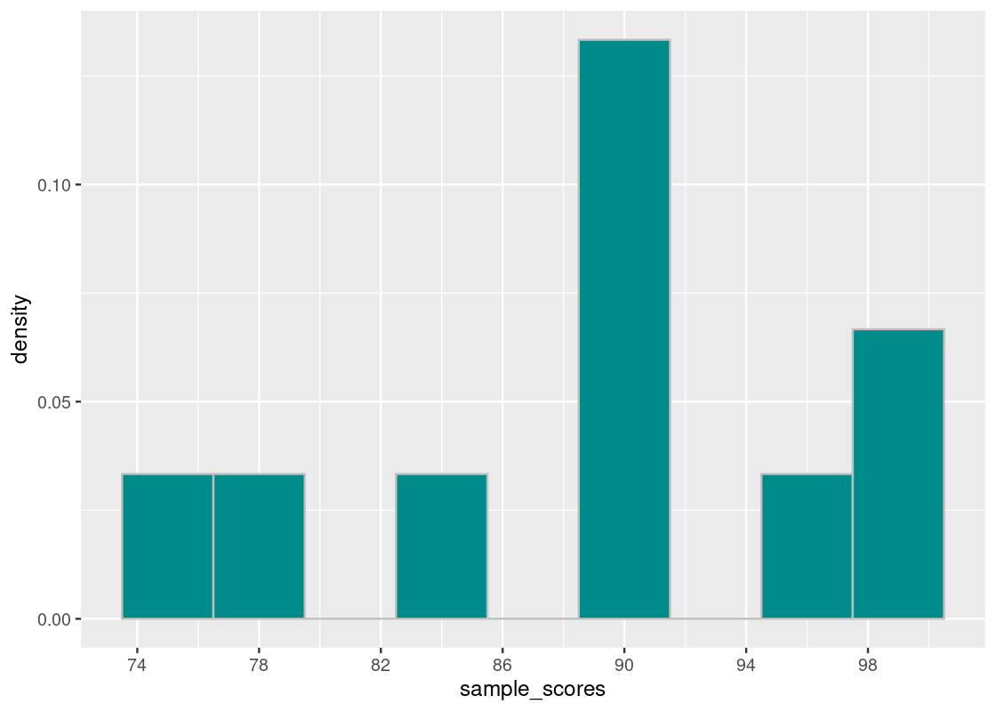
Let us compare these scores with another group of 10 scores.
sample_scores2 <- c(88, 89, 93, 90, 86, 90, 84, 91, 93, 80)
sample_scores2
## [1] 88 89 93 90 86 90 84 91 93 80We will repeat the above steps.
mu2 <- mean(sample_scores2)
diffs_from_mu_squared2 <- (sample_scores2 - mean(sample_scores2)) ** 2
variance2 <- sum(diffs_from_mu_squared2) / length(sample_scores2)
sdev2 <- sqrt(variance2)
Let us examine the mean and standard deviation of this group.
mu2## [1] 88.4
sdev2## [1] 3.878144Interestingly, the group has the same mean but the standard deviation is much smaller. Notice that the sum of the squared difference values are much larger in the first vector than in the second.
sum(diffs_from_mu_squared)## [1] 532
sum(diffs_from_mu_squared2)## [1] 150.4This tells us that the grades in the second group are closer together. We can confirm our findings with a histogram of the score distribution.
tibble(sample_scores2) |>
  ggplot() +
  geom_histogram(aes(x = sample_scores2, y = after_stat(density)),
                 color = "gray", fill = "darkcyan", binwidth = 3) +
  scale_x_continuous(breaks = seq(70, 100, 4))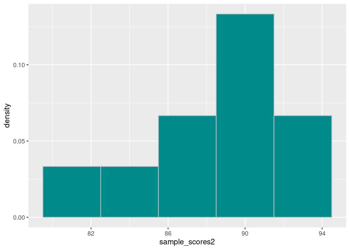
Observe that the scores are much closer together compared to the first histogram.
8.1.4 Sample standard deviation
Often in the calculation of standard deviation, instead of dividing by \(N\), we divide by \(N-1\). We call the versions of \(\sigma^2\) and \(\sigma\) with division by \(N\) the population variance and the population standard deviation, respectively. The versions that use division by \(N-1\) are the sample variance and sample standard deviation.
There is a subtle consideration in why we want to use \(N-1\) for the variance. To see why, suppose you have made up your mind on the value of the mean, say it is 6, and determine all the values in your data except for the last one. Here is an example of the situation.
\[ \mu = 6 = \frac{2 + 8 + 4 + \text{ ?}}{4} \]
Once you have finished determining three out of the four values, you no longer have anymore freedom in choosing the fourth value. This is because of a constraint composed by the mean formula. That is, if we isolate the sum of the numbers from above…
\[ 2 + 8 + 4 + \text{ ?} = 6 * 4 \]
Thus, we can figure quite easily the value of the \(?\).
\[ \text{ ?} = 6 * 4 - (2 + 8 + 4) = 10 \]
The phenomena we observed is representative of a general fact. In the formula that involves \(\mu\) and \(x_1, \ldots, x_N\), like the one for variance, there are no longer \(N\) independent values, there are only \(N-1\) of them.
The difference in quantity by using \(N-1\) instead of \(N\) may not be large, specifically, when \(N\) is large and the differences are small. Still, for an accurate understanding of the data spread, the choice can be highly critical. For this reason, statisticians prefer to work with the sample standard deviation when dealing with samples. We will do so as well for the remainder of this text.
8.1.5 The sd function
Fortunately R comes with a function sd that computes the sample standard deviation. We compare them side-by-side with the values we computed earlier.
## [1] 7.293833 7.688375## [1] 3.878144 4.087923Because of the use of \(N-1\) in place of \(N\), the values in the right column are greater than those on the left.
8.2 More on Standard Deviation
The previous section introduced the notion of standard deviation (SD) and how it is a measure of spread in the data. We build upon our discussion of SD in this section.
8.2.1 Prerequisites
We will continue to make use of the tidyverse. To demonstrate an example of the use (as well as misuses) of SD, we also load in two synthetically generated datasets from the package datasauRus.
We retrieve the two datasets here, and will explore them shortly.
8.2.2 Working with SD
To see what we can glean from the SD, let us turn to a more interesting dataset. The tibble starwars from the dplyr package contains data about all characters in the Star Wars canon. The table records a wealth of information about each character, e.g., name, height (cm), weight (kg), home world, etc. Pull up the help (?starwars) for more information about the dataset.
starwars## # A tibble: 87 × 14
## name height mass hair_…¹ skin_…² eye_c…³ birth…⁴ sex gender homew…⁵
## <chr> <int> <dbl> <chr> <chr> <chr> <dbl> <chr> <chr> <chr>
## 1 Luke Skywa… 172 77 blond fair blue 19 male mascu… Tatooi…
## 2 C-3PO 167 75 <NA> gold yellow 112 none mascu… Tatooi…
## 3 R2-D2 96 32 <NA> white,… red 33 none mascu… Naboo
## 4 Darth Vader 202 136 none white yellow 41.9 male mascu… Tatooi…
## 5 Leia Organa 150 49 brown light brown 19 fema… femin… Aldera…
## 6 Owen Lars 178 120 brown,… light blue 52 male mascu… Tatooi…
## 7 Beru White… 165 75 brown light blue 47 fema… femin… Tatooi…
## 8 R5-D4 97 32 <NA> white,… red NA none mascu… Tatooi…
## 9 Biggs Dark… 183 84 black light brown 24 male mascu… Tatooi…
## 10 Obi-Wan Ke… 182 77 auburn… fair blue-g… 57 male mascu… Stewjon
## # … with 77 more rows, 4 more variables: species <chr>, films <list>,
## # vehicles <list>, starships <list>, and abbreviated variable names
## # ¹hair_color, ²skin_color, ³eye_color, ⁴birth_year, ⁵homeworldLet us focus on the characters’ heights. It turns out that the height information is missing for some of them; let us remove these entries from the dataset.
starwars_clean <- starwars |>
  drop_na(height)
Here is a histogram of the characters’ heights.
ggplot(starwars) +
  geom_histogram(aes(x = height, y = after_stat(density)),
                 color = "gray", fill = "darkcyan", bins = 20)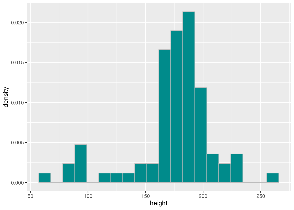
The average height of Star Wars characters is just over 174 centimeters (or 5’8’‘), which is about 1.4 centimeters shorter than the average height of men in the United States (5’9’’).
## [1] 174.358The SD tells us how far off a character’s height is from the average, which is about 34.77 centimeters.
## [1] 34.77043The shortest character in cannon is the legendary Jedi Master Yoda, registering a height of just 66 centimeters!
## # A tibble: 1 × 14
## name height mass hair_color skin_color eye_co…¹ birth…² sex gender homew…³
## <chr> <int> <dbl> <chr> <chr> <chr> <dbl> <chr> <chr> <chr>
## 1 Yoda 66 17 white green brown 896 male mascu… <NA>
## # … with 4 more variables: species <chr>, films <list>, vehicles <list>,
## # starships <list>, and abbreviated variable names ¹eye_color, ²birth_year,
## # ³homeworldYoda is about 108 centimeters shorter than the average height.
66 - mean_height## [1] -108.358Put another way, Yoda is about 3 SDs below the average height.
(66 - mean_height) / sd_height## [1] -3.116384We can repeat the same steps for the tallest character in canon: the Quermian Yarael Poof.
## # A tibble: 1 × 14
## name height mass hair_c…¹ skin_…² eye_c…³ birth…⁴ sex gender homew…⁵
## <chr> <int> <dbl> <chr> <chr> <chr> <dbl> <chr> <chr> <chr>
## 1 Yarael Poof 264 NA none white yellow NA male mascu… Quermia
## # … with 4 more variables: species <chr>, films <list>, vehicles <list>,
## # starships <list>, and abbreviated variable names ¹hair_color, ²skin_color,
## # ³eye_color, ⁴birth_year, ⁵homeworldYarael Poof’s height is about 2.58 SDs above the average height.
(264 - mean_height) / sd_height## [1] 2.57811It seems then that the tallest and shortest characters are only a few SDs away from the mean – no more than 3. The mean and SD is useful in this way: all the heights of Star Wars characters can be found within 3 SDs of the mean. This gives us a good sense of the spread in the data.
8.2.3 Standard units
The number of standard deviations a value is away from the mean can be calculated as follows:
\[ z = \frac{\text{value} - \text{mean}}{\text{SD}} \]
The resulting quantity \(z\) measures standard units and is sometimes called the z-score. We saw two such examples of standard units when studying the tallest and shortest Star Wars characters.
R provides a function scale that converts values into standard units. Such a transformation is called scaling. For instance, we can add a new column with all of the heights in standard units.
## # A tibble: 81 × 3
##    name               height  su[,1]
##    <chr>               <int>   <dbl>
##  1 Luke Skywalker        172 -0.0678
##  2 C-3PO                 167 -0.212
##  3 R2-D2                  96 -2.25
##  4 Darth Vader           202  0.795
##  5 Leia Organa           150 -0.701
##  6 Owen Lars             178  0.105
##  7 Beru Whitesun lars    165 -0.269
##  8 R5-D4                  97 -2.22
##  9 Biggs Darklighter     183  0.249
## 10 Obi-Wan Kenobi        182  0.220
## # … with 71 more rows
As before, note that the standard units are much less than 3 SDs (in general, they need not be).
Scaling is often used in data analysis as it allows us to put data in a comparable format. Let us visit another example to see why.
8.2.4 Example: Judging a contest
Suppose three eccentric judges evaluated eight contestants at a contest. They evaluate each contestant on the scale of 1 to 10. Enter the judges.
- Mrs. Sweet. Her cakes are loved by everyone. She also has a reputation for giving high scores. She has never given a score below 5.
- Mr. Coolblood. He has a reputation of being ruthless with a strong penchant for corn dogs. He has never given a high score to anyone in the past.
- MS Hodgpodge. Her salsa dip is quite spicy. Yet she tends to spread her scores fairly. If there are enough contestants, she gives 1 or 2 to at least one contestant and 9 or 10 to at least one contestant.
Here are the results.
contest <- tribble(~name, ~sweet, ~coolblood, ~hodgepodge,
                        "Ashley",  9, 5, 9,
                        "Bruce",   8, 6, 4,
                        "Cathryn", 7, 5, 5,
                        "Drew",    8, 2, 1,
                        "Emily",   9, 7, 7,
                        "Frank",   6, 1, 1,
                        "Gail",    8, 4, 4,
                        "Harry",   5, 3, 3
                        )
contest
## # A tibble: 8 × 4
## name sweet coolblood hodgepodge
## <chr> <dbl> <dbl> <dbl>
## 1 Ashley 9 5 9
## 2 Bruce 8 6 4
## 3 Cathryn 7 5 5
## 4 Drew 8 2 1
## 5 Emily 9 7 7
## 6 Frank 6 1 1
## 7 Gail 8 4 4
## 8 Harry 5 3 3Would it be enough to simply total their scores to determine the winner? Or should we take into account their eccentricities and scale the scores somehow?
That is where standard units come to play. We adjust each judge’s scores by subtracting his/her mean and then dividing it by his/her standard deviation. After adjustment, each score represents relative to the standard deviation how much away the original score is from the mean.
Let us compute the raw total of the three scores, and compare this with the scaled scores.
contest |> mutate(
  sweet_su = scale(sweet),
  hodge_su = scale(hodgepodge),
  cool_su = scale(coolblood),
  raw_sum = sweet + coolblood + hodgepodge,
  scaled_sum = sweet_su + hodge_su + cool_su
  ) |>
  select(name, raw_sum, scaled_sum)
## # A tibble: 8 × 3
## name raw_sum scaled_sum[,1]
## <chr> <dbl> <dbl>
## 1 Ashley 23 3.21
## 2 Bruce 18 1.19
## 3 Cathryn 17 0.349
## 4 Drew 11 -1.87
## 5 Emily 23 3.47
## 6 Frank 8 -3.77
## 7 Gail 16 0.202
## 8 Harry 11 -2.77Based on the raw scores, we identify a two-way tie between Ashely and Emily. The scaled scores allow us to break the scores and we can announce, with confidence, Emily as the winner!
8.2.5 Be careful with summary statistics!
The SD is part of what we call summary statistics as they are useful for summarizing information about a distribution. The SD tells us about the spread of the data and where a histogram might sit on a number line.
Indeed, SD is an important tool and we will continue our study of it in the following sections. However, SD – as with all summary statistics – must be used with caution. We end our discussion in this section with an instructive example as to why.
Recall that we have two datasets star and bullseye. Each contains some x and y coordinate pairs. Let us examine some of the x coordinates in each.
## [1] 58.21361 58.19605 58.71823 57.27837 58.08202 57.48945## [1] 51.20389 58.97447 51.87207 48.17993 41.68320 37.89042The values seem close, but look different enough. Let us compute the SD.
sd(star_x)## [1] 16.76896
sd(bullseye_x)## [1] 16.76924How about the mean?
mean(star_x)## [1] 54.26734
mean(bullseye_x)## [1] 54.26873The result points to a clear answer: both distributions represented by star_x and bullseye_x have the exact same SD and mean. We may be tempted then to conclude that both distributions are equivalent. We would be mistaken!
Whenever in doubt, turn to visualization. We plot a histogram of the distributions overlaid on top of each other. If the distributions are actually equal, we expect this to be reflected in the histogram.
datasaurus_dozen |>
  filter(dataset == "star" | dataset == "bullseye") |>
  ggplot() +
  geom_histogram(aes(x = x, y = after_stat(density), fill = dataset),
                 color = "gray", position = "identity",
                 alpha = 0.7, bins = 10) +
  scale_x_continuous(breaks = seq(15, 90, 5))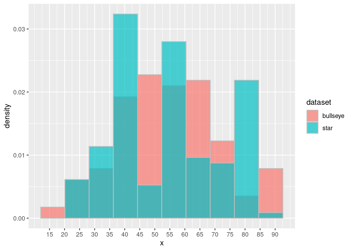
The histogram confirms that, contrary to what we might expect, these distributions are very much different – despite having the same SD and mean! Thus, the moral of this lesson: be careful with summary statistics and always visualize your data.
The star and bullseye datasets have an additional y coordinate which we have ignored in this study. We leave it as an exercise to the reader to determine if the distributions represented by y are also different yet have identical summary statistics.
8.3 The Normal Curve
The mean and SD are key pieces of information in determining the shape of some distributions. The most famous of them is the normal distribution, which we turn to in this section.
8.3.1 Prerequisites
We will continue to make use of the tidyverse so let us load it in. We will also work with some datasets from the edsdata package so let us load that in as well.
8.3.2 The standard normal curve
The standard normal curve has a rather complicated formula:
\[ \phi(z) = {\frac{1}{\sqrt{2 \pi}}} e^{-\frac{1}{2}z^2}, ~~ -\infty < z < \infty \]
where \(\pi\) is the constant \(3.141592\ldots\) and \(e\) is Euler’s number \(2.71828\ldots\). It is best to think of this visually as in the following plot.
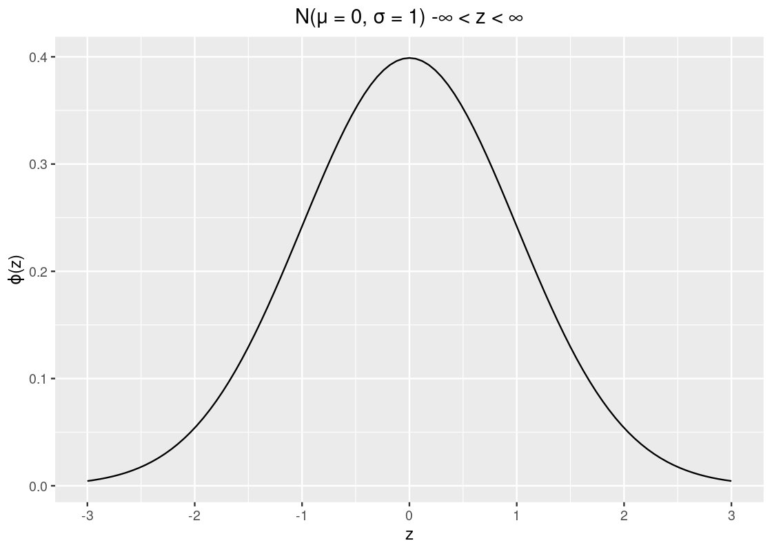
The values on the x-axis are in standard units (or z-scored values). We observe that the curve is symmetric around 0 where the “bulk” of the data is close to the mean. Following are some properties about the curve:
- The total area under the curve is 1.
- The curve is symmetric so it inherits a property we know about symmetric distributions: the mean and median are both 0.
- The SD is 1 which, fortunately for us, is clearly identifiable on the x-axis.
- The curve has two points of inflection at -1 and +1, which are annotated on the following plot.
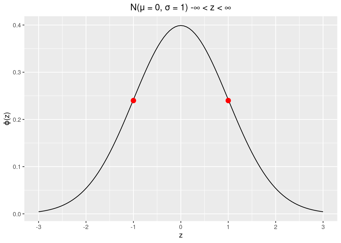
Observe how the curve looks like a salad bowl in the regions \((-\infty, -1)\), and \((1, \infty)\) and in the region \((-1, 1)\) the bowl is flipped upside down!
8.3.3 Area under the curve
We can find the area under the standard normal curve with the function pnorm. Let us use this function to find the amount of area to the left of \(z = -1\).
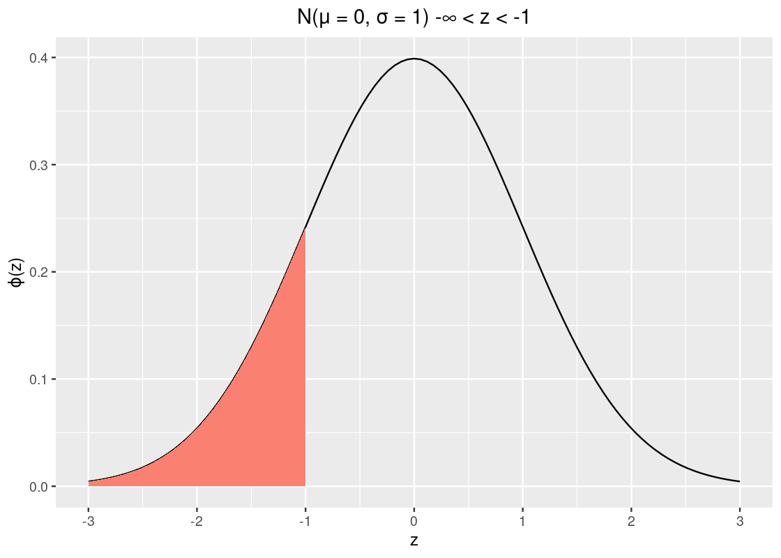
pnorm(-1)## [1] 0.1586553So about 15.9% of the data lies to the left of \(z = -1\). Recall from our properties that the curve is symmetric and that the total area must sum to 1. We can take advantage of these two to calculate other areas, e.g., the area to the right of -1.
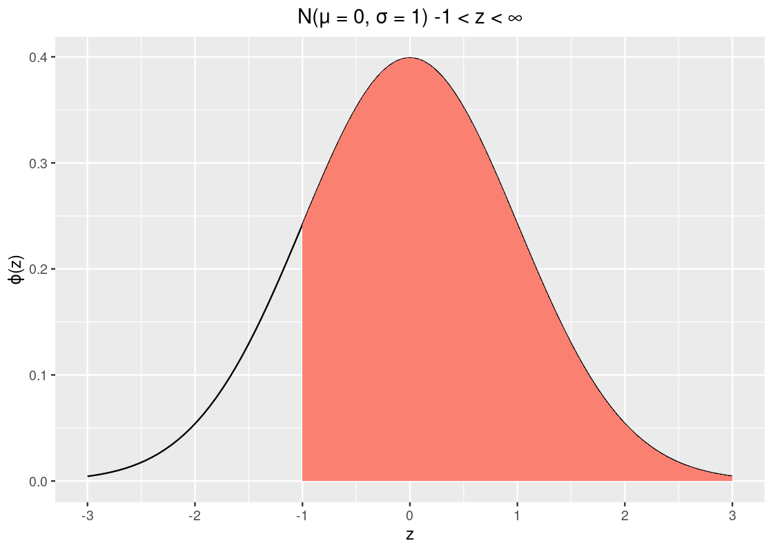
1 - pnorm(-1)## [1] 0.8413447That’s about 84% of the data.
Here is a trickier problem: how much area is within 1 SD? Put another way, what is the area between \(z = -1\) and \(z = 1\)? That’s the orange-shaded area in the following plot.
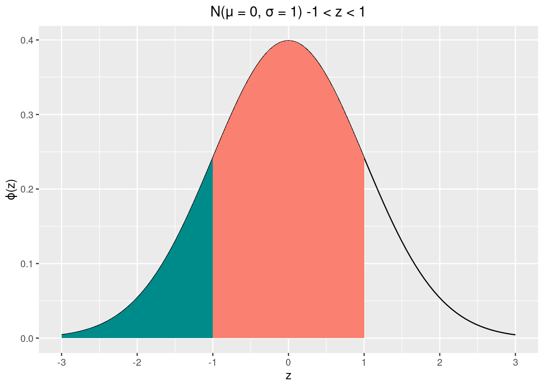
You might be able to guess at a few ways to answer this. One way to do it is to find the area to left of \(z = -1\) (shaded in dark cyan) and subtract it from the area to the left of \(z = 1\). This resulting subtraction is the area in orange, between \(z = -1\) and \(z = 1\).
## [1] 0.6826895That’s about 68.3% of the data.
How much data is within 2 SDs?
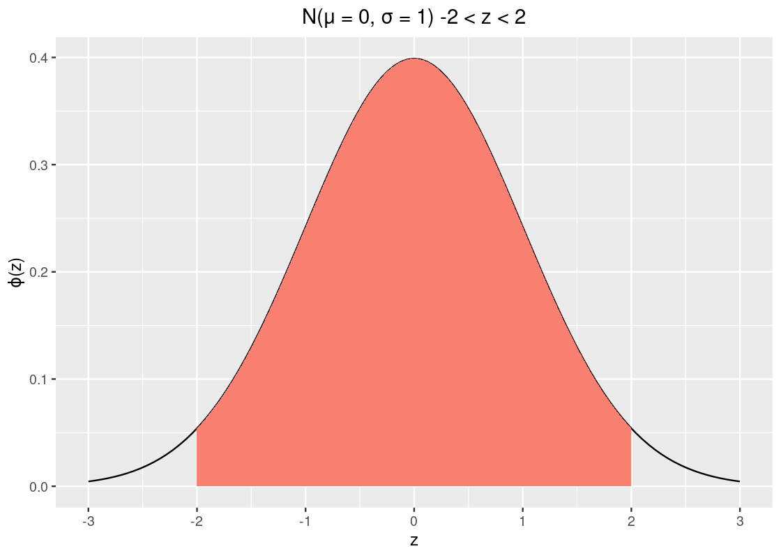
## [1] 0.9544997That’s about 95% of the data. To complete the story, let’s look at the amount of data within 3 SDs.
## [1] 0.9973002That covers almost all the data, but mind the italics. There is still about 0.3% of the data that lies beyond 3 SDs, which can happen.
Therefore, for a standard normal curve, we can calculate the probability of where a sample might lie. We have:
- a sample that falls within \(\pm 1\) SD is about 68%.
- a sample that falls within \(\pm 2\) SDs is about 95%.
- a sample that falls between \(\pm 3\) is about 99.73%.
8.3.4 Normality in real data
Normality frequently occurs in real datasets. Let us have a look at a few attributes from the Olympic athletes dataset in athletes from the edsdata package.
We focus specifically on the heights, weights, and age variables.
Here is the histogram of these variables.
my_athletes |>
  pivot_longer(everything()) |>
  ggplot(aes(x = value, y = after_stat(density), fill = name)) +
  geom_histogram(bins=15, color = "gray") +
  facet_wrap(~name, scales = "free") +
  guides(fill = "none")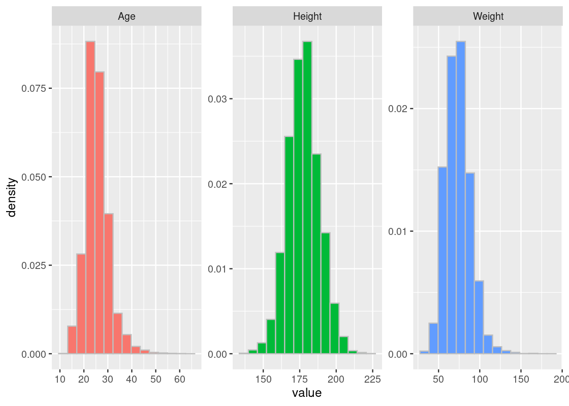
The heights most closely resemble the bell curve. We can also spot normality in the weight and age distributions, though they appear to be somewhat “lopsided” when compared to the heights.
Let us compute the mean and standard deviation of the athletes’ heights.
## # A tibble: 1 × 2
##   `mean(Height)` `sd(Height)`
##            <dbl>        <dbl>
## 1           178.         10.9
height_mean <- summarized[[1]]
height_sd <- summarized[[2]]
8.3.5 Athlete heights and the dnorm function
We can create a normal curve using the function dnorm. It takes as arguments a vector of \(x\) values, the mean, and SD; in terms of the plot, it returns the “y coordinate” for each corresponding \(x\) value. Let us construct a normal curve for the Olympic athlete heights using the mean and SD we have just obtained, and overlay it atop the histogram.
ggplot(athletes, aes(x = Height, y = after_stat(density))) +
  geom_histogram(col="grey", fill = "darkcyan", bins=14) +
  geom_line(mapping = aes(x = Height, y = height_norm),
            color = "salmon") +
  labs(x = "Height") +
ggtitle("Normal curve and the histogram") 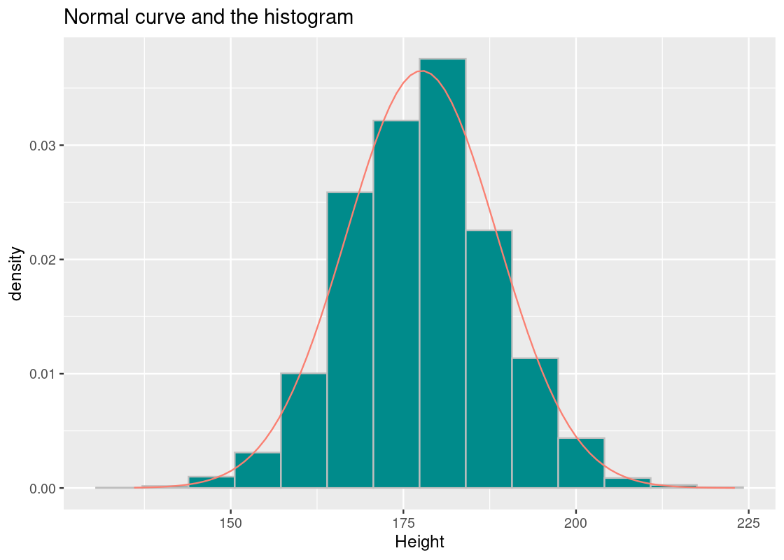
We observe the following.
- The histogram shows strong resemblance to the normal curve.
- The tails of the normal curve extend towards infinity, but there are no athletes shorter than 136 cm and taller than 223 cm.
How close is the curve to the histogram? Let us compare the proportion of athletes whose height is at most 200 cm with respect to the two distributions.
pnorm(200, mean = height_mean, sd = height_sd)## [1] 0.9796522## [1] 0.9812465The normal distribution says 97.96% while the actual record is 98.12%. Pretty close.
How about 181?
pnorm(181, mean = height_mean, sd = height_sd)## [1] 0.6207147## [1] 0.634704The two values are 62.07% versus 63.47%.
8.4 Central Limit Theorem
As noted at the outset of this chapter, the bell-shaped distribution has been a running motif through most of our examples. While most of the data histograms we studied have not turned out bell-shaped, the sampling distributions representing some simulated statistic has reliably turned out that way.
This is no coincidence. In fact, it is the consequence of an impressive theory in statistics called the Central Limit Theorem. We will study the theorem in this section, but let us first see a situation where a bell-shaped distribution results to set up the context.
8.4.1 Prerequisites
We will make use of the tidyverse in this chapter, so let’s load it in as usual.
We will also work with GDP per capita data from the gapminder package, so let us load that in as well.
8.4.2 Example: Net allotments from a clumsy clerk
Recall that in an earlier section, we simulated the story of a minister and the doubling grains. In that story, the amount of grains a minister receives doubles each day; by the end of the 64th day, he expects to receive an impressive total of \(2^{64}-1\) grains.
The king has put a clerk in charge to assign the correct amount of grains each day. However, she is human and tabulates the grains by hand, so is prone to error: she may double count the number of grains on some days or forget to count a day altogether. But for the most part she gets it right.
This yields three events on a given day: the counting was as expected, it was double counted, or the clerk forgot. We said that the probabilities for these events are \(2/3\), \(1/3\), and \(1/3\), respectively. Here is the distribution.
df <- tribble(~event, ~probability,
              "as expected", 2/4,
              "double counted", 1/4,
              "forgot", 1/4
              )
ggplot(df) +
  geom_bar(aes(x = event, y = probability),
                 stat = "identity", fill = "darkcyan")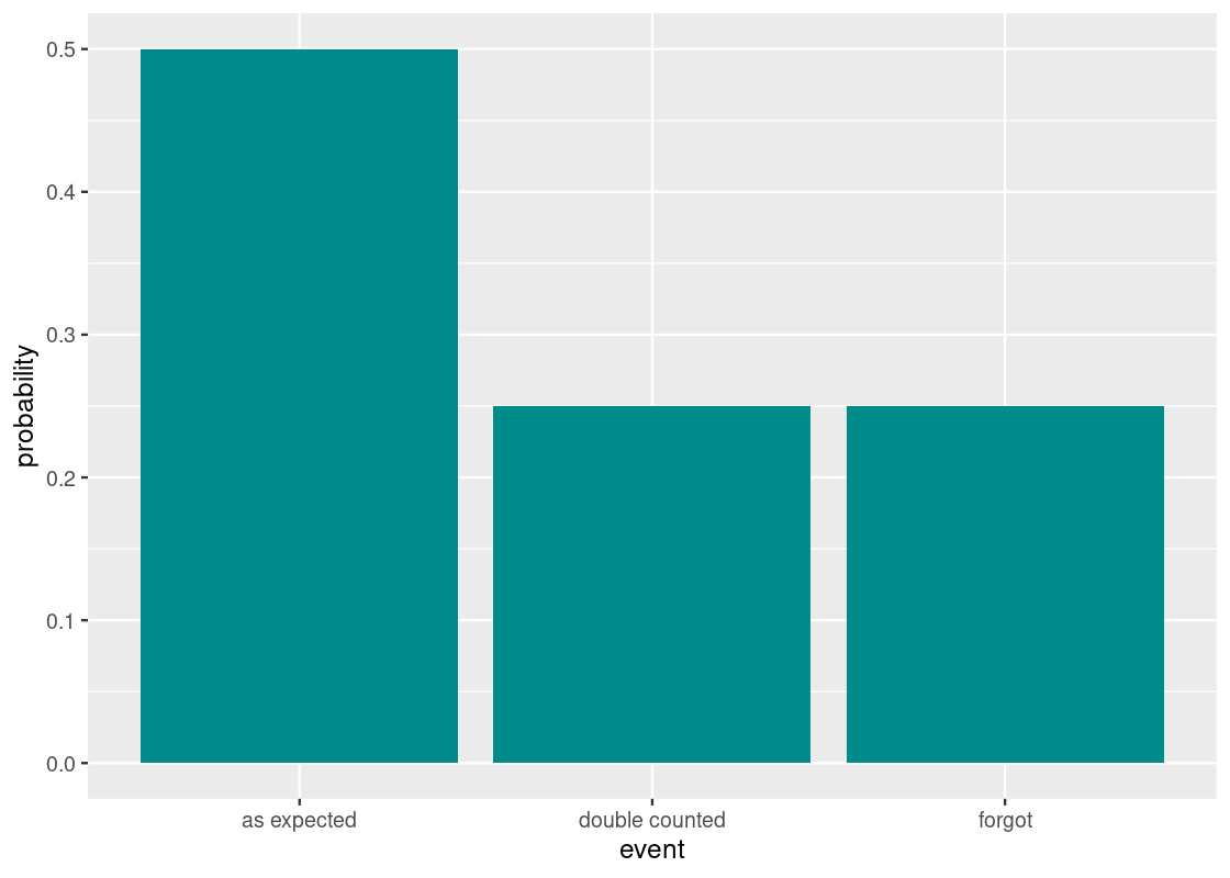
The number of grain allotments received after 64 days is the sum of draws made at random with replacement from this distribution.
Using sample we can see the result of the grain allotment on any given day.
## [1] 1If allotment turns out 1, the minister received the correct amount of grains that day; 0 indicates that no grains were received and 2 means he received double the amount. The minister hopes that the allotments will total to be 64 and, to the king’s dismay, perhaps even more.
We are now ready to simulate one value of the statistic. Let us put our work into a function we can use called one_simulation.
one_simulation <- function() {
  allotments <- sample(c(0, 1, 2),
                       prob = c(1/4, 2/4, 1/4),
                       replace = TRUE, size = 64)
  return(sum(allotments))
}
one_simulation()
## [1] 70The following code simulates 10,000 times the net allotments the minister received at the end of the 64th day.
num_repetitions <- 10000
net_allotments <- replicate(n = num_repetitions, one_simulation())

results <- tibble(
  repetition = 1:num_repetitions,
  net_allotments = net_allotments
)
results
## # A tibble: 10,000 × 2
## repetition net_allotments
## <int> <dbl>
## 1 1 77
## 2 2 67
## 3 3 63
## 4 4 66
## 5 5 66
## 6 6 63
## 7 7 60
## 8 8 65
## 9 9 57
## 10 10 64
## # … with 9,990 more rows
ggplot(results) +
  geom_histogram(aes(x = net_allotments, y = after_stat(density)),
                 color = "gray", fill = "darkcyan", bins = 15)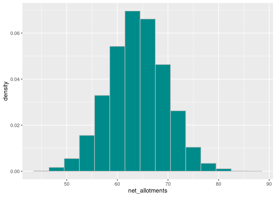
We observe a bell-shaped curve, even though the distribution we drew from does not look bell-shaped. Note the the distribution is centered around 64 days, as expected. With kudos to the clerk for a job well done, we note that accomplishing such a feat in reality would be impossible.
To understand the spread, look for the inflection point in this histogram. That point occurs at around 70 days, which means the SD is the distance from the center to this point – that looks to be about 5.6 days.
## [1] 5.662408To confirm the bell-shaped curve we are seeing, we can create a normal distribution from this mean and SD and overlay it atop the sampling histogram. We observe that it provides a good fit.
curve <- dnorm(net_allotments, mean = 64, sd = 5.66)
ggplot(results) +
  geom_histogram(aes(x = net_allotments, y = after_stat(density)),
                 color = "gray", fill = "darkcyan", bins = 15) +
  geom_line(mapping = aes(x = net_allotments, y = curve),
color = "salmon") 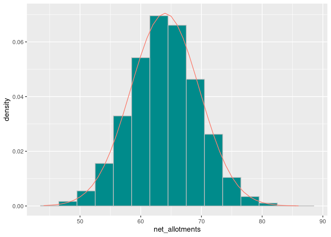
8.4.3 Central Limit Theorem
The Central Limit Theorem is a formalization of the phenomena we observed from the doubling grains story. Formally, it states the following.
The sum or average of a large random sample that is identically and independently distributed will resemble a normal distribution, regardless of the underlying distribution from which the sample is drawn.
The “identically and independently distributed” condition, often abbreviated simply as “IID”, is a mouthful. It means that the random samples we draw must have no relation to each other, i.e., the drawing of one sample (say, the event forgot) does not make another event more or less likely of occcuring. Hence, we prefer a sampling plan of sampling with replacement.
The Central Limit Theorem is a powerful concept because it becomes possible to make inferences about unknown populations with very little knowledge. And, the larger the sample size becomes, the stronger the resemblance.
8.4.4 Comparing average systolic blood pressure
The Central Limit Theorem says that the sum of IID samples follows a distribution that resembles a normal distribution. Let us return to the NHANES package and compare average systolic blood pressure for males and females. If we take a large sample of participants, what is the sample average systolic blood pressure as given by BPSysAve? According to the theorem, we expect the distribution to be roughly normal.
Let us first do some basic pre-processing and remove any missing values in the BPSysAve column.
NHANES_relevant <- NHANES |>
  drop_na(BPSysAve)
Let us compare the systolic blood pressure readings for males and females using an overlaid histogram.
NHANES_relevant |>
  ggplot() +
  geom_histogram(aes(x = BPSysAve, fill = Gender,
                     y = after_stat(density)),
                 color = "gray", alpha = 0.7,
                 position = "identity", bins=15)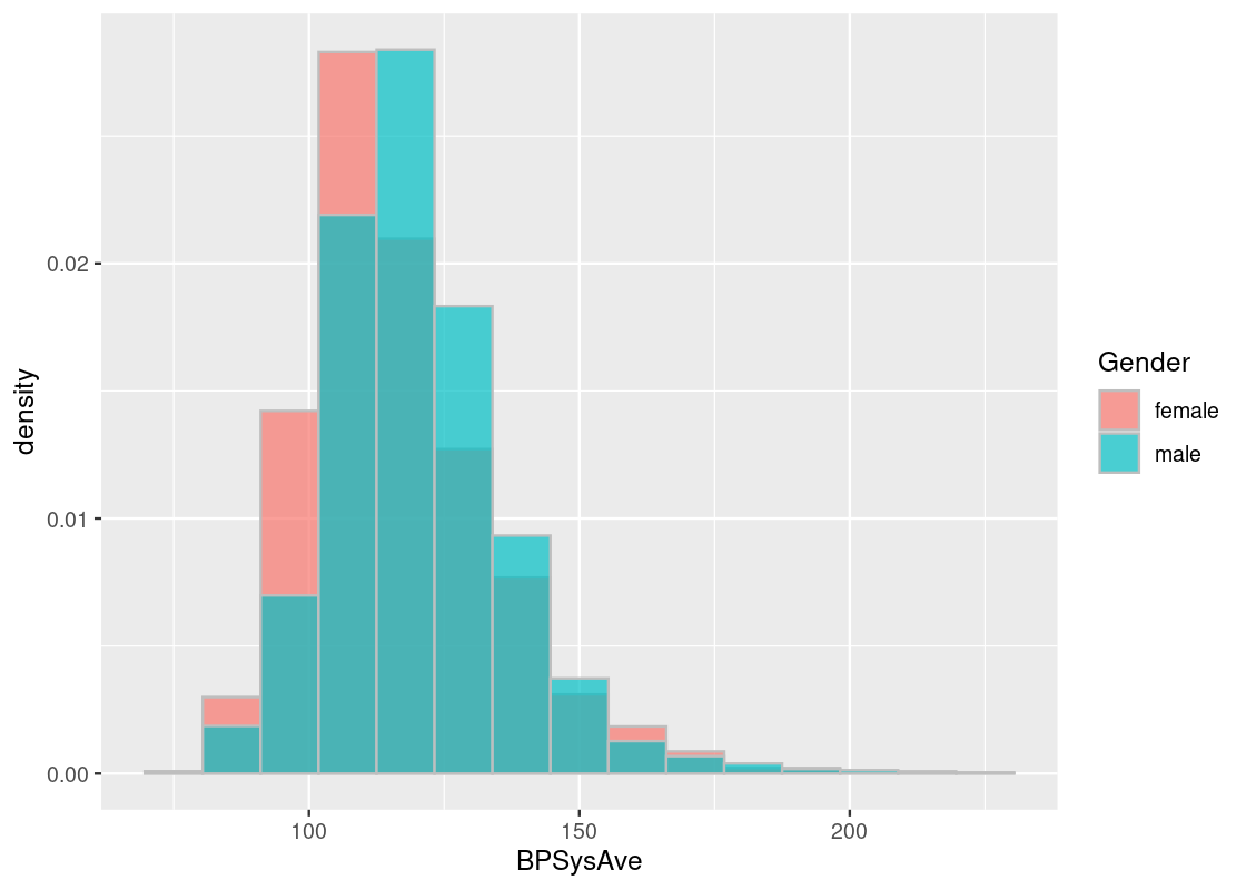
Observe the skew in these data histograms, as shown by the long right-tail in each. Neither closely resembles a normal distribution.
Let us also note the standard deviation and mean for these distributions.
summary_stats <- NHANES_relevant |>
  group_by(Gender) |>
  summarize(mean = mean(BPSysAve),
            sd = sd(BPSysAve))
summary_stats
## # A tibble: 2 × 3
## Gender mean sd
## <fct> <dbl> <dbl>
## 1 female 116. 17.8
## 2 male 120. 16.4Let us deal out the participants into two separate datasets according to the gender status.
NHANES_female <- NHANES_relevant |>
  filter(Gender == "female")
NHANES_male <- NHANES_relevant |>
  filter(Gender == "male")
Let us simulate the average systolic blood pressure in a sample of 100 participants for both males and females. We will write a function to simulate one value for us. Observe that the sampling is done with replacement, in accordance to the “IID” precondition needed by the Central Limit Theorem.
one_simulation <- function(df, label, sample_size) {
  df |>
    slice_sample(n = sample_size, replace = TRUE) |>
    summarize(mean({{ label }})) |>
    pull()
}
The function one_simulation takes as arguments the tibble df, the column label to use for computing the statistic, and the sample size sample_size.
Here is one run of the function with the female data.
one_simulation(NHANES_female, BPSysAve, 100)## [1] 116.2As before, we will simulate the statistic for female data 10,000 times.
num_repetitions <- 10000
sample_means <- replicate(n = num_repetitions,
                          one_simulation(NHANES_female, BPSysAve, 100))

female_results <- tibble(
  repetition = 1:num_repetitions,
  sample_mean = sample_means,
  gender = "female"
)
female_results
## # A tibble: 10,000 × 3
## repetition sample_mean gender
## <int> <dbl> <chr>
## 1 1 116. female
## 2 2 118. female
## 3 3 114. female
## 4 4 115. female
## 5 5 115. female
## 6 6 117. female
## 7 7 115. female
## 8 8 118. female
## 9 9 117. female
## 10 10 115. female
## # … with 9,990 more rowsLet us repeat the simulation for the male data.
sample_means <- replicate(n = num_repetitions,
                          one_simulation(NHANES_male, BPSysAve, 100))

male_results <- tibble(
  repetition = 1:num_repetitions,
  sample_mean = sample_means,
  gender = "male"
)
male_results
## # A tibble: 10,000 × 3
## repetition sample_mean gender
## <int> <dbl> <chr>
## 1 1 118. male
## 2 2 120. male
## 3 3 120. male
## 4 4 120. male
## 5 5 119. male
## 6 6 122. male
## 7 7 118. male
## 8 8 119 male
## 9 9 121. male
## 10 10 118. male
## # … with 9,990 more rowsLet us merge the two tibbles together so that we can plot the sampling distributions together.
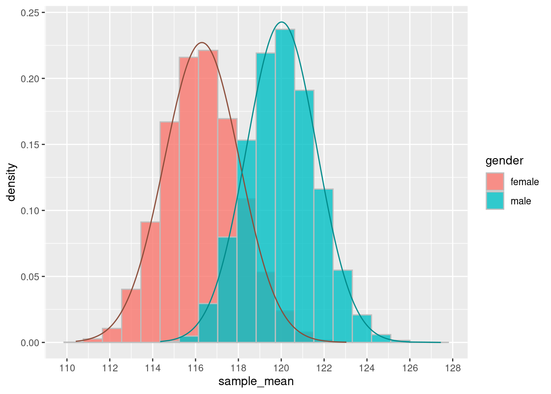
results <- bind_rows(female_results, male_results)We plot an overlaid histogram in density scale showing the two distributions.
ggplot(results) +
  geom_histogram(aes(x = sample_mean, y = after_stat(density)),
                 bins = 20, color = "gray",
                 position = "identity", alpha = 0.8) +
  facet_wrap(~gender, scales = "free")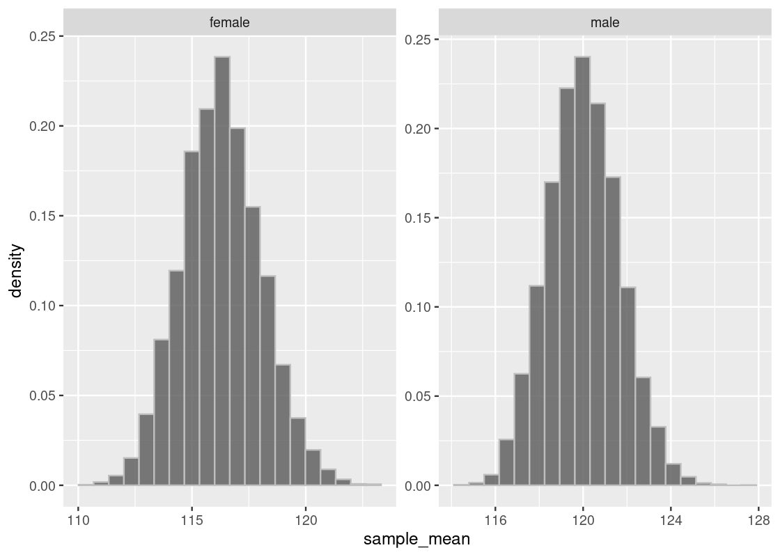
Indeed, we see that both distributions are approximately normal, where each centers a different mean. To confirm the shape, we overlay a normal curve atop each histogram.
summary_stats## # A tibble: 2 × 3
## Gender mean sd
## <fct> <dbl> <dbl>
## 1 female 116. 17.8
## 2 male 120. 16.4Let us briefly compare the sampling histograms to the summary statistics computed earlier in summary_stats, which gives the mean and standard deviation for this dataset, which we are treating as the “population.” We observe that both sampling histograms are centered at this population mean.
The standard deviation has a curious relationship and follows the equation:
\[ \text{sample SD} = \frac{\text{pop SD}}{\sqrt{\text{sample size}}} \] For instance, the standard deviation for the sample female distribution follows:
17.81539 / sqrt(100)## [1] 1.781539The interested reader should confirm this visually by looking for the inflection point in the histogram, as well as what the sample SD would be for the male distribution.
It turns out this formula is a component of the Central Limit Theorem. We will explore this in more detail in the exercise set.
8.5 Exercises
Be sure to install and load the following packages into your R environment before beginning this exercise set.
Question 1 Suppose in the town of Raines, the rain falls throughout the year. A student created a record of 30 consecutive days whether there was a precipitation of at least a quarter inch. The observations are stored in a tibble named rain_record.
rain_record <- tibble(had_rain = c(1, 0, 1, 0, 1, 0, 0, 1, 0, 1, 0, 1,
                                   1, 1, 0, 0, 0, 0, 1, 0, 1, 1, 0, 0,
                                   0, 0, 0, 0, 1, 0))
rain_record
## # A tibble: 30 × 1
## had_rain
## <dbl>
## 1 1
## 2 0
## 3 1
## 4 0
## 5 1
## 6 0
## 7 0
## 8 1
## 9 0
## 10 1
## # … with 20 more rowsIn the variable had_rain, 1 represents the day in which there was enough precipitation and 0 represents the day in which there was not enough precipitation.
The Central Limit Theorem (CLT) tells us that the probability distribution of the sum or average of a large random sample drawn with replacement will look roughly normal (i.e., bell-shaped), regardless of the distribution of the population from which the sample is drawn.
-
Question 1.1 Let us visualize the precipitation distribution in Raines (given by
had_rain) using a histogram. Plot the histogram under density scale so that the y-axis shows the chance of the event. Use only 2 bins.It looks like there is about a 40% chance of rain and a 60% chance of no rain, which definitely does not look like a normal distribution. The proportion of rainy days in a month is equal to the average number of
1s that appear, so the CLT should apply if we compute the sample proportion of rainy days in a month many times. -
Question 1.2 Let us examine the Central Limit Theorem using
rain_record. Write a function calledrainy_proportion_after_periodthat takes aperiodnumber of days to simulate as input. The function simulatesperiodnumber of days by sampling from the variablehad_raininrain_recordwith replacement. It then returns the proportion of rainy days (i.e.,1) in this sample as a double.rainy_proportion_after_period(5) # an example call -
Question 1.3 Write a function
rainy_experiment()that receives two arguments,daysandsample_size, wheredaysis the number of days in Raines to simulate andsample_sizeis the number of times to repeat the experiment. It executes the functionrainy_proportion_after_period(days)you just wrotesample_sizenumber of times. The function returns a tibble with the following variables:-
iteration, for the rounds1:sample_size -
sample_proportion, which gives the sample proportion of rainy days in each experiment
-
-
Question 1.4 Here is one example call of your function. We simulate 30 days following the same regimen the student did in the town of Raines, and repeat the experiment for 5 times.
rainy_experiment(30, 5)The CLT only applies when sample sizes are “sufficiently large.” Let us try a simulation to develop a sense for how the distribution of the sample proportion changes as the sample size is increased.
The following function
draw_ggplot_for_rainy_experiment()takes a single argumentsample_size. It calls yourrainy_experiment()with the argumentsample_sizeand then plots a histogram from the sample proportions generated.draw_ggplot_for_rainy_experiment <- function(sample_size) { g <- rainy_experiment(30,sample_size) |> ggplot(aes(x = sample_proportion)) + geom_histogram(aes(y = after_stat(density)), fill = "darkcyan", color="gray", bins=50) return(g) } draw_ggplot_for_rainy_experiment(10)Play with different calls to
draw_ggplot_for_rainy_experiment()by passing in different sample size values. For what value ofsample_sizedo you begin to observe the application of the CLT? What does the shape of the histogram look like for the value you found?
Question 2 The CLT states that the standard deviation of a normal distribution is given by:
\[ \frac{\text{SD of distribution}}{\sqrt{\text{sample size}}} \]
Let us test that the SD of the sample mean follows the above formula using flight delays from the tibble flights in the nycflights13 package.
-
Question 2.1 Write a function called
theory_sdthat takes a sample sizesample_sizeas its single argument. It returns the theoretical standard deviation of the mean for samples of sizesample_sizefrom the flight delays according to the Central Limit Theorem.theory_sd(10) # an example call -
Question 2.2 The following function
one_sample_mean()simulates one sample mean of sizesample_sizefrom theflightsdata.one_sample_mean <- function(sample_size) { one_sample_mean <- flights |> slice_sample(n = sample_size, replace = FALSE) |> summarize(mean = mean(dep_delay, na.rm = TRUE)) |> pull(mean) return(one_sample_mean) } one_sample_mean(10) # an example callWrite a function named
sample_sdthat receives a single argument: a sample sizesample_size. The function simulates 200 samples of sizesample_sizefromflights. The function returns the standard deviation of the 200 sample means. This function should make repeated use of theone_sample_mean()function above. -
Question 2.3 The chunk below puts together the theoretical and sample SDs for flight delays for various sample sizes into a tibble called
sd_tibble.sd_tibble <- tibble( sample_size = seq(10, 100, 5), theory_sds = map_dbl(sample_size, theory_sd), sample_sds = map_dbl(sample_size, sample_sd) ) |> pivot_longer(c(theory_sds,sample_sds), names_to = "category", values_to = "sd") sd_tibblePlot these theoretical and sample SD quantities from
sd_tibbleusing either a line plot or scatter plot withggplot2. A line plot may be easier to spot differences between the two quantities, but feel free to use whichever visualization makes most sense to you. Regardless, your visualization should show both quantities in a single plot. Question 2.4 As the sample size increases, do the theory and sample SDs change in a way that is consistent with what we know about the Central Limit Theorem?
Question 3. In the textbook, we examined judges’ evaluations of contestants. We have another example here with a slightly bigger dataset. The data is from the evaluation of applicants to a scholarship program by four judges. Each judge evaluated each applicant on a scale of 5 points. The applicants have already gone through a tough screening process and, in general, they are already high achievers.
To begin, let us load the data into applications from the edsdata package.
## # A tibble: 22 × 5
##    Last        Mary Nancy Olivia Paula
##    <chr>      <dbl> <dbl>  <dbl> <dbl>
##  1 Arnold      4.9   4.95   4.75  4
##  2 Baxter      4.05  3.55   4.35  3.6
##  3 Chromovich  4.3   3.55   4.1   3.25
##  4 Dempsey     4     3.75   4.35  3.8
##  5 Engels      3.85  4.3    3.8   3.9
##  6 Franks      4.1   4.74   3.89  4.6
##  7 Greene      4.55  4.4    3.7   4.7
##  8 Hanks       3.55  3.55   3.9   3.7
##  9 Ingels      4.35  4.35   3.95  3.5
## 10 Jules       4.7   4.6    4.4   4.5
## # … with 12 more rows
Question 3.1 If the observational unit is defined as the score an applicant received by some judge, then the current presentation of the data are not tidy (why?). Apply a pivot transformation to
applicationsso that three variables are apparent in the dataset:Last(last name of the student),Judge(the judge who scored the student), andScore(the score the student received). Assign the resulting tibble to the nameapp_tidy.Question 3.2 Use the
scalefunction to obtain the scaled version of the scores with respect to each judge. Add a new variable toapp_tidycalledScaledthat contains these scaled scores. Assign the resulting tibble to the namewith_scaled.-
Question 3.3 Which of the following statements, if any, are accurate based on the tibble
with_scaled?- Arnold’s scaled Judge Mary score is about 1.9 standard deviations higher than the mean score Arnold received from the four different judges.
- The score Judge Mary gave to Baxter is roughly 0.02 standard deviations below Judge Mary’s mean score over all applicants.
- Based on the raw score alone, we can tell the score Arnold received from Judge Mary is higher than the average score Judy Mary gave.
- The standard deviation of Judge Mary’s scaled scores is higher than the standard deviation of Judge Olivia’s scaled scores.
Question 3.4 Add two new variables to
with_scaled,Total RawandTotal Scaled, that gives the total raw score and total scaled score, respectively, for each applicant. Save the resulting tibble to the nametotal_scores.Question 3.5 Sort the rows of the data in
total_scoresin descending order ofTotal Rawand create a variableRaw Rankthat gives the index of the sorted rows. Store the resulting tibble in the nameapp_raw_sorted. Then usetotal_scoresto sort the rows in descending order ofTotal Scaledand, likewise, create a variableScaled Rankthat gives the index of the row when sorted this way. Store the result inapp_scaled_sorted.Question 3.6 Join the results from
app_raw_sortedwithapp_scaled_sortedusing an appropriate join function. The resulting tibble should contain five variables: the applicant’s last name, their total raw score, total scaled score, the raw “rank”, and the scaled “rank”. Assign the resulting tibble to the nameranks_together.Question 3.7 Create a new variable
Rank differencethat gives the difference between the raw rank and the scaled rank. Assign the resulting tibble back to the nameranks_together.Question 3.8 For which applicant does the first rank difference occur? For which applicant does the largest rank difference occur?
Question 3.9 Why do you think there are differences in the rankings given by the raw and scaled scores? Does the use of scaling bring any benefit when making a decision about which applicant should be granted admission? Which one would you choose?
Question 3.10 How does the ranking change when removing applicants with large discrepancies in ranking? Remove Baxter from the dataset and then repeat all above steps. What differences do you observe in the ranking? Do the new findings change your answer to Question 3.9?
Question 4. Recall that the Central Limit Theorem states that the distribution of the average of independent and identically distributed samples gets closer to a normal distribution as we increase the number of samples. We have used the sample mean for examining the phenomenon, but let us try a different statistic – the sample variance – and see if the phenomenon holds. Moreover, we will compute this statistic using some quantity we will make up that is not normally distributed, and see if the Central Limit Theorem still applies regardless of the underlying quantity we are using.
For this exploration, we will continue our examination of departure delays in the flights tibble from nycflights13.
Note: Be careful when dealing with missing values for this problem! For this problem, it is enough to simply eliminate missing values in the arr_delay and dep_delay variables.
library(nycflights13)
flights <- flights |>
  drop_na()
Question 4.1 The quantity we will examine here is the absolute difference in departure delay (
dep_delay) and arrive delay (arr_delay). Add a new variable calleddep_arr_abs_diffthat gives this new quantity. Assign the resulting tibble to the nameflights_with_diff.Question 4.2 Assuming that we can treat the
flights_with_difftibble as the population of all flights that departed NYC, compute the population variance of thedep_arr_abs_diffvariable. Assign the resulting double to the namepop_var_abs_diff.Question 4.3 What is the max of the absolute differences in
dep_arr_abs_diff? What is the mean of them? Store the answers in the namesmax_diffandmean_diff, respectively. How about the quantile values at 0.5, 0.15, 0.35, 0.50, 0.65, 0.85, 0.95, and 0.99? Store the quantile values inquantile_values.Question 4.4 Plot a histogram of
dep_arr_abs_difffromflights_with_diffin density scale with 30 bins. Add to the histogram the point on the x-axis indicating the max, the mean, the 0.5 quantile, and the 0.99 quantile. Use"black"for the 0.99 quantile and"red"for the max. Use two other different colors for the mean and the median.-
Question 4.5 Write a function
var_from_samplethat receives a single argumentn_sample. The function samplesn_samplesfrom the the tibbleflights_with_diffwithout replacement, and computes the sample variance in the new variabledep_arr_abs_diffwe created. The sample variance is then returned.# example calls var_from_sample(10) var_from_sample(100) var_from_sample(1000) -
Question 4.6 Write a function called
hist_for_samplethat receives a single argumentsample_size. This function should accomplish the following:- Call repeatedly the function
var_from_samplewith the givensample_size, say, 1,000 times. - Generate a histogram of the simulated sample statistics under density scale.
- Annotate this histogram with (1) a vertical blue line showing where the population parameter is (
pop_var_abs_diff) and (2) a red point indicating the mean of the generated sample statistics.
hist_for_sample <- function(sample_size) {

}
The following code calls your function with different sample sizes:
- Call repeatedly the function
Question 4.7 As the sample size is increased, does the variance of the simulated statistics increase or decrease? How can you tell?
Question 4.8 As the sample size is increased, the red point moves closer and closer to the vertical blue line. Is this observation a coincidence due to the data we used? If not, what does it suggest about the mean computed from our sample and the population parameter?
-
Question 4.9 Alex, Bob, and Jeffrey are grumbling about whether we can use the Central Limit Theorem (CLT) to help think about what the histograms should look like in the above parts.
- Alex believes we cannot use the CLT since we are looking at the sampling histogram of the test statistic and we do not know what the probability distribution looks like.
- Bob believes the CLT does not apply because the distribution of
dep_arr_abs_diffis not normally distributed. - Jeffrey believes that both of these concerns are invalid, and the CLT is helpful.
Who is right? Are they all wrong? Explain your reasoning.