5 Sampling
In the previous chapter we learned that we can make selections by chance using randomness and that we can encapsulate randomness by means of simulation. In this chapter we will use sampling more aggressively and learn to exploit random samples for drawing meaningful conclusions from data.
Specifically, we will learn that:
- By drawing random samples, we are able to observe what an unknown distribution might look like
- By conducting experiments using random sampling we can assess how unlikely or likely a phenomenon is at hand.
In both cases, the number of samples we draw and the manner of sampling play an important role.
5.1 To Sample or Not to Sample?
This chapter introduces some sampling preliminaries that we need for building our experiments.
5.1.1 Prerequisites
Before starting, let’s load the tidyverse as usual.
We will familiarize ourselves with the use of sampling from tibbles, or data frames.
In this chapter specifically, we will use the mpg data set that comes packaged with the tidyverse. Here is a preview of it:
mpg## # A tibble: 234 × 11
## manufacturer model displ year cyl trans drv cty hwy fl class
## <chr> <chr> <dbl> <int> <int> <chr> <chr> <int> <int> <chr> <chr>
## 1 audi a4 1.8 1999 4 auto… f 18 29 p comp…
## 2 audi a4 1.8 1999 4 manu… f 21 29 p comp…
## 3 audi a4 2 2008 4 manu… f 20 31 p comp…
## 4 audi a4 2 2008 4 auto… f 21 30 p comp…
## 5 audi a4 2.8 1999 6 auto… f 16 26 p comp…
## 6 audi a4 2.8 1999 6 manu… f 18 26 p comp…
## 7 audi a4 3.1 2008 6 auto… f 18 27 p comp…
## 8 audi a4 quattro 1.8 1999 4 manu… 4 18 26 p comp…
## 9 audi a4 quattro 1.8 1999 4 auto… 4 16 25 p comp…
## 10 audi a4 quattro 2 2008 4 manu… 4 20 28 p comp…
## # … with 224 more rowsEach row of the tibble represents an individual; in the mpg tibble, each individual is a car model. Sampling individuals can thus be achieved by sampling the rows of a table.
The contents of a row are the values of different variables measured on the same individual. So the contents of the sampled rows form samples of values for each of the variables.
5.1.2 The existential questions: Shakespeare ponders sampling
When we get down to the business of sampling, some critical decisions must be decided before beginning to sample. Not unlike the famous soliloquy given by Prince Hamlet in Shakespeare’s Hamlet, the questions of how to sample are not always straightforward to answer and merit consideration. Here are the main ones to consider:
- Is the sampling to be done deterministically or probabilistically?
- Is the sampling to be done systematically or not?
- Can the same record appear more than once in the sampled data frame?
- Do the records have a equal chance of becoming a sample?
5.1.3 Deterministic samples
Recall that when working with data frames, we often anticipate the columns of the table to represent the properties we can obtain from an individual object. A collection of the properties representing an individual is a record or a data object. The rows of a data frame are the data records. The row \(X\) and column \(Y\) of the data frame is the property \(Y\) of the data object \(X\).
By “sampling” we mean to select rows from the data frame. If we want to select distinct rows of the data frame, there is a convenient function slice for the action, which you may recall. The first argument of the function call specifies the source for sampling, and the other specifies the rows we draw using vector representation. The following generates a new tibble with rows 3, 25, and 100 of mpg.
## # A tibble: 3 × 11
##   manufacturer model    displ  year   cyl trans    drv     cty   hwy fl    class
##   <chr>        <chr>    <dbl> <int> <int> <chr>    <chr> <int> <int> <chr> <chr>
## 1 audi         a4         2    2008     4 manual(… f        20    31 p     comp…
## 2 chevrolet    corvette   5.7  1999     8 auto(l4) r        15    23 p     2sea…
## 3 honda        civic      1.6  1999     4 manual(… f        28    33 r     subc…
Note that slice does not care if the row numbers appearing in the second argument are all different or if the row numbers are given in non-decreasing order. For instance, we can create a tibble containing four instances of Audi A4’s and Chevrolet Corvette’s.
## # A tibble: 8 × 11
##   manufacturer model    displ  year   cyl trans    drv     cty   hwy fl    class
##   <chr>        <chr>    <dbl> <int> <int> <chr>    <chr> <int> <int> <chr> <chr>
## 1 audi         a4         2    2008     4 manual(… f        20    31 p     comp…
## 2 chevrolet    corvette   5.7  1999     8 auto(l4) r        15    23 p     2sea…
## 3 audi         a4         2    2008     4 manual(… f        20    31 p     comp…
## 4 chevrolet    corvette   5.7  1999     8 auto(l4) r        15    23 p     2sea…
## 5 audi         a4         2    2008     4 manual(… f        20    31 p     comp…
## 6 chevrolet    corvette   5.7  1999     8 auto(l4) r        15    23 p     2sea…
## 7 audi         a4         2    2008     4 manual(… f        20    31 p     comp…
## 8 chevrolet    corvette   5.7  1999     8 auto(l4) r        15    23 p     2sea…
In the above examples, we knew beforehand which rows would appear in the sampled data frame because we specified explicitly the corresponding index of rows to include (e.g., four repeats of row 3 and row 25). We call such a sampling process with a selection vector a deterministic sample. The determinism refers to the non-existence of chance during the selection process.
An alternative to directly specifying the row numbers is specifying a condition on a variable for a record to be in the sample. We have also seen this before. This is the dplyr verb filter.
mpg_sub <- mpg |>
  filter(manufacturer == "land rover")
mpg_sub
## # A tibble: 4 × 11
## manufacturer model displ year cyl trans drv cty hwy fl class
## <chr> <chr> <dbl> <int> <int> <chr> <chr> <int> <int> <chr> <chr>
## 1 land rover range rover 4 1999 8 auto… 4 11 15 p suv
## 2 land rover range rover 4.2 2008 8 auto… 4 12 18 r suv
## 3 land rover range rover 4.4 2008 8 auto… 4 12 18 r suv
## 4 land rover range rover 4.6 1999 8 auto… 4 11 15 p suvThe condition on the variable of a record either puts it in the subset or it does not. Exactly one of the two must occur. Like slice, filter also selects the records deterministically. If you are not convinced, you could run through each of the 234 rows of mpg by hand and manually check whether the manufacturer is indeed a land rover. Those that pass the check will end up in the sample data frame and, by the end of it all, you would end up with the same result as filter – no manual effort needed!
5.1.4 Random sampling
The antonym of “deterministic” is “non-deterministic”, which is a concept that plays an important role in computer science. The meaning of it is quite obvious: it refers to a process that is not deterministic. However, it is quite vague in that it does not state how to draw the non-determinism. Data science prefers a more concrete form of non-determinism called randomness, which we have seen before. We call the process of sampling that leverages randomness to make its draws random sampling.
The pool of subjects from which we draw samples is called the population. There are multiple types of populations and the determining factors of the types is its quantity and the way the samples are generated.
When we draw a random sample, there are two questions that must be answered before the sampling is done: (1) what is the population being measured, and (2) what is the the chance of selection for each group in that population? If either of these points are not known beforehand, the sample obtained is NOT a random sample! This is an important point to emphasize because sometimes a sample can appear “random” even though it is not.
Following are some (non-comprehensive) examples of populations and how sampling might be carried out.
- Accessible Data with Succinct Definition We want to study the choice of major at a college. The registrar’s office can generate a complete list of all the students currently attending the college. We could form a random sample by selecting at random a student from the enrollment database where each student has an equal chance of appearing in the sample. Alternatively, a deterministic sample may apply some filtering. This can be done to narrow down the population to a specific group (e.g., the full-time sophomore students). We can then form a random sample from just this group or we can opt to include all the students in the group in our study.
- Continuous Population Requiring Discretization We want to study the quality of air based on how ``blue’’ the skies are. There is no clear definition of the population. The geographical location of measurement equipment, the area to cover in the sky, and the time of measurement can be factors in determining the samples. The determination of these factors essentially discretize the continuous data. After determining all these factors succinctly, a technician can make a measurement.
- Data with Succinct Definition Beyond Reach We want to study the relationship between the height and weight of the people living in the United States. The population appears to have a clear definition, but it is difficult to determine who gets to be included in the population because the population is transient (due to babies coming to life, people moving out of the country, etc.). By specifying at which point of time the person must be living in the United States, the definition can be succinct. The problem is that it is impossible to include everyone in the population. There are more than 300 million people, and we have no way of knowing who those people are.
- Non-existing Population Requiring Active Generation We want to examine the fairness of a coin. Each time we throw the coin, we generate a record. Throwing the coin \(N\) times you get a population of \(N\) records, but you may wish to use the entire population for the analysis.
5.1.5 To sample systematically or not?
In systematic samples, we choose samples in a systematic manner. For example, we can select all students whose university-issued ID number has an odd number in the second-to-last position from the population of all students in a university. Also, we could select, from the entire population of the United States, all voters whose mailing address has a postal code ending in 1, whose street address has a digit 2, owns a car, and whose license plate has either the letter T or the numeral 6. Systematic samples are usually convenient to carry out and are often called convenience samples.
Here is an example of making systematic sampling on the mpg data set using dplyr verbs. Let’s start by preparing a version of the data frame that includes the row index for better visual inspection.
mpg_with_index <- mpg |>
  mutate(row_index = row_number()) %>%
  relocate(row_index, .before = manufacturer)
mpg_with_index
## # A tibble: 234 × 12
## row_index manuf…¹ model displ year cyl trans drv cty hwy fl class
## <int> <chr> <chr> <dbl> <int> <int> <chr> <chr> <int> <int> <chr> <chr>
## 1 1 audi a4 1.8 1999 4 auto… f 18 29 p comp…
## 2 2 audi a4 1.8 1999 4 manu… f 21 29 p comp…
## 3 3 audi a4 2 2008 4 manu… f 20 31 p comp…
## 4 4 audi a4 2 2008 4 auto… f 21 30 p comp…
## 5 5 audi a4 2.8 1999 6 auto… f 16 26 p comp…
## 6 6 audi a4 2.8 1999 6 manu… f 18 26 p comp…
## 7 7 audi a4 3.1 2008 6 auto… f 18 27 p comp…
## 8 8 audi a4 q… 1.8 1999 4 manu… 4 18 26 p comp…
## 9 9 audi a4 q… 1.8 1999 4 auto… 4 16 25 p comp…
## 10 10 audi a4 q… 2 2008 4 manu… 4 20 28 p comp…
## # … with 224 more rows, and abbreviated variable name ¹manufacturerWe will now pick one of the first 10 rows at random, and then we will select every 10th row after that.
# Pick random start among rows 0 through 9; then every 10th row.
start <- sample(1:10, size = 1)
mpg_with_index |>
  slice(seq(start, n(), by = 10))
## # A tibble: 24 × 12
## row_index manuf…¹ model displ year cyl trans drv cty hwy fl class
## <int> <chr> <chr> <dbl> <int> <int> <chr> <chr> <int> <int> <chr> <chr>
## 1 2 audi a4 1.8 1999 4 manu… f 21 29 p comp…
## 2 12 audi a4 q… 2.8 1999 6 auto… 4 15 25 p comp…
## 3 22 chevro… c150… 5.7 1999 8 auto… r 13 17 r suv
## 4 32 chevro… k150… 6.5 1999 8 auto… 4 14 17 d suv
## 5 42 dodge cara… 3.3 2008 6 auto… f 17 24 r mini…
## 6 52 dodge dako… 3.9 1999 6 manu… 4 14 17 r pick…
## 7 62 dodge dura… 5.2 1999 8 auto… 4 11 16 r suv
## 8 72 dodge ram … 5.2 1999 8 manu… 4 11 16 r pick…
## 9 82 ford expl… 4.6 2008 8 auto… 4 13 19 r suv
## 10 92 ford must… 3.8 1999 6 auto… r 18 25 r subc…
## # … with 14 more rows, and abbreviated variable name ¹manufacturerRun the code a few times to see how the output varies.
This attempts to be a combination of systematic sampling and random sampling. The starting point is random and there are 10 possibilities, and we pick one from these 10 possibilities with probability 10% (i.e., one in ten chances). The selection after determining the starting point is deterministic; we select every tenth element from the starting point. Therefore, there are just ten different sample data sets out of the original data set.
There are many other ways of selecting one out of ten records from the dataset. We could expand the systematic selection to assembling every 10 rows into groups and selecting exactly one from each group. This selection would open up more possibilities.
Despite the use of the random initial point, we would not consider the resulting sample drawn to be a random sample. The systematic selection of every 10 rows after the random initial choice may disproportionately favor one or more groups from the population. Without further consideration, we would label this a convenience sample. Convenience samples are examined in greater depth in Section 7.6.
Note, also, that there exist combinations that can never be generated. For instance, in both of the schemes we just described, it is impossible to generate a sample that contains the very first two records. Can you see why?
5.1.6 To sample with replacement or not?
When we conduct random sampling, there are two main strategies. One is to prohibit any record from appearing more than once in the sampled data frame. The other is, of course, not to impose such a restriction.
We call the first strategy sampling without replacement and the second sampling with replacement. Most of the sampling we conduct is sampling with replacement. The reasons for this will follow in the next section.
5.1.7 To select samples uniformly or not?
There are situations in which the population we want to observe is a mixture of several groups, but the representation is not equal among them. For example, a university may have a 50:50 ratio among male and female students but a dataset covering some of the student population has a 20:80 ratio instead. We may want to sample four male students for every female student sampled in order to remain true to the gender distribution in the student population.
5.2 Distribution of a Sample
One of the most important applications of sampling is to obtain an approximation for a “true” distribution, which we often do not know. Think of a question like: “what percent of people in the United States are taller than six feet?” If we had access to a census that contained all qualifying individuals in the population, we could compute the answer directly. Without a census, we would need to not only define who are “the people in the United States,” but engage in an enormous effort to collect and record all the heights – a task that is not only tedious, but likely impossible to accomplish.
Enter sampling. Instead of trying to account for every individual in the country, we can sample people from the population that we determine and approximate the height of people in the United States from the sample we collect. Our hope is that any histogram we construct from our sample will be close enough to the one we would have if we could record the heights from the entire population. All the heights from the U.S. population follows what we call the true distribution and those from our sampled population the sampling distribution.
Let’s examine what an sampling distribution looks like with an example of throwing die.
5.2.2 Throwing a 6-sided die
There are six faces to a (fair) die. The outcome of throwing a die is the face that turns up.
die <- tibble(face = 1:6)
die
## # A tibble: 6 × 1
## face
## <int>
## 1 1
## 2 2
## 3 3
## 4 4
## 5 5
## 6 6Since the die is fair, the probability of the faces are all equal to each other and each is exactly \(1/6\). The true distribution then is the probability where each of the faces is exactly \(1/6\). Here is what that distribution looks like. Observe that the height is equal for all bars, at the level of \(1/6\).
ggplot(die) +
  geom_histogram(aes(x = face, y =  after_stat(density)),
                 bins = 6, color = "gray")
Does that mean that if you throw the die six times, you would see each of the faces exactly once? Not at all!
Here is a quick counterargument: Assume that your intuition is correct. After throwing the die five times you observed five different faces. You could then predict the face of the sixth one to be the one that appears next. In fact, you could apply the same logic to each consecutive five throws to predict the next one. What have we done here? Our observation is leading to a realization that, after the first five throws, the remaining throws actually become deterministic. This contradicts the randomness we are expecting from the die.
Therefore, the proportion of faces you see after throwing a die multiple times can be substantially different from the expected “\(1/6\) for each face”.
Note that the sampling we are about to conduct is different from the example of sampling heights from the U.S. population on three counts.
- The fair die may not exist in the real world, so we use a tibble that represents a fair die.
- The population exists only in our throwing of the die; that is, each time we throw the die, the throw and its outcome becomes a new member of the population.
- Because we can generate a sample any number of times, the population is actually infinite in size.
Nevertheless, we know what the true distribution looks like. It is our histogram shown above.
5.2.2.1 A sampling distribution
We now generate a sampling distribution using simulation. We used previously sample for generating samples from a vector. Here we will use the dplyr function slice_sample for sampling from a data frame. It draws at random from the rows of a data frame, with an argument to sample with replacement. It also receives an argument n for the sample size, and it returns a data frame consisting of the rows that were selected.
Here are the results of 10 rolls of a die.
die |>
  slice_sample(n = 10, replace = TRUE)
## # A tibble: 10 × 1
## face
## <int>
## 1 2
## 2 1
## 3 2
## 4 6
## 5 2
## 6 4
## 7 6
## 8 3
## 9 2
## 10 4Run the cell above a few times and observe how the faces selected changes.
We can adjust the sample size by changing the number given to the n argument. Let’s generalize the call by writing a function that receives a sample size n and generates the sampling histogram for this sample size.
sample_hist <- function(n) {
  die_sample <- die |>
    slice_sample(n = n, replace = TRUE)
  ggplot(die_sample, aes(x = face, y = after_stat(density))) +
    geom_histogram(bins = 6, color = "gray")
}
Here is a histogram of 10 rolls. Note how it does not look anything like the true distribution from above. Run the cell a few times to see how it varies.
sample_hist(10)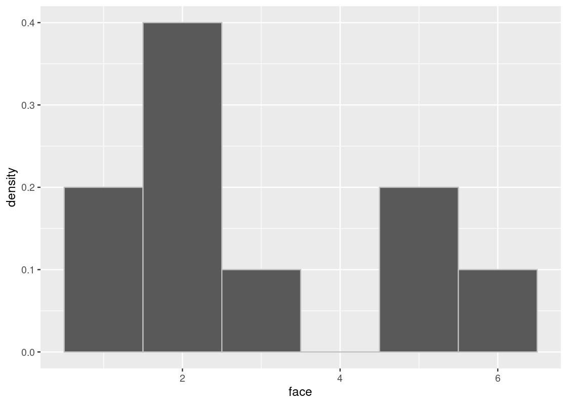
When we increase the sample size, we see that the distribution gets closer to the true distribution.
sample_hist(100)
sample_hist(1000)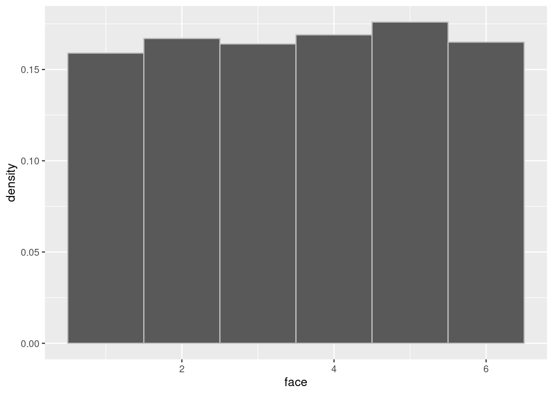
The phenomenon we have observed - the sampling distribution growing closer and closer to the true distribution as the sample size is increased - is an important concept in data science. In fact, it is so important that it has a special name: we call it the Law of Averages.
A critical requirement for the Law of Averages to be applicable is that the samples come from the same underlying distribution and do not depend on the drawing of other samples, e.g. the rolling of a 2 does not make the rolling of a 6 more likely on the next roll. This idea is sometimes called sampling “independently and under identical conditions”, where the resulting distribution is “independently and identically distributed”.
5.2.3 Pop quiz: why sample with replacement?
The careful reader may have noticed that in the calls to slice_sample in this section, the replace argument has been set to TRUE, i.e. the sampling is done with replacement. Why not sample without?
You may have already guessed at an answer: if we sample without replacement, we would not be able to make more than 6 draws since we would have run out of faces on the die to choose from! Here is what happens when trying to sample 6 times without replacement.
die |>
  slice_sample(n = 6, replace = FALSE)
## # A tibble: 6 × 1
## face
## <int>
## 1 6
## 2 5
## 3 2
## 4 3
## 5 4
## 6 1We simply get back the 6-sided die! So sampling with replacement is a requirement for the dice roll example. But, there is another problem when sampling without replacement. Let’s look at the true distribution again.
ggplot(die) +
  geom_histogram(aes(x = face, y =  after_stat(density)), bins = 6,
                 color = "gray")
When we sample without replacement, we are effectively removing the possibility of that event happening from future draws. Put another way, this would be the same as somehow erasing or “deleting” a face from the die before drawing again. For instance, let’s check the true distribution after rolling a 2.
selected_face <- 2  # assume a 2 was rolled
slice(die, -selected_face) |>
  ggplot() +
  geom_histogram(aes(x = face, y =  after_stat(density)), bins = 6,
                 color = "gray")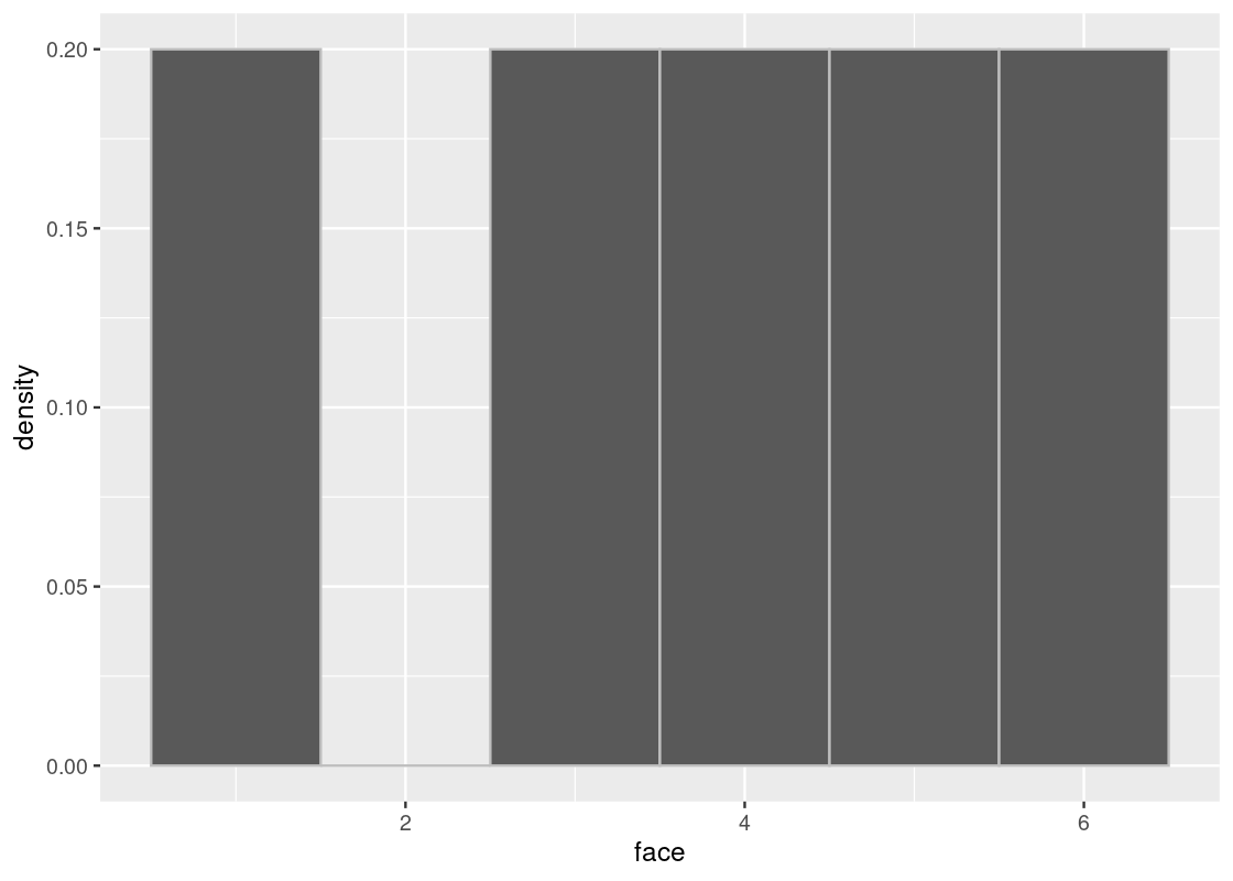
If we were to sample again from this die, the probability of rolling any of the faces is no longer the same as when we rolled the 2. For one thing, the probability of rolling the faces \(1, 3, 4, 5, 6\) has increased to 20% (or \(1/5\)) and it is impossible to roll a 2. The underlying distribution has fundamentally changed, confirmed by the above ggplot.
Recall that a prerequisite for the Law of Averages to work is that the drawing of samples must be done “independently and under identical conditions”. Sampling without replacement is a clear violation of this assumption. And yet, the story does not end there. In our example, there were only 6 individuals to choose from – the faces of a 6-sided die. If we were to increase the number of individuals that we could sample from, say the entire U.S. population, then the effect observed here actually becomes negligible. Sampling without replacement remains an important method for sampling, especially in drug studies with treatment/control groups where it is physically not possible to sample with replacement. Cloning people remains the imagination of science fiction, at least for now. Therefore, our hope is that both sampling plans will generate similar results in practice.
5.3 Populations
The Law of Averages can be useful when the population from which to draw samples is very large.
As an example, we will study a population of flight delay times. The tibble flights contains all 336,776 flights that departed from New York City in 2013. It is drawn from the Bureau of Transportation Statistics in the United States. The help page ?flights contains more documentation about the dataset.
5.3.1 Prerequisites
We will continue to make use of the tidyverse in this section. Moreover, we will load the nycflights13 package, which has the flights table we will be using.
There are 336,776 rows in flights, each corresponding to a flight. Note that some delay times are negative; those flights left early.
flights## # A tibble: 336,776 × 19
## year month day dep_time sched_de…¹ dep_d…² arr_t…³ sched…⁴ arr_d…⁵ carrier
## <int> <int> <int> <int> <int> <dbl> <int> <int> <dbl> <chr>
## 1 2013 1 1 517 515 2 830 819 11 UA
## 2 2013 1 1 533 529 4 850 830 20 UA
## 3 2013 1 1 542 540 2 923 850 33 AA
## 4 2013 1 1 544 545 -1 1004 1022 -18 B6
## 5 2013 1 1 554 600 -6 812 837 -25 DL
## 6 2013 1 1 554 558 -4 740 728 12 UA
## 7 2013 1 1 555 600 -5 913 854 19 B6
## 8 2013 1 1 557 600 -3 709 723 -14 EV
## 9 2013 1 1 557 600 -3 838 846 -8 B6
## 10 2013 1 1 558 600 -2 753 745 8 AA
## # … with 336,766 more rows, 9 more variables: flight <int>, tailnum <chr>,
## # origin <chr>, dest <chr>, air_time <dbl>, distance <dbl>, hour <dbl>,
## # minute <dbl>, time_hour <dttm>, and abbreviated variable names
## # ¹sched_dep_time, ²dep_delay, ³arr_time, ⁴sched_arr_time, ⁵arr_delayOne flight departed 43 minutes early, and one was 1301 minutes late.
slice_min(flights, dep_delay)## # A tibble: 1 × 19
## year month day dep_time sched_dep…¹ dep_d…² arr_t…³ sched…⁴ arr_d…⁵ carrier
## <int> <int> <int> <int> <int> <dbl> <int> <int> <dbl> <chr>
## 1 2013 12 7 2040 2123 -43 40 2352 48 B6
## # … with 9 more variables: flight <int>, tailnum <chr>, origin <chr>,
## # dest <chr>, air_time <dbl>, distance <dbl>, hour <dbl>, minute <dbl>,
## # time_hour <dttm>, and abbreviated variable names ¹sched_dep_time,
## # ²dep_delay, ³arr_time, ⁴sched_arr_time, ⁵arr_delay
slice_max(flights, dep_delay)## # A tibble: 1 × 19
## year month day dep_time sched_dep…¹ dep_d…² arr_t…³ sched…⁴ arr_d…⁵ carrier
## <int> <int> <int> <int> <int> <dbl> <int> <int> <dbl> <chr>
## 1 2013 1 9 641 900 1301 1242 1530 1272 HA
## # … with 9 more variables: flight <int>, tailnum <chr>, origin <chr>,
## # dest <chr>, air_time <dbl>, distance <dbl>, hour <dbl>, minute <dbl>,
## # time_hour <dttm>, and abbreviated variable names ¹sched_dep_time,
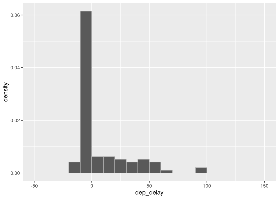
## # ²dep_delay, ³arr_time, ⁴sched_arr_time, ⁵arr_delayIf we visualize the distribution of delay times using a histogram, we can see that they lie almost entirely between -10 minutes and 200 minutes.
ggplot(flights, aes(x = dep_delay, y = after_stat(density))) +
  geom_histogram(col="grey", breaks = seq(-50, 200, 1))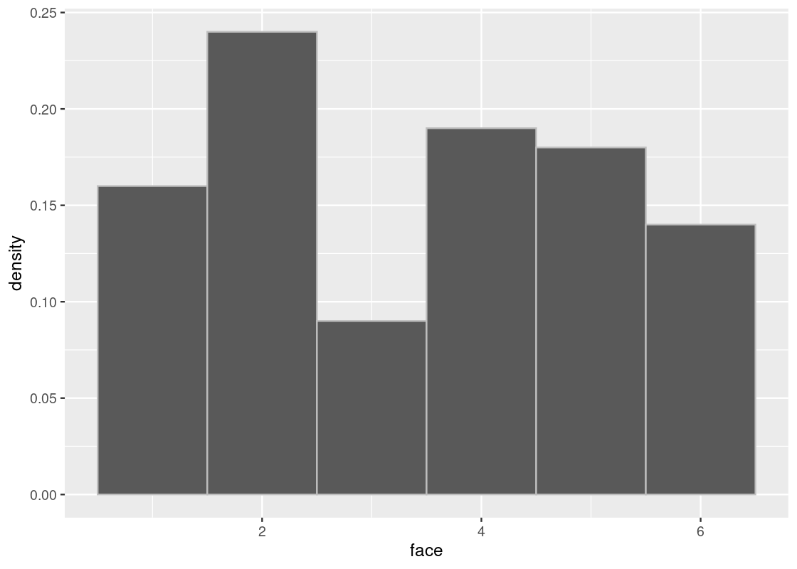
We are interested in the bulk of the data here, so we can ignore the 1.83% of flights with delays of more than 150 minutes.
We will only use the core part of the data excluding the 1.83% using the filter method as we show below.
Note that the table flight still has all the data.
## [1] 0.0183386
delay_bins <- seq(-50, 150, 1)
ggplot(flights, aes(x = dep_delay, y = after_stat(density))) +
  geom_histogram(col="grey", breaks = delay_bins)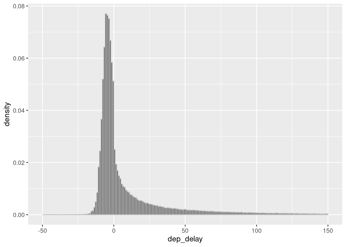
We group together delay values in size 10 intervals, so we can see better.
delay_bins <- seq(-50, 150, 10)
ggplot(flights, aes(x = dep_delay, y = after_stat(density))) +
  geom_histogram(col="grey", breaks = delay_bins)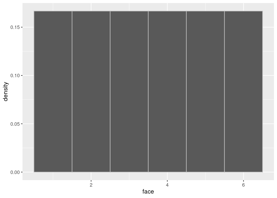
The tallest bar in the histogram is the \((-10, 0]\) bar is just below 0.06, which is equal to 6%. There are ten values of delay minutes in the bin, we multiply the below-0.06% by 10 to assess that the delays in the interval occupy slightly below 60%. We can confirm the visual assessment by counting rows:
## [1] 0.55710625.3.2 Sampling distribution of departure delays
Let us now think of the 336,776 flights as a population, and draw random samples from it with replacement. As we may try using various values for the number of samples, let us define a function for sampling and plotting.
The function sample_hist takes the sample size as its argument, which we call n, and draws a histogram of the results.
sample_hist <- function(n) {
  flights_sample <- slice_sample(flights, n = n, replace = TRUE)
  ggplot(flights_sample, aes(x = dep_delay, y = after_stat(density))) +
    geom_histogram(breaks = delay_bins, color = "gray")
}
As we saw in the simulation for throwing a die, the more samples we have, the closer the histogram of the sample approximates the histogram of the population.
Let us compare two sample sizes 10 and 100.
sample_hist(10)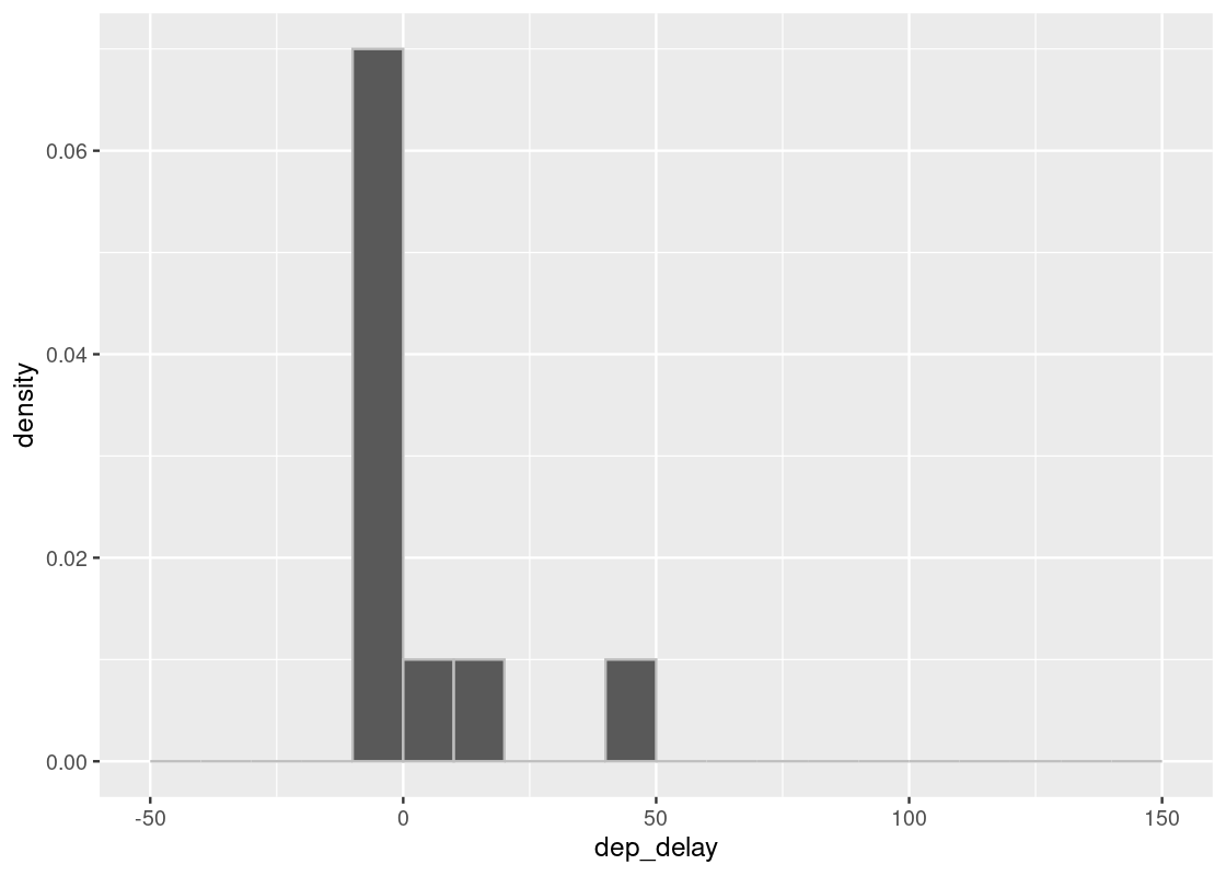
sample_hist(100)
We may notice various differences between the two plots. The plots may vary each time we execute the code. Of all the differences that emerge when we execute the two codes and compare the plots, the most notable are the number of bars and how far the bars reach to the right without a gap. We notice that in the case of 100 samples, there are always bars far to the right and there almost is also some presence in each bar between the tallest bar and the farthest one.
Here is a plot with 1000 samples. We see the plot is much closer to the one with the entire flight data.
sample_hist(1000)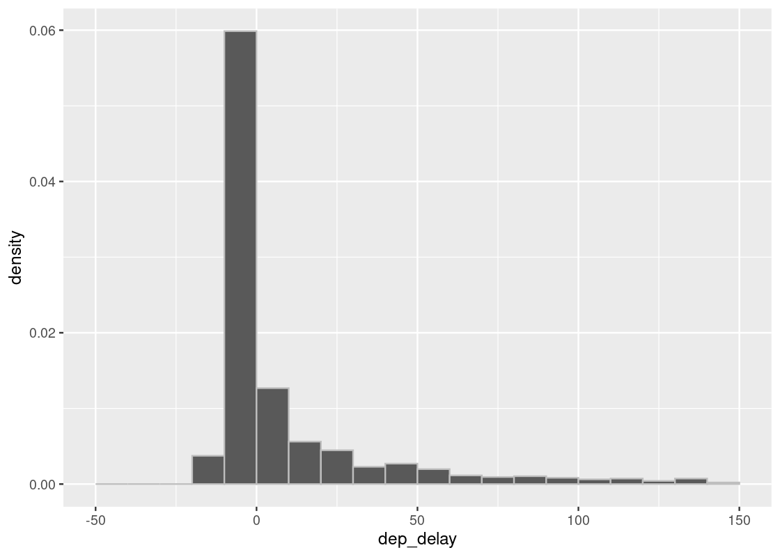
5.3.3 Summary: Histogram of the sample
From the experiments we have conducted with 10, 100, and 1000 samples, we have observed that:
- The larger the sample gets, the closer the sampling distribution becomes to the true distribution, which we obtain from the true population.
- At some large size, with high probability, the approximation of the true distribution we produce through sampling becomes almost indistinguishable from the true one.
Because of the two properties, we can use random sampling in statistical inference. The indistinguishable nature of sampling distributions is quite powerful. When the population is large, we can turn to sampling to generate a sample data set of a reasonably large size, which saves computation time.
5.4 The Mean and Median
There are quantitative evaluations that we commonly use in statistical analysis. For instance, in a population of flights that departed New York City (NYC) in 2013, the median departure delay can tell us something about the central tendency of the data – are most departure flights delayed, on time, or are they ahead of schedule? Similarly, in baseball, the ability of a player to produce a hit is measured by the player’s average (or mean) hit rate; the hitting rate is the number of hits divided by the number of times the player stood in the batter box.
The criteria median and mean are useful for understanding properties of a population. When we calculate a quantity from a population, we call such quantities parameters of the population. Thus, the median and mean are two useful parameters we wish to estimate somehow. We will see how to in the next section, but for now we will study some properties of the mean and median to develop an appreciation for its usefulness.
First some vocabulary:
- The mean or average (we will use both interchangeably) of a vector of numbers is the sum of the elements divded by the number of elements in the vector.
- The median is the value at the middle position in the data after reordering the values. It is also called an order statistic, which we will learn about later.
5.4.1 Prerequisites
We will make use of the tidyverse in this chapter, so let’s load it in as usual.
5.4.2 Properties of the mean
The function mean returns the mean of a vector.
## [1] 6.6We can note some properties of the mean based on this example.
The mean is not necessarily an element in the vector.
The mean must be between the smallest and largest values in the vector and it need not be exactly in the middle between these two extremes.
If the vector is measured in some unit (e.g. \(ft^2\)), the mean carries the same unit.
The mean is a “smoother”. For instance, imagine that the numbers in the vector above are dollar amounts owned by five friends. They pool the money together and deal out the money in even amounts among the friends. The amount each person will have is given in the above output: $6.6.
-
Proportions are means. If a vector consists of only 1s and 0s, the sum of the vector is the number of 1s in it, and the mean is the proportion of 1s in the vector. Following is an example:
## [1] 2mean(ones_and_zeros)## [1] 0.5Thus, the mean tells us that 50% of the values in
ones_and_zerosare 1s.
5.4.3 The mean: a measure of central tendency
Let us visualize the distribution of some_numbers using a histogram.
tibble(some_numbers) |>
  ggplot() +
  geom_histogram(aes(x = some_numbers, y = after_stat(density)),
                 color = "gray", fill = "darkcyan", binwidth = 1)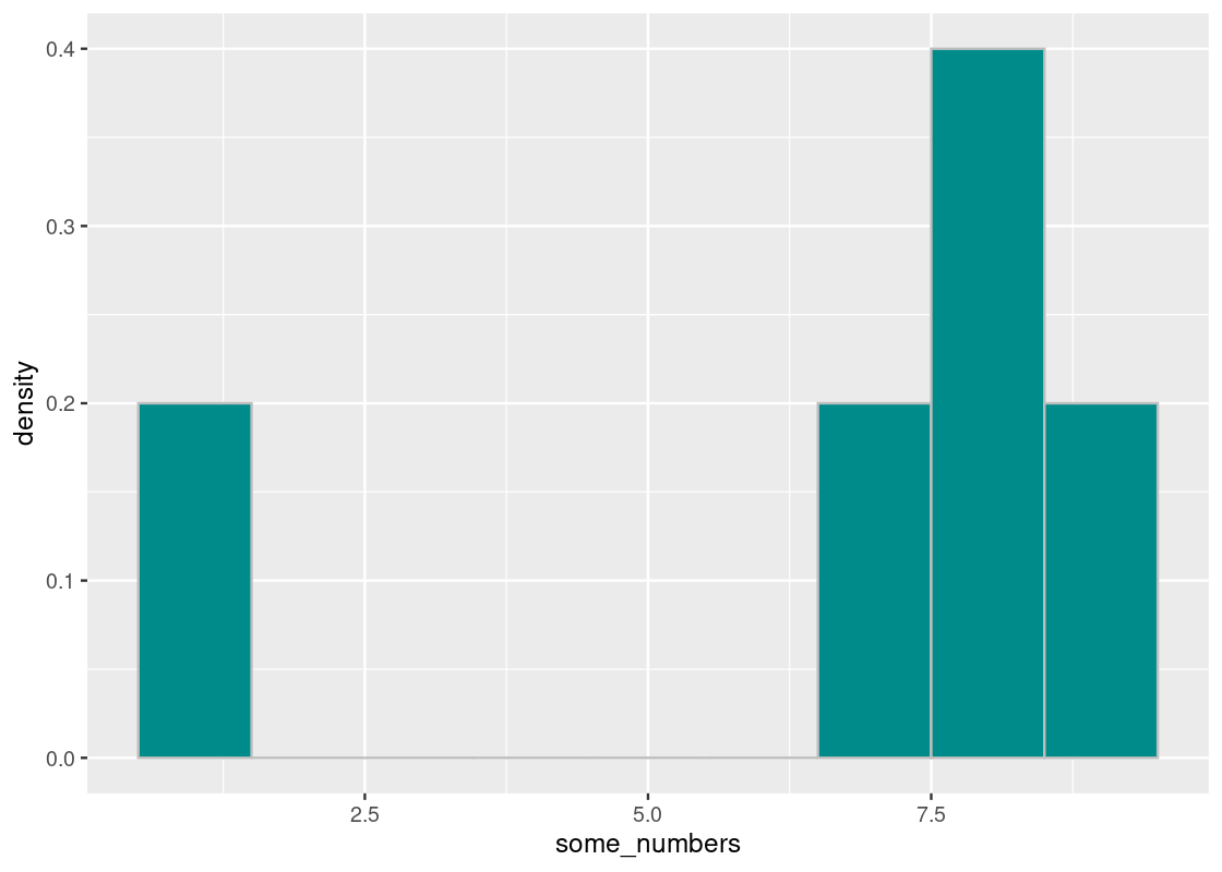
If we imagine the base of a histogram as a seesaw, then the mean is the pivot by which the seesaw is supported by. We can denote this point visually using a triangle.

The pivot is the point at which this “seesaw” is balanced. If we nudge the point in any direction, say toward 7.5, the seesaw tips over to the right; if it is closer to 5, the seesaw tips to the left. That pivot is the mean. Thus,
The mean is the “pivot” or “balancing point” of the histogram.
5.4.4 Symmetric distributions
Here is another vector called symmetric.
symmetric <- c(8, 8, 8, 7, 9)Let us visualize this distribution. We note that it is symmetric around 3.
The mean and the median will both equal to 8.
mean(symmetric)## [1] 8
median(symmetric)## [1] 8Thus, our next property:
For symmetric distributions, in general, the mean and the median will equal.
What if the distribution was not symmetric? We already have an example of one in the numbers contained by not_symmetric. Let us overlay both on the same histogram.
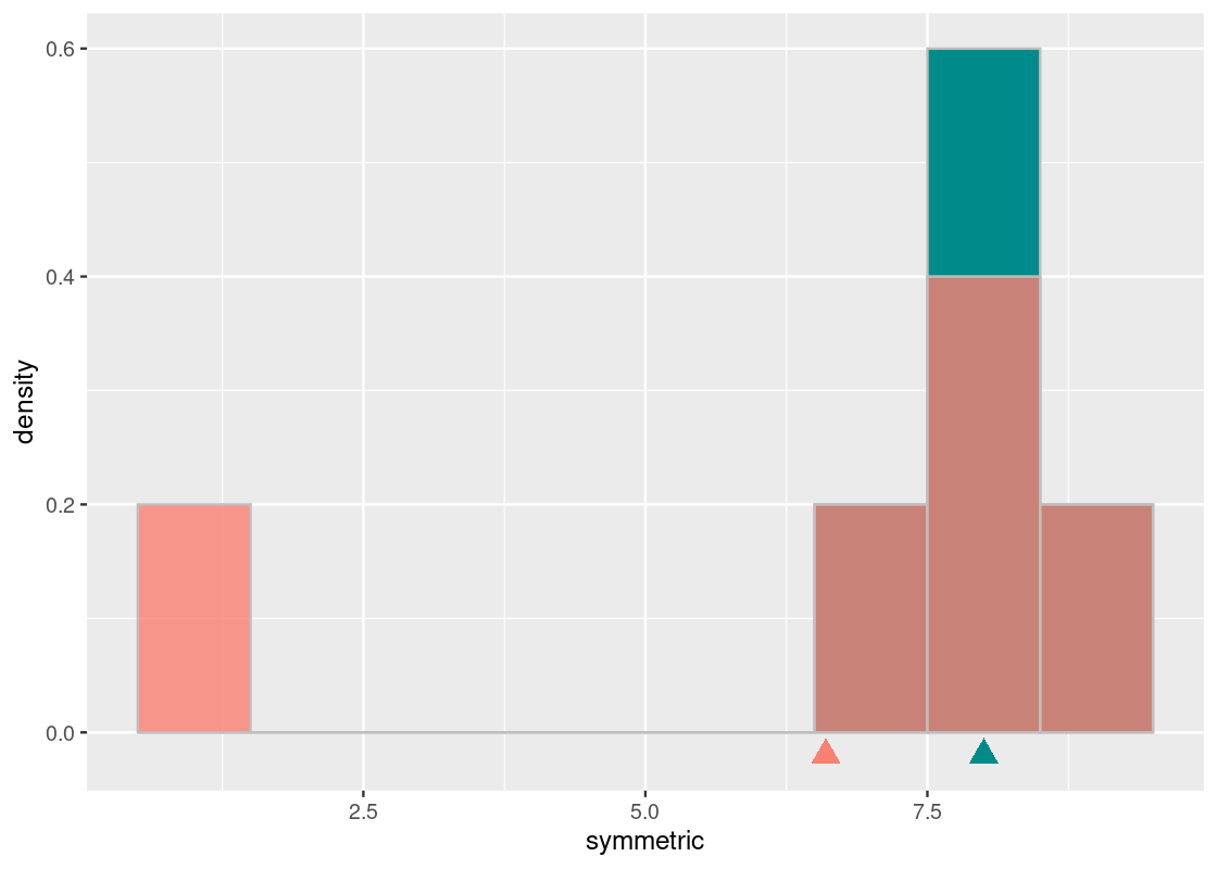
The cyan histogram shows the distribution represented by symmetric and the orange the distribution represented by some_numbers. If we again imagine the x-axis as a seesaw, we see that the cyan distribution balances around the pivot at 8. Both the mean and median of the cyan distribution is equal to 8.
The orange histogram of some_numbers starts out the same as the cyan at the right end but its left bar is at the value 1; the darker shading shows where the two histograms overlap. The median of the orange distribution is also 8. However, in order to keep this distribution “balanced” on the seesaw, we need to scoot the pivot to the left, to 6.6. That is the mean of the orange histogram.
median(some_numbers)## [1] 8
mean(some_numbers)## [1] 6.65.4.5 The mean of two identical distributions are identical
We end this section with one more important property about means. We said earlier that the mean of a vector is just the sum of its elements divided by the number of elements. However, observe that we could have calculated it in different ways:
\[\begin{align*} \mbox{mean} &=~ \frac{8 + 1 + 8 + 7 + 9}{5} \\ \\ &=~ 8 \cdot \frac{1}{5} ~~ + 8 \cdot \frac{1}{5} ~~ + ~~ 1 \cdot \frac{1}{5} ~~ + ~~ 7 \cdot \frac{1}{5} ~~ + ~~ 9 \cdot \frac{1}{5} \\ \\ &=~ 8 \cdot \frac{2}{5} ~~ + ~~ 1 \cdot \frac{1}{5} ~~ + ~~ 7 \cdot \frac{1}{5} ~~ + ~~ 9 \cdot \frac{1}{5} \\ \\ \end{align*}\]
This rewriting reveals an important point: each unique value in the vector is weighted by the proportion of times it appears. For instance, we see that 8 has much more weight than either 1 or 7 because it appears more often in the vector.
Let us consider another example.
## [1] 6.6This vector has the same mean as some_numbers. What is the point here? The mean of a vector depends only on the distinct values and their proportions, not on the number of elements in the vector. Put differently, the mean depends only on the distribution of values.
Thus, our final property:
If two vectors have the same distribution, their means will equal.
5.5 Simulating a Statistic
In many situations we do not know the value of a parameter of a population. Yet, it turns out that random sampling is a reliable tool we can use to find a good estimate of a parameter. Since large-scale sampling produces a sampling distribution that approximates the true distribution, we hope that the value we compute from it will also be close enough to the parameter we could obtain from the population directly when the sample size is large enough.
Before jumping into the tidyverse, first some vocabulary:
- A parameter is some useful quantitative evaluation criteria about a population. For instance, a parameter is the mean height of all individuals in the United States. This is typically unknown to us.
- A statistic is a value obtained from an sampling distribution (which we can generate). The purpose of a statistic is to estimate a parameter. When we compute the mean or median from an sampling distribution, we call these statistics the sample mean and median, respectively.
5.5.1 Prerequisites
We continue to make use of the tidyverse in this section. We will first look at a toy example to demonstrate different properties of a statistic and then simulate a statistic in practice using flights data from nycflights13.
5.5.2 The variability of statistics
One thing we need to keep in mind is that the sampling distribution can look quite different between runs. Recall the histogram of departure delays in flights.
delay_bins <- seq(-50, 150, 10)
ggplot(flights, aes(x = dep_delay, y = after_stat(density))) +
  geom_histogram(col="grey", breaks = delay_bins)
Here is a sampling histogram of the delays in a random sample of 1,000 such flights.
sample_1000 <- slice_sample(flights, n = 1000, replace = TRUE)
ggplot(sample_1000, aes(x = dep_delay, y = after_stat(density))) +
  geom_histogram(col="grey", breaks = delay_bins)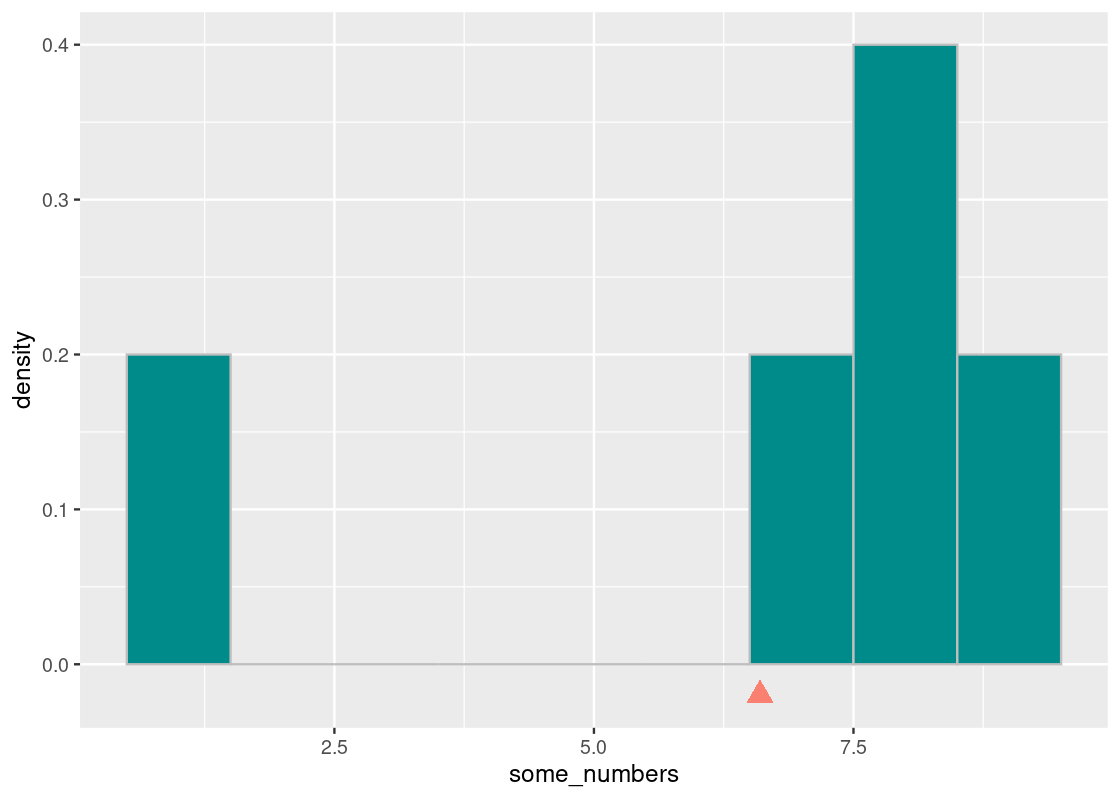
Since we are assuming that the population of all departed NYC flights in 2013 is available to us in flights, we can compute directly the value of the parameter “median flight delay.” This is a rare luxury not usually possible using real data.
We can check the value we obtain through sampling against the value we obtain from the entire population.
## [1] -2Note the argument na.rm (read as “NaN remove”) used in this function call. An interesting property of the flights dataset is that it has missing values, e.g., not all rows have a value in the dep_delay column. We toggle a flag na.rm so that R knows to drop these rows before computing the median.
The function median returns the half-way point of a column or vector after reordering the values (the even median when the number of data is even). For flights, the returned value means that the median delay was -2 minutes so about 50% of the flights in the population had early departures of 2 minutes or more.
## [1] 0.4892332Now let’s compute the sample median from the sampling distribution in sample_1000.
## [1] -1Let us check what happens if we tried another random sample of 1,000 flights.
slice_sample(flights, n = 1000, replace = TRUE) |>
  pull(dep_delay) |>
  median(na.rm = TRUE)
## [1] -2You can run the code a few times to see that the value that appears as the result is not consistent, but always either -1 or -2. While the two values are close, you cannot assert that the median is -1 or -2.
Is there any way out of this? Can we say anything about how likely the median is -1 and how likely the median is -2? We thus turn to simulation. We compute the sample median statistic many times using sampling and then see a histogram of the numbers we obtain.
5.5.3 Simulating a statistic
Before getting down to the business of estimating the median distribution, let us set up the steps for obtaining a distribution of a statistic.
Step 1: Select the statistic to estimate. Two questions are at hand. What statistic do we want to estimate? How many samples do we use in each estimate?
Step 2: Write the code for estimation. We need to write the code for sampling and then computing a statistic from the sample. Typically we encapsulate such steps in a function that we can use in a call to the function replicate.
Step 3: Generate estimations and visualize. A question at hand is how many times do we repeat the experiment? We may not have an answer to the question. We will write the code for repeating experiments, collecting the results in a vector whose length is equal to the number of repetitions, and then generating a visualization of the results we have collected in the vector. The code we write may be a function that takes the number of repetitions as an argument.
5.5.4 Guessing a “lucky” number
Before continuing on with the flights data, let us first see an example of simulating a statistic using a toy problem.
Your friend invites you to a game of rolling die. He rolls a special 30-sided die (sometimes called a “D30” die) 10 times and, after each roll, adds some “lucky” number of his choosing. He does not say what his lucky number is or show you the dice rolls before he adds the number to the roll.
Let us suppose his lucky number is 6. We can use sample to simulate the total rolls we get to see. This is what one set of total rolls might look like after the game is over:
lucky_number <- 6
d30_dice <- 1:30
sample(d30_dice, size = 10, replace=TRUE) + lucky_number
## [1] 11 32 18 13 10 32 14 17 14 26Can you figure out your friend’s lucky number knowing only these total rolls?
5.5.5 Step 1: Select the statistic to estimate
Let us play with two different statistics:
- From the total rolls shown to you, use the smallest one as your guess. Since the minimum value on a 30-sided die is 1, a good estimate is the smallest roll minus 1. Let us call this the min-based estimator.
- From the total rolls shown to you, leverage the mean of the rolls as your guess. Let us call this the mean-based estimator.
We simulate 10 rolls of a 30-sided die and add the lucky number to each roll. The following function one_game simulates the action.
one_game <- function(lucky_number) {
  sample(1:30, size = 10, replace=TRUE) + lucky_number
}
one_game(6)
## [1] 16 29 14 22 14 14 11 8 35 18We can call one_game to generate a sample and then compute a statistic from it. This is a process we can repeat a large number of times to simulate a large number of sample statistics.
5.5.6 Step 2: Write code for estimation
The following function min_based implements the min-based estimator. As noted earlier, we use the smallest total roll as our estimate and subtract 1.
min_based <- function(sample) {
  min(sample) - 1
}
A mean-based estimate uses the mean total roll instead. This will look similar to our min-based estimator. However, to guess the lucky number from the mean-based estimate, we need to account for the average, or expected, value of a fair 30-sided dice. This can be computed using probability theory, but simulation is often easier!
Let us simulate a 30-sided die over a big run, say, 10,000 rolls.
sample_rolls <- sample(d30_dice, size = 10000, replace = TRUE)We then take the mean of these rolls.
d30_expected_value <- mean(sample_rolls)
d30_expected_value
## [1] 15.5154This value we just computed has a special name: the expected value. Statisticians give it this name because it is the number that we can expect to get in the long run, say, after doing an arbitrarily large number of trials. For a 30-sided die, probability theory dictates this should be 15.5. Our answer in d30_expected_value comes pretty close!
We are now ready to implement the mean-based estimator.
mean_based <- function(sample) {
  mean(sample) - d30_expected_value
}
The following function receives as an argument a functional estimator, which can be either the min-based or mean-based estimator. The function simulates one game, computes a statistic using the estimator function passed in, and returns the calculated value.
simulate_one_stat <- function(estimator) {
  one_game(lucky_number = 6) |>
    estimator()
}
Here is an example call using the min-based estimator. Run the cell a few times and observe the variability in the result. Does it guess correctly the lucky number?
simulate_one_stat(min_based) # an example call ## [1] 75.5.7 Step 3: Generate estimations and visualize
We issue 10,000 repetitions of the simulation. Here is the replicate call that makes use of the function simulate_one_stat. This is done twice, once for the mean-based estimator and again for the min-based estimator.
reps <- 10000

mean_estimates <- replicate(n = reps, simulate_one_stat(mean_based))
min_estimates <- replicate(n = reps, simulate_one_stat(min_based))
We collect the results together into a tibble estimate_tibble. Note that a pivot transformation is applied here so that one row corresponds to exactly one simulated statistic.
estimate_tibble <- tibble(mean_est = mean_estimates,
                      min_est = min_estimates) %>%
  pivot_longer(c(mean_est, min_est),
               names_to = "estimator", values_to = "estimate")
estimate_tibble
## # A tibble: 20,000 × 2
## estimator estimate
## <chr> <dbl>
## 1 mean_est 6.28
## 2 min_est 6
## 3 mean_est 5.98
## 4 min_est 7
## 5 mean_est 4.08
## 6 min_est 8
## 7 mean_est 0.985
## 8 min_est 9
## 9 mean_est 3.38
## 10 min_est 7
## # … with 19,990 more rowsWe can visualize the sampling distribution of the two estimators using an overlaid histogram. We also plot the “balancing point” for each of these distributions (shown using a triangle) by computing the mean of the corresponding simulated statistics.
bins <- seq(0, 22, 1)

dist_mean_tib <- tibble(
  estimator = c("min_est", "mean_est"),
  mean = c(min_estimates |> mean(),
           mean_estimates |> mean()))

ggplot(estimate_tibble) +
  geom_histogram(aes(x = estimate, y = after_stat(density),
                     fill = estimator),
                 position = "identity", alpha = 0.5,
                 color = "gray", breaks = bins) +
  geom_point(data = dist_mean_tib,
             aes(x = mean, y = 0, color = estimator),
             shape = "triangle", size = 3) +
  scale_x_continuous(breaks = bins)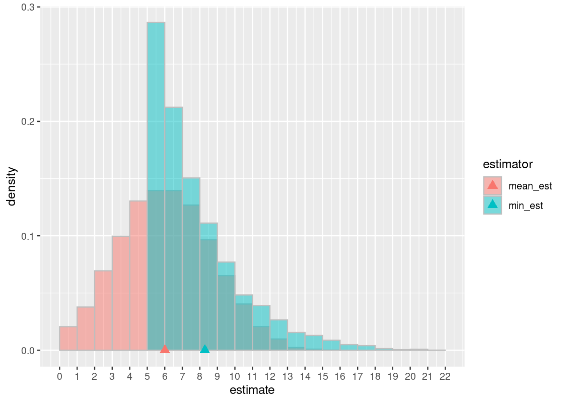
Let us examine the min-based estimator. First, observe that its balancing point (in cyan) is a number larger than the lucky number 6. Because this number is larger than the true value (the lucky number 6), we conclude that the min-based estimator overestimates and is, therefore, biased. This should not be surprising considering that, by design, this estimator can only predict a number equal to the lucky number or greater. This is the “bottoming out” effect that we observe in the \((5, 6]\) bin.
In contrast, the mean-based estimator appears to overestimate about as often as it underestimates. This gives rise to a familiar “bell-shaped” curve. We can see the effect of this is a balancing point that is about equal to the true value. Therefore, we can say that the estimator is unbiased.
The downside of the mean-based estimator is that it trades off bias for more variability. This turns out to be one of the advantages of the min-based estimator: high bias but low variability. This raises an important trade-off between variance and bias when working with statistics.
Which estimator would you choose for this problem? Are there other situations where you might prefer one more than the other, given the bias-variance trade-off?
5.5.8 Median flight delay in flights
Let us now return to estimating the median flight delay in the flights data frame. Recall that, following our assumptions, we know the value of the parameter the statistic is trying to estimate. It is the value \(-2\).
5.5.9 Step 1: Select the statistic to estimate
We will draw random samples of size 1,000 from the population of flights and simulate the median.
5.5.10 Step 2: Write code for estimation
We know how to generate a random sample of 1,000 flights.
sampled <- flights |>
  slice_sample(n = 1000, replace = TRUE)
We also know how to compute the median of this sample.
## [1] -2Let’s wrap this up into a function we can use in a replicate call.
one_sample_median <- function() {
  sample_median <- flights |>
    slice_sample(n = 1000, replace = TRUE) |>
    pull(dep_delay) |>
    median(na.rm = TRUE)
  return(sample_median)
}
5.5.11 Step 3: Generate estimations and visualize
We will issue 5,000 repetitions of our simulation.
Here is the call to replicate that makes use of the function one_sample_median.
Note that this simulation takes a bit more time to run: we are repeating an experiment where we draw 1,000 random samples a total of 5,000 times!
num_repetitions <- 5000
medians <- replicate(n = num_repetitions, one_sample_median())
Here are what some of the sample medians look like.
medians_df <- tibble(medians)
medians_df
## # A tibble: 5,000 × 1
## medians
## <dbl>
## 1 -2
## 2 -1
## 3 -2
## 4 -1
## 5 -2
## 6 -2
## 7 -2
## 8 -2
## 9 -2
## 10 -1
## # … with 4,990 more rowsOf course, it would be much better to visualize these results using a histogram. This histogram displays the sampling distribution of the statistic. As before, let us also annotate this histogram with the balancing point of the distribution.
ggplot(medians_df) +
  geom_histogram(aes(x = medians, y = after_stat(density)),
                 color = "gray", fill = "darkcyan", bins = 3) +
  geom_point(aes(x = mean(medians), y = 0),
             shape = "triangle",
             color = "salmon", size = 3)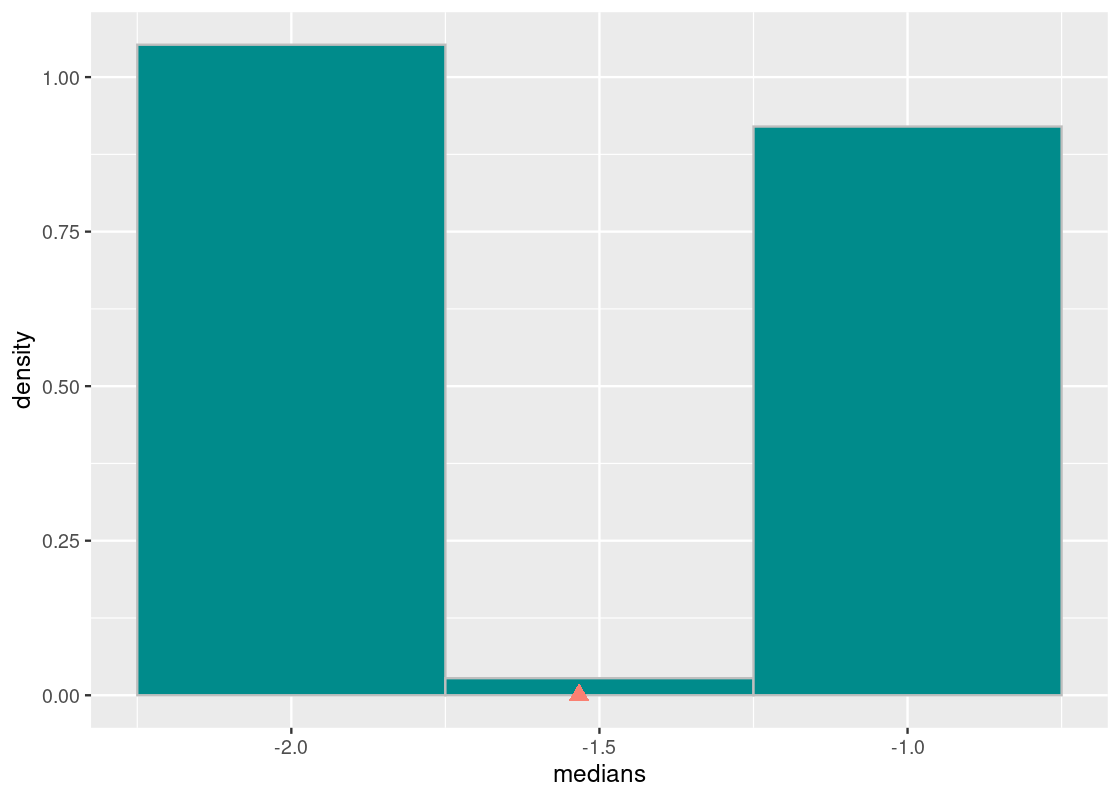
The sample median is very likely to be about -2, which is exactly the value of the population median. This is because the sampling distribution of 1,000 flight departure delays is close to what we know about the true distribution. We can guess that in running the experiment, each sampling distribution with 1,000 flights would have looked like the true one.
We can also observe that the balancing point of this distribution is pulled to the right of the true value. This is likely due to the original distribution having a long right-tail. Hence, we can say that the median statistic is biased. However, the bias in this case does not bear much practically as the simulated statistics are so close to the population parameter. This may be a case where we say that the result is “good enough.”
The interested reader can extend the analysis to try a mean-based estimate for this example instead of the median-based used here. Would this estimator also be biased? How about its variability?
5.6 Convenience Sampling
The story goes that we can derive meaningful conclusions about a population using sampling distributions. Such distributions are formed by the application of random sampling. The one we have used so far has been drawing random samples with (or without) replacement. We refer to such a scheme as simple random sampling. However, simple random sampling is not the only way to generate a sampling distribution. We briefly discussed another method at the start of this chapter: convenience sampling. In this section, we examine convenience sampling in greater detail and discuss its suitability for statistical analysis.
5.6.1 Prerequisites
We will continue to make use of the tidyverse in this section. Our example in this section will be data about New York City flight delays in 2013 from the package nycflights13, which we have worked with before. We will also look at a sample of flights made available in the edsdata package. Let’s load these packages.
Recall that the median flight delay in the true distribution of flights is \(-2\).
## [1] -25.6.2 Systematic selection
Recall that systematic selection is a kind of convenience sample. In systematic selection, we pick some random pivot (say, the 4th row), and then select every \(i\)-th row after that. This method of sampling is quite popular because of its sheer simplicity. For example, if we wanted to sample a student population at a university, we could select all students based on the digits in their university-issued ID number, e.g., selecting all students who have an odd number in the second-to-last position of their ID.
We can explore this sampling strategy using the flights tibble. We will select a random row in the tibble as the pivot, and then select every 100th row after that (recall that the dataset is quite large, with ~330K rows!).
## [1] 260042Does the generated distribution mirror what we know about the true distribution?
selected_rows <- seq(start, nrow(flights), 100)

slice(flights, selected_rows) |>
  ggplot(aes(x = dep_delay, y = after_stat(density))) +
  geom_histogram(fill = "darkcyan", color = "gray",
                 breaks = seq(-50, 150, 10)) +
  ggtitle(str_c("starting row = ", start))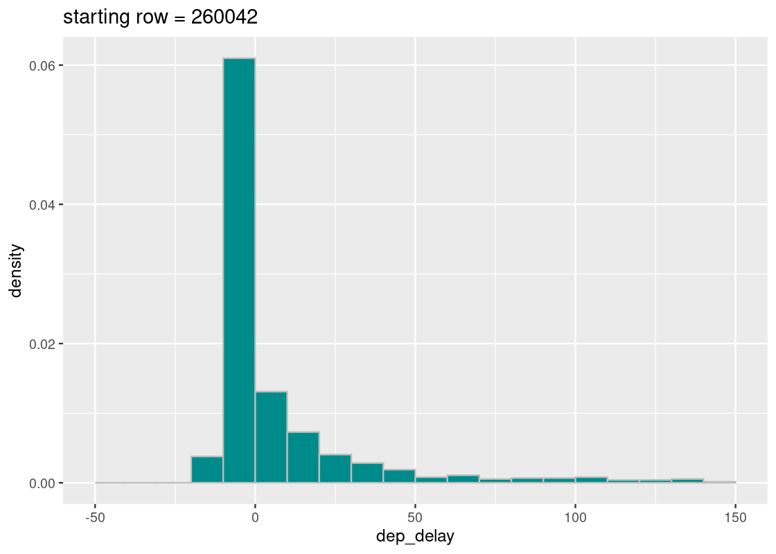
Looks good! The sampling distribution still looks a whole lot like the true distribution of flight delays. However, the number of samples that appear in the tail varies greatly across runs – why might that be? Run the cell a few times and observe the effect of the selected start variable on the resulting distribution.
From our initial exploration, it looks like systematic sampling is a good bet. Any statistics we compute using this sampling strategy is likely to provide a good estimate of the population parameter in question.
Now suppose that we reorganized the flights data a bit into a tibble called mystery_flights.
mystery_flights <- mystery_flights |>
  relocate(ID, .before = year)
mystery_flights
## # A tibble: 336,776 × 20
## ID year month day dep_time sched_dep_…¹ dep_d…² arr_t…³ sched…⁴ arr_d…⁵
## <int> <int> <int> <int> <int> <int> <dbl> <int> <int> <dbl>
## 1 1 2013 1 1 517 515 2 830 819 11
## 2 2 2013 1 1 533 529 -6 850 830 20
## 3 3 2013 1 1 542 540 2 923 850 33
## 4 4 2013 1 1 544 545 -4 1004 1022 -18
## 5 5 2013 1 1 554 600 -6 812 837 -25
## 6 6 2013 1 1 554 558 -3 740 728 12
## 7 7 2013 1 1 555 600 -5 913 854 19
## 8 8 2013 1 1 557 600 -6 709 723 -14
## 9 9 2013 1 1 557 600 -3 838 846 -8
## 10 10 2013 1 1 558 600 -2 753 745 8
## # … with 336,766 more rows, 10 more variables: carrier <chr>, flight <int>,
## # tailnum <chr>, origin <chr>, dest <chr>, air_time <dbl>, distance <dbl>,
## # hour <dbl>, minute <dbl>, time_hour <dttm>, and abbreviated variable names
## # ¹sched_dep_time, ²dep_delay, ³arr_time, ⁴sched_arr_time, ⁵arr_delayNotice anything problematic? Don’t worry if you can’t spot it; the problem doesn’t jump at first glance. Let’s keep with our sampling scheme, but with one key modification. We will assert that the randomly generated start is 2.
start <- 2We can now perform the same systematic selection as before.
selected_rows <- seq(start, nrow(mystery_flights), 100)

slice(mystery_flights, selected_rows) |>
  ggplot(aes(x = dep_delay, y = after_stat(density))) +
  geom_histogram(fill = "darkcyan", color = "gray",
                 breaks = seq(-50, 150, 10)) +
  ggtitle(str_c("starting row = ", start))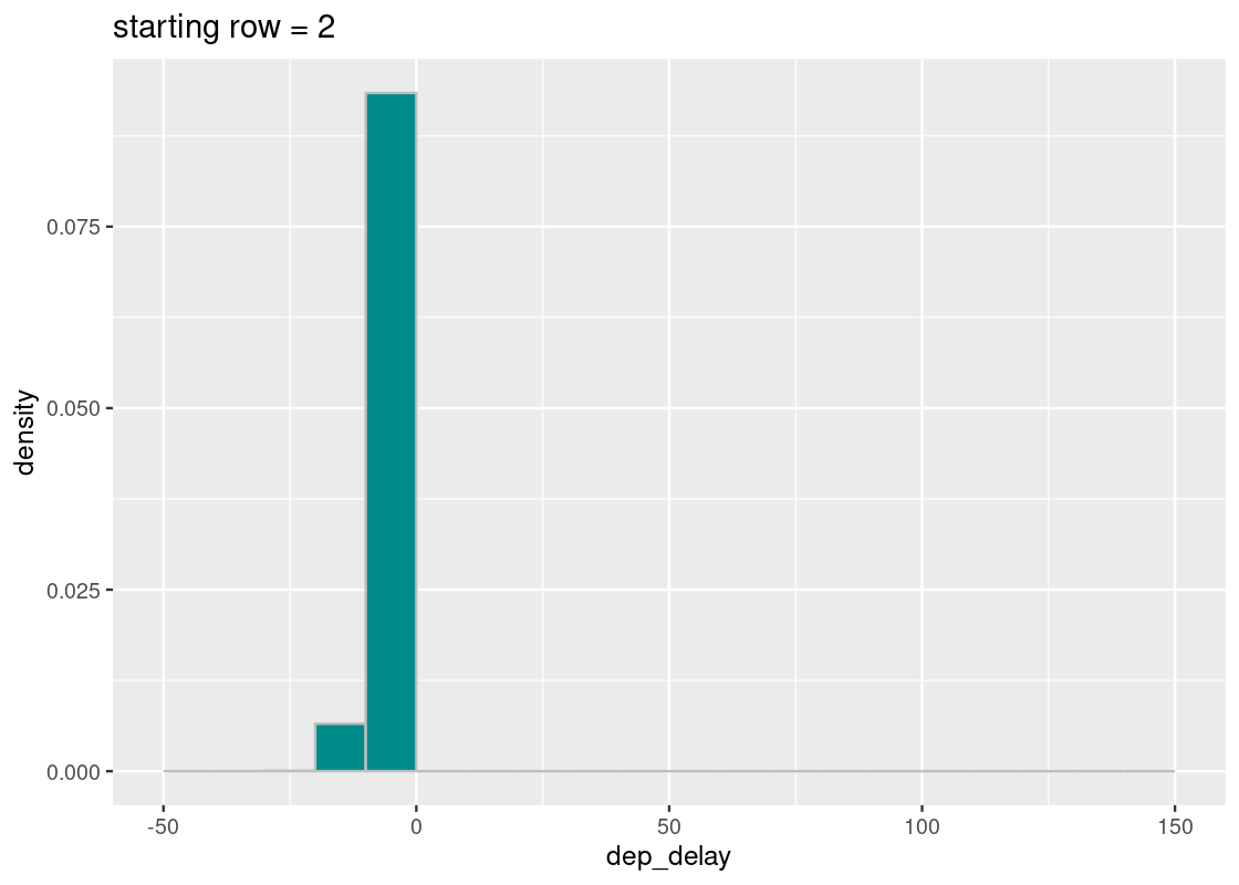
All of the sampled flights have early departures! What happened?
Let’s break down the steps we took. The first row selected is at index 2, as told by start, and each row after increases by increments of 100. If we write out some of these indices, we would select rows:
## # A tibble: 3,368 × 1
##    row_index
##        <dbl>
##  1         2
##  2       102
##  3       202
##  4       302
##  5       402
##  6       502
##  7       602
##  8       702
##  9       802
## 10       902
## # … with 3,358 more rows
There are several patterns that can be gleaned from this listing, but we will direct your attention to one in particular: these row numbers are all even! If we pick out some of these rows from mystery_flights, we find something revealing.
## # A tibble: 5 × 20
## ID year month day dep_time sched_dep_t…¹ dep_d…² arr_t…³ sched…⁴ arr_d…⁵
## <int> <int> <int> <int> <int> <int> <dbl> <int> <int> <dbl>
## 1 2 2013 1 1 533 529 -6 850 830 20
## 2 102 2013 1 1 754 759 -4 1039 1041 -2
## 3 202 2013 1 1 933 937 -3 1057 1102 -5
## 4 302 2013 1 1 1157 1200 -10 1452 1456 -4
## 5 402 2013 1 1 1418 1419 -14 1726 1732 -6
## # … with 10 more variables: carrier <chr>, flight <int>, tailnum <chr>,
## # origin <chr>, dest <chr>, air_time <dbl>, distance <dbl>, hour <dbl>,
## # minute <dbl>, time_hour <dttm>, and abbreviated variable names
## # ¹sched_dep_time, ²dep_delay, ³arr_time, ⁴sched_arr_time, ⁵arr_delayCompare this with the rows just before these.
## # A tibble: 5 × 20
## ID year month day dep_time sched_dep_t…¹ dep_d…² arr_t…³ sched…⁴ arr_d…⁵
## <int> <int> <int> <int> <int> <int> <dbl> <int> <int> <dbl>
## 1 1 2013 1 1 517 515 2 830 819 11
## 2 101 2013 1 1 753 755 -2 1056 1110 -14
## 3 201 2013 1 1 932 930 2 1219 1225 -6
## 4 301 2013 1 1 1157 1205 -8 1342 1345 -3
## 5 401 2013 1 1 1416 1411 5 1603 1549 14
## # … with 10 more variables: carrier <chr>, flight <int>, tailnum <chr>,
## # origin <chr>, dest <chr>, air_time <dbl>, distance <dbl>, hour <dbl>,
## # minute <dbl>, time_hour <dttm>, and abbreviated variable names
## # ¹sched_dep_time, ²dep_delay, ³arr_time, ⁴sched_arr_time, ⁵arr_delayIt turns out that the flights with even row numbers all have early departures. By fixing start to be an even value, our systematic sampling scheme was “fooled” into always choosing flights that are ahead of schedule. Under such circumstances, we conclude that this sample is not a random sample!
5.6.3 Beware: the presence of patterns
The mystery_flights tibble is a contrived example that required careful reorganization of the rows to create a setup where every flight with an even row index among the approximately 330K flights present in the dataset had an early departure. While it is quite unlikely that a real-world dataset would contain such an anomaly, the example points to valuable lessons that can occur in practice, especially when dealing with a convenience sample.
Real-world datasets are rife with patterns. Manufacturing errors due to a particular malfunctioning machine that assemble every \(n\)-th product; software engineering teams where every tenth member is designated the product manager; university-issued ID’s where ID numbers ending in 0 are reserved for faculty members. Any systematic sampling scheme is much more prone to selecting samples that follow (unexpected) patterns than a simple random sample would be. Not unlike like the story with mystery_flights, a biased sample can result and lead to misleading (and likely erroneous) findings. Even more, some may be willing to exploit such patterns for the sole possibility of increasing the significance of their results – we would hardly call them data scientists!
Sampling strategies demand prudence on the part of the data scientist. It is for this reason that random sampling is the most principled approach.
5.7 Exercises
Be sure to install and load the following packages into your R environment before beginning this exercise set.
Question 1 Following are some samples of students in a Data Science course named “CSC100”:
of classes
2. All undergraduate freshmen in CSC100
3. Every 11th person starting with the first person in the classroom
on a random day of lecture
4. 11 students picked randomly from the course roster
Which of these samples are random samples, if any?
Question 2. The following function twenty_sided_die_roll() simulates one roll of a 20-sided die. Run it a few times to see how the rolls vary.
Let us determine the mean value of a twenty-sided die by simulation.
Question 2.1 Create a vector
sample_rollsthat contains 10,000 simulated rolls of the 20-sided die. Usereplicate().Question 2.2 Compute the mean of the vector
sample_rollsyou computed and assign it to the nametwenty_sided_die_expected_value.Question 2.3 Which of the following statements, if any, are true?
twenty_sided_die_expected_value is an elementin
sample_rolls.2. The distribution of
sample_rolls is roughly uniform andsymmetric around the mean.
3. The value of
twenty_sided_die_expected_value is at themidpoint between 1 and 20.
4. The computed mean does not carry a unit.
Question 3: Convenience sampling. The tibble sf_salary from the package edsdata gives compensation information (names, job titles, salaries) of all employees of the City of San Francisco from 2011 to 2014 at annual intervals. The data is sourced from the Nevada Policy Research Institute’s Transparent California database and then tidied by Kaggle.
Let us preview the data:
## # A tibble: 148,654 × 13
## Id Employe…¹ JobTi…² BasePay Overt…³ Other…⁴ Benef…⁵ Total…⁶ Total…⁷ Year
## <dbl> <chr> <chr> <dbl> <dbl> <dbl> <dbl> <dbl> <dbl> <dbl>
## 1 1 NATHANIE… GENERA… 167411. 0 400184. NA 567595. 567595. 2011
## 2 2 GARY JIM… CAPTAI… 155966. 245132. 137811. NA 538909. 538909. 2011
## 3 3 ALBERT P… CAPTAI… 212739. 106088. 16453. NA 335280. 335280. 2011
## 4 4 CHRISTOP… WIRE R… 77916 56121. 198307. NA 332344. 332344. 2011
## 5 5 PATRICK … DEPUTY… 134402. 9737 182235. NA 326373. 326373. 2011
## 6 6 DAVID SU… ASSIST… 118602 8601 189083. NA 316286. 316286. 2011
## 7 7 ALSON LEE BATTAL… 92492. 89063. 134426. NA 315981. 315981. 2011
## 8 8 DAVID KU… DEPUTY… 256577. 0 51322. NA 307899. 307899. 2011
## 9 9 MICHAEL … BATTAL… 176933. 86363. 40132. NA 303428. 303428. 2011
## 10 10 JOANNE H… CHIEF … 285262 0 17116. NA 302378. 302378. 2011
## # … with 148,644 more rows, 3 more variables: Notes <lgl>, Agency <chr>,
## # Status <chr>, and abbreviated variable names ¹EmployeeName, ²JobTitle,
## # ³OvertimePay, ⁴OtherPay, ⁵Benefits, ⁶TotalPay, ⁷TotalPayBenefitsSuppose we are interested in examining the mean total compensation of San Francisco employees in 2011, where total compensation data is available in the variable TotalPay.
-
Question 3.1 Apply the following three tidying steps:
- Include only those observations from the year 2011.
- Add a new variable
TotalPay (10K)that contains the total compensation in amounts of tens of thousands. - Add a new variable
datasetthat contains the string"population"for all observations.
Assign the resulting tibble to the name
sf_salary11.In most statistical analyses, it is often difficult (if not impossible) to obtain data on every individual from the underlying population. We instead prefer to draw some smaller sample from the population and estimate parameters of the larger population using the collected sample.
Question 3.2 Let us treat the 36,159 employees available in
sf_salary11as the population of San Francisco city employees in 2011. What is the annual mean salary according to this tibble (with respect toTotalPay)? Assign your answer to the namepop_mean_salary11.
In Section 7.6 we learned that we need to be careful about the selection of observations when sampling data. One (generally bad) plan is to sample employees that are somehow convenient to sample. Suppose you randomly pick two letters from the English alphabet, say “G” and “X”, and decide to form two samples: employees whose name starts with “G” and employees whose name starts with “X”. Perhaps you are convinced that such a sample should be “random” enough…
Question 3.3 Explain why a sample drawn under this sampling plan would not be a random sample.
Question 3.4 Add a new variable to
sf_salary11namedfirst_letterthat gives the first letter of an employee’s name (provided inEmployeeName). Assign the resulting tibble to the namewith_first_letter.-
Question 3.5 Generate a bar plot using
with_first_letterthat shows the number of employees whose name begins with a given letter. For instance, the names of 2854 employees start with the letter “A”. Fill your bars according to whether the bar corresponds to the letters “G” or “X”.The following function
plot_salary_histogram()receives a tibble as an argument and compares the compensation distribution from the sample with the population using an overlaid histogram. No changes are needed in the following chunk; just run the code.# an example call using the full data plot_salary_histogram(with_first_letter) -
Question 3.6 Write a function
plot_and_compute_mean_stat()that receives a tibble as an argument and:- Plots an overlaid histogram of the compensation distribution with that of the population.
- Returns the mean salary from the sample in the
TotalPay (10K)variable as a double.
plot_and_compute_mean_stat(with_first_letter) # an example callThe value reported by
plot_and_compute_mean_stat(with_first_letter)is the parameter (because we computed it directly from the population) we hope to estimate by our sampling plan. -
Question 3.7 Write a function
filter_letter()that receives a characterletter(e.g., “X”) and returns the data consisting of all rows whoseEmployeeNamestarts with the uppercase letter matchingletter. Moreover, the value in the variabledatasetshould be mutated to the stringletterfor all observations in the resulting tibble.filter_letter("Z") # an example call Question 3.8 Let us now compare the convenience sample salaries with the full data salaries by calling your function
plot_compute_mean_stat(). Call this function twice, once for the sample corresponding to “G” and another for the sample corresponding to “X”.Question 3.9 We have now examined two convenience samples. Do these give an accurate representation of the compensation distribution of the population of San Francisco employees? Why or why not?
Question 3.10 As we learned, a more principled approach is to use random sampling. Let us form a simple random sample by sampling at random without replacement. Target 1% of the observations in the population. The value in the variable
datasetshould be mutated to the string"sample 1"for all observations. Assign the resulting tibble to the namerandom_sample1.Question 3.11 Repeat Question 3.10, but now target 5% of the rows. This time, rename the values in the variable
datasetto the string"sample 2". Assign the resulting tibble to the namerandom_sample2.-
Question 3.12 Call your function
plot_compute_mean_stat()on the two random samples you have formed.You should repeat Question 3.10 through Question 3.12 a few times to get a sense of how much the statistic changes with each random sample.
Question 3.13 Do the statistics vary more or less in random samples that target 1% of the observations than in samples that target 5%? Do the random samples offer a better estimate of the mean salary value than the convenience samples we tried? Are these results surprising or is this what you expected? Explain your answer.
Question 4 The tibble penguins from the package palmerpenguins includes measurements for penguin species, island in Palmer Archipelago, size, and sex. Suppose you are part of a conservation effort interested in surveying annually the population of penguins on Dream island. You have been tasked with estimating the number of penguins currently residing on the island.
To make the analysis easier, we will assume that each penguin has already been identified through some attached ID chip. This identifier starts at \(1\) and counts up to \(N\), where \(N\) is the total number of observations. We will also examine the data only for one of the recorded years, 2007.
-
Question 4.1 Apply the following tidying steps to
penguins:- Filter the data to include only those observations from Dream island in the year 2007.
- Create a new variable named
penguin_idthat assigns an identifier to the resulting observations using the above scheme. (Hint: you can useseq()).
Assign the resulting tibble to the name
dream_with_id. Question 4.2 In each survey you stop after observing 20 penguins and writing down their ID. It is possible for a penguin to be observed more than once. Generate a vector named
one_samplethat consists of the penguin IDs observed after one survey. Simulate this sample from the tibbledream_with_id.-
Question 4.3 Generate a histogram in density scale of the observed IDs from the sample you found in
one_sample. We suggest using the binsseq(1,46, 1).We will try to estimate the population of penguins on Dream island from this sample. More specifically, we would like to estimate \(N\), where \(N\) is the largest ID number (recall this number is unknown to us!). We will try to estimate this value by trying two different statistics: a max-based estimator and a mean-based estimator.
-
Question 4.4 A max-based estimator simply returns the largest ID observed from the sample. Write a function called
max_based_estimatethat receives a vector \(x\), computes the max-based estimate, and returns this value.max_based_estimate(one_sample) # an example call -
Question 4.5 The mean of the observed penguin IDs is likely halfway between 1 and \(N\). We have that the midpoint between any two numbers is \(\frac{1+N}{2}\). Solving this for \(N\) yields our mean-based estimate. Using this, write a function called
mean_based_estimatethat receives a vector \(x\), computes the mean-based estimate, and returns the computed value.mean_based_estimate(one_sample) # an example call Question 4.6 Analyze several samples and histograms by repeating Question 7.2 through Question 7.5. Which estimates, if any, capture the correct value for \(N\)?
-
Question 4.7 Write a function
simulate_one_statthat receives two arguments, a tibbletiband a functionestimator(that can be either be yourmean_based_estimate()ormax_based_estimate()). The function simulates a survey usingtib, computes the statistic from this sample using the functionestimator, and returns the computed statistic as a double.simulate_one_stat(dream_with_id, mean_based_estimate) # example call Question 4.8 Simulate 10,000 max estimates and 10,000 mean estimates. Store the results in the vectors
max_estimatesandmean_estimates, respectively.-
Question 4.9 The following code creates a tibble named
stats_tibbleusing the estimates you generated in Question 4.8.stats_tibble <- tibble(max_est = max_estimates, mean_est = mean_estimates) |> pivot_longer(c(max_est, mean_est), names_to = "estimator", values_to = "estimate") stats_tibbleGenerate a histogram of the sampling distributions of both statistics. This should be a single plot containing two histograms. You will need to use a positional adjustment to see both distributions together.
Question 4.10 How come the mean-based estimator has estimates larger than 46 while the max-based estimator doesn’t?
-
Question 4.11 Consider the following statements about the two estimators. For each of these statements, state whether or not you think it is correct and explain your reasoning.
- The max-based estimator is biased, that is, it almost always underestimates.
- The max-based estimator has higher variability than the mean-based estimator.
- The mean-based estimator is unbiased, that is, it overestimates about as often as it underestimates.
Question 5 This question is a continuation of the City of San Francisco compensation data from Question 3 and assumes that the function filter_letter() exists and that the names sf_salary11 and pop_mean_salary11 have already been assigned.
Question 5.1 Let us write a function
sim_random_sample()that samplessizerows from tibbletibby sampling at random with replacement. The function returns a tibble containing the sample.-
Question 5.2 Write a function
mean_stat_from_sample()that receives a sample tibbletib. The function computes the mean of the variableTotalPay (10K)and returns this value as a double.mean_stat_from_sample(sf_salary11) # using the full data -
Question 5.3 Generate 10,000 simulated mean statistics using
sim_random_sample()andmean_stat_from_sample(). Each simulated mean statistic should be generated from the tibblesf_salary11using a sample size of 100.The following code chunk puts the simulated values you found into a tibble named
stat_tibble.stat_tibble <- tibble(rep=1:10000, mean=mean_stats) -
Question 5.4 Generate a histogram showing the sampling distribution of these simulated mean statistics. Then, attach, to the histogram, a square at the population mean for 2011 at \(y=0\), with a size 2 square as the point.
We see that the population mean lies in the “bulk” of the simulated mean statistics. Now that we have learned about different sampling plans, we can compare the statistics generated by these plans with this histogram.
Question 5.5 Compute a mean statistic called
head_statusing the first 1,000 rows ofsf_salary. Then compute a mean statistic calledtail_statusing the last 1,000 rows.-
Question 5.6 We saw that we can form convenience samples by partitioning the observations using the first letter of
EmployeeName. Using apurrrmap function, generate a list of tibbles (each corresponding to all employees whose name starts with a given letter) by mapping the 26 letters of the English alphabet to the functionfilter_letter(). Assign the resulting list to the nameby_letter.Hint:
LETTERSis a vector containing the letters of the English alphabet in uppercase. -
Question 5.7 Use another
purrrmap function to map the list of tibblesby_letterto the functionmean_stat_from_sampleto obtain a vector of mean statistics for each sample. Assign the result to the nameletter_group_stats.The following code chunk organizes your results into a tibble
letter_tibble.letter_tibble <- tibble( letter = LETTERS[1:26], stat = letter_group_stats) Question 5.8 Augment your histogram from Question 5.2 with the computed statistics you found from the head sample, tail sample, and the convenience samples. Use a point geom for each statistic.
Question 5.9 Do you notice that some of the averages among the 26 letter samples are very close to the population mean while others are quite far away? How about for the statistics generated using the tail and head samples? Why does this happen?