9 Regression
In this chapter we turn to making guesses, or predictions, about the future. There are many examples in which you, your supervisor, or an employer would want to make claims about the future – that are accurate! For instance:
- Can we predict the miles per gallon of a brand new car model using aspects of its design and performance?
- Can we predict the price of suburban homes in a city using information collected from towns in the city, e.g. crime levels, demographics, median income, and distance to closest employment center?
- Can we predict the magnitude of an earthquake given temporal and geological characteristics of the area, e.g. fault length and recurrence interval?
To answer these questions, we need a framework or model for understanding how the world works. Fortunately, data science has offered up many such models for addressing the above proposed questions. This chapter turns to an important one known as regression, which is actually a family of methods designed for modeling the value of a response variable given some number of predictor variables.
We have already seen something that resembles regression in the introduction to visualization, where we guessed by examination the line explaining the highway mileage using what we know about a car model’s displacement. We build upon that intuition to examine more formally what regression is and how to use it appropriately in data science tasks.
9.1 Correlation
Linear regression is closely related to a statistic called the correlation, which refers to how tightly clustered points are about a straight line with respect to two variables. If we observe such clustering, we say that the two variables are correlated; otherwise, we say that there is no correlation or, put differently, that there is no association between the variables.
In this section, we build an understanding of what correlation is.
9.1.1 Prerequisites
We will make use of the tidyverse and the edsdata package in this chapter, so let us load these in as usual. We will also return to some datasets from the datasauRus package, so let us load that as well.
To build some intuition, we composed a tibble called corr_tibble (available in edsdata) that contains several artificial datasets. Don’t worry about the internal details of how the data is generated; in fact, it would be better to think of it as real data!
corr_tibble## # A tibble: 2,166 × 3
## x y dataset
## <dbl> <dbl> <chr>
## 1 0.695 2.26 cone
## 2 0.0824 0.0426 cone
## 3 0.0254 -0.136 cone
## 4 0.898 3.44 cone
## 5 0.413 1.15 cone
## 6 -0.730 -1.57 cone
## 7 0.508 1.26 cone
## 8 -0.0462 -0.0184 cone
## 9 -0.666 -0.143 cone
## 10 -0.723 0.159 cone
## # … with 2,156 more rows9.1.2 Visualizing correlation with a scatter plot
Let us begin by examining the relationship between the two variables y versus x in the dataset linear within corr_tibble. As we have done in the past, we will use a scatter plot for such a visualization.
corr_tibble |>
  filter(dataset == "linear") |>
  ggplot() +
geom_point(aes(x = x, y = y), color = "darkcyan") 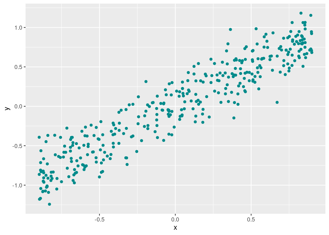
We noted earlier that two variables are correlated if they appear to cluster around a straight line. It appears that there is a strong correlation present here, but let us confirm what we are seeing by drawing a reference line at \(y = x\).
corr_tibble |>
  filter(dataset == "linear") |>
  ggplot() +
  geom_point(aes(x = x, y = y), color = "darkcyan") +
  geom_line(data = data.frame(x = c(-1,1), y = c(-1,1)),
            aes(x = x, y = y), color = "blue", size = 1)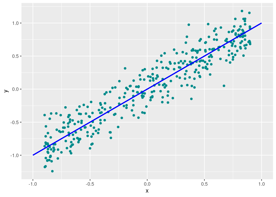
Indeed, we can confirm a “strong” correlation between these two variables. We will define how strong momentarily. Let us turn to another dataset, perf.
corr_tibble |>
  filter(dataset == "perf") |>
  ggplot() +
  geom_point(aes(x = x, y = y), color = "darkcyan") +
  geom_line(data = tibble(x = c(-1,1), y = c(-1,1)),
            aes(x = x, y = y), color = "blue", size = 1)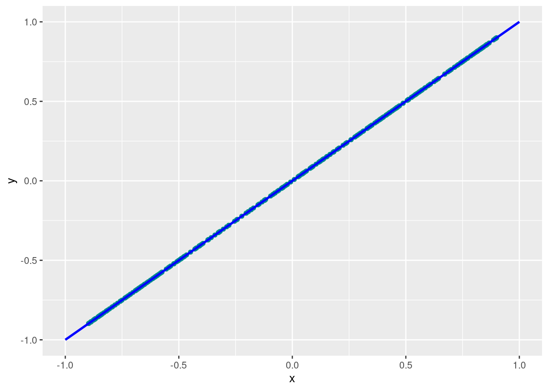
Neat! The points fall exactly on the line. We can confidently say that y_perf and x are perfectly correlated.
How about in the dataset null?
corr_tibble |>
  filter(dataset == "null") |>
  ggplot() +
  geom_point(aes(x = x, y = y), color = "darkcyan") +
  geom_line(data = data.frame(x = c(-1,1), y = c(-1,1)),
            aes(x = x, y = y), color = "blue", size = 1)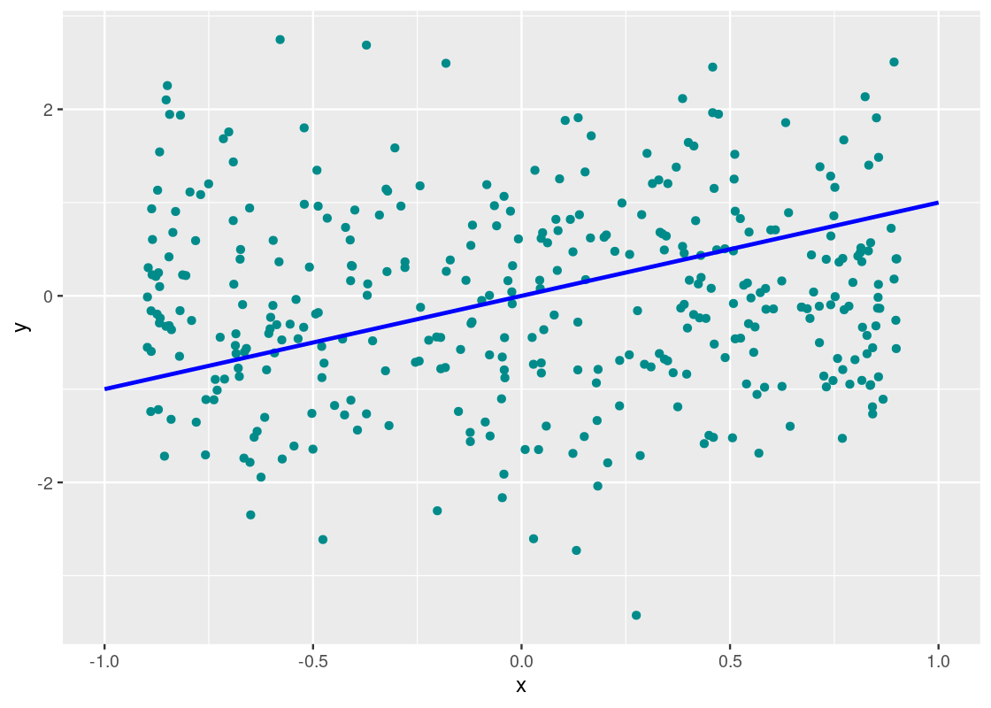
This one, unlike the others, does not cluster well around the line \(y = x\) nor does it show a trend whatsoever; in fact, it seems the points are drawn at random, much like static noise on a television. We call a plot that shows such phenomena a null plot.
Let us now quantify what correlation is.
9.1.3 The correlation coefficient r
We are now ready to present a formal definition for correlation, which is usually referred to as the correlation coefficient \(r\).
\(r\) is the mean of the products of two variables that are scaled to standard units.
Here are some mathematical facts about \(r\). Proving them is beyond the scope of this text, so we only state them as properties.
- \(r\) can take on a value between \(1\) and \(-1\).
- \(r = 1\) means perfect positive correlation; \(r = -1\) means perfect negative correlation.
- Two variables with \(r = 0\) means that they are not related by a line, i.e., there is no linear association among them. However, they can be related by something else, which we will see an example of soon.
- Because \(r\) is scaled to standard units, it is a dimensionless quantity, i.e., it has no units.
-
Association does not imply causation! Just because two variables are strongly correlated, positively or negatively, does not mean that
xcausesy.
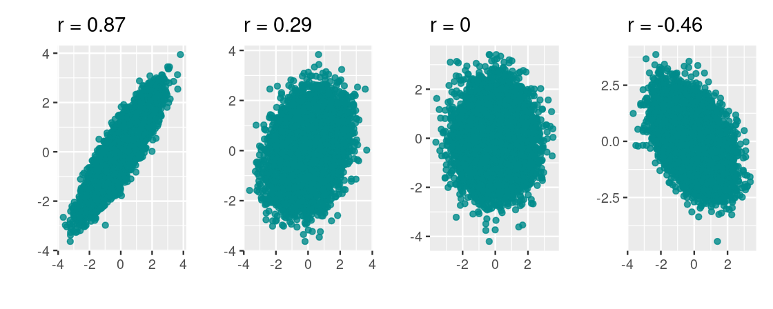
To build some intuition for this quantity, following are four scatter plots. We labeled each with its corresponding \(r\).
Let us return to the linear dataset and compute the coefficient by hand. First, we append two new columns, x_su and y_su, that puts x and y in standard units.
corr_tibble |>
  filter(dataset == 'linear') |>
  transmute(x = x,
            y = y,
            x_su = scale(x),
            y_su = scale(y))
## # A tibble: 361 × 4
## x y x_su[,1] y_su[,1]
## <dbl> <dbl> <dbl> <dbl>
## 1 0.695 0.757 1.20 1.24
## 2 0.0824 0.326 0.112 0.511
## 3 0.0254 0.128 0.0114 0.175
## 4 0.898 0.708 1.56 1.16
## 5 0.413 0.0253 0.698 0.00109
## 6 -0.730 -0.505 -1.33 -0.900
## 7 0.508 0.701 0.866 1.15
## 8 -0.0462 -0.101 -0.116 -0.213
## 9 -0.666 -0.971 -1.21 -1.69
## 10 -0.723 -0.583 -1.31 -1.03
## # … with 351 more rowsWe weill modify the above code to add one more column, prod, that takes the product of the columns x_su and y_su. We will also save the resulting tibble to a variable called linear_df_standard.
linear_df_standard <- corr_tibble |>
  filter(dataset == 'linear') |>
  transmute(x = x,
            y = y,
            x_su = scale(x),
            y_su = scale(y),
            prod = x_su * y_su)
linear_df_standard
## # A tibble: 361 × 5
## x y x_su[,1] y_su[,1] prod[,1]
## <dbl> <dbl> <dbl> <dbl> <dbl>
## 1 0.695 0.757 1.20 1.24 1.49
## 2 0.0824 0.326 0.112 0.511 0.0574
## 3 0.0254 0.128 0.0114 0.175 0.00199
## 4 0.898 0.708 1.56 1.16 1.81
## 5 0.413 0.0253 0.698 0.00109 0.000761
## 6 -0.730 -0.505 -1.33 -0.900 1.19
## 7 0.508 0.701 0.866 1.15 0.995
## 8 -0.0462 -0.101 -0.116 -0.213 0.0246
## 9 -0.666 -0.971 -1.21 -1.69 2.05
## 10 -0.723 -0.583 -1.31 -1.03 1.36
## # … with 351 more rowsAccording to the definition, we need only to calculate the mean of the products to find \(r\).
## [1] 0.9366707So the correlation of y and x is about \(0.94\) which implies a strong positive correlation, as expected.
Thankfully, R comes with a function for computing the correlation so we need not repeat this work every time we wish to explore the correlation between two variables. The function is called cor and receives two vectors as input.
## # A tibble: 1 × 1
##       r
##   <dbl>
## 1 0.939
Note that there may be some discrepancy between the two values. This is due to the \(n - 1\) correction that R provides when calculating quantities like sd.
9.1.4 Technical considerations
There are a few technical points to be aware of when using correlation in your analysis. We reflect on these here.
Switching axes does not affect the correlation coefficient. Let us swap \(x\) and \(y\) in the “linear” dataset in corr_tibble and then plot the result.

Observe how this visualization is a reflection over the \(y = x\) line. We compute the correlation.
## # A tibble: 1 × 1
##       r
##   <dbl>
## 1 0.939
This value is equivalent to the value we found earlier for this dataset.
Correlation is sensitive to “outliers.” Consider the following toy dataset and its corresponding scatter.

Besides the first point, we would expect this dataset to have a near perfect negative correlation between \(x\) and \(y\). However, computing the correlation coefficient for this dataset tells a different story.
## # A tibble: 1 × 1
##       r
##   <dbl>
## 1     0
We call such points that do not follow the overall trend “outliers”. It is important to look out for these as said observations have the potential to dramatically affect the signal in the analysis.
\(r = 0\) is a special case. Let us turn to the dataset curvy to see why.
curvy <- corr_tibble |>
  filter(dataset == "curvy")
We can compute the correlation coefficient as before.
## # A tibble: 1 × 1
##   `cor(x, y)`
##         <dbl>
## 1     -0.0368
The small value may suggest that there is no correlation and, therefore, the scatter diagram should resemble a null plot. Let us visualize the data.
ggplot(curvy) +
  geom_point(aes(x = x, y = y), color = "darkcyan")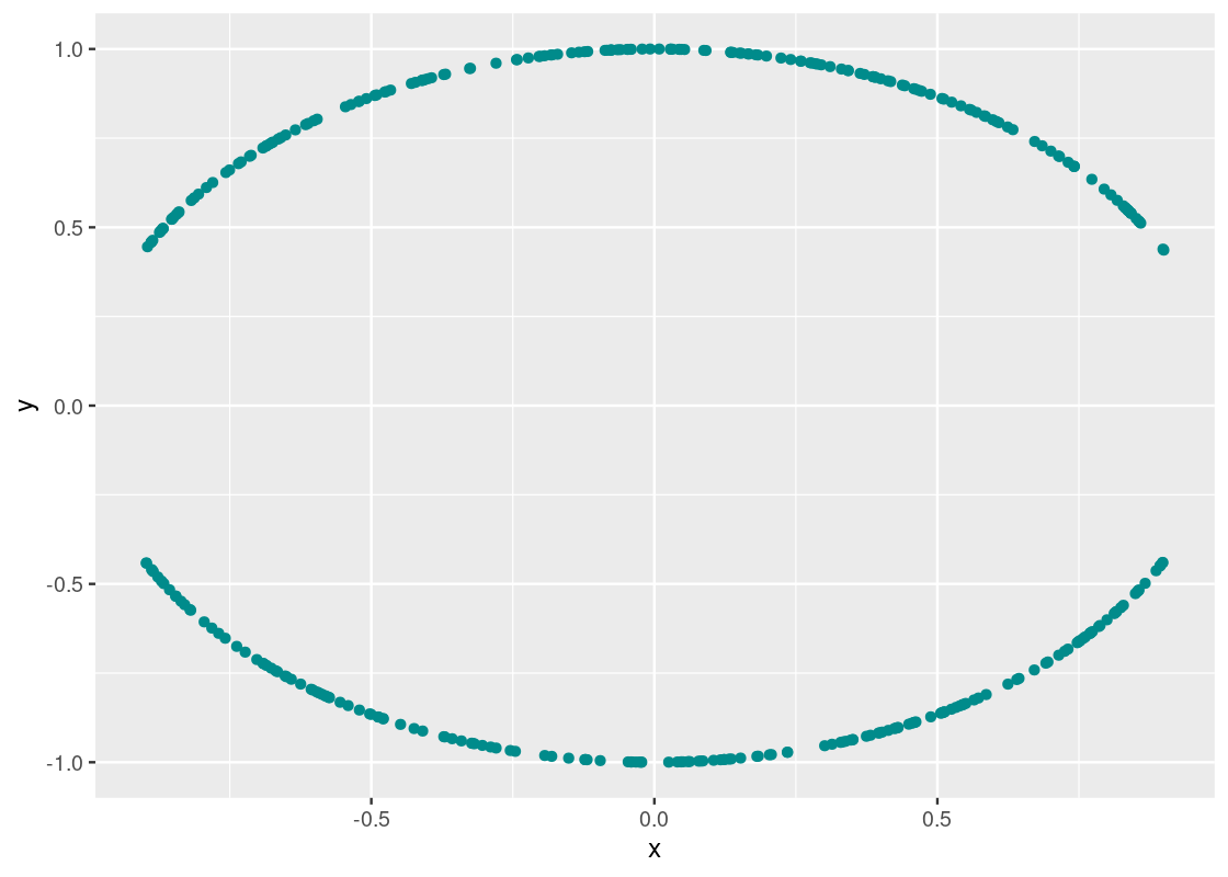
A clear pattern emerges! However, the association is very much not linear, as indicated by the obtained \(r\) value.
\(r\) is agnostic to units of the input variables. This is due to its calculation being based on standard units. So, for instance, we can look at the correlation between a quantity in miles per gallon and another quantity in liters.
9.1.5 Be careful with summary statistics! (revisited)
We saw before the danger of using summary statistics like mean and standard deviation without first visualizing data. Correlation is another one to watch out for. Let us see why using the same bullseye and star datasets we examined before. We will compute the correlation coefficient for each dataset.
datasaurus_dozen |>
  filter(dataset == "bullseye" | dataset == "star") |>
  group_by(dataset) |>
  summarize(r = cor(x, y))
## # A tibble: 2 × 2
## dataset r
## <chr> <dbl>
## 1 bullseye -0.0686
## 2 star -0.0630We observe that both datasets have almost identical coefficient values so we may be suspect that both also have seemingly identical associations as well. We may also claim there is some evidence that suggests there is a weak negative correlation between the variables.
As before, the test of any such claim is visualization.
datasaurus_dozen |>
  filter(dataset == "bullseye" | dataset == "star") |>
  ggplot() +
  geom_point(aes(x = x, y = y, color = dataset)) +
  facet_wrap( ~ dataset, ncol = 2)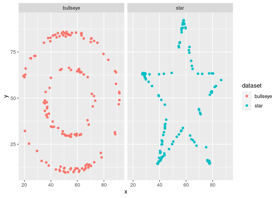
Indeed, we would be mistaken! The variables in each dataset are not identically associated nor do they bear any kind of linear association. The lesson here, then, remains the same: always visualize your data!
9.2 Linear Regression
Having a better grasp of what correlation is, we are now ready to develop an understanding of linear regression.
9.2.1 Prerequisites
We will make use of the tidyverse in this chapter, so let us load it in as usual.
9.2.2 The trees data frame
The trees data frame contains data on the diameter, height, and volume of 31 felled black cherry trees. Let us first convert the data to a tibble.
Note that the diameter is erroneously labeled as Girth.
slice_head(trees_data, n=5)## # A tibble: 5 × 3
## Girth Height Volume
## <dbl> <dbl> <dbl>
## 1 8.3 70 10.3
## 2 8.6 65 10.3
## 3 8.8 63 10.2
## 4 10.5 72 16.4
## 5 10.7 81 18.8Let us visualize the relationship between Girth and Height.
ggplot(trees_data) +
  geom_point(aes(x = Height, y = Girth), color = "darkcyan")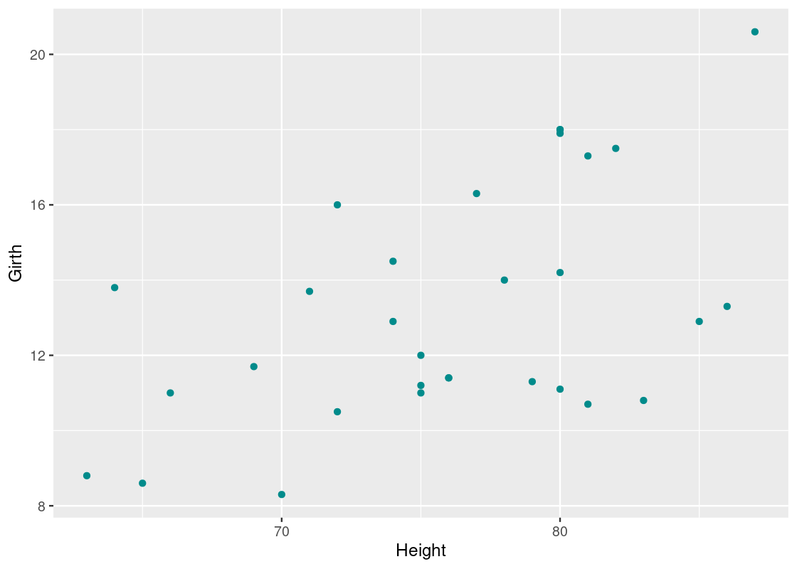
There seems to be some correlation between the two – taller trees tend to have larger diameters. Confident in the trend we are seeing, we propose the question: can we predict the average diameter of a black cherry tree from its height?
9.3 First approach: nearest neighbors regression
One way to make a prediction about the outcome of some individual is to first find others who are similiar to that individual and whose outcome you do know. We can then use those outcomes to guide the prediction.
Say we have a new black cherry tree whose height is 65 ft. We can look at trees that are “close” to 65 ft, say, within 1 feet. We can find these individuals using dplyr:
## # A tibble: 7 × 3
##   Girth Height Volume
##   <dbl>  <dbl>  <dbl>
## 1  11       75   18.2
## 2  11.2     75   19.9
## 3  11.4     76   21
## 4  11.4     76   21.4
## 5  12       75   19.1
## 6  12.9     74   22.2
## 7  14.5     74   36.3
Here is a scatter with those “close” observations annotated using the color cyan.
trees_data |>
  mutate(close_to_75 = between(Height, 75 - 1, 75 + 1)) |>
  ggplot() +
    geom_point(aes(x = Height, y = Girth, color = close_to_75))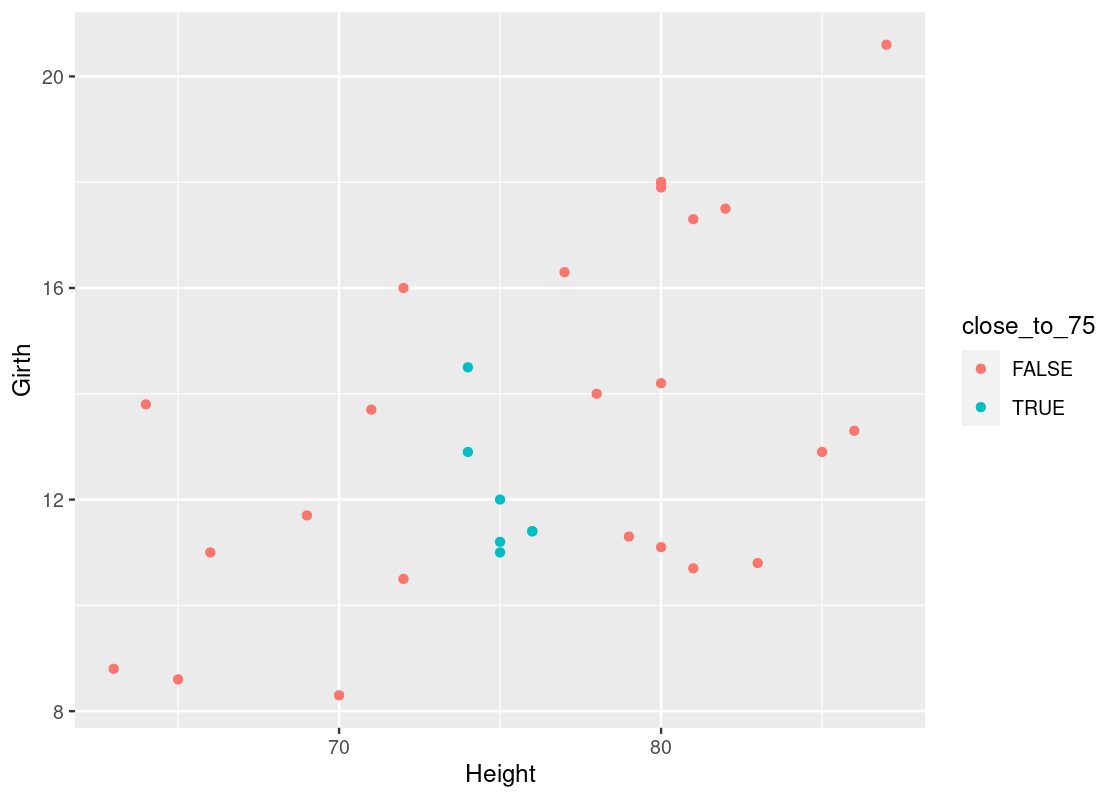
We can take the mean of the outcomes for those observations to obtain a prediction for the average diameter of a black cherry tree whose height is 65 ft. Let us amend our dplyr code to compute this value.
## # A tibble: 1 × 1
##   prediction
##        <dbl>
## 1       12.1
This method is called nearest neighbors regression because of the use of “neighbors” to make informed predictions about individuals whose outcomes we do not know. Its procedure is as follows:
- Define a threshold \(t\)
- Filter each \(x\) in the dataset to contain only rows where its \(x\) value is within \(x \pm t\). This defines a group, or “neighborhood”, for each \(x\).
- Take the mean of corresponding \(y\) values in each group
- For each \(x\), the prediction is the average of the \(y\) values in the corresponding group
We write a function called nn_predict to obtain a prediction for each height in the dataset. The function is designed so that it can be used to make predictions for any dataset with a given threshold amount.
nn_predict <- function(x, tib, x_label, y_label,
                       threshold) {
  tib |>
    filter(between({{ x_label }},
                   x - threshold,
                   x + threshold)) |>
    summarize(avg = mean({{ y_label }})) |>
    pull(avg)
}
We will use nearest neighbors regression to help us develop intuition for linear regression.
9.3.1 The simple linear regression model
Linear regression is a method that estimates the mean value of a response variable, say Girth, against a collection of predictor variables (or regressors), say Height or Volume, so that we can express the value of the response as some combination of the regressors, where each regressor either adds to or subtracts from the response value estimation. It is customary to represent the response as \(y\) and the regressors as \(x_i\), where \(i\) is the index for one of the regressors.
The linear model takes the form:
\[ y = c_0 + c_1x_1 + \ldots + c_n x_n \]
where \(c_0\) is the intercept and the other \(c_i\)’s are coefficients. This form is hard to digest, so we will begin with using only one regressor. Our model, then, reduces to:
\[ y = c_0 + c_1x \]
which is the equation of a line, just as you have seen it in high school math classes. There are some important assumptions we are making when using this model:
- The model is of the form \(y = c_0 + c_1x\), that is, the data can be modeled linearly.
- The variance of the “errors” is more or less constant. This notion is sometimes referred to as homoskedasticity.
We will return to what “errors” mean in just a moment. For now just keep in mind that the linear model may not, and usually will not, pass through all of the points in the dataset and, consequently, some amount of error is produced by the predictions it makes.
You may be wondering how we can obtain the intercept (\(c_0\)) and slope (\(c_1\)) for this line. For that, let us return to the tree data.
9.3.2 The regression line in standard units
We noted before that there exists a close relationship between correlation and linear regression. Let us see if we can distill that connection here.
We begin our analysis by noting the correlation between the two variables.
## # A tibble: 1 × 1
##       r
##   <dbl>
## 1 0.519
This confirms the positive linear trend we saw earlier. Recall that the correlation coefficient is a dimensionless quantity. Let us standardize Girth and Height so that they are in standard units and are also dimensionless.
girth_height_su <- trees_data |>
  transmute(Girth_su = scale(Girth),
         Height_su = scale(Height))
girth_height_su
## # A tibble: 31 × 2
## Girth_su[,1] Height_su[,1]
## <dbl> <dbl>
## 1 -1.58 -0.942
## 2 -1.48 -1.73
## 3 -1.42 -2.04
## 4 -0.876 -0.628
## 5 -0.812 0.785
## 6 -0.780 1.10
## 7 -0.716 -1.57
## 8 -0.716 -0.157
## 9 -0.685 0.628
## 10 -0.653 -0.157
## # … with 21 more rowsLet us plot the transformed data using a scatter plot again. Note how the axes of this plot have changed and that we can clearly identify how many SDs each point is away from the mean along each axis.
ggplot(girth_height_su) +
  geom_point(aes(x = Height_su, y = Girth_su), color = "darkcyan")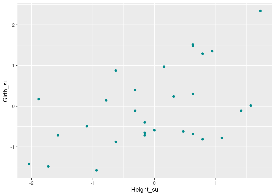
How can we find an equation of a line that “best” passes through this collection of points? We can start with some trial and error – say, the line \(y = x\).
Let us compare this with the nearest neighbors regression line. We use the function nn_predict we developed earlier in combination with a purrr map and set the threshold amount to \(\pm\) 1 ft.
with_nn_predictions <- girth_height_su |>
  mutate(prediction =
           map_dbl(Height_su,
                   nn_predict, girth_height_su, Height_su, Girth_su, 1))
with_nn_predictions
## # A tibble: 31 × 3
## Girth_su[,1] Height_su[,1] prediction
## <dbl> <dbl> <dbl>
## 1 -1.58 -0.942 -0.440
## 2 -1.48 -1.73 -0.767
## 3 -1.42 -2.04 -0.787
## 4 -0.876 -0.628 -0.272
## 5 -0.812 0.785 0.254
## 6 -0.780 1.10 0.535
## 7 -0.716 -1.57 -0.596
## 8 -0.716 -0.157 0.0280
## 9 -0.685 0.628 0.144
## 10 -0.653 -0.157 0.0280
## # … with 21 more rowsThe new column prediction contains the nearest neighbor predictions. Let us overlay these atop the scatter plot.

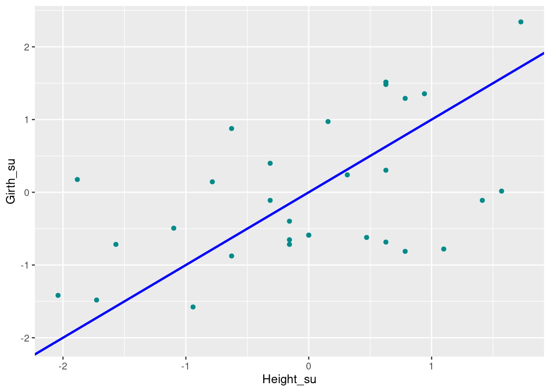
The graph of these predictions is called a “graph of averages.” If the relationship between the response and predictor variables is roughly linear, then points on the “graph of averages” tend to fall on a line.
What is the equation of that line? It appears that the \(y = x\) overestimates observations where \(\text{Height} > 0\) and underestimates observations where \(\text{Height} < 0\).
How about we try a line where the slope is the correlation coefficient, \(r\), we found earlier? That follows the equation:
\[ \text{Girth} = r * \text{Height} = 0.519 * \text{Height} \] Let us overlay this on the scatter plot using a purple line.

We can see that this line closely follows the “graph of averages” predicted by the nearest neighbor regression method. It turns out that, when the variables are scaled to standard units, the slope of the regression line equals \(r\). We also see that the regression line passes through the origin so its intercept equals 0.
Thus, we discover a connection:
When \(x\) and \(y\) are scaled to standard units, the slope of the regression of \(y\) on \(x\) equals the correlation coefficient \(r\) and the line passes through the origin \((0,0)\).
Let us summarize what we have learned so far about the equation of the regression line.
9.3.3 Equation of the Regression Line
When working in standard units, the average of \(x\) and \(y\) are both 0 and the standard deviation of \(x\) (\(SD_x\)) is \(1\) and the standard deviation of \(y\) is \(1\) (\(SD_y\)). Using what we know, we can recover the equation of the regression line in original units. If the slope is \(r\) in standard units, then moving 1 unit along the x-axis in standard units is equivalent to moving \(SD_x\) units along the x-axis in original units. Similarly, moving \(r\) units along the y-axis in standard units is equivalent to moving \(r * SD_y\) units along the y-axis in original units. Thus, we have the slope of the regression line in original units:
\[ \text{slope} = r * \frac{SD_y}{SD_x} \]
Furthermore, if the line passes through the origin in standard units, then the line in original units passes through the point \((\bar{x}, \bar{y})\) , where \(\bar{x}\) and \(\bar{y}\) is the mean of \(x\) and \(y\), respectively. So if the equation of the regression line follows:
\[ \text{estimate of } y = \text{slope} * x + \text{intercept} \]
Then the intercept is:
\[ \text{intercept} = \bar{y} - \text{slope} * \bar{x} \]
9.3.4 The line of least squares
We have shown that the “graph of averages” can be modeled using the equation of the regression line. However, how do we know that the regression line is the best line that passes through the collection of points? We need to be able to quantify the amount of error at each point.
For this, we introduce the notion of a residual, which we define as the vertical distance from the point to the line (which can be positive or negative depending on the location of the point relative to the line). More formally, we say that a residual \(e_i\) has the form:
\[ e_i = y_i - (c_0 + c_1 x_i) \]
where plugging into \(c_0 + c_1 x_i\), the equation of the line, returns the predicted value for some observation \(i\). We usually call this the fitted value.
We can annotate the plot with the regression line using the residual amounts.
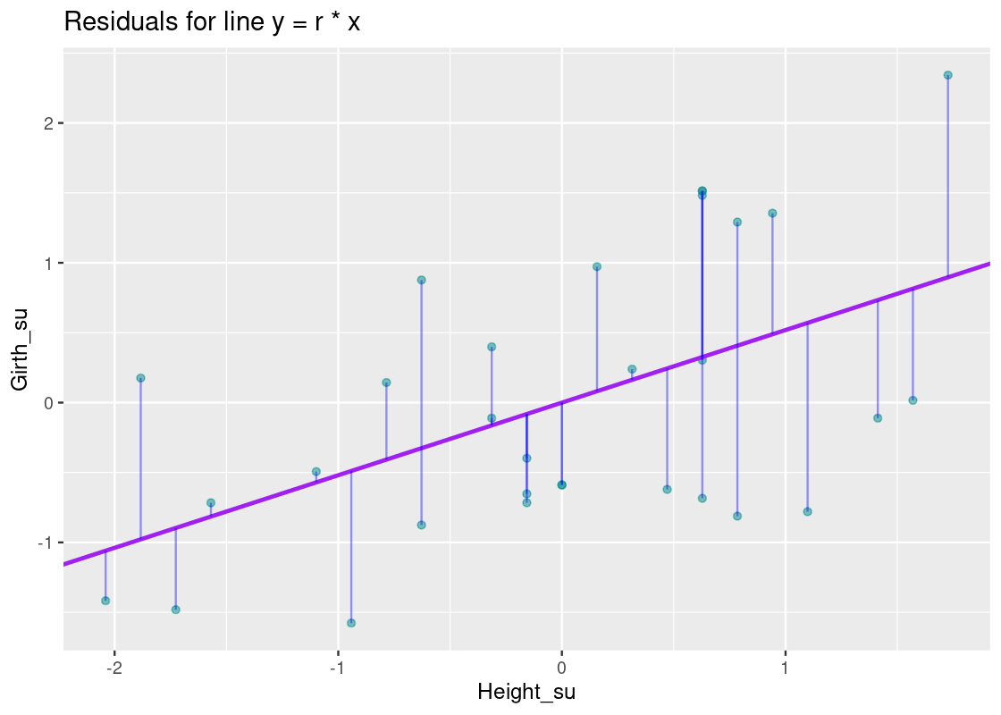
The vertical blue lines show the residual for each point; note how some are small while others are quite large. How do the residuals for this line compare with those for, say, the line \(y = x\) or a horizontal line at \(y = 0\)?
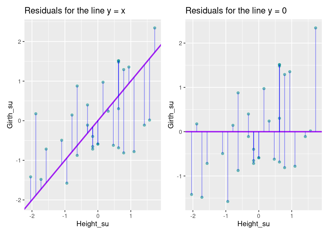
If we compare these plots side-by-side, it becomes clear that the equation \(y = r * x\) has smaller residuals overall than the \(y = x\) line and the horizontal line that passes through \(y = 0\). This observation is key: to get an overall sense of the error in the model, we can sum the residuals for each point. However, there is a problem with such an approach. Some residuals can be positive while others can be negative, so a straightforward sum of the residuals will total to 0! Thus, we take the square of each residual and then issue the sum.
Our goal can now be phrased as follows: we would like to find the line that minimizes the residual sum of squares. We normally refer to this quantity as \(RSS\). Let us write a function that returns the \(RSS\) for a given linear model. This function receives a vector called params where the first element is the slope and the second the intercept, and returns the corresponding \(RSS\).
line_rss <- function(params) {
  slope <- params[1]
  intercept <- params[2]

  x <- pull(girth_height_su, Height_su)
  y <- pull(girth_height_su, Girth_su)
  fitted <- slope * x + intercept
  return(sum((y - fitted) ** 2))
}
We can retrieve the \(RSS\) for the two lines we played with above. First, for the line \(y = r * x\), where \(r\) is the correlation between Height and Girth.
params <- c(0.5192, 0)
line_rss(params)
## [1] 21.91045Next, for the line \(y = x\).
params <- c(1, 0)
line_rss(params)
## [1] 28.8432Finally, for the horizontal line passing through \(y = 0\). Note how the larger \(RSS\) for this model confirms what we saw graphically when plotting the vertical distances.
params <- c(0, 0)
line_rss(params)
## [1] 30We could continue experimenting with values until we found a configuration that seems “good enough”. While that would hardly be acceptable to our peers, solving this rigorously involves methods of calculus which are beyond the scope of this text. Fortunately, we can use something called numerical optimization which allows R to do the trial-and-error work for us, “nudging” the above line until it minimizes \(RSS\).
9.3.5 Numerical optimization
The optim function can be used to accomplish the task of finding the linear model that yields the smallest \(RSS\). optim takes as arguments an initial vector of values and a function to be minimized using an initial guess as a starting point.
Let us see an example of it by finding an input that minimizes the output given by a quadratic curve. Consider the following quadratic equation:
my_quadratic_equation <- function(x) {
  (x - 2) ** 2 + 3
}
Geometrically, we know that the minimum occurs at the bottom of the “bowl”, so the answer is 2.
The orange dot at \(x = 1\) shows our first “guess”. You can imagine the call optim(initial_guess, my_quadratic_equation) nudging this point around until a minimum is reached. Let us try it.
initial_guess <- c(1)  # start with a guess at x = 1
best <- optim(initial_guess, my_quadratic_equation)
We can inspect the value found using pluck from purrr.
best |>
  pluck("par")
## [1] 1.9This value closely approximates the expected value of 2.
Let us now use the optim function to find the linear model that yields the smallest \(RSS\). Note that our initial guess now consists of two values, one for the slope and the second for the intercept.
We can examine the minimized slope and intercept found.
best |>
  pluck("par")
## [1] 0.5192362885 -0.0001084234This means that the best linear model follows the equation:
\[ \text{Girth}_{su} = 0.5192 * \text{Height}_{su} \]
where the intercept is essentially 0. This line is equivalent to the regression line. Therefore, we find that the regression line is also the line of least squares.
Let us overlay the least squares line on our scatter plot. Compare this line with our original guesses, shown in gray.
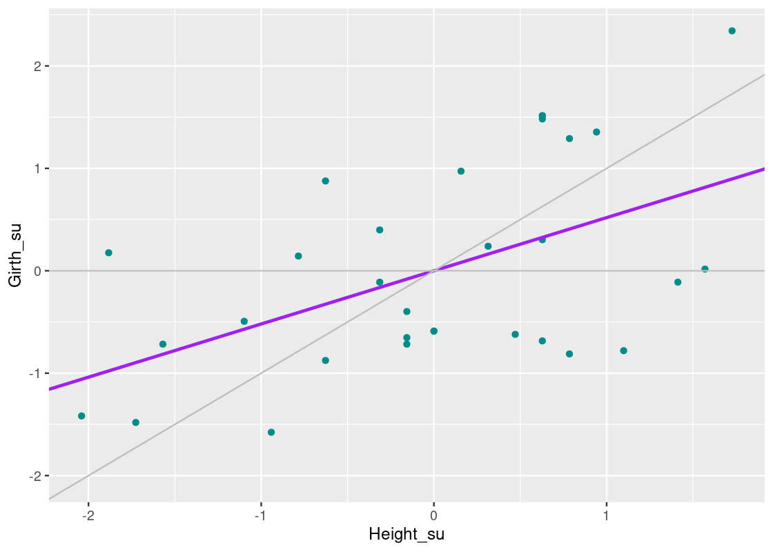
Compare the line we have just found (in purple) with the line \(y = x\). For trees with heights that are less than 0 \(SD\)s away from the mean, the regression line predicts a larger girth than the \(y = x\) line. And, for trees with heights that are more than 0 \(SD\) away from the mean, the regression line predicts a smaller girth than the \(y = x\) line. The effect should become clearer in the following plot.
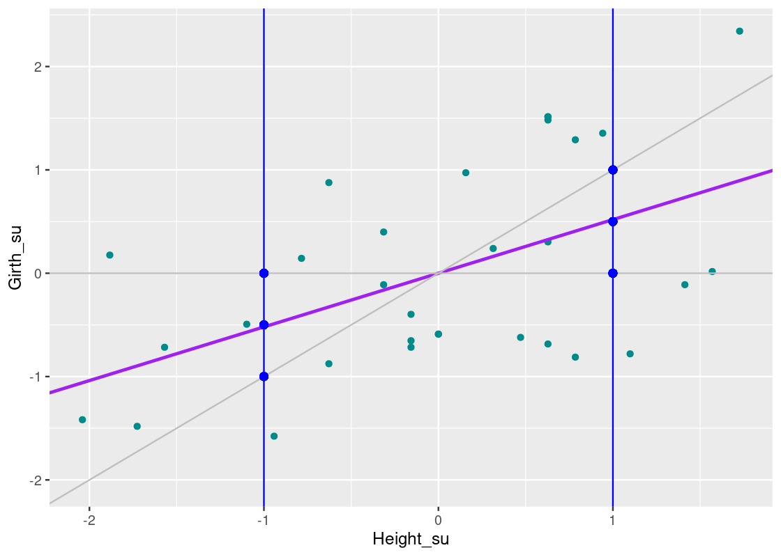
Observe the position of the regression line relative to \(y = x\) at each vertical blue line. Note how the regression line approaches the horizontal line that passes through \(y = 0\). The phenomena we are observing is called “regression towards the mean”, as the regression line prefers to predict extreme points closer to the mean. We can summarize the effect on the data as follows:
Shorter trees will have larger girths on average, and taller trees will have smaller girths on average.
9.3.6 Computing a regression line using base R
Before closing this section, we show how to compute a regression line using functions from base R. Note that you can find the regression line simply by plugging into the formulas we derived above, but it is easier to call a function in R that takes care of the work.
That function is lm, which is the short-hand for “linear model”. Running the linear regression function requires two parameters. One parameter is the dataset, which takes the form data = DATA_SET_NAME. The other is the response and the regressors, which takes a formula of the form response ~ regressor_1 + ... + regressor_k.
For a regression of Girth on Height in standard units, we have the following call.
lmod <- lm(Girth_su ~ Height_su, data = girth_height_su)The resulting linear model is stored in a variable lmod. We can inspect it by simply typing its name.
lmod##
## Call:
## lm(formula = Girth_su ~ Height_su, data = girth_height_su)
##
## Coefficients:
## (Intercept) Height_su
## 1.468e-16 5.193e-01This agrees with our calculations. Let us compute the same regression, this time in terms of original units.
lmod_original_units <- lm(Girth ~ Height, data = trees_data)
lmod_original_units
##
## Call:
## lm(formula = Girth ~ Height, data = trees_data)
##
## Coefficients:
## (Intercept) Height
## -6.1884 0.2557So the equation of the line follows:
\[ \text{Girth} = 0.2557 * \text{Height} - 6.1884 \]
Let us reflect briefly on the meaning of the intercept and the slope. First, the intercept is measured in inches as it takes on the units of the response variable. However, its interpretation is nonsensical: a tree with no height is predicted to have a negative diameter.
The slope of the line is a ratio quantity. It measures the increase in the estimated diameter per unit increase in height. Therefore, the slope of this line is 0.2557 inches per foot. Note that this slope does not say that the diameter of an individual black cherry tree gets wider as it gets taller. The slope tells us the difference in the average diameters of two groups of trees that are 1 foot apart in height.
We can also make predictions using the predict function.
##        1
## 12.99264
So a tree that is 75 feet tall is expected, on average, to have a diameter of about 12.9 inches.
An important function for doing regression analysis in R is the function summary, which we will not cover. The function reports a wealth of useful information about the linear model, such as significance of the intercept and slope coefficients. However, to truly appreciate and understand what is presented requires a deeper understanding of statistics than what we have developed so far – if this sounds at all interesting, we encourage you to take a course in statistical analysis!
Nevertheless, for the curious reader, we include the incantation to use.
summary(lmod)9.4 Using Linear Regression
The last section developed a theoretical foundation for understanding linear regression. We also saw how to fit a regression model using built-in R features such as lm. This section will involve linear regression more practically, and we will see how to run a linear regression analysis using tools from a collection of packages called tidymodels.
9.4.1 Prerequisites
This section introduces a new meta-package called tidymodels. This package can be installed from CRAN using install.packages. We will also make use of the tidyverse so let us load this in as usual.
9.4.2 Palmer Station penguins
For the running example in this section, we appeal to the dataset penguins from the palmerpenguins package, which contains information on different types of penguins in the Palmer Archipelago, Antarctica. The dataset contains 344 observations and ?penguins can be used to pull up further information. Let us perform basic preprocessing on this dataset by removing any missing values that may be present.
my_penguins <- penguins |>
  drop_na()
my_penguins
## # A tibble: 333 × 7
## species island bill_length_mm bill_depth_mm flipper_length…¹ body_…² sex
## <fct> <fct> <dbl> <dbl> <int> <int> <fct>
## 1 Adelie Torgersen 39.1 18.7 181 3750 male
## 2 Adelie Torgersen 39.5 17.4 186 3800 fema…
## 3 Adelie Torgersen 40.3 18 195 3250 fema…
## 4 Adelie Torgersen 36.7 19.3 193 3450 fema…
## 5 Adelie Torgersen 39.3 20.6 190 3650 male
## 6 Adelie Torgersen 38.9 17.8 181 3625 fema…
## 7 Adelie Torgersen 39.2 19.6 195 4675 male
## 8 Adelie Torgersen 41.1 17.6 182 3200 fema…
## 9 Adelie Torgersen 38.6 21.2 191 3800 male
## 10 Adelie Torgersen 34.6 21.1 198 4400 male
## # … with 323 more rows, and abbreviated variable names ¹flipper_length_mm,
## # ²body_mass_gWe refer to the preprocessed data as my_penguins. Let us visualize the relationship between bill_length_mm and bill_depth_mm.
ggplot(my_penguins) +
  geom_point(aes(x = bill_length_mm, y = bill_depth_mm),
             color = "darkcyan")
How much correlation is present between the two variables?
## # A tibble: 1 × 1
##        r
##    <dbl>
## 1 -0.229
The negative correlation is suspicious considering that we should expect to see a positive correlation after viewing the above the scatter plot. Plotting a histogram for each of these variables reveals a distribution where there appears to be two modes in the data, shown geometrically as two “humps”.
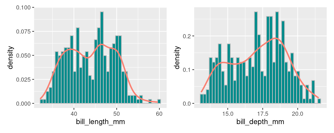
We refer to this as a bimodal distribution and here it suggests that there is something about this dataset that we have not yet considered (i.e., the penguin species). For now, we will proceed with the regression analysis.
9.4.3 Tidy linear regression
Let us run linear regression, this time using tidymodels. The benefit of learning about tidymodels is that once you have mastered how to use it for linear regression, you can then use the same functions for trying out different models (e.g., generalized linear models) and other learning techniques (e.g., nearest neighbor classification).
To fit a linear regression model using tidymodels, first provide a specification for it.
linear_reg()## Linear Regression Model Specification (regression)
##
## Computational engine: lmThere are different ways to fit a linear regression model and the method is determined by setting the model engine. For a regression line fitted using the least squares method we learned, we use the "lm" method.
linear_reg() |>
  set_engine("lm") # ordinary least squares
## Linear Regression Model Specification (regression)
##
## Computational engine: lmWe then fit the model by specifying bill_depth_mm as the response variable and bill_length_mm as the predictor variable.
lmod_parsnip <- linear_reg() |>
  set_engine("lm") |>
  fit(bill_depth_mm ~ bill_length_mm, data = penguins)
lmod_parsnip
## parsnip model object
##
##
## Call:
## stats::lm(formula = bill_depth_mm ~ bill_length_mm, data = data)
##
## Coefficients:
## (Intercept) bill_length_mm
## 20.88547 -0.08502The model output is returned as a parsnip model object. We can glean the equation of the regression line from its output:
\[\text{Bill Depth} = -0.08502 * \text{Bill Length} + 20.885\]
We can tidy the model output using the tidy function from the broom package (a member of tidymodels). This returns the estimates as a tibble, a form we can manipulate well in the usual ways.
linear_reg() %>%
  set_engine("lm") %>%
  fit(bill_depth_mm ~ bill_length_mm, data = penguins) %>%
  tidy() # broom
## # A tibble: 2 × 5
## term estimate std.error statistic p.value
## <chr> <dbl> <dbl> <dbl> <dbl>
## 1 (Intercept) 20.9 0.844 24.7 4.72e-78
## 2 bill_length_mm -0.0850 0.0191 -4.46 1.12e- 5Note the estimates for the intercept and slope given in the estimate column. The p.value column indicates the significance of each term; we will return to this shortly.
We may wish to annotate each observation in the dataset with the predicted (or fitted) values and residual amounts. This can be accomplished by augmenting the model output. To do this, we extract the "fit" element of the model object and then call the function augment from the parsnip package.
lmod_augmented <- lmod_parsnip |>
  pluck("fit") |>
  augment()
lmod_augmented
## # A tibble: 342 × 9
## .rownames bill_depth_mm bill_…¹ .fitted .resid .hat .sigma .cooksd .std.…²
## <chr> <dbl> <dbl> <dbl> <dbl> <dbl> <dbl> <dbl> <dbl>
## 1 1 18.7 39.1 17.6 1.14 0.00521 1.92 9.24e-4 0.594
## 2 2 17.4 39.5 17.5 -0.127 0.00485 1.93 1.07e-5 -0.0663
## 3 3 18 40.3 17.5 0.541 0.00421 1.92 1.68e-4 0.282
## 4 5 19.3 36.7 17.8 1.53 0.00806 1.92 2.61e-3 0.802
## 5 6 20.6 39.3 17.5 3.06 0.00503 1.92 6.41e-3 1.59
## 6 7 17.8 38.9 17.6 0.222 0.00541 1.93 3.64e-5 0.116
## 7 8 19.6 39.2 17.6 2.05 0.00512 1.92 2.93e-3 1.07
## 8 9 18.1 34.1 18.0 0.114 0.0124 1.93 2.23e-5 0.0595
## 9 10 20.2 42 17.3 2.89 0.00329 1.92 3.73e-3 1.50
## 10 11 17.1 37.8 17.7 -0.572 0.00661 1.92 2.96e-4 -0.298
## # … with 332 more rows, and abbreviated variable names ¹bill_length_mm,
## # ².std.residAugmenting model output is useful if you wish to overlay the scatter plot with the regression line.
ggplot(lmod_augmented) +
  geom_point(aes(x = bill_length_mm,
                 y = bill_depth_mm),
             color = "darkcyan") +
  geom_line(aes(x = bill_length_mm,
                y = .fitted),
            color = "purple",
            size = 2)
Note that we can obtain an equivalent plot using a smooth geom with the lm method.
ggplot(my_penguins,
       aes(x = bill_length_mm, y = bill_depth_mm)) +
  geom_point(color = "darkcyan") +
  geom_smooth(method = "lm", color = "purple", se = FALSE)
9.4.4 Including multiple predictors
As hinted earlier, there appear to be issues with the regression model found. We saw a bimodal distribution when visualizing the bill depths and bill lengths, and the negative slope in the regression model has a dubious interpretation.
We know that the dataset is composed of three different species of penguins, yet so far we have excluded this information from the analysis. We will now bring in species, a factor variable, into the model.
Let us visualize the scatter again and map the color aesthetic to the species variable.
ggplot(my_penguins) +
  geom_point(aes(x = bill_length_mm,
                 y = bill_depth_mm,
                 color = species))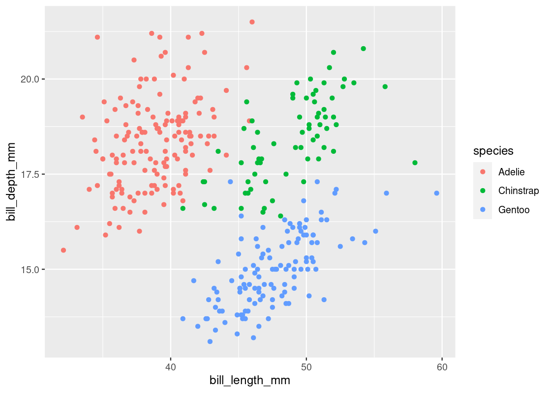
If we were to fit a regression line with respect to each species, we should expect to see a positive slope. Let us try this out by modifying the linear regression specification to include the factor variable species.
lmod_parsnip_factor <- linear_reg() |>
  set_engine("lm") %>%
  fit(bill_depth_mm ~ bill_length_mm + species,
      data = penguins)

lmod_parsnip_factor |>
  tidy()
## # A tibble: 4 × 5
## term estimate std.error statistic p.value
## <chr> <dbl> <dbl> <dbl> <dbl>
## 1 (Intercept) 10.6 0.683 15.5 2.43e-41
## 2 bill_length_mm 0.200 0.0175 11.4 8.66e-26
## 3 speciesChinstrap -1.93 0.224 -8.62 2.55e-16
## 4 speciesGentoo -5.11 0.191 -26.7 3.65e-85Indeed, we find a positive estimate for the slope, as shown for the bill_length_mm term. However, we now have three regression lines, one for each category in the variable species. The slope of each of these lines is the same, however, the intercepts are different. We can write the equation of this line as follows:
\[ \text{Depth} = 0.2 * \text{Length} - 1.93 * \text{Chinstrap} - 5.1 * \text{Gentoo} + 10.6 \]
The variables \(\text{Chinstrap}\) and \(\text{Gentoo}\) in the equation should be treated as Boolean variables. If we want to recover the line for “Gentoo” penguins, set \(\text{Chinstrap} = 0\) and \(\text{Gentoo} = 1\) to obtain the equation \(\text{Depth} = 0.2 * \text{Length} + 5.5\). Recovering the line for “Adelie” penguins is curious and requires setting \(\text{Chinstrap} = 0\) and \(\text{Gentoo} = 0\). This yields the equation \(\text{Depth} = 0.2 * \text{Length} + 10.6\).
We call this a one-factor model. Let us overlay the new model atop the scatter plot. First, let us annotate the dataset with the fitted values using the augment function on the new parsnip model.
lmod_aug_factor <- lmod_parsnip_factor |>
  pluck("fit") |>
  augment()
lmod_aug_factor
## # A tibble: 342 × 10
## .rown…¹ bill_…² bill_…³ species .fitted .resid .hat .sigma .cooksd .std.…⁴
## <chr> <dbl> <dbl> <fct> <dbl> <dbl> <dbl> <dbl> <dbl> <dbl>
## 1 1 18.7 39.1 Adelie 18.4 0.292 0.00665 0.955 1.58e-4 0.307
## 2 2 17.4 39.5 Adelie 18.5 -1.09 0.00679 0.953 2.24e-3 -1.15
## 3 3 18 40.3 Adelie 18.6 -0.648 0.00739 0.954 8.66e-4 -0.682
## 4 5 19.3 36.7 Adelie 17.9 1.37 0.00810 0.952 4.26e-3 1.44
## 5 6 20.6 39.3 Adelie 18.4 2.15 0.00671 0.947 8.66e-3 2.26
## 6 7 17.8 38.9 Adelie 18.4 -0.568 0.00663 0.954 5.96e-4 -0.598
## 7 8 19.6 39.2 Adelie 18.4 1.17 0.00668 0.953 2.56e-3 1.23
## 8 9 18.1 34.1 Adelie 17.4 0.691 0.0140 0.954 1.90e-3 0.730
## 9 10 20.2 42 Adelie 19.0 1.21 0.0101 0.952 4.16e-3 1.28
## 10 11 17.1 37.8 Adelie 18.1 -1.05 0.00695 0.953 2.13e-3 -1.10
## # … with 332 more rows, and abbreviated variable names ¹.rownames,
## # ²bill_depth_mm, ³bill_length_mm, ⁴.std.residWe can use the .fitted column in this dataset to plot the new regression line in a line geom layer.
ggplot(lmod_aug_factor,
       aes(x = bill_length_mm)) +
  geom_point(aes(y = bill_depth_mm,
                 color = species)) +
  geom_line(aes(y = .fitted,
                group = species),
            color = "purple",
            size = 1)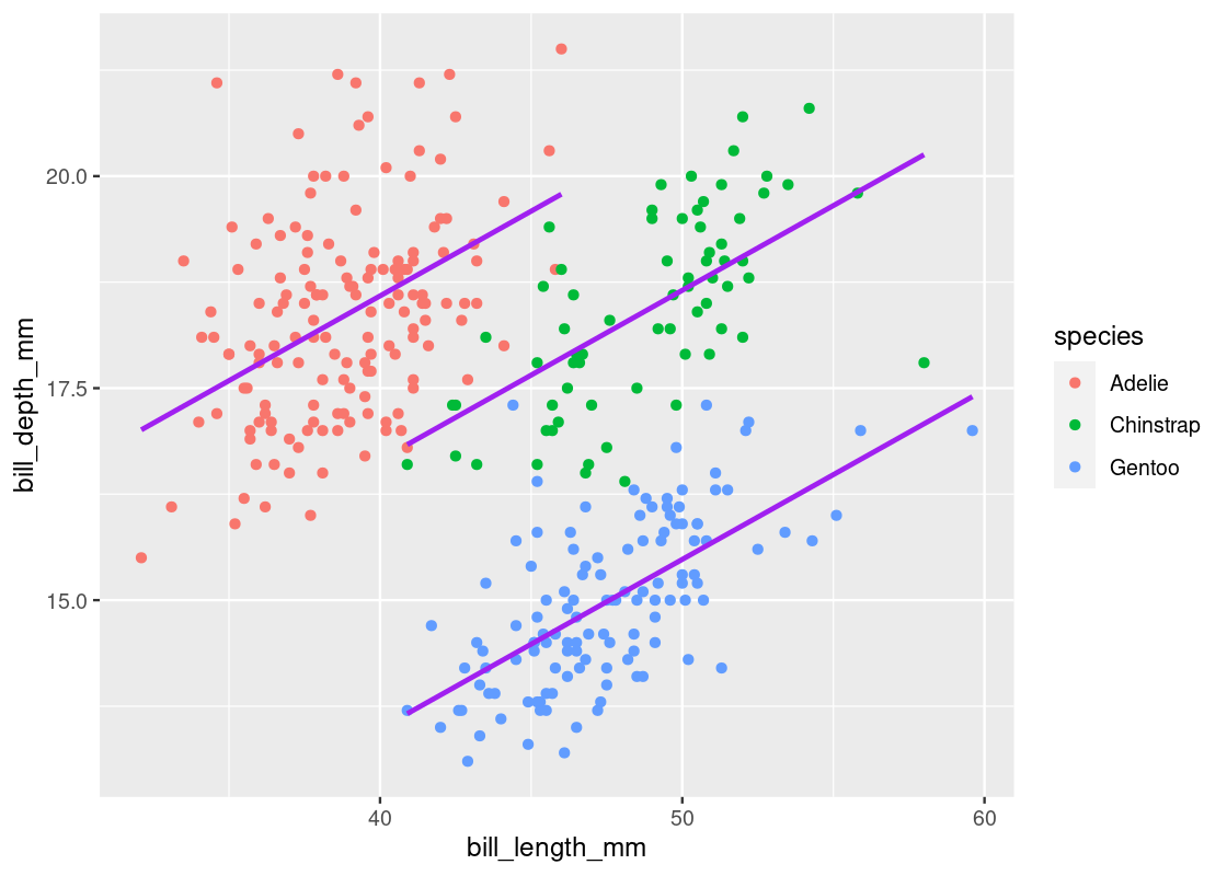
Note how the slope of these lines are the same, but the intercepts in each are different.
9.4.5 Curse of confounding variables
Let us reflect for a moment the importance of species and the impact this variable has when it is incorporated into the regression model. Let us first show the two models again side-by-side.
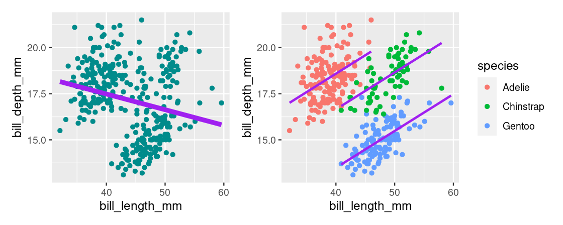
When species is excluded from the model, we find a negative estimate for the slope. When species is included, as in the one-factor model, the sign of the slope is flipped. This effect is known as Simpson’s paradox.
While the inclusion of species seemed obvious for this dataset, we are often unaware of critical variables like these that are “missing” in real-world datasets. These kinds of variables are either neglected from the analysis or were simply not measured. Yet, when included, they can have dramatic effects such as flipping the sign of the slope in a regression model. We call these confounding variables because said variables implicate the relationship between two observed variables. For instance, species is confounding in the relationship between bill_depth_mm and bill_length_mm.
For a variable to be confounding, it must have an association with the two variables of primary interest. We can confirm this for the relationship between species and bill_depth_mm, as well as for species and bill_length_mm. Try to think of a visualization we have used that can demonstrate the association.
It is important to emphasize that confounding variables can occur in any analysis, not just regression. For instance, a hypothesis test may reject a null hypothesis with very high significance when a confounding variable is not accounted for. Yet, when included, the hypothesis test concludes nothing.
We can summarize the effect of confounding variables as follows:
A variable, usually unobserved, that influences the association between the variables of primary interest.
A predictor variable, not included in the regression, that if included changes the interpretation of the regression model.
In some cases, a confounding variable can exaggerate the association between two variables of interest (say \(A\) and \(B\)) if, for example, there is a causal relationship between \(A\) and \(B\). In this way, the relationship between \(A\) and \(B\) also reflects the influence of the confounding variable and the association is strengthened because of the effect the confounding variable has on both variables \(A\) and \(B\).
9.5 Regression and Inference
In this section we examine important properties about the regression model. Specifically, we look at making reliable predictions about unknown observations and how to determine the significance of the slope estimate.
9.5.1 Prerequisites
This section will continue using tidymodels. We will also make use of the tidyverse and a dataset from the edsdata package so let us load these in as well.
For the running example in this section, we examine the athletes dataset from the edsdata package. This is a historical dataset that contains bio and medal count information for Olympic athletes from Athens 1896 to Rio 2016. The dataset is sourced from “120 years of Olympic history: athletes and results” on Kaggle.
Let us focus specifically on athletes that competed in recent Summer Olympics after 2008. We will apply some preprocessing to ensure that each row corresponds to a unique athlete as the same athlete can compete in multiple events and in more than one Olympic Games. We accomplish this using the dplyr verb distinct.
my_athletes <- athletes |>
  filter(Year > 2008, Season == "Summer") |>
  distinct(ID, .keep_all = TRUE)
my_athletes
## # A tibble: 3,180 × 15
## ID Name Sex Age Height Weight Team NOC Games Year Season City
## <dbl> <chr> <chr> <dbl> <dbl> <dbl> <chr> <chr> <chr> <dbl> <chr> <chr>
## 1 62 "Giovan… M 21 198 90 Italy ITA 2016… 2016 Summer Rio …
## 2 65 "Patima… F 21 165 49 Azer… AZE 2016… 2016 Summer Rio …
## 3 73 "Luc Ab… M 27 182 86 Fran… FRA 2012… 2012 Summer Lond…
## 4 250 "Saeid … M 26 170 80 Iran IRI 2016… 2016 Summer Rio …
## 5 395 "Jennif… F 20 160 62 Cana… CAN 2012… 2012 Summer Lond…
## 6 455 "Denis … M 19 161 62 Russ… RUS 2012… 2012 Summer Lond…
## 7 465 "Matthe… M 30 197 92 Aust… AUS 2016… 2016 Summer Rio …
## 8 495 "Alaael… M 21 188 87 Egypt EGY 2012… 2012 Summer Lond…
## 9 576 "Alejan… M 23 198 93 Spain ESP 2016… 2016 Summer Rio …
## 10 608 "Ahmad … M 20 178 68 Jord… JOR 2016… 2016 Summer Rio …
## # … with 3,170 more rows, and 3 more variables: Sport <chr>, Event <chr>,
## # Medal <chr>The preprocessed dataset contains 3,180 Olympic athletes.
Let us visualize the relationship between their heights and weights.
ggplot(my_athletes) +
  geom_point(aes(x = Height, y = Weight),
             color = "darkcyan")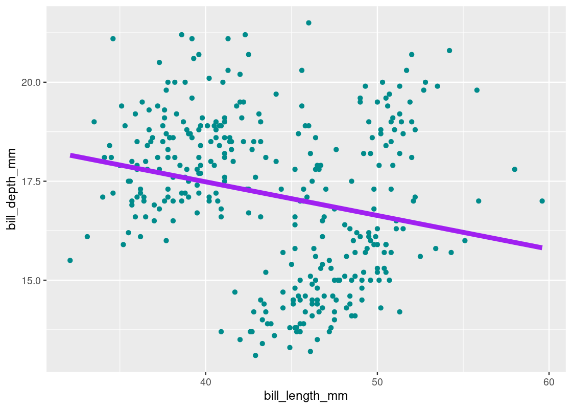
We also observe a strong positive correlation between the two variables.
## # A tibble: 1 × 1
##       r
##   <dbl>
## 1 0.790
9.5.2 Assumptions of the regression model
Before using inference for regression, we note briefly some assumptions of the regression model. In a simple linear regression model, the regression model assumes that the underlying relation between the response \(y\) and the predictor \(x\) is perfectly linear and follows a true line. We cannot see this line.
The scatter plot that is shown to us is generated by taking points on this line and “pushing” them off the line vertically by some random amount. For each observation, the process is as follows:
- Find the corresponding point on the true line
- Make a random draw with replacement from a population of errors that follows a normal distribution with mean 0 (i.e.,
rnorm(1, mean = 0)) - Draw a point on the scatter with coordinates \((\text{x}, \text{y + error} )\)
Let us demonstrate the effect for two scatter plots with two different sample sizes. The broken dashed line shows the “true” line that generated the scatter. The purple line is the regression line fitted using the least squares method we learned.
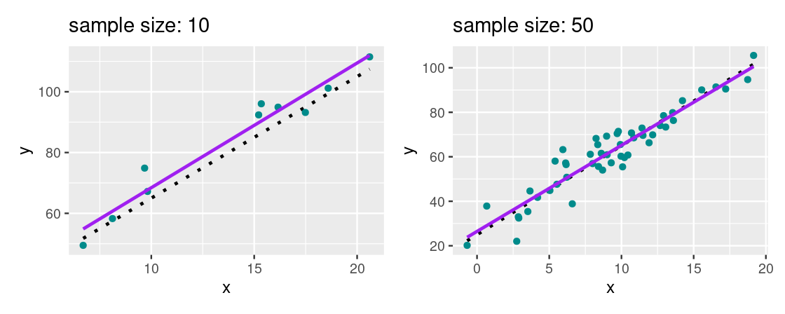
We cannot see the true line, however, we hope to approximate it as closely as possible. For a large enough sample size where the assumptions of the regression model are valid, we find that the regression line provides a good estimate of the true line.
9.5.3 Making predictions about unknown observations
The power of a linear model lies not in its ability to provide the best fit through a collection of points, but because we can use such a model to make predictions about observations that do not exist in our dataset. More specifically, we can use linear regression to make predictions about the expected weight of an Olympic athlete using just one piece of information: their height.
Let us first fit a regression for weight on height using the athlete data.
lmod_parsnip <- linear_reg() |>
  set_engine("lm") |>
  fit(Weight ~ Height, data = my_athletes)

lmod_parsnip |>
  tidy()
## # A tibble: 2 × 5
## term estimate std.error statistic p.value
## <chr> <dbl> <dbl> <dbl> <dbl>
## 1 (Intercept) -120. 2.69 -44.8 0
## 2 Height 1.09 0.0150 72.6 0Making a prediction is easy: just plug into the equation of the linear model! For example, what is the expected weight of an Olympic athlete who is 190 centimeters tall?
\[ \text{Weight} = 1.0905 * (190) - 120.402 = 86.79 \]
So an athlete that is 190 centimeters tall has an expected weight of about 86.8 kilograms.
We can accomplish the work with tidymodels using the function predict. Note that this function receives a dataset in the form of a data frame or tibble, and returns the prediction(s) as a tibble.
## # A tibble: 1 × 1
##   .pred
##   <dbl>
## 1  86.8
The prudent reader may have some suspicions about this result – that’s it? Is this something you can take to the bank?
Indeed, there is a key element missing from the analysis so far: confidence. How confident are we in our predictions? We learned that data scientists rarely report singular (or pointwise) estimates because so often they are working with samples of data. The errors are random under the regression model, so the regression line could have turned out differently depending on the scatter plot we get to see. Consequently, the predicted value can change as well.
To combat this, we can provide a confidence interval that quantifies the amount of uncertainty in a prediction. We hope to capture the prediction that would be given by the true line with this interval. We learned one way of obtaining such intervals in the previous chapters: resampling.
9.5.4 Resampling a confidence interval
We will use the resampling method we learned earlier to estimate a confidence interval for the prediction we just made. To accomplish this, we will:
- Create a resampled scatter plot by resampling the samples present in
my_athletesby means of sampling with replacement. - Fit a linear model to the bootstrapped scatter plot.
- Generate a prediction from this linear model.
- Repeat the process a large number of times, say, 1,000 times.
We could develop the bootstrap using dplyr code as we did before. However, this time we will let tidymodels take care of the bootstrap work for us.
First, let us write a function that fits a linear model from a scatter plot and then predicts the expected weight for an athlete who is 190 cm tall.
predict190_from_scatter <- function(tib) {
  lmod_parsnip <- linear_reg() |>
    set_engine("lm") |>
    fit(Weight ~ Height, data = tib)

  lmod_parsnip |>
    predict(tibble(Height = c(190))) |>
    pull()
}
We use the function specify from the infer package to specify which columns in the dataset are the relevant response and predictor variables.
my_athletes |>
  specify(Weight ~ Height) # infer package
## Response: Weight (numeric)
## Explanatory: Height (numeric)
## # A tibble: 3,180 × 2
## Weight Height
## <dbl> <dbl>
## 1 90 198
## 2 49 165
## 3 86 182
## 4 80 170
## 5 62 160
## 6 62 161
## 7 92 197
## 8 87 188
## 9 93 198
## 10 68 178
## # … with 3,170 more rowsWe form 1,000 resampled scatter plots using the function generate with the "bootstrap" setting.
resampled_scatter_plots <- my_athletes |>
  specify(Weight ~ Height) |>
  generate(reps = 1000, type = "bootstrap")
resampled_scatter_plots
## Response: Weight (numeric)
## Explanatory: Height (numeric)
## # A tibble: 3,180,000 × 3
## # Groups: replicate [1,000]
## replicate Weight Height
## <int> <dbl> <dbl>
## 1 1 81 181
## 2 1 80 188
## 3 1 78 184
## 4 1 54 162
## 5 1 64 170
## 6 1 67 178
## 7 1 83 187
## 8 1 58 168
## 9 1 67 181
## 10 1 83 190
## # … with 3,179,990 more rowsNote that this function returns a tidy tibble with one resampled observation per row, where the variable replicate designates which bootstrap the resampled observation belongs to. This effectively increases the size of the original dataset by a factor of 1,000. Hence, the returned table contains 3.1M entries.
Let us make this more compact by applying a transformation so that we have one resampled dataset per row. This can be accomplished using the function nest which creates a nested dataset.
resampled_scatter_plots |>
  nest()
## # A tibble: 1,000 × 2
## # Groups: replicate [1,000]
## replicate data
## <int> <list>
## 1 1 <tibble [3,180 × 2]>
## 2 2 <tibble [3,180 × 2]>
## 3 3 <tibble [3,180 × 2]>
## 4 4 <tibble [3,180 × 2]>
## 5 5 <tibble [3,180 × 2]>
## 6 6 <tibble [3,180 × 2]>
## 7 7 <tibble [3,180 × 2]>
## 8 8 <tibble [3,180 × 2]>
## 9 9 <tibble [3,180 × 2]>
## 10 10 <tibble [3,180 × 2]>
## # … with 990 more rowsObserve how the number of rows in the nested table (1,000) equals the number of desired bootstraps. We can create a new column that contains a resampled prediction for each scatter plot using the function predict190_from_scatter we wrote earlier. We call this function using a purrr map.
bstrap_predictions <- resampled_scatter_plots |>
  nest() |>
  mutate(prediction = map_dbl(data,
                        predict190_from_scatter))
bstrap_predictions
## # A tibble: 1,000 × 3
## # Groups: replicate [1,000]
## replicate data prediction
## <int> <list> <dbl>
## 1 1 <tibble [3,180 × 2]> 86.8
## 2 2 <tibble [3,180 × 2]> 86.9
## 3 3 <tibble [3,180 × 2]> 86.8
## 4 4 <tibble [3,180 × 2]> 87.1
## 5 5 <tibble [3,180 × 2]> 87.1
## 6 6 <tibble [3,180 × 2]> 86.8
## 7 7 <tibble [3,180 × 2]> 86.2
## 8 8 <tibble [3,180 × 2]> 86.9
## 9 9 <tibble [3,180 × 2]> 87.8
## 10 10 <tibble [3,180 × 2]> 87.0
## # … with 990 more rowsWe can identify a 95% confidence interval from the 1,000 resampled predictions. We can use the function get_confidence_interval from the infer package as a shortcut this time. This uses the same percentile method we learned earlier.
middle <- bstrap_predictions |>
  get_confidence_interval(level = 0.95)
middle
## # A tibble: 1 × 2
## lower_ci upper_ci
## <dbl> <dbl>
## 1 86.3 87.3Let us plot a sampling histogram of the predictions and annotate the confidence interval on this histogram.
ggplot(bstrap_predictions,
       aes(x = prediction, y = after_stat(density))) +
  geom_histogram(col="grey", fill = "darkcyan", bins = 13) +
  geom_segment(aes(x = middle[1][[1]], y = 0,
                   xend = middle[2][[1]], yend = 0),
size = 2, color = "salmon") 
We find that the distribution is approximately normal. Our prediction interval spans between 86.28 and 87.35 kilograms.
We can use R to give us the prediction interval by amending the call to predict.
lmod_parsnip |>
  predict(test_data_tib,
          type = "conf_int",
          level = 0.95)
## # A tibble: 1 × 2
## .pred_lower .pred_upper
## <dbl> <dbl>
## 1 86.3 87.3predict obtains the interval by means of statistical theory, and we can see that the result is very close to what we found using the the bootstrap. Formally, these intervals go by a special name: confidence intervals for the mean response. That’s a mouthful!
9.5.5 How significant is the slope?
We showed that the predictions generated by a linear model can vary depending on the sample we have at hand. The slope of the linear model can also turn out differently for the same reasons. This is especially important if our regression model estimates a non-zero slope when the slope of the true line turns out to be 0.
Let us conduct a hypothesis test to evaluate this claim for the athlete data:
- Null Hypothesis: Slope of true line is equal to 0.
- Alternative Hypothesis: Slope of true line is not equal to 0.
We can use a confidence interval to test the hypothesis. In the same way we used bootstrapping to estimate a confidence interval for the mean response, we can apply bootstrapping to estimate the slope of the true line. Fortunately, we need only to make small modifications to the code we wrote earlier to perform this experiment. The change being that instead of generating a prediction from the linear model, we will return its slope.
Here is the modified function we will use.
slope_from_scatter <- function(tib) {
  lmod_parsnip <- linear_reg() |>
    set_engine("lm") |>
    fit(Weight ~ Height, data = tib)

  lmod_parsnip |>
    tidy() |>
    pull(estimate) |>
    last() # retrieve slope estimate as a vector
}
We also modify the bootstrap code to use the new function. The rest of the bootstrap code remains the same.
bstrap_slopes <- my_athletes |>
  specify(Weight ~ Height) |>
  generate(reps = 1000, type = "bootstrap") |>
  nest() |>
  mutate(prediction = map_dbl(data, slope_from_scatter))
bstrap_slopes
## # A tibble: 1,000 × 3
## # Groups: replicate [1,000]
## replicate data prediction
## <int> <list> <dbl>
## 1 1 <tibble [3,180 × 2]> 1.10
## 2 2 <tibble [3,180 × 2]> 1.07
## 3 3 <tibble [3,180 × 2]> 1.09
## 4 4 <tibble [3,180 × 2]> 1.10
## 5 5 <tibble [3,180 × 2]> 1.07
## 6 6 <tibble [3,180 × 2]> 1.10
## 7 7 <tibble [3,180 × 2]> 1.08
## 8 8 <tibble [3,180 × 2]> 1.06
## 9 9 <tibble [3,180 × 2]> 1.11
## 10 10 <tibble [3,180 × 2]> 1.09
## # … with 990 more rowsHere is the 95% confidence interval.
middle <- bstrap_slopes |>
  get_confidence_interval(level = 0.95)
middle
## # A tibble: 1 × 2
## lower_ci upper_ci
## <dbl> <dbl>
## 1 1.06 1.12Following is the sampling histogram of the bootstrapped slopes with the annotated confidence interval.
ggplot(bstrap_slopes,
       aes(x = prediction, y = after_stat(density))) +
  geom_histogram(col="grey", fill = "darkcyan", bins = 13) +
  geom_segment(aes(x = middle[1][[1]], y = 0,
                   xend = middle[2][[1]], yend = 0),
size = 2, color = "salmon") 
As before, we observe that the distribution is roughly normal. Our 95% confidence interval ranges from about 1.06 to 1.12. According to our null hypothesis, the value 0 does not sit on this interval. Therefore, we reject the null hypothesis at the 95% significance level and conclude that the slope estimate obtained is non-zero. The benefit of using the confidence interval is that we also have a range of estimates for what the true slope is.
The normality of this distribution is important since it is the basis for the statistical theory that regression builds on. This means that our interval should be extremely close to what R reports, which is calculated using normal theory. The function confint gives us the answer.
##                   2.5 %      97.5 %
## (Intercept) -125.670130 -115.134110
## Height         1.061099    1.120017
Indeed, they are quite close! As a bonus, we also get a confidence interval for the intercept.
9.6 Graphical Diagnostics
An important part of using regression analysis well is understanding how to apply it. Many situations will present itself to you as what seems a golden opportunity for applying linear regression only to find out that the data does not meet any of the assumptions. Do not despair – there are many transformation techniques and diagnostics available that can render linear regression suitable. However, using any of them first requires a realization that there is a problem at hand with the current linear model.
Detecting problems with a regression model is the job of diagnostics. We can broadly categorize them as two kinds – numerical and graphical. We find graphical diagnostics easier to digest because they are visual and, hence, is what we will cover in this section.
9.6.1 Prerequisites
We will make use of the tidyverse and tidymodels in this chapter, so let us load these in as usual. We will also use a dataset from the edsdata package.
To develop the discussion, we will make use of the toy dataset we artificially created when studying correlation. We will study three datasets contained in this tibble: linear, cone, and quadratic.
diagnostic_examples <- corr_tibble |>
  filter(dataset %in% c("linear", "cone", "quadratic"))
diagnostic_examples
## # A tibble: 1,083 × 3
## x y dataset
## <dbl> <dbl> <chr>
## 1 0.695 2.26 cone
## 2 0.0824 0.0426 cone
## 3 0.0254 -0.136 cone
## 4 0.898 3.44 cone
## 5 0.413 1.15 cone
## 6 -0.730 -1.57 cone
## 7 0.508 1.26 cone
## 8 -0.0462 -0.0184 cone
## 9 -0.666 -0.143 cone
## 10 -0.723 0.159 cone
## # … with 1,073 more rows9.6.2 A reminder on assumptions
To begin, let us recap on the assumptions we have made about the linear model.
- The model is of the form \(y = c_0 + c_1x\), that is, the data can be modeled linearly.
- The variance of the residuals is constant, i.e., it fulfills the property of homoskedasticity.
Recall that the regression model assumes that the scatter is derived from points that start on a straight line and are then “nudged off” by adding random normal noise.
9.6.3 Some instructive examples
Let us now examine the relationship between y and x across three different datasets. As always, we start with visualization.
ggplot(diagnostic_examples) +
  geom_point(aes(x = x, y = y, color = dataset)) +
  facet_wrap( ~ dataset, ncol = 3)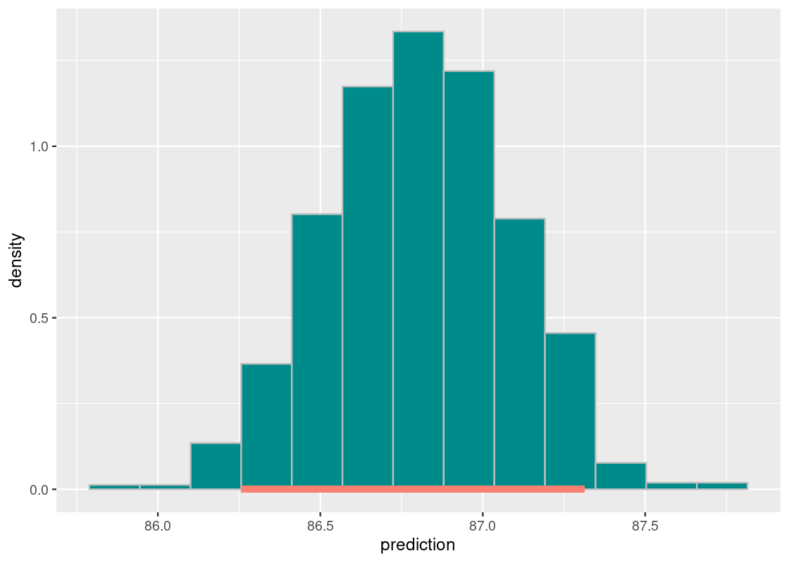
Assuming we have been tasked with performing regression on these three datasets, does it seem like a simple linear model of y on x will get the job done? One way to tell is by using something we have already learned: look at the correlation between the variables for each dataset.
We use dplyr to help us accomplish the task.
## # A tibble: 3 × 2
##   dataset         r
##   <chr>       <dbl>
## 1 cone       0.888
## 2 linear     0.939
## 3 quadratic -0.0256
Even without computing the correlation, it should be clear that something is very wrong with the quadratic dataset. We are trying to fit a line to something that follows a curve – a clear violation of our assumptions! The correlation coefficient also confirms that x and y do not have a linear relationship in that dataset.
The situation with the other datasets is more complicated. The correlation coefficients are roughly the same and signal a strong positive linear relationship in both. However, we can see a clear difference in how the points are spread in each of the datasets. Something looks “off” about the cone dataset.
Notwithstanding our suspicions, let us proceed with fitting a linear model for each. Let us use tidymodels to write a function that fits a linear model from a dataset and returns the augmented output.
augmented_from_dataset <- function(dataset_name) {
  dataset <- diagnostic_examples |>
    filter(dataset == dataset_name)

  lmod_parsnip <- linear_reg() |>
    set_engine("lm") |>
    fit(y ~ x, data = dataset)

  lmod_parsnip |>
    pluck("fit") |>
    augment()
}
augmented_cone <- augmented_from_dataset("cone")
augmented_linear <- augmented_from_dataset("linear")
augmented_quadratic <- augmented_from_dataset("quadratic")
We need a diagnostic for understanding the appropriateness of our linear model. For that, we turn to the residual plot.
9.6.4 The residual plot
One of the main diagnostic tools we use for studying the fit of a linear model is the residual plot. A residual plot can be drawn by plotting the residuals against the fitted values.
This can be accomplish in a straightforward manner using the augmented output. Let us look at the residual plot for augmented_linear.
ggplot(augmented_linear) +
  geom_point(aes(x = .fitted, y = .resid), color = "red") +
  geom_hline(yintercept = 0, color = "gray",
             lty = "dashed", size = 1)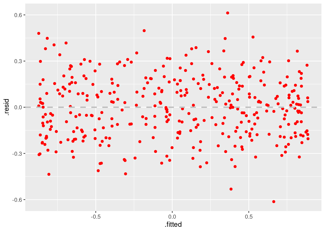
This residual plot tells us that the linear model has a good fit. The residuals are distributed roughly the same around the horizontal line at 0, and the width of the plot is not wider in some parts while narrower in others. The resulting shape is “blobbish nonsense” with no tilt.
Thus, our first observation:
A residual plot corresponding to a good fit shows no pattern. The residuals are distributed roughly the same around the horizontal line passing through 0.
9.6.5 Detecting lack of homoskedasticity
Let us now turn to the residual plot for augmented_cone, which we suspected had a close resemblance to augmented_linear.
ggplot(augmented_cone) +
  geom_point(aes(x = .fitted, y = .resid), color = "red") +
  geom_hline(yintercept = 0, color = "gray",
             lty = "dashed", size = 1)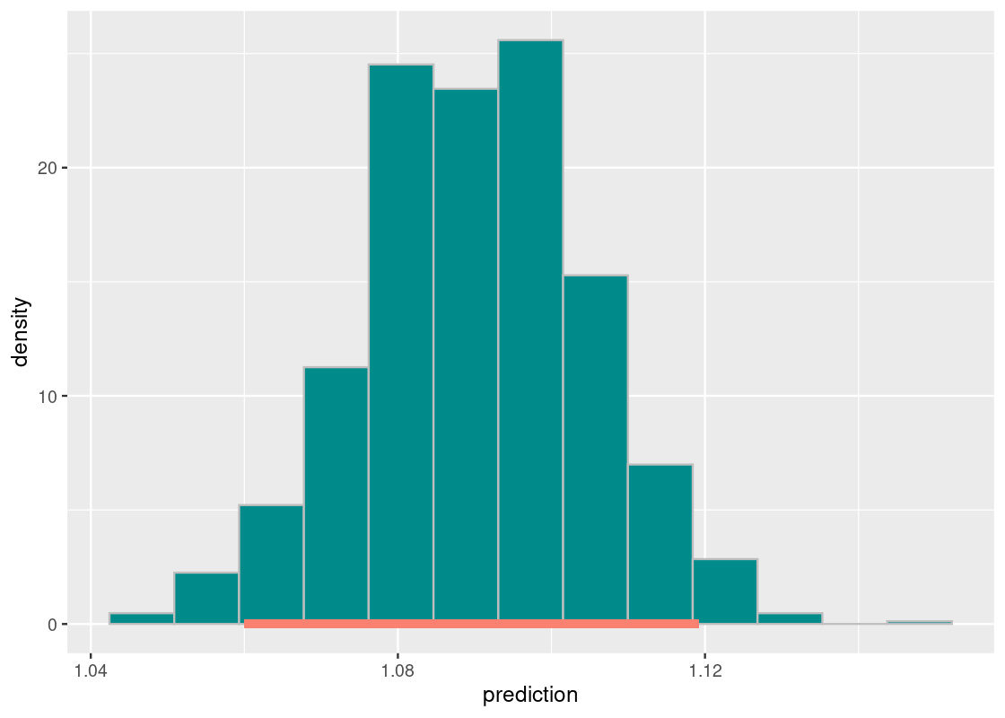
Observe how the residuals fan out at both ends of the residual plot. Meaning, the variance in the size of the residuals is higher in some places while lower in others – a clear violation of the linear model assumptions. Note how this problem would be harder to detect with the scatter plot or correlation coefficient alone.
Thus, our second observation:
A residual plot corresponding to a fit with nonconstant variance shows uneven variation around the horizontal line passing through 0. The resulting shape of the residual plot usually resembles a “cone” or a “funnel”.
9.6.6 Detecting nonlinearity
Let us move onto the final model, given by augmented_quadratic.
ggplot(augmented_quadratic) +
  geom_point(aes(x = .fitted, y = .resid), color = "red") +
  geom_hline(yintercept = 0, color = "gray",
             lty = "dashed", size = 1)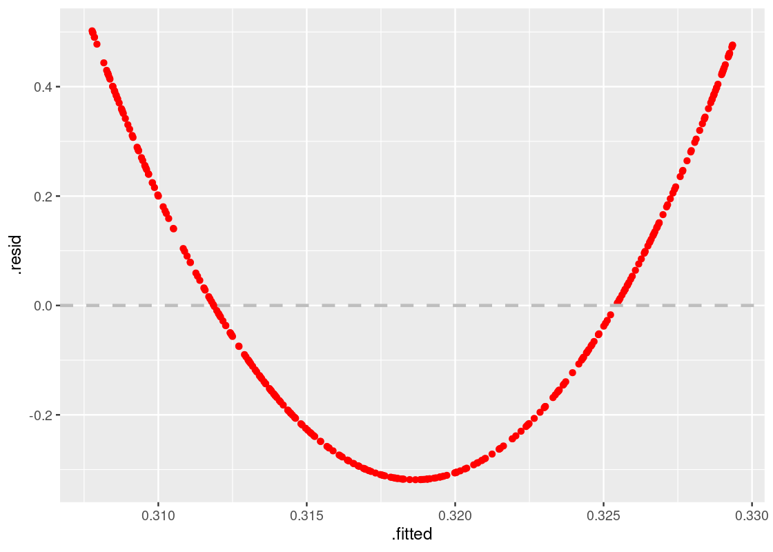
This one shows a striking pattern, which bears the shape of a quadratic curve. That is a clear violation of the model assumptions, and indicates that the variables likely do not have a linear relationship. It would have been better to use a curve instead of a straight line to estimate y using x.
Thus, our final observation:
When a residual plot presents a pattern, there may be nonlinearity between the variables.
9.6.7 What to do from here?
The residual plot is helpful in that it is a tell-tale sign of whether a linear model is appropriate for the data. The next question is, of course, what comes next? If a residual plot indicates a poor fit, data scientists will likely first look to techniques like transformation to see if a quick fix is possible. While such methods are certainly beyond the scope of this text, we can demonstrate what the residual plot will look like after the problem is addressed using these methods.
Let us return to the model given by augmented_quadratic. The residual plot signaled a problem of nonlinearity, and the shape of the plot (as well as the original scatter plot) gives a hint that we should try a quadratic curve.
We will modify our model to include a new regressor, which contains the term \(x^2\). Our model will then have the form:
\[ y = c_0 + c_1x + c_2x^2 \]
which is the standard form of a quadratic curve. Let us amend the parsnip model call and re-fit the model.
quadratic_dataset <- corr_tibble |>
  filter(dataset == "quadratic")

lmod_parsnip <- linear_reg() |>
    set_engine("lm") |>
    fit(y ~ x + I(x^2), data = quadratic_dataset)

augmented_quad_revised <- lmod_parsnip |>
  pluck("fit") |>
  augment()
Let us draw again the residual plot.
ggplot(augmented_quad_revised) +
  geom_point(aes(x = .fitted, y = .resid), color = "red") +
  geom_hline(yintercept = 0, color = "gray",
             lty = "dashed", size = 1)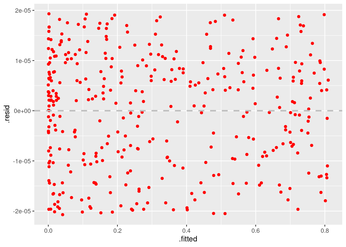
The residual plot shows no pattern whatsoever and, therefore, we can be more confident in this model.
9.7 Exercises
Be sure to install and load the following packages into your R environment before beginning this exercise set.
Answering questions for this chapter can be done using the linear modeling functions already available in base R (e.g., lm) or by using the tidymodels package as shown in the textbook. Let us load this package. If you do not have it, then be sure to install it first.
Question 1 You are deciding what Halloween candy to give out this year. To help make good decisions, you defer to FiveThirtyEight’s Ultimate Halloween Candy Power Ranking survey that collected a sample of people’s preferences for 269,000 randomly generated matchups.
To measure popularity of candy, you try to describe the popularity of a candy in terms of a single attribute, the amount of sugar a candy has. That way, when you are shopping at the supermarket for treats, you can predict the popularity of a candy just by looking at the amount of sugar it has!
We have collected the results into a tibble candy in the edsdata package. We will use this dataset to see if we can make such predictions accurately using linear regression.
Let’s have a look at the data:
## # A tibble: 85 × 13
## competito…¹ choco…² fruity caramel peanu…³ nougat crisp…⁴ hard bar pluri…⁵
## <chr> <dbl> <dbl> <dbl> <dbl> <dbl> <dbl> <dbl> <dbl> <dbl>
## 1 100 Grand 1 0 1 0 0 1 0 1 0
## 2 3 Musketee… 1 0 0 0 1 0 0 1 0
## 3 One dime 0 0 0 0 0 0 0 0 0
## 4 One quarter 0 0 0 0 0 0 0 0 0
## 5 Air Heads 0 1 0 0 0 0 0 0 0
## 6 Almond Joy 1 0 0 1 0 0 0 1 0
## 7 Baby Ruth 1 0 1 1 1 0 0 1 0
## 8 Boston Bak… 0 0 0 1 0 0 0 0 1
## 9 Candy Corn 0 0 0 0 0 0 0 0 1
## 10 Caramel Ap… 0 1 1 0 0 0 0 0 0
## # … with 75 more rows, 3 more variables: sugarpercent <dbl>,
## # pricepercent <dbl>, winpercent <dbl>, and abbreviated variable names
## # ¹competitorname, ²chocolate, ³peanutyalmondy, ⁴crispedricewafer, ⁵pluribusQuestion 1.1 Filter this dataset to contain only the variables
winpercentandsugarpercent. Assign the resulting tibble to the namecandy_relevant.-
Question 1.2 Have a look at the data dictionary given for this dataset. What does
sugarpercentandwinpercentmean? What type of data are these (doubles, factors, etc.)?Before we can use linear regression to make predictions, we must first determine if the data are roughly linearly associated. Otherwise, our model will not work well.
Question 1.3 Make a scatter plot of
winpercentversussugarpercent. By convention, the variable we will try to predict is on the vertical axis and the other variable – the predictor – is on the horizontal axis.Question 1.4 Is the percentile of sugar and the overall win percentage roughly linearly associated? Do you observe a correlation that is positive, negative, or neither? Moreover, would you guess that correlation to be closer to 1, -1, or 0?
Question 1.5 Create a tibble called
candy_standardcontaining the percentile of sugar and the overall win percentage in standard units. There should be two variables in this tibble:winpercent_suandsugarpercent_su.Question 1.6 Repeat Question 1.3, but this time in standard units. Assign your
ggplotobject to the nameg_candy_plot.Question 1.7 Compute the correlation
rusingcandy_standard. Do NOT try to shortcut this step by usingcor()! You should use the same approach as shown in Section 11.1. Assign your answer to the namer.-
Question 1.8 Recall that the correlation is the slope of the regression line when the data are put in standard units. Here is that regression line overlaid atop your visualization in
g_candy_plot:g_candy_plot + geom_smooth(aes(x = sugarpercent_su, y = winpercent_su), method = "lm", se = FALSE)What is the slope of the above regression line in original units? Use
dplyrcode and the tibblecandyto answer this. Assign your answer (a double value) to the namecandy_slope. -
Question 1.9 After rearranging that equation, what is the intercept in original units? Assign your answer (a double value) to the name
candy_intercept.Hint: Recall that the regression line passes through the point
(sugarpcnt_mean, winpcnt_mean)and, therefore, the equation for the line follows the form (wherewinpcntandsugarpcntare win percent and sugar percent, respectively):\[ \text{winpcnt} - \text{winpcnt mean} = \texttt{slope} \times (\text{sugarpcnt} - \text{sugarpcnt mean}) \]
-
Question 1.10 Compute the predicted win percentage for a candy whose amount of sugar is at the 30th percentile and then for a candy whose sugar amount is at the 70th percentile. Assign the resulting predictions to the names
candy_pred10andcandy_pred70, respectively.The next code chunk plots the regression line and your two predictions (in purple).
ggplot(candy,
       aes(x = sugarpercent, y = winpercent)) +
  geom_point(color = "darkcyan") +
  geom_abline(aes(slope = candy_slope,
                  intercept = candy_intercept),
              size = 1, color = "salmon") +
  geom_point(aes(x = 0.3,
                 y = candy_pred30),
             size = 3, color = "purple") +
  geom_point(aes(x = 0.7,
                 y = candy_pred70),
             size = 3, color = "purple")
Question 1.11 Make predictions for the win percentage for each candy in the
candy_relevanttibble. Put these predictions into a new variable calledpredictionand assign the resulting tibble to a namecandy_predictions. This tibble should contain three variables:winpercent,sugarpercent, andprediction(which contains the prediction for that candy).Question 1.12 Compute the residual for each candy in the dataset. Add the residuals to
candy_predictionsas a new variable calledresidual, naming the resulting tibblecandy_residuals.-
Question 1.13 Following is a residual plot. Each point shows one candy and the over- or under-estimation of the predicted win percentage.
ggplot(candy_residuals,
       aes(x = sugarpercent, y = residual)) +
  geom_point(color = "darkred")
Do you observe any pattern in the residuals? Describe what you see.
Question 1.14 In
candy_relevant, there is no candy whose sugar amount is at the 1st, median, and 100th percentile. Under the regression line you found, what is the predicted win percentage for a candy whose sugar amount is at these three percentiles? Assign your answers to the namespercentile_0_win,percentile_median_win, andpercentile_100_win, respectively.Question 1.15 Are these values, if any, reliable predictions? Explain why or why not.
Question 2 This question is a continuation of the linear regression analysis of the candy tibble in Question 1.
Let us see if we can obtain an overall better model by including another attribute in the analysis. After looking at the results from Question 1, you have a hunch that whether or not a candy includes chocolate is an important aspect in determining the most popular candy.
This time we will use functions from R and tidymodels to perform the statistical analysis, rather than rolling our own regression model as we did in Question 1.
Question 2.1 Convert the variable
chocolateincandyto a factor variable. Then select three variables from the dataset:winpercent,sugarpercent, and the factorchocolate. Assign the resulting tibble to the namewith_chocolate.-
Question 2.2 Use a
parsnipmodel to fit a simple linear regression model ofwinpercentonsugarpercenton thewith_chocolatedata. Assign the model to the namelmod_simple.NOTE: The slope and intercept you get should be the same as the slope and intercept you found during lab – just this time we are letting R do the work.
Question 2.3 Using a
parsnipmodel again, fit another regression model ofwinpercentonsugarpercent, this time adding a new regressor which is the factorchocolate. Use thewith_chocolatedata. Assign this model to the namelmod_with_factor.-
Question 2.4 Using the function
augment, augment the model output fromlmod_with_factorso that each candy in the dataset is given information about its predicted (or fitted) value, residual, etc. Assign the resulting tibble to the namelmod_augmented.The following code chunk uses your
lmod_augmentedtibble to plot the data and overlays the predicted values fromlmod_with_factorin the.fittedvariable – two different regression lines! The slope of each line is actually the same. The only difference is the intercept.lmod_augmented |> ggplot(aes(x = sugarpercent, y = winpercent, color = chocolate)) + geom_point() + geom_line(aes(y = .fitted))Is the
lmod_with_factormodel any better thanlmod_simple? One way to check is by computing the \(RSS\) for each model and seeing which model has a lower \(RSS\). -
Question 2.5 The augmented tibble has a variable
.residthat contains the residual for each candy in the dataset; this can be used to compute the \(RSS\). Compute the \(RSS\) for each model and assign the result to the appropriate name below. Question 2.6 Based on what you found, do you think the predictions produced by
lmod_with_factorwould be more or less accurate than the predictions fromlmod_simple? Explain your answer.
Question 3 This question is a continuation of the linear regression analysis of the candy tibble in Question 1.
Before we can be confident in using our linear model for the candy dataset, we would like to know whether or not there truly exists a relationship between the popularity of a candy and the amount of sugar the candy contains. If there is no relationship between the two, we expect the correlation between them to be 0. Therefore, the slope of the regression line would also be 0.
Let us use a hypothesis test to confirm the true slope of regression line. Here is the null hypothesis statement:
The true slope of the regression line that predicts candy popularity from the amount of sugar it contains, computed using a dataset that contains the entire population of all candies that have ever been matched up, is 0. Any difference we observed in the slope of our regression line is because of chance variation.
-
Question 3.1 What would be a good alternative hypothesis for this problem?
The following function
slope_from_scatteris adapted from the textbook. It receives a dataset as input, fits a regression ofwinpercentonsugarpercent, and returns the slope of the fitted line: Question 3.2 Using the
inferpackage, create 1,000 resampled slopes fromcandyusing a regression ofwinpercentonsugarpercent. You should make use of the functionslope_from_scatterin your code. Assign your answer to the nameresampled_slopes.Question 3.3 Derive the approximate 95% confidence interval for the true slope using
resampled_slopes. Assign this interval to the namemiddle.Question 3.4 Based on this confidence interval, would you accept or reject the null hypothesis that the true slope is 0? Why?
-
Question 3.5 Just in time for Halloween, Reese’s Pieces released a new candy this year called Reese’s Chunks. We are told its sugar content places the candy at the 64th percentile of sugar within the dataset. We would like to use our linear model
lmod_simplefrom Question 1 to make a prediction about its popularity. However, we know that we can’t give an exact estimate because our prediction depends on a sample of 85 different candies being matched up!Instead, we can provide an approximate 95% confidence interval for the prediction using the resampling approach in Section 11.3. Recall that such an interval goes by a special name: confidence interval for the mean response.
Suppose we find this interval to be \([48.7, 55.8]\). Does this interval cover around 95 percent of the candies in
candywhose sugar amount is at the 64th percentile? Why or why not?
Question 4 Linear regression may not be the best method for describing the relationship between two variables. We would like to have techniques that can help us decide whether or not to use a linear model to predict one variable from another.
If a regression fits a scatter plot well, then the residuals from our regression model should show no pattern when plotted against the predictor variable. This is called the residual plot. Section 11.4 shows how we can use ggplot to generate a residual plot from a parsnip linear model.
The tibble and_vertebrates from the package lterdatasampler contains length and weight observations for Coastal Cutthroat Trout and two salamander species (Coastal Giant Salamander, and Cascade Torrent Salamander) in HJ Andrews Experimental Forest, Willamette National Forest, Oregon. See the dataset description for more information.
and_vertebrates## # A tibble: 32,209 × 16
## year sitecode section reach pass unitnum unittype vert_in…¹ pitnu…² species
## <dbl> <chr> <chr> <chr> <dbl> <dbl> <chr> <dbl> <dbl> <chr>
## 1 1987 MACKCC-L CC L 1 1 R 1 NA Cutthr…
## 2 1987 MACKCC-L CC L 1 1 R 2 NA Cutthr…
## 3 1987 MACKCC-L CC L 1 1 R 3 NA Cutthr…
## 4 1987 MACKCC-L CC L 1 1 R 4 NA Cutthr…
## 5 1987 MACKCC-L CC L 1 1 R 5 NA Cutthr…
## 6 1987 MACKCC-L CC L 1 1 R 6 NA Cutthr…
## 7 1987 MACKCC-L CC L 1 1 R 7 NA Cutthr…
## 8 1987 MACKCC-L CC L 1 1 R 8 NA Cutthr…
## 9 1987 MACKCC-L CC L 1 1 R 9 NA Cutthr…
## 10 1987 MACKCC-L CC L 1 1 R 10 NA Cutthr…
## # … with 32,199 more rows, 6 more variables: length_1_mm <dbl>,
## # length_2_mm <dbl>, weight_g <dbl>, clip <chr>, sampledate <date>,
## # notes <chr>, and abbreviated variable names ¹vert_index, ²pitnumberLet us try to predict the weight (in grams) of Coastal Giant Salamanders based on their snout-vent length (in millimeters).
Question 4.1 Filter the tibble
and_vertebratesto contain only those observations that pertain to Coastal Giant Salamanders. Assign the resulting tibble to the nameand_salamanders.Question 4.2 Generate a scatter plot of
weight_gversuslength_1_mm.Question 4.3 Generate the residual plot for a linear regression of
weight_gonlength_1_mm.-
Question 4.4 Following are some statements that can be made about the above residual plot. For each of these statements, state whether or not the statement is correct and explain your reasoning.
- The residuals are distributed roughly the same around the horizontal line passing through 0. Because there is no visible pattern in the residual plot, the linear model is a good fit.
- The residual plot shows uneven variation around the horizontal line passing through 0.
- The residual plot shows a pattern, which points to nonlinearity between the variables.
Question 4.5 For the problem(s) you found in Question 4.3, try applying transformations as shown in Section 11.4 to see if they can be corrected. If you did not find any problems, suggest some ways to improve the linear model.
Question 5 The tibble mango_exams from the edsdata package contains exam scores from four different offerings of a course taught at the University of Mango. The course contained two midterm assessments and a final exam administered at the end of the semester. Here is a preview of the data:
## # A tibble: 440 × 4
##     Year Midterm1 Midterm2 Final
##    <dbl>    <dbl>    <dbl> <dbl>
##  1  2001     80.1     90.8  96.7
##  2  2001     87.5     78.3  93.3
##  3  2001     29.4     30    46.7
##  4  2001     97.5     96.7  98.3
##  5  2001     79.4     75.5  66.7
##  6  2001     82.5     57.5  80
##  7  2001     97.2     83.8  75
##  8  2001     80       85    80
##  9  2001     38.8     60    51.7
## 10  2001     67.5     62.5  66.7
## # … with 430 more rows-
Question 5.1 Following are some questions you would like to address about the data:
- Is there a difference in Final exam performance between the offerings in
2001and2002? - How high will student scores on the Final be on average, given a Midterm 1 score of 75?
- What is the estimated range of mean Midterm 2 scores in the population of University of Mango students who have taken the course?
Here are four techniques we have learned:
- Hypothesis test
- Bootstrapping
- Linear Regression
- Central Limit Theorem
Choose the best one to address each of the above questions. For each question, select only one technique.
- Is there a difference in Final exam performance between the offerings in
Question 5.2 Using an appropriate geom from
ggplot2, visualize the distribution of scores inMidterm1. Then generate another visualization showing the distribution of scores inFinal. Do the distributions appear to be symmetrical and roughly normally distributed? Explain your reasoning.Question 5.3 Visualize the relationship between
Midterm1andFinalusing an appropriate geom withggplot2. Then answer in English: do these variables appear to be associated? Are they linearly related?-
Question 5.4 Fit a regression line to this scatter plot. Write down the equation of this line. Does the intercept have a sensible interpretation? Then, augment your visualization from Question 5.3 with this line.
Note: it is tempting to use
geom_smoothbutgeom_smoothcomputes its own linear regression; you must find another way so that the visualization shows your regression line. Question 5.5 Generate a residual plot for this regression. Does the association between final and midterm scores appear linear? Or does the plot suggest problems with the regression? Why or why not?
Question 5.6 You want to know how students who scored a 80 on the first midterm will perform on the final exam, on average. Assuming the regression model holds for this data, what could plausibly be the predicted final exam score?
-
Question 5.7 Following are some statements about the prediction you just generated. Which of these are valid statements that can be made about this prediction? In English, explain why or why not each is a valid claim.
- This is the score an individual student can expect to receive on the final exam after scoring a 80 on the first midterm.
- A possible interpretation of this prediction is that a student who scored a 80 on the first midterm cannot possibly score a 90 or higher on the final exam.
- This is an estimate of the height of the true line at \(x = 80\). Therefore, we can confidently report this result.
- A prediction cannot be determined using a linear regression model fitted on this data.
-
Question 5.8 An alternative to transformation is to set aside data that appears inconsistent with the rest of the dataset and apply linear regression only to the subset. For instance, teaching style and content may change with each course offering and it can be fruitful to focus first on those offerings that share similar characteristics (e.g., the slope and intercept of the fitted regression line on each individual offering is similar). We may also consider cut-offs and set aside exam scores that are too low or high.
Using
dplyrand your findings so far, craft a subset ofmango_examsscores that seems appropriate for a linear regression ofFinalonMidterm1. Explain why your subset makes sense. Then perform the linear regression using this subset and showggplot2visualizations that demonstrate whether the model fitted on this subset is any better than the model fitted on the full data.
Question 6 This question is a continuation of Question 7 from Chapter 5. There is evidence suggesting that mean annual temperature is a primary factor for the change observed in lake ice formation. Let us explore the role of air temperature as a confounding variable in the relationship between year and ice cover duration. We will bring in another data source: daily average temperature data from 1869 to 2019 in Madison, Wisconsin. These data are available in the tibble ntl_airtemp, also sourced from the lterdatasampler package.
Question 6.1 Form a tibble named
by_year_avgthat reports the mean annual temperature. According to the documentation, data prior to (and including) 1884 should be filtered as we are told data for these dates contain biases.Question 6.2 Create a tibble named
icecover_with_tempthat contains both the ice cover duration (fromntl_icecover) and the air temperature data (by_year_avg). The resulting tibble should not contain any data before 1885.Question 6.3 Generate a scatter plot showing ice duration versus mean annual temperature.
Question 6.4 Generate a line plot showing mean annual air temperature versus year.
Question 6.5 Fit a regression model for
ice_durationonyear. Then fit another regression model forice_durationonyearandavg_air_temp_year. Note if the sign of the estimate given foryearchanges when including the additionalavg_air_temp_yearregressor.-
Question 6.6 We have now visualized the relationship between mean annual air temperature and year and between mean annual air temperature and ice duration. We also generated two regression models where the only difference is inclusion of the variable
avg_air_temp_year. Based on these, which of the following conclusions can be correctly drawn about the data? Explain which visualization and/or model gives evidence for each statement.- There is a positive correlation between year and mean annual temperature.
- There is a negative correlation between ice duration and mean annual temperature.
- Mean annual air temperature is a confounding variable in the relationship between year and ice cover duration.
- The relationship between year and ice cover duration is spurious.